Hush to Roar in 1993

Twenty years ago today The Smashing Pumpkins released Siamese Dream, their breakthrough multi-platinum-selling effort.

A month later, on my way to Syracuse, NY to work at the New York State Fair (booth sitting for a basement waterproofing business), I stopped by the newly-built Walmart in Rome and bought the album on cassette.

CassetteSPI think it was the last cassette tape I ever bought, and I think the primary reason I purchased the cassette version was because my step-dad’s late 1980’s Buick Skyhawk had a cassette deck and I didn’t yet have a portable CD player.

I suppose I could wax rhapsodic about the album, take histrionic license in describing how it affected me, or make grand claims of its wider cultural significance. I doubt it needs that kind of support or defense. Just the fact that it still holds water for me after 20 years feels pretty significant when so much cultural flotsam has easily floated away. I’ll try to contain myself.

Yet even after two decades I can still remember some the feelings I had first hearing those songs. I literally caught my breath when Soma, the last song on the first side of the cassette, transformed from hush to roar in my ears that first time. I had been turning the volume up and up and up during that first side, and the quietness of the initial minutes of the track yielding instantly to the guitar blast was awesome to experience with no prior knowledge of what was about to happen.

That pivot – from Soma finishing side 1 and Geek USA opening side 2 – was astounding. I think these two are my quintessential Smashing Pumpkins songs. They both share a kind of binary form where the balance between the hush and the roar is necessary to their emotional content. The stuff that Corgan is talking about in these songs – the existential rush of desire and fear, love and death, meaning and dissolution – requires more than a simple, single movement. So when Soma blows up or Geek USA stills its storm we sense the contours of one man’s deeply-felt reflections.

Here are the lyrics at the key moment between the two movements in Geek USA:

Shot full of diamonds
And a million years
The disappointed disappear
Like they were never here

In a dream
We are connected
Siamese twins
At the wrist

And then I knew we’d been forsaken
Expelled from Paradise
I can’t believe them
When they say that it’s alright

It’s completely appropriate that we find a nod to the album’s title in the whispered words between each half of the song.

The longest track on the album, Silverfuck, takes this ebb-and-flow/hush-to-roar mode to another level, blasting through a ramrod guitar and drum interplay into scintillating psychedelic dreamscapes until pausing for an echoed spoken word intermission only to scream through the huge main theme and spin off in distortion and buzz. It’s exactly the melodrama and bombast that the Pumpkins – a la Billy Corgan – have always stood for.

Siamese Dream is full of great moments sonically and in the sentiments it carries; it’s easy to understand why this album resonated with a generation of teenagers. I don’t know that is truly relevant to my life or emotional state now, but I greatly appreciate the work in aesthetic terms, particularly in the balance and interpolation of big concerns with big sounds. Just a few short years later the Pumpkins would take all of this to a completely cosmic – and semi-psychotic – level on the Mellon Collie and the Infinite Sadness double album. If Mellon Collie represented a serious kind of break from reality, I think it’s clear that Siamese Dream is solidly rooted in reality and felt experience. In it you hear just some conflicted, weird young kids from Chicago trying to carve out a space for their hopes and hide away from their fears. You can see the complexity of these emotions in their performance at The Metro in Chicago on August 14, 1993, which was a CD release event. Click here to watch it.

Or just pick up Siamese Dream and listen closely.
Relevant Anachronisms

Ballou-AnachronismsWHT

Ballou-AnachronismsStudyWHT

Light and Shadow

Looking

Translation

Colors

The Dodecahedron

Hardwood Furniture

Angles

“Selfies” in Mirrors

Images

Slide Carousel Boxes

Symbol

Meaning

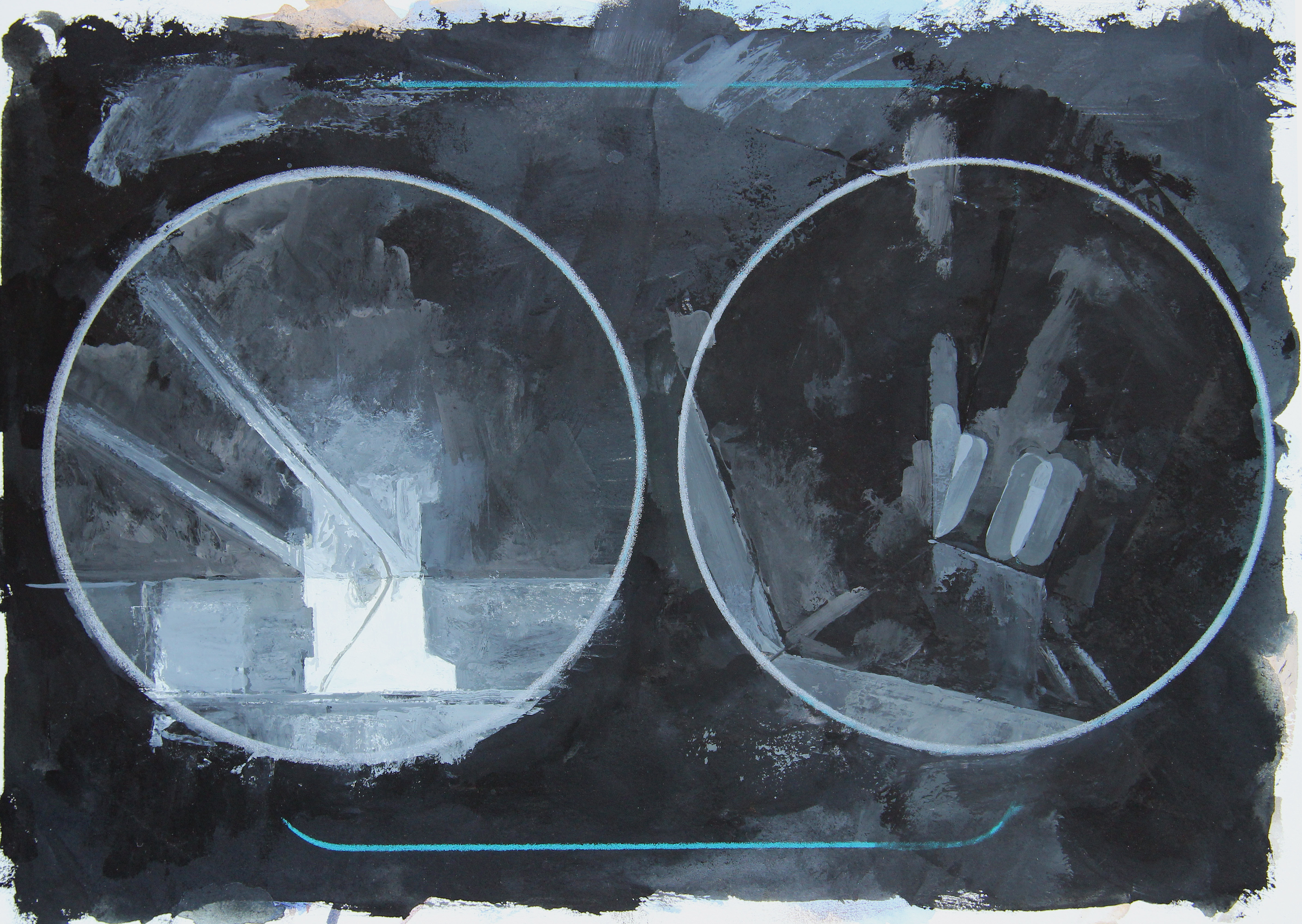
Above, top: Relevant Anachronisms, gouache on paper, 13 inches in diameter, 2012-2013.

Above, bottom: Relevant Anachronisms (Study), colored pencils on paper, 13 inches in diameter, 2012.

Solo Exhibition in Kansas

I’ve got a solo exhibition coming up October 5 – October 25, 2013, in Hays, Kansas. The exhibition, titled ASEVENANDAWONADOE* will take place at the Moss-Thorn Gallery of Art on the campus of Fort Hays State University. Featuring thirty new works, the exhibition will unite the representational tondos and abstract mandalas that I have been creating simultaneously over the last few years.

WORKINGSEVENANDAWONADOE copyHere is a brief statement about the show. A longer version will be presented during the closing reception:

ASEVENANDAWONADOE* – Paintings and Prints by Matthew Ballou

This exhibition explores the reality that a vernacular of meaning is constructed through our physical, emotional, and intellectual experiences. These experiences take place in the spaces that surround us, via the ideas that fill our minds, and through the objects that engage us. Meaning is imputed to these spaces, ideas, and objects rather than being necessarily inherent in them. This notion follows from the work of 20th Century Pragmatist philosopher John Dewey, who described how we “fund” our lives with significance through investments of time, emotion, and effort. These, in turn, come together to manifest the wealth of meaning we sense in our world.

By concentrating my artistic contemplation on objects that I have funded over the course of my life, I draw attention to not only their significance but also the modes, methods, and extents to which others have done the same. Conversely, by exploring issues that previous generations have investigated, such as the mandala form and geometric abstraction, I participate in the legacy of their contemplations. In a sense, I have borrowed from the storehouse they built while adding an investment of my own. The works on display here play on the distance between representation and abstraction, between the iconic and symbolic, between the organic and geometric, and between the received and the constructed.

*ASEVENANDAWONADOE is a word my young daughter Miranda invented during the time she was learning “real” words. It combined the structures of the new words she was encountering but was also, to her, connected to abstract concepts such as mathematics, pain, comfort, and security. An entirely made up word – yet one that relied on the received information and influences my daughter experienced – ASEVENANDAWONADOE is an example of something seemingly “meaningless” taking on meaning through experience, context, and subjectivity. In adding to the history and lineage of this word by including it in this exhibition, I further shape the contours of its potential meaning and more deeply connect it to the story of our family.

If Justin Timberlake and Robin Thicke Can Display Them, Why Can’t A Mom?

I saw this today on the Huffington Post (the inimitable Anne Harris brought it to my attention – thanks!), and it’s the 100% truth:

Click above to watch Hollie McNish’s spoken word recital about the appropriateness of breastfeeding and the inappropriate stupidity of the western world for having a problem with it.

Recently I’ve become more and more annoyed with the fact that women continue to be presented as eye-candy for men, while legitimate explorations of the body in art are consistently challenged. Writer Amy Wilder interviewed me a few weeks ago about this very issue.

These issues won’t go away. It’s happening right now in our culture. A few months after Robin Thicke’s idiotic and misogynistic music video went viral, Justin Timberlake entered the fray with his own. Both of these videos pair the fragmented display of women’s bodies with the rape-language of “you/i know you want it”. No, I won’t link you to the material I’m talking about. You’ve probably already seen it.

What it amounts to is millions of people apparently buying into the lifestyle and vision of the likes of Thicke and Timberlake (fully-clothed men who parade the bodies of women just to make a buck, who parade the bodies of women around for the delectation of and consumption of other men, who parade the purposely fragmented and de-individualized bodies of women around and pretend like it’s just a matter of “blurring lines”) while simultaneously shaming women for nursing their children in public.

It’s pathetic. It’s frustrating. It’s wrong. It’s wrong for specific profit-producing demographics (be they people or industries) to drive the cultural position and presentation of women’s bodies in this world. That’s exactly what’s happening here. It’s been happening for generations.

Part of what is playing into my anger about this is that I watched the documentary Girl Model, which really disturbed me. If you haven’t watched it, do it. It’s streaming on Netflix right now and is eye-opening.

On top of this, going through the adoption process over the last year really disabused me of the rose-colored-glasses ideas I had about the progress of women in the last couple of decades. Globally, it’s dangerous to be born female. In the west, where we think we can rest on the laurels of our “progressive” progress, it’s hard to make people understand this. I won’t recount the horrific stories that have been in the news recently. But it’s in THIS STUFF – where women are asked to APPEAR but not to ACT – that we continue to fail as societies. Our media continues to present a vision of women as young and as tight and as coquettish as men want them to be. The second their bodies resist the classification of appearance (for instance, when a woman breastfeeds her child or becomes too old to fulfill the wish-fantasies of 18 year old boys) they are simply denied. Hidden. Disappeared.

This is a major problem, and more people need to get angry about it.

I think about the world my two daughters are living in…

Enigma

ballou-tealgrill

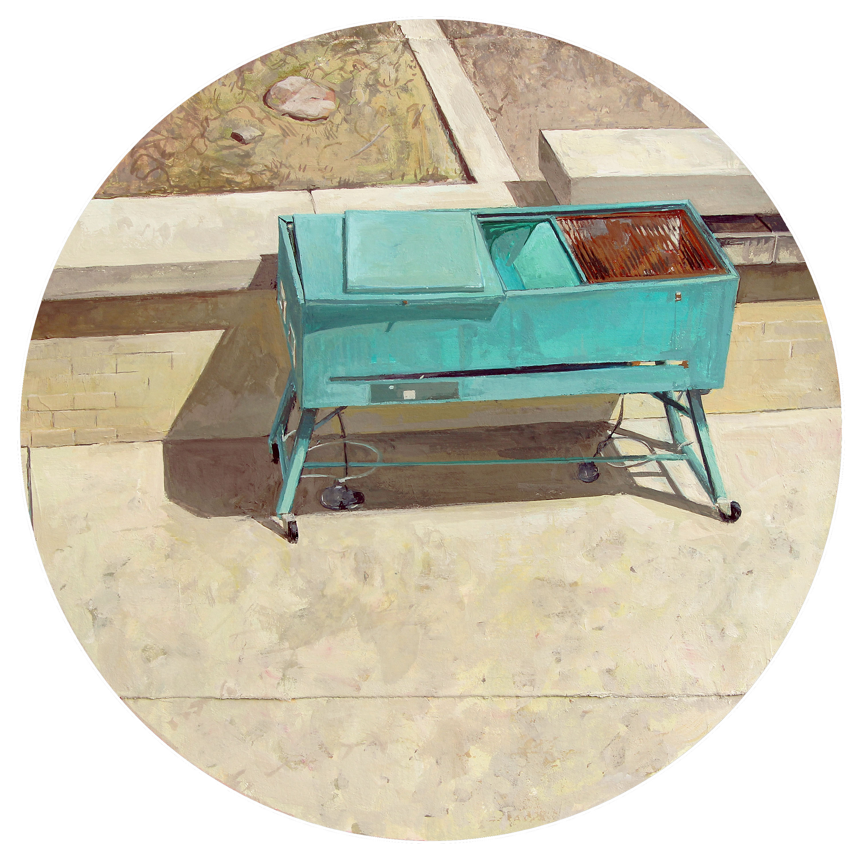
Enigma (Teal Grill), Gouache on paper, 12 inches in diameter. 2013.

I’ve been looking at this teal grill for the last six months or so. It’s situated in a little courtyard common area for students who live in nearby residence towers here at the University of Missouri. A few months ago when I moved into my new office/studio space I became even more enamored with this thing. It’s awkward. It’s got a glorious, alchemical color that changes with the weather. I’ve never seen it being used, and yet it’s got a presence and sort of commands a section of the courtyard wall. Situated on an East-West axis, the sun gives the grill a dramatic polyhedral shadow that tracks out, under, and around its gangly legs. Vaguely alien, dingy and unused, and having physical proportions and angular relationships that allow for formal play, it was only a matter of time until I painted it. The exploration was worth it… I might have to dive right back in.

What Is A Great Image?

On May 22, 2013, I gave a public talk at the Boone County Chambers Room in Columbia, Missouri that addressed the question, “What is a great image?”

Below is audio from that talk synced up with the slide show that I used. If you’ve got an hour and are interested in how art, history, and human experience interconnect, you might appreciate this talk. Obviously it’s by no means exhaustive and has to skim over many issues, but I think it’s got some quality observations. I would greatly appreciate any questions, comments, or observations you might have after watching through.

And here’s a picture of me and my girls during the Q&A session after the talk :)

Sci-Fi Film Worth Seeing Again (and Again [and Again])

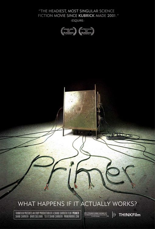
It’s been nearly a decade since Shane Carruth’s Primer came out. The movie is an unconventional time-travel* film and extremely low-budget ($7,000) project that delivers on every level. On a whim, I watched it again yesterday and was pleasantly surprised at how well it holds up. In some sense, it’s even better now.

primer

One of the things that makes it feel better to me in 2013 is that it is clearly from a time before social media really took off – the computers are as big as Buicks, the pace of life and modes of interpersonal exchange are still face-to-face, and the technology is less ubiquitous, more alchemical. The film plays on ethos of now-tech giants having started around the kitchen tables and in the garages of 70s, 80s, and 90s suburbia. The film also succeeds in bringing the human equation – the brokenness of human nature and the contingencies of our perceptions of reality – to the fore, never cramming the sci-fi down viewers’ throats. Even the technical jargon, which actually seems to bear some relationship to real science, is presented as asides rather than lame attempts at pseudo-explanation (I’m talking about you, Prometheus).

The filmmaker also presents compelling and simple camera work. Nothing flashy. Useful cuts. Good pacing. Subtlety. Nice compositional balance. All the basics of fundamental visual dynamics where the audience doesn’t need to be firebombed to understand what’s happening. We never focus on the technology, we focus on people.

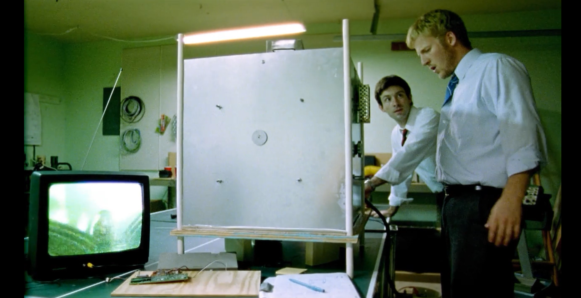
Screen shot 2013-06-21 at 11.20.40 AMAaron and Abe realize something unique is going on inside The Box.

In an era where lame reboots and aimless, mindless sci-fi films are a dime a dozen, it’s gratifying that a well-executed, thoughtful movie can be made in the genre and stand the test of time. To me, Primer holds a position similar to films like Donnie Darko or Brick (both of which also happened to be made in the first half of the 2000s). These are noir-ish, psychological films that ask big questions and mix realism and surrealism in such a way that they feel like lived experiences. The dislocations, paradoxes, neurotic turns, and seemingly inconsequential points of aesthetic and conceptual concern upon which these films pivot put the big-budget/shoot-em-up/blow-everything-up/summer-block-busters to shame. What Shane Carruth did with seven grand makes Michael Bay (with his hundreds of millions) look like a chump.

That Primer won the Grand Jury Prize at Sundance in 2004 makes complete sense. If you haven’t seen the film, do it now. It’s streaming on Netflix.

*People who know me know that, in general, I HATE time-travel movies – they’re usually bogus and annoying plot devices that offer little in terms of real narrative, conceptual, or emotional meaning. But when it works, it works.

An Awesome New Diebenkorn Book

IMG_7460

I just recently picked up a fantastic new Diebenkorn book, and it turns out to be very impressive. No, I’m not talking about the new Berkeley Years catalog (though I did buy that a few weeks ago and am enjoying it). This is a volume out of a small California publisher called Kelly’s Cove Press.

The book, Richard Diebenkorn: Abstractions on Paper contains 88 full color images and a few black and white shots of Diebenkorn’s studios. There are a few points that make this paperback book exceptional. First, it contains dozens of works that have never before been published. This isn’t because they were lacking in quality; many of the pieces shown here really display Diebenkorn’s quintessential processes very well. Secondly, the book shows abstractions on paper from all of the major locations where he worked throughout his life: Sausalito, Albuquerque, Urbana, Berkeley, Ocean Park and Healdsburg.

IMG_7457

The Healdsburg works contained in this book make it indispensable for aficionados of Diebenkorn’s work. I’ve followed every Diebenkorn publication, traveled to see his work in many states, and searched widely to find examples of his work. There simply is no other publication that contains as many Healdsburg-era works that I know of.

The book lacks any scholarly essays, which is a virtue. The only words are short quotes from the artist interspersed among the images and a short biography at the end. This gives us nearly 125 pages of beautiful artworks, printed nicely in an 8 by 6 inch format. I’ll definitely be keeping this book close to me for informal browsing. But don’t let the small size fool you – the overall feel and color quality is excellent.

IMG_7458

Authorized by the Richard Diebenkorn Foundation, the book was produced in support of what should be a fantastic traveling exhibition titled The Intimate Diebenkorn: Works on Paper 1949-1992. The exhibition starts at the College of Marin Fine Arts Gallery (Kentfield, CA – 9/28/13-11/21/13) and then moves on to San Jose State University (4/15/14-5/17/14), American University (Washington DC – 11/8/14-12/14/14), Sonoma Valley Museum of Art (6/6/15-8/23/15), and ends at The University of Montana (Missoula, MT – 9/24/15-12/12/15).

IMG_7459

This book is well worth the mere $20 it costs to pick it up. If you’re into Diebenkorn, it’s essential. If you love Abstract Expressionism, works on paper, gestural painting, collage, West Coast art, or the California art traditions, you’ll love this book. Click here to buy it.

~

I’ve had the chance to write about Diebenkorn’s work a few times. My most recent essay about the artist is Diebenkorn’s Ocean Park: Provisional Action, Provisional Vision, and is available to read here.