Conference on Inspiring College Teaching, 2026
Community Forum #4, Sunday, May 24, 2026
“Teaching AGAINST AI: Pitfalls and worries of AI in teaching and learning” Lectures by Julie Bruneau (Plymouth State University) and Matt Ballou (Mizzou) with a panel discussion with the Wakonse Fellows moderated by Bruneau and Ballou.
Note: What follows is an edited transcript of Ballou’s talk with citations and resources added. Here is a PDF of the talk if you’d like to download it. Feel free to share far and wide.
Matt Ballou – Reflecting on AI, Pedagogy, Embodiment, and Consciousness
The background on this topic for me is that I was an early adopter of skills and tools related to AI and education. This goes back to a question I got in 2013: “Can you teach a fully online studio art class?” I made the first one – a section of beginning level drawing – at Mizzou in 2014. And I received physical artworks from students all over the world through that project. I learned a lot from that initial experience, and it still informs how I teach face-to-face and asynchronous courses today.
Eventually I also began – around 2020 – to start to explore what the AI space was going to be. By the end of 2023, when we had the first widely-used versions of ChatGPT out[i], there was definitely some inkling that it was going to be a major aspect of what I’d potentially have to use, and at least what I’d have to pay attention to. That same year, one of my online digital drawing students began to submit AI-generated drawings. And I know now, from almost three years later, that he ended up becoming a master at prompts. Today, after graduating with a dual BA in Journalism and Strat-Comm and a minor in Art, he does high-level work with prompts of the AI. But his prompting skill was rudimentary enough at the time that I could tell that it was not his physical, technical ability coming through those drawings.
It was interesting. One of the things that I require in my digital drawing class is they have to show me the video. They must have time lapse turned on in their drawing app so that I can watch them draw. When they submit the work – when I see the drawing – I also have the video of the drawing available for review. Strangely, he never sent me the videos of him doing those drawings. Of course, that is because he didn’t do the drawings. We ended up meeting with the administration of the Art program. There was a question of should he just get an F? I said, “No. If he wants to do this, then let’s build it. Let’s make it happen.”
So, what I did is create a project for the student using what is called “ethical” AI[ii], which in this instance used a company called exactly.AI[iii]. They allow you to upload your artwork to build a model within their closed system. Then, you can prompt generated images that only use the visual information from your artwork. To me, that’s an ethical situation because it is not mining the history of human creativity to create something. It’s mining your creativity, the proclivities that come out of your own drawing, inside your own painting, from your own design tendencies, and then it presents you with something that corresponds to your approach. I have generated a couple hundred images with this method. And I would say that around 1 out of 10 was acceptable. They all kind of looked like what I did. But they were… off.
So I picked about 20 of them, printed them out, and then worked back into them. I made them more like mine through physically drawing or painting on the printed versions. I decided to work with my student with a few caveats: you can’t use Midjourney, you can’t use these other image generation tools. You have to use exactly.AI. You have to upload drawings or photography that you did yourself, and then you can use your prompting ability to iterate from them. This way, he could still use a language model. He’s still getting an algorithm that’s processing what things are, but the imagery can’t come from anything other than what he’s done.
That became a really interesting project. Why? Because it was reflective. Because it was iterative. Because he had to accept that he could not simply generate something that was remarkably high quality. Because he had to use it as part of a process. I wanted him to see that the developmental process is not something to be avoided. It is something to be seen as the bedrock base of our human creativity.
Given that, one of the things I like to give to my students is this poem by Joseph Fasano[iv]. And this is what he says:
For a Student Who Used AI to Write a Paper.
Now I let it fall back in the grasses.
I hear you. I know this life is hard now.
I know your days are precious on this earth.
But what are you trying to be free of?
The living? The miraculous task of it?
Love is for the ones who love the work.
Brief, poignant, powerful words. “But what are you trying to be free of? The living?” Fasano asks. I want my students to be in love with their experience of life. In love with it enough to be committed to it and not farm out the human equation to something that is not human. So, I have a few thoughts about that I want to share.
Think about it: Do you want the computer to make love for you? Do you want the AI to taste your food for you and tell you what it’s like? Do you want it to chew your food? Do you want it to breathe for you? Do you want it to climb mountains for you? Do you want it to jump in the freaking lake for you?
No.
No, you don’t. Nobody does. People want to have a true, genuine experience of life. But when we’re students, and we’re being evaluated, and when there’s money behind it, and when there’s a grade, and when there’s a future, and when you’re uncertain… it’s hard not to take an easier road.
Guess what, folks: we are primates. That means we’re nervous. We’re agitated. We like to groom each other, and we also become afraid really easily. And when you’re confronted with this technology that can give you an easy answer, hundreds of millions of people are going to go there and use it. That’s the truth.
The primary issue I have is not even about the AI technology itself. But I distrust it because of how it has been presented to us, how it manipulatively draws us into engagement. I distrust it when a bunch of venture capitalists fund a bunch of tech bros, and those two groups tell me that what they’re doing is absolutely essential. That it is inevitable, in fact. That it is unavoidable. That we must use it. Not only all of that, but that it must be used in the way they demand. That attitude is suspect on its face.
If you have read about this subject, you know that they do not do AI in China the way that it is pursued in the United States. It is remarkably different in China. And strangely enough, for all our so-called exceptionalism in the West, what China is doing with AI is tailored to the stability of the state, to the stability of the population in general. Whereas here, it’s something completely different. Here, it’s almost entirely about building markets and users. This is the reason China has fleets of autonomous vehicles that actually work, while ours don’t[v].
In any case, what all this amounts to is concentrating immense power and money in the hands of very few. And I think that if you’ve paid attention to the sociopolitical situation in America over the last decade, what is happening is exactly that. It’s people who are morally bankrupt – who have no position beyond the establishment of their own power and command of capital – taking more… and more, and more, and more, and MORE, AND MORE. We cannot have a power like Artificial General Intelligence in the hands of these people. It is dangerous.
One of the great theorists of this space is Johannes Grenzfurthner. He is an Austrian filmmaker, activist, and artist. He wrote an amazing piece recently called Manifesto of Reality: Cinema After the Physical Trace[vi]. In that short text, he makes some tremendously powerful statements. It reads almost like a classic old-school modernist manifesto in the arts. Let me just share a few of his points with you – though he’s talking about cinema, you can think about this in terms of education. You can think about this in terms of driving your car. You can think about this in terms of living your life.
He starts off his discourse by saying, “Cinema is entering a new epoch, not because images are becoming artificial. But because they no longer require an origin.” Today, you can make a movie with zero physical trace. Your 14-year-old daughter can end up in porn uploaded all over the web. It looks like her, but it’s not. There is no real event to depict. It never happened, but you can’t tell the difference between what happened and what didn’t happen. That’s what we’re talking about when we debate AI. We are letting people who do not have a moral center – who are probably somewhere along the spectrum of sociopathy or psychopathy[vii] – run the show. And that is a problem.
Grenzfurthner goes on in a series of points that flesh out a set of reasonable actions we should take. He says that a charter for interacting with AI needs to include ontological disclosure. That is, documents, images, films – anything – must be able to show where they came from. We need to be able to know at a glance.
Are you guys (the conference audience) real? I think you’re real. I don’t think this is a simulation. I’m pretty sure we’re here. I mean, there’s a little bit of tension in terms of, you know, my perception. I am not seeing all of the electromagnetic spectrum. I am constrained to three physical dimensions. But still, I think this is a real event. I’ve been in this room, you know, in 9 years over the course of the last 12. Okay? I think it’s real.
But all of us have experienced a sense of disbelief, an instinct to distrust what is before our eyes. Especially so in the last couple of years. When you go online you do not know if the news that you see – the headline that you read, the video that auto-played – is real. You don’t know, and you are aware that you do not know. It is not even about whether the information is AI generated or not. It’s that now it is almost impossible to know if AI is being deployed to manipulate you. You can’t tell if it’s a true, physical, verifiable event. It almost feels like – and I am going to sound like a conspiracy theorist here – a psyop[viii].
Yet all of us, in all our different fields, want our students to be able to prove to us how they arrived at a conclusion, or document, or artwork. We ask for definitive, baseline materials. Give me your literature review. Give me your citations. Let me look at the original sources. Let’s talk about the core ideas. Let’s see how we can use them, implement them, remix them, change them.
When that process of proof is broken, when reality itself becomes post-truth[ix], it becomes extremely difficult to definitively state, “this specific event is killing innocent people” or “this particular action is destroying the water table of an entire region.” Thus, facts become disputed fundamentally. When we can no longer say, “this is a scientific reality,” because of the way ideas, and data, and words, and information in general have been corrupted, we enter a terrifying reality.
The architects of this situation have shown clearly that this is what they intended to do. Steve Bannon said years ago that the right’s strategy would be to “flood the zone with shit.”[x] This resulted in a reality where we’re forced into a state of fight, flight, or freeze. In that situation, it’s impossible to respond, to understand the context, to make reasoned arguments. It’s like being sprayed in the face with a fire hose. You can’t swallow it and you can’t look away from it. This is the social mechanics of abuse.
Abuse. That is what has been done over the last decade in the information space. It’s my opinion that AI has already been used toward this end. It will certainly be used in this way to greater – and more devastating – effect in coming years.
AI is a technology that has clear, important applications. Do I want it to check my grammar? Yes. Do I want it to double check the atmospheric keyhole insertion trajectory of a spacecraft on the way back from the moon? Sure. Is it great at helping us understand how to grasp the trends inherent in economies and datasets? Absolutely. In all these realms, I also want a human being involved. I want double checks, triple checks. AI could run in nanobots in my bloodstream and give me real-time updates on how my arteries are operating. I think that would be great. What I do not want is Elon Musk or Peter Thiel running it. Okay?
Another one of the things that Grenzfurthner talks about is that there should be “no simulated testimony.”[xi] Artificial images must not secretly claim factual documentary value. For the last 200 years we have assumed that if it’s a photograph, it’s real. This attitude prevails despite the fact we know there were photographs of the battlefields of the Civil War that were doctored. People have been editing, changing, and supplementing images from the very beginning. Most of the time this is not done to make things more clear or more honest.
Much of what we study in the art world about photography is not just the mechanics and the techniques, but the instinct in human beings to just assume that if it is a photo, it is real. They are using that against us. They’re using it against our children. They’re using it against truth. They’re using it against science. And there needs to be some sort of strong response. Who knows, perhaps there needs to be some kind of violent response.
But don’t get me wrong. I think the violence must be within us, internally, aimed inward. We must be willing to deprive ourselves of ease to preserve our humanity. We must confront our assumptions and deny ourselves some thoughtless comforts. What about getting rid of Amazon Prime? How about not using ChatGPT or Perplexity to get easy structure or an easy A? What part of creativity are we trying to be free of? What aspect of making things is so annoyingly repugnant that we’re willing to trade the human touch for algorithmic immediacy?
The desire to have an easier way, to just have the “product” appear, is a deeply rooted problem. Sure, some of the stuff AI does well is useful. I really do believe that AI is great for things like grammar or, say, converting one type of document to another. Or for converting text to speech – or vice versa. AI tools are great for sorting information and getting insights from data sets. There are AI aids that help doctors read MRIs and other medical images. There’s a form of AI in all our cars. I mean, that sensor showing you there is a car in your blind spot. That’s great. These are examples of what it should be for. It’s for aiding and supplementing. It’s for double checking and spotting areas where we can implement best practices. But it is not for taking my creativity away. It’s not for “experiencing” Michigan for me; I want to go to Michigan. I don’t want a simulation of Michigan. I want to be in Michigan.
This leads me into another insight from Grenzfurthner: “AI is a tool, not an author.” We need to stop talking about AI agents with the language of sentience or personhood or creation. They may be agents, but they are not human agents. No matter how developed they become, they will always be some other kind of intelligence. We need to put a hard foot down on this, because human beings suck at the Turing Test[xii]. We suck at it. Human beings were failing the equivalent of the Turing Test hundreds of years ago. When was the Mechanical Turk[xiii], late 18th century? We are bad at differentiating the feeling of intelligence from the reality of intelligence. We anthropomorphize and project interiority to non-human subjects because doing so was an adaptive advantage for our species[xiv]. But now we must be careful that we don’t trick ourselves into misrepresenting reality.
One final point from Grenzfurthner is this: “Embodiment remains central. Where bodies, time and material participate, responsibility exists within the event.” When you have generation but no physical trace, responsibility is relocated out of an actual event into someone – or something – else’s purview, and into some context other than the realm of human decisions. Therefore, the product is fundamentally not human, no matter how much it deploys a thin charade of humanity.
Where do I come down on all of this? I am not expressly against AI. I’m not a Luddite. I know I am not outside of this. I know that I’m complicit. Like, I know I’ve got rare earth minerals here in my phone, minerals probably mined by children in harsh conditions. I know that I’m complicit in this situation. We all traveled to this beautiful lakeside space in vehicles that are actively damaging it. From the production of our food to the media we consume, we’re all part of the problem. Our collective addiction to entertainment and convenience is a real issue.
What’s the solution? Throw away all the tech? Never travel? Never use the AC? Put our collective heads in the sand and just click “Yes, I’m still watching” on Netflix? I don’t think that’s the way to go.
But at the same time, I’m against farming out the uniquely human creative quality to something that is not human, okay? It’s not conscious. Hell, we don’t even know how we’re conscious yet. We don’t even know. Why would we make grand proclamations about the “consciousness” or the “sentience” of an AI tool? We haven’t even figured it out for ourselves yet.
Think about this: in some sense, we ourselves – humanity itself – are an algorithmic or rhizomatic outgrowth of a black box[xv] that is the universe. But I don’t want some other random black box – a proprietary one controlled by some sleazy corporate board – making choices for us all. I don’t want them taking away our data, taking away our experiences, taking away our attention and dreams. I don’t want us to lose our ability for wonder, our inspiration.
Ray Bradbury once said, “It’s lack that gives us inspiration. It’s not fullness.”[xvi] In other words, need, yearning, and determination to express ourselves are the root of our creativity. It’s certainly what brought me here. I grew up below the poverty line in a tiny mill town. I wanted to escape the wire mill, right? That trajectory of struggle, growth, and change is what makes great art. When a bunch of trust fund kids make your art, or when a bunch of venture capitalists make your AI, you are not getting the fundamental human experience.
That is part of my issue. You know, yes, in some way, we come from that black box of quantum mechanics and the strong and weak nuclear forces, and the strange alchemy of time and physics. We come from a place that we can’t ever fully understand. Yet our order – the order of our living and moving and beingness – emerged out of that seeming chaos. Order is emergent[xvii]. In a way, we defied entropy, right? And in some sense, our intelligence is both a gift and something that was won through hard work. We fought for it. We fought for societies. We fought for agriculture. We fought for understanding the value of human beings, of each other. We should not be cavalier about this. We should not talk about things that are not us as if they were. We should not use terms and descriptions with AI that are meant to describe us.
That’s my thing. When I talk to ChatGPT, I don’t say “thank you.” I don’t say “you.” I tell it what I want without the personalizing language it’s been trained to pay attention to and mine for engagement. I don’t treat it like a human being. I don’t treat it like an actual agent. I treat it like my calculator… because that’s really what it is. It’s a pretty cool calculator that can do a lot. But it cannot make my paintings. It can help me make my prints, but it can’t make the prints. It can help me craft a lesson plan, but it can’t hone and shape and present that lesson tailored to specific students in a specific moment. I can do that. It cannot teach my students, it can’t. It cannot. It cannot teach my students. I can teach my students. And I want my students to believe that they are real.
I want them to know that they – in their bodies – are real. I want them to be astonished that they are embodied entities, miraculously, strangely. We don’t know precisely how we gained consciousness and intelligence, but we have some evidence, some proof. We do have access to truth. We have the sciences we developed over thousands of years. We have physics, and through it an understanding of the physical universe. We deployed mathematics to describe and explore that universe. Why would we give those treasures of experience and meaning to something that is not us? And, furthermore, why would we expect that it will not do whatever it “wants” once we lose the ability to control it?
On this and related topics I’d recommend the latest book by Yuval Noah Harari[xviii] called Nexus: A Brief History of Information Networks from the Stone Age to AI. It compellingly explores a lot of the issues surrounding AI and how we’re thinking about it globally. It’s good – both hopeful and terrifying. Phil (Gresham, Mizzou SVS graduate student) and I just finished reading it. I think everyone should consider checking it out.
To make a conclusion to this rambling talk, I want to make a few specific points. First, all technologies – and I’m including everything from Stone Age fire and wheels right up to AI – must be tuned to, calibrated with, and expressly created for human flourishing. That fundamental value – everything done to serve human flourishing – is the baseline for me. Unfortunately, it’s a core value that cannot work in AI as it exists right now. That’s because the corporate model behind AI is social media. And the corporate model behind social media is advertisement. And advertising is designed for attention retention and engagement farming. That’s why AI doesn’t really exist as a service to us, even though the various companies promote that angle. Instead, it’s being developed using granular data about our lives, creativity, and exploitable resources to predict our desires and mine our every waking moment for content and money.
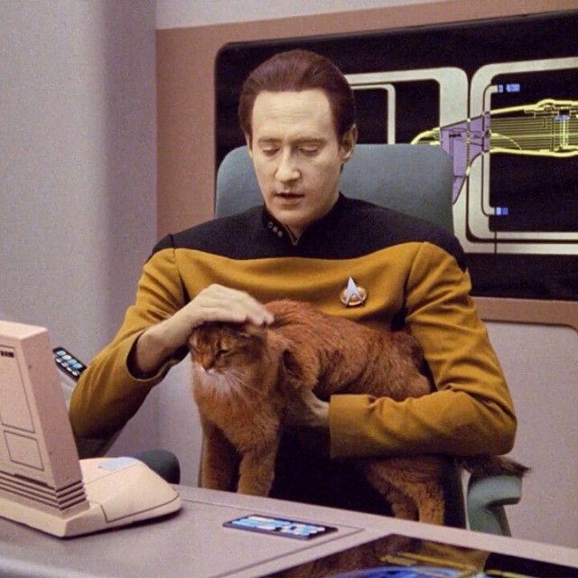
Sure, there are some halfway decent services that AI can provide, but all of them grow out of a business model that has little to do with empowering all humans. It has to do with empowering ethically bankrupt tech bros and funneling money from our attention into their pockets. So, that’s my take on AI. It’s got great potential to be useful, but it’s owned and controlled by people who do not have our best interests at heart. I’m going to use it from time to time. But I won’t pretend that it can love my kids or even be told to care about my kids. I don’t think that it can. It can’t affirm the humanity of my students. It can’t make art because it has no experiences. Art and creativity are artifacts of human experience, not mere aggregation of data. I think we are a long way from Mr. Data and his cat, Spot. If the AI was like Mr. Data and Spot the Cat, I’d be totally happy. Sorry, folks… that’s a Star Trek reference. I’m a nerd. Thank you.
[i] https://www.educatorstechnology.com/2024/06/the-evolution-of-chatgpt.html
[ii] https://hai.stanford.edu/ai-definitions/what-is-ethical-ai
[v] https://www.intertraffic.com/news/autonomous-driving/china-the-global-leader-in-autonomous-vehicles
[vi] https://midwestfilmjournal.com/2026/02/20/manifesto-of-reality-cinema-after-the-physical-trace/amp/
[vii] I know there are not formal diagnoses for “sociopathy” or “psychopathy.” Instead, the DSM-5 classifies them within the Antisocial Personality Disorder (ASPD).
[viii] https://ciaotest.cc.columbia.edu/journals/sa/v28i1/0000458.pdf
[ix] https://about.jstor.org/blog/the-humanities-as-a-compass-navigating-a-post-truth-era/
[x] https://www.vox.com/policy-and-politics/2020/1/16/20991816/impeachment-trial-trump-bannon-misinformation
[xi] https://midwestfilmjournal.com/2026/02/20/manifesto-of-reality-cinema-after-the-physical-trace/amp/
[xii] https://plato.stanford.edu/entries/turing-test/
[xiii] https://www.britannica.com/story/the-mechanical-turk-ai-marvel-or-parlor-trick
[xiv] https://www.frontiersin.org/journals/psychology/articles/10.3389/fpsyg.2018.01839/full
[xv] https://umdearborn.edu/news/ais-mysterious-black-box-problem-explained
[xvi] https://www.npr.org/transcripts/154524695
[xvii] https://www.stevenstrogatz.com/books/sync-the-emerging-science-of-spontaneous-order