Light Study

2013-08-11 06.01.30-1

Above are two studies of light effects I made last week while traveling to visit family. Left is from sunlight glare through a window onto a wall/ceiling in the Fine Arts Building. Right is from a tableau of multiple light beams through an empty PBR case. Click the image for a large version.

I almost always carry a special art-making case of paper, gouache, collage material, and colored pencils with me on vacations to visit family. Got some good stuff this time.

More later.

Relevant Anachronisms

Ballou-AnachronismsWHT

Ballou-AnachronismsStudyWHT

Light and Shadow

Looking

Translation

Colors

The Dodecahedron

Hardwood Furniture

Angles

“Selfies” in Mirrors

Images

Slide Carousel Boxes

Symbol

Meaning

Above, top: Relevant Anachronisms, gouache on paper, 13 inches in diameter, 2012-2013.

Above, bottom: Relevant Anachronisms (Study), colored pencils on paper, 13 inches in diameter, 2012.

Enigma

ballou-tealgrill

Enigma (Teal Grill), Gouache on paper, 12 inches in diameter. 2013.

I’ve been looking at this teal grill for the last six months or so. It’s situated in a little courtyard common area for students who live in nearby residence towers here at the University of Missouri. A few months ago when I moved into my new office/studio space I became even more enamored with this thing. It’s awkward. It’s got a glorious, alchemical color that changes with the weather. I’ve never seen it being used, and yet it’s got a presence and sort of commands a section of the courtyard wall. Situated on an East-West axis, the sun gives the grill a dramatic polyhedral shadow that tracks out, under, and around its gangly legs. Vaguely alien, dingy and unused, and having physical proportions and angular relationships that allow for formal play, it was only a matter of time until I painted it. The exploration was worth it… I might have to dive right back in.

What Is A Great Image?

On May 22, 2013, I gave a public talk at the Boone County Chambers Room in Columbia, Missouri that addressed the question, “What is a great image?”

Below is audio from that talk synced up with the slide show that I used. If you’ve got an hour and are interested in how art, history, and human experience interconnect, you might appreciate this talk. Obviously it’s by no means exhaustive and has to skim over many issues, but I think it’s got some quality observations. I would greatly appreciate any questions, comments, or observations you might have after watching through.

And here’s a picture of me and my girls during the Q&A session after the talk :)

Sci-Fi Film Worth Seeing Again (and Again [and Again])

It’s been nearly a decade since Shane Carruth’s Primer came out. The movie is an unconventional time-travel* film and extremely low-budget ($7,000) project that delivers on every level. On a whim, I watched it again yesterday and was pleasantly surprised at how well it holds up. In some sense, it’s even better now.

primer

One of the things that makes it feel better to me in 2013 is that it is clearly from a time before social media really took off – the computers are as big as Buicks, the pace of life and modes of interpersonal exchange are still face-to-face, and the technology is less ubiquitous, more alchemical. The film plays on ethos of now-tech giants having started around the kitchen tables and in the garages of 70s, 80s, and 90s suburbia. The film also succeeds in bringing the human equation – the brokenness of human nature and the contingencies of our perceptions of reality – to the fore, never cramming the sci-fi down viewers’ throats. Even the technical jargon, which actually seems to bear some relationship to real science, is presented as asides rather than lame attempts at pseudo-explanation (I’m talking about you, Prometheus).

The filmmaker also presents compelling and simple camera work. Nothing flashy. Useful cuts. Good pacing. Subtlety. Nice compositional balance. All the basics of fundamental visual dynamics where the audience doesn’t need to be firebombed to understand what’s happening. We never focus on the technology, we focus on people.

Screen shot 2013-06-21 at 11.20.40 AMAaron and Abe realize something unique is going on inside The Box.

In an era where lame reboots and aimless, mindless sci-fi films are a dime a dozen, it’s gratifying that a well-executed, thoughtful movie can be made in the genre and stand the test of time. To me, Primer holds a position similar to films like Donnie Darko or Brick (both of which also happened to be made in the first half of the 2000s). These are noir-ish, psychological films that ask big questions and mix realism and surrealism in such a way that they feel like lived experiences. The dislocations, paradoxes, neurotic turns, and seemingly inconsequential points of aesthetic and conceptual concern upon which these films pivot put the big-budget/shoot-em-up/blow-everything-up/summer-block-busters to shame. What Shane Carruth did with seven grand makes Michael Bay (with his hundreds of millions) look like a chump.

That Primer won the Grand Jury Prize at Sundance in 2004 makes complete sense. If you haven’t seen the film, do it now. It’s streaming on Netflix.

*People who know me know that, in general, I HATE time-travel movies – they’re usually bogus and annoying plot devices that offer little in terms of real narrative, conceptual, or emotional meaning. But when it works, it works.

An Awesome New Diebenkorn Book

IMG_7460

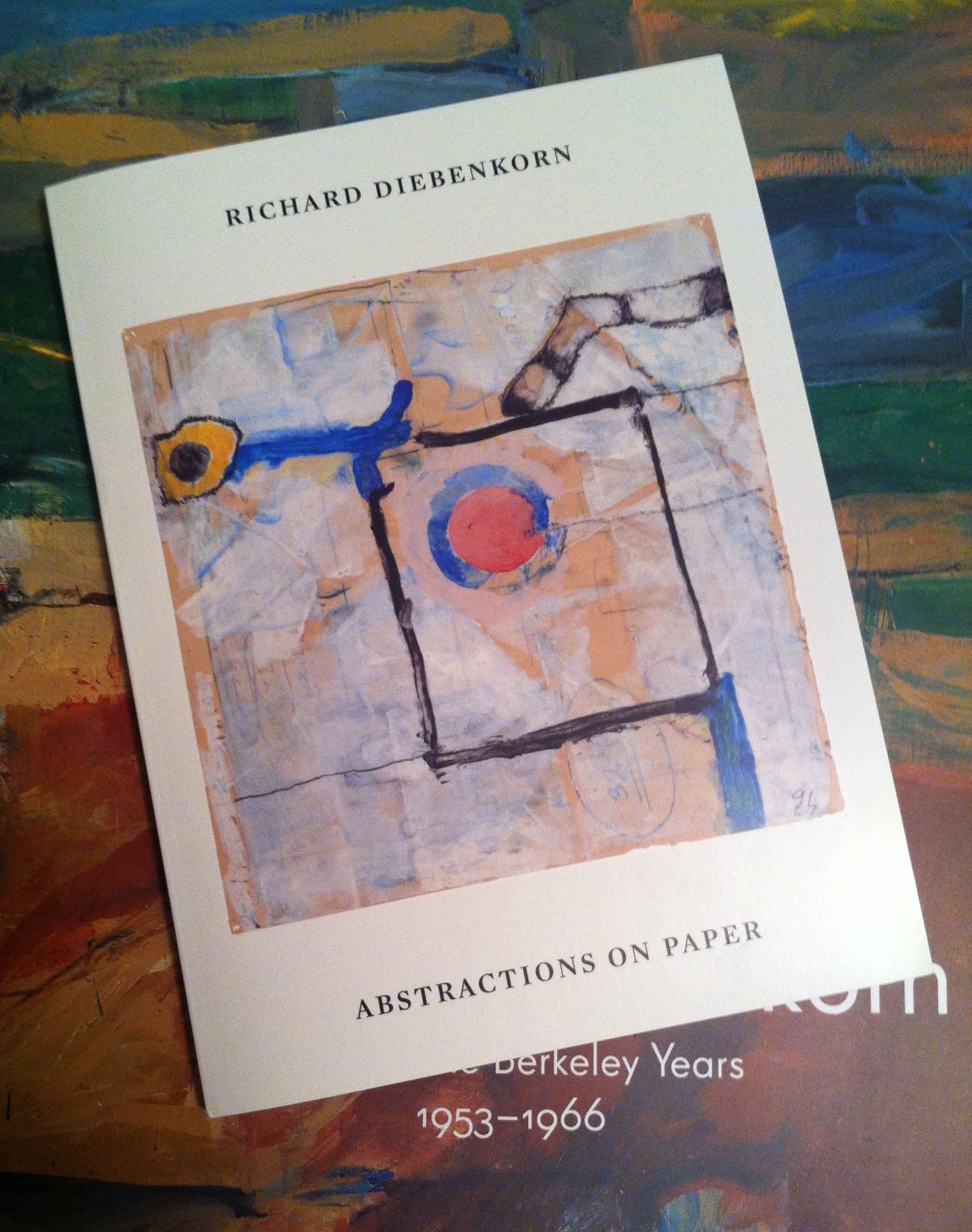
I just recently picked up a fantastic new Diebenkorn book, and it turns out to be very impressive. No, I’m not talking about the new Berkeley Years catalog (though I did buy that a few weeks ago and am enjoying it). This is a volume out of a small California publisher called Kelly’s Cove Press.

The book, Richard Diebenkorn: Abstractions on Paper contains 88 full color images and a few black and white shots of Diebenkorn’s studios. There are a few points that make this paperback book exceptional. First, it contains dozens of works that have never before been published. This isn’t because they were lacking in quality; many of the pieces shown here really display Diebenkorn’s quintessential processes very well. Secondly, the book shows abstractions on paper from all of the major locations where he worked throughout his life: Sausalito, Albuquerque, Urbana, Berkeley, Ocean Park and Healdsburg.

IMG_7457

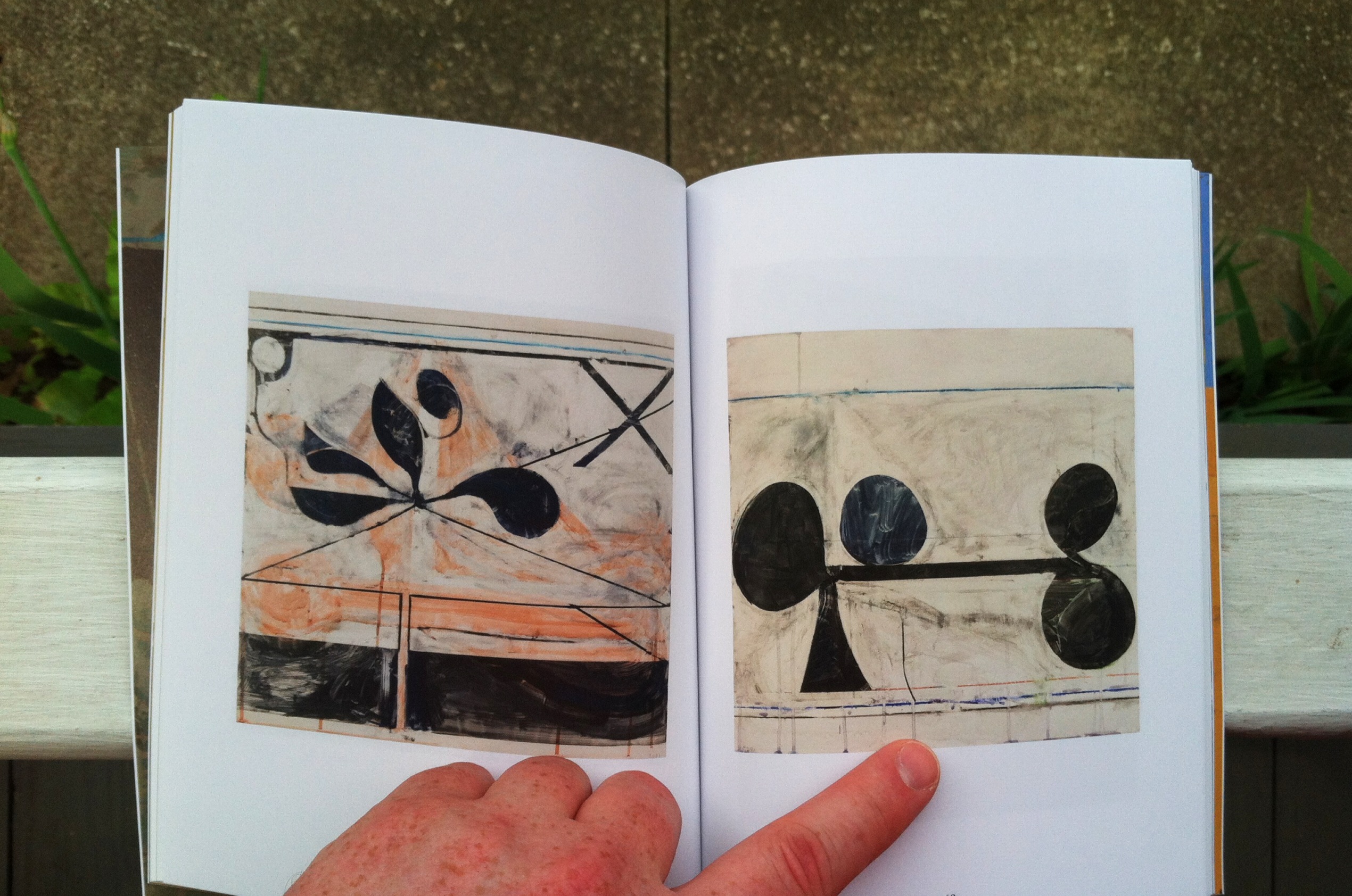
The Healdsburg works contained in this book make it indispensable for aficionados of Diebenkorn’s work. I’ve followed every Diebenkorn publication, traveled to see his work in many states, and searched widely to find examples of his work. There simply is no other publication that contains as many Healdsburg-era works that I know of.

The book lacks any scholarly essays, which is a virtue. The only words are short quotes from the artist interspersed among the images and a short biography at the end. This gives us nearly 125 pages of beautiful artworks, printed nicely in an 8 by 6 inch format. I’ll definitely be keeping this book close to me for informal browsing. But don’t let the small size fool you – the overall feel and color quality is excellent.

IMG_7458

Authorized by the Richard Diebenkorn Foundation, the book was produced in support of what should be a fantastic traveling exhibition titled The Intimate Diebenkorn: Works on Paper 1949-1992. The exhibition starts at the College of Marin Fine Arts Gallery (Kentfield, CA – 9/28/13-11/21/13) and then moves on to San Jose State University (4/15/14-5/17/14), American University (Washington DC – 11/8/14-12/14/14), Sonoma Valley Museum of Art (6/6/15-8/23/15), and ends at The University of Montana (Missoula, MT – 9/24/15-12/12/15).

IMG_7459

This book is well worth the mere $20 it costs to pick it up. If you’re into Diebenkorn, it’s essential. If you love Abstract Expressionism, works on paper, gestural painting, collage, West Coast art, or the California art traditions, you’ll love this book. Click here to buy it.

~

I’ve had the chance to write about Diebenkorn’s work a few times. My most recent essay about the artist is Diebenkorn’s Ocean Park: Provisional Action, Provisional Vision, and is available to read here.

The Best Way To Do A Q&A

I gave a couple of talks last week, one for the community at large and one for the teaching symposium held here a few days ago.

Perhaps my favorite part of giving talks/lectures is the Q&A time afterward. I get into it. Here’s an example:

DSC_0599

That’s me in 2008, answering a question at the Glen Arbor Art Association. There I am, totally sun-burned, wine in hand, and in my element.

But I think the best way to answer questions is after my daughters run up to the front of the room and want to be with their dad while he talks:

MCTalk-DadGirls1smallThanks to Shalonda for capturing this image.

Wow. That’s a lot of life lived between the first image and the second.

For the record, Miranda asked a question herself while there in my arms. After looking at the image of one of my paintings up on the screen at the time, she asked, “Dad, don’t you think we should draw more back into that painting?”

No, babe, I think it’s done :)

This Week in 2005

Screen Shot 2013-05-14 at 4.59.04 PM

This week in 2005 Alison and I arrived in Florence, Italy. Above is the path we took almost every day during our stay – from our apartment on Via Ricorboli (right hand of the picture) to the Church of Santa Felicita. (On the left – click the image above to explore the area).

Why did we make the nearly 2 kilometer trek so many times, even if our final destination was in some other part of the city?

Because Pontormo’s epic Deposition resides in that church. Here I am gazing up at the piece:

OLYMPUS DIGITAL CAMERA

I must have spent 6 or 8 hours in front of that painting. I have thought about it, written about it, and taught about it many times over the last 8 years. This painting is ingrained in my life.

I can’t wait to walk once again along the Arno, sidestep the Ponte Vecchio, slip into the cool silence of Santa Felicita, and see it again.

My Favorite Sketchbook Page, and a Surprise 14 Years in the Making

zecchisphoto

Above is a double page spread from one of my most cherished sketchbooks. My main professor from graduate school (Barry Gealt) bought it for me during our trip together to Italy in the summer of 2005. The sketchbook is from Zecchi’s, the famous art store in Florence. I really cherish this handmade book. Every 6 months to a year I do a sketch of my wife, Alison, in the sketchbook. These two pages are amazing – the left page is from August 13, 2009, the right from August 7, 2010. They were drawn almost exactly a year apart, and yet what a difference! In the left hand image, Alison was pregnant… but we didn’t even know it yet. And there on the right side is little Miranda Grace Ballou, sleeping as we watch The West Wing. Such a juxtaposition. So much life.

And what a life I experienced today. After a full slate of teaching, I came home to fine china, wine, and risotto – certainly an event. And, of course, today is momentous. It was on this day in 1999 that Alison and I first shared our feelings, intentions, and hopes with each other. We began a dating relationship that would culminate in so much joy and growth for us. When I look into the eyes of our daughters, when I catch a glimpse of my wife across the room, when we come together to make firm determinations about what we plan to do with God’s grace… it’s in those times that I know how important this day was all those years ago. So we celebrate our wedding anniversary, but also find this day special. Here’s the spread Alison laid for us tonight – a simple, rich meal of Aline’s Risotto, fresh grapes, white wine, some flowers, and places set for four.

dateanniphoto

I am blessed – above and beyond, more than I could ask for or think of; it’s pure grace.

Thankful tonight.