The Best Way To Do A Q&A

I gave a couple of talks last week, one for the community at large and one for the teaching symposium held here a few days ago.

Perhaps my favorite part of giving talks/lectures is the Q&A time afterward. I get into it. Here’s an example:

DSC_0599

That’s me in 2008, answering a question at the Glen Arbor Art Association. There I am, totally sun-burned, wine in hand, and in my element.

But I think the best way to answer questions is after my daughters run up to the front of the room and want to be with their dad while he talks:

MCTalk-DadGirls1smallThanks to Shalonda for capturing this image.

Wow. That’s a lot of life lived between the first image and the second.

For the record, Miranda asked a question herself while there in my arms. After looking at the image of one of my paintings up on the screen at the time, she asked, “Dad, don’t you think we should draw more back into that painting?”

No, babe, I think it’s done :)

New Homes

2012 was a good year for selling my work. Many pieces that we’ve lived with for many years are now gone. They live new lives with others. They will, in tandem with these fresh viewers, take on different resonances, build more meanings. Three recent sales in particular are significant to me. What’s interesting to me as an artist is that these works don’t necessarily represent the height of my prowess as a painter or draftsperson (Though I do count Four Pale Bricks as among the most significant paintings I’ve ever made). Nor are these works the end of a particular line of thought or closed, singular achievement. Each was, in some sense, a reaction to different pressures and concerns. They were attempts to understand influences, necessities, desires. They were stepping stones.

11

Untitled Landscape (#1), Acrylic on canvas, 36 x 46 inches, 2000. Private collection, MO. Click to view larger.

They are all about different times in my life. The colorful Untitled Landscape (#1) above was made when I was a junior at SAIC. It wasn’t meant to be my own personal expression. I was trying to understand Diebenkorn and integrate his approach to composition and structure. In spite of the derivative quality (something that’s unavoidable for any artist and something that, when embraced, can spark true development) the work displays my growing sense of color and use of mark and mass.

As I packed it up for delivery to its new owners, I was so pleased with the craftsmanship: the bars are still square; the canvas stretched and primed beautifully; the corners wrapped flat and tight. It was that follow-through with the love for the materials at all levels that, I think, made me develop as an artist. I wasn’t just winging it. I was being thoughtfully engaged all the way through. I’m not saying this just to toot my own horn… I’m just proud of the fact that, in spite of myself, I got something about materials, process, and focus that still rings true and gives the work quality.

ballou-fourpalebricks

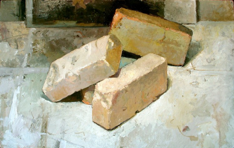
Four Pale Bricks, Oil on canvas on panel, 14 by 22 inches, 2006. Private collection, MO. Click to view larger.

The second piece, above, really shows (to me) how my grasp of composition and visual dynamics was affected by combining my early love for Diebenkorn with my research, via Frank Stella’s Working Space, into the formal concerns of the Renaissance. Four Pale Bricks was painted very soon after my return from Italy, a trip that greatly supplemented what I thought I’d learned from Working Space. My encounters there with alchemical pictorial formulas, various numerological/metaphysical theories a la sacred geometry, and the intense formal constructions of everyone from Giotto to Pontormo were extremely influential. In many ways this work was the beginning of my current explorations into two-dimensional shape and angle dynamics as they manifest in illusions of space, air, and light.

ballou18-tinfoilcoal

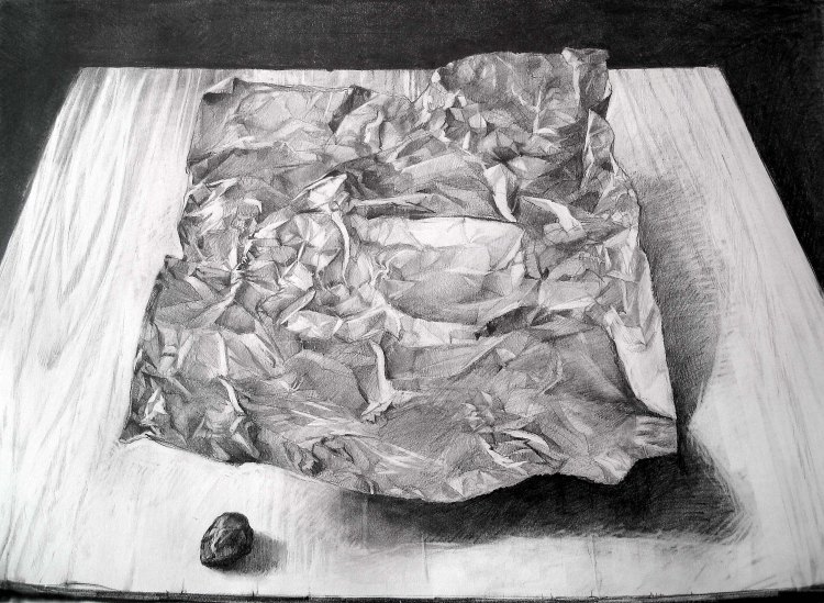
Still Life With Tinfoil, Coal, and Plywood, Graphite on paper, 18 by 24 inches, 2007. Private collection, MO. Click to view larger.

This last work – something I shipped out to its new owner just this morning – is all about my having become a teacher. One of the things I believe in most strongly as an educator is that I must model the skills, ideas, and values that I teach. I will never make any impression at all if I merely vomit out vague data; I’ve got to believe it and practice it. This work came about as a challenge from my students, who did not believe the processes I was teaching them would yield positive results. As I drew this work, I took photos and from them produced a short video to demonstrate how it all worked. I have used this example every semester since. The piece is very sentimental to me because of how it embodies my own practice of teaching. I was willing to live out the things I talked about, and that made my students trust me.

Having these three works – and all of the others recently sold – go into the hands of people who appreciate them is wonderful for me. It’s also a reminder that gratification (and appreciation) is often very much delayed. I do work today that may only become appreciated decades from now. That is something that is hard for all artists – we are a notoriously insecure and touchy lot, aren’t we? – but having these works go out into the world is special.

It’s all the more special for me because every dollar from every sale I’ve made over the last year has gone directly into bringing Madeleine Cai Qun home. Now when I think of these artworks, I won’t only consider what they were for me or how they have gone to new homes, but I’ll be able to see in them how they gave my daughter a new home.

That’s a value that is transcendent. I’m thankful that my work as an artist can be a part of that even greater work of manifesting love and peace into the world.

There’s still a few more weeks before we head to China. If you’d like to help out in the final stretch by bringing one of my works into your home, check out my etsy site here.


Matt Ballou: RANGE – Reception at William Woods University

02

My exhibition – Matt Ballou: RANGE – is still up at William Woods University until December 16, 2012. I hope you can go see it if you haven’t yet. Below are some photos of the space, both after the installation and during the reception. I want to thank everyone who came out – friends, students (graduate and undergrad, current and former), and colleagues – and especially Jennifer Sain for her help in making the exhibition happen. Special thanks to Jane Mudd for encouraging William Woods to host this show.

01

Installation, back on November 12, 2012.

04

05

06

Three panoramas of the installed work.

03

Two of my all-time favorite works… Locus #77 and #78

09

10

07

Beautiful angles and shapes during the reception…

At the reception I gave a brief impromptu talk that led into some interesting questions from the audience and my own musing on the work.

11

Me during my talk – Photo by Kevin Larson.

Click here to download the talk and Q+A session (42 MB MP3 format, 50 minutes long).

Some notes about the talk:

12

Photo of me at the talk – Photo by Eric Norby.

My First Classroom

Click to see a larger view.

Here it is.

My first REAL classroom. I’d done a bit here and there. I’d done some substitution work. I’d done some minor short term stuff. But this was my first place of my own. Room 175 in the The Henry Radford Hope School of Fine Arts at Indiana University Bloomington. I taught some amazing students there. I cut my teeth, tested my strength, felt out the pace and scope and sequence of teaching. It was good to go back to that room recently – more than 8 years after – and spend time in that space. Snap a picture. Sense the light. Remember the slide of charcoal, the scratch of graphite, and the laughter of willing students.

Sometimes it’s hard to remember why this path I’ve taken is important. In the silent witness of this room there is proof of what I – what so many of us – have tried to express about awareness and presence.

I’m still seeking to be worthy of that task.

Color Drawing, Fall 2012

We’re halfway through another great semester of Color Drawing. Below are just a few examples of some of the standout work from this year. Click for higher res!

Danielle Wallace, Chalk pastel of reflections.

Emily Brewer, Oil pastel study of colored and fluid filled glass.

Emily Brewer, Oil pastel large arrangement of reflective and glass objects.

Jessica Bremehr, Colored pencil study of a lamp.

Jessica Bremehr, Oil pastel large arrangement of reflective and glass objects.

Jessica Bremehr, Chalk Pastel study of reflective surface.

Ginny Algier, Oil pastel large arrangement of reflective and glass objects.

Kevin Moreland, Chalk Pastel self portrait in a reflective surface.

Julie Bennett, Oil pastel large arrangement of reflective and glass objects.

Click HERE to see more of my posts on my Color Drawing class glory!

Barry Gealt: Embracing Nature at the IU Art Museum

Yesterday my wife, daughter, and I made an epic 17 hour round trip to Bloomington, Indiana. We left our home at 9am and returned a little after 2am the next morning.

It was a long, rainy drive, but it was worth it. We went to the opening reception for Emeritus Professor Barry Gealt’s retrospective exhibition Embracing Nature at the Indiana University Art Museum.

Barry was my main professor while I earned my MFA at IU and has continued to be a mentor and encouragement. It was the least I could do to be present for this opening and evening of celebrating Barry’s life and work as both a painter and an educator. Below are a few fragments from the night.

The text just inside the doorway to the Special Exhibitions Wing of the IU Art Museum.

Detail of Greenwich Beach, Prince Edward Island, 2009. The top layer of a living document.

Detail of Condon’s View of Corea, Maine, 2011. Brushmarks are alchemical – both entirely surface and entirely illusion; both/and.

Prince Edward Island, East Point (2009), commands a wall in the gallery. The works spill and splash; their air inundates viewers.

A detail of the majestic edge of Indiana Vista, 2001. Paint as light, matter, air, and presence.

A detail view of Owen County Vista from 1994 – compared to Barry’s more recent work this is pretty smooth. Even so, it’s tremendously worked and amazingly saturated.

Beautiful density in a detail of The Cave, 1994. This painting is incredible in its color and level of surface development. Evocative.

Robert Shakespeare’s Light Totem saturated the area outside Barry’s show with energy – my 2 year old loved it.

There’s Barry waving to me from across the Atrium during the post-reception dinner. A beautiful space and a beautiful evening.

Here I am (sporting my Indianapolis Colts Marvin Harrison #88 jersey) holding the book that was published in tandem with the exhibition. It is AWESOME. You can pre-order your own copy by clicking here. Do it! The essays are wonderful, the reproductions and details fantastic. I was able to have a significant correspondence with the author, Rachael Berenson Perry, in 2011 which resulted in many of my thoughts and reflections on my time with Barry being used in the book. I was extremely honored to be included in this text; it’s really more than I could have imagined. To get to be a part of this celebration of Barry’s life and work is humbling and truly a highpoint of my life as an artist.

If you can get to the show, DO IT. It’s worth it.

Barry Gealt: Embracing Nature will be on at the IU Art Museum from October 6 until December 23, 2012

Inspiration – Ian Shelly

Ian Shelly is a former student – and current friend – of mine. He teaches at Indiana University Southeast with his wife, the inimitable Natalie Shelly. They are awesome people and I’m so glad to know them.

Yesterday I drove out to St. Charles, MO to see Ian’s show at the Foundry Art Center there. It was great to see the continuity between his newer work and the thesis work he made here at Mizzou. Below are a few shots of the works installed at the Foundry. For best viewing check it out yourself! The Foundry is a very large space with tons of art and it’s situated in a beautiful waterfront area with lots of shops and parks. I think the space offered some really nice context for Ian’s work.

Title

A glorious homestead… I loved the overhead views that dominated this exhibition. Ian works to make the wall a ground plane and affords his viewers a God’s-eye perspective. This piece has a synergy with some of the not-so-intended intensities in Thomas Kinkade works…

Grazing

Orchestration of shadowspacestructure!

Pallet! The many miniature elements in this body of work are quite beautiful to investigate and serve to focus viewers on the deeper subtexts of Ian’s work. You can read a bit more on what he’s trying to do here and here.

Egress Solution!

Rooted – this piece was especially dynamic and evocative. The lighting and overall space around the piece was also powerful – a typical aspect of Ian’s work.

Archetypal… the shapes, forms, and the interactions of mass with shadow and light, as well as the dynamics between tension, balance, and stillness are all elements of Ian’s works that helps them access a sense of the archetypal. Go see the show to learn about titles for these works and to read Ian’s longer statement about the work. Seriously, you need to experience the light and space around each work to get a true feeling for what he’s accomplishing through his playful yet intensely felt art. Good stuff. Glad I got to see it.
The show is up until September 7th, so check the Foundry’s website to get directions and hours of operation. Go there!

PS: This isn’t the first time Ian’s inspired me… Click here.

Inspiration – Laurie Anderson

Above: Anderson singing with a luminous microphone inside her mouth

“I don’t necessarily think that political art is any better or more worthwhile or more relevant than making a giant blue painting. We need giant blue paintings and they can sometimes be more about freedom than works of art that tell you how to be free. Giant blue paintings can show you.” – Laurie Anderson, at the SVA commencement ceremony, 2012.

Watch her whole speech here. Be sure to watch through to her “pillow recorder” performance at the end – fantastic!

And here’s a (mostly) “giant blue painting” – Ocean Park #129.