I have mentioned the importance of Miyoko Ito many times before (here, here, and here), but there’s a little more to celebrate this Christmas day: I just received the new book Miyoko Ito: Heart of Hearts hot off the press.

Published by Pre-Echo Press, and featuring the research and writing of Jordan Stein, Heart of Hearts is the major publication that Miyoko Ito and her work deserve. Jordan Stein is an active and insightful curator who has developed a major presence nationally over the last decade. His research into and presentations on Ito are extremely significant, adding great depth to what is available on the artist.

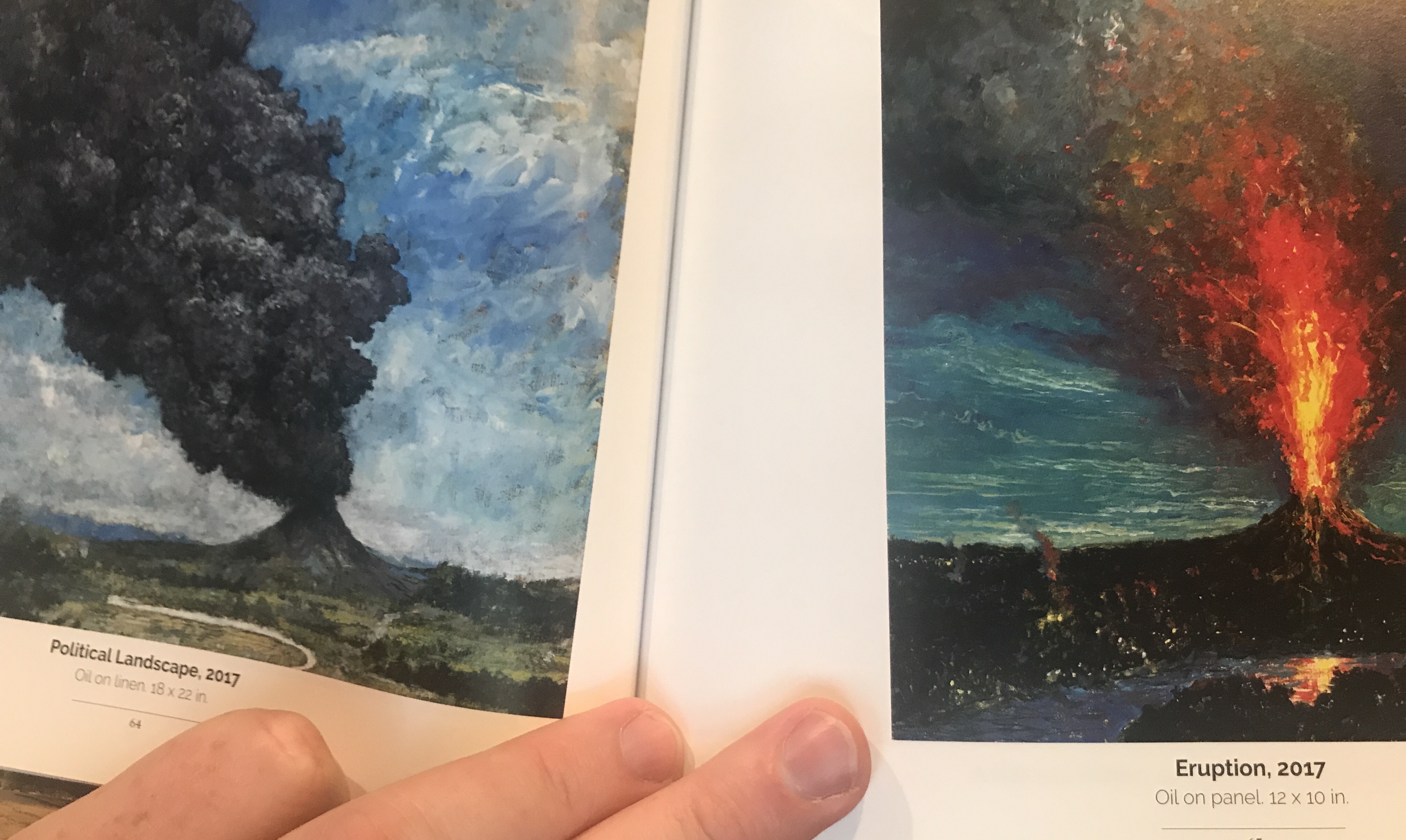
Loaded with chromatically accurate images, Heart of Hearts is the most complete compendium of Ito’s work available. Beyond this, the book provides a single place from which students and admirers of her painting can find all pertinent information about her life and process. Stein’s essay provides key context, deftly connecting Ito to not only her roots in the Chicago art scene but the broader aesthetic superstructure to which she belonged.
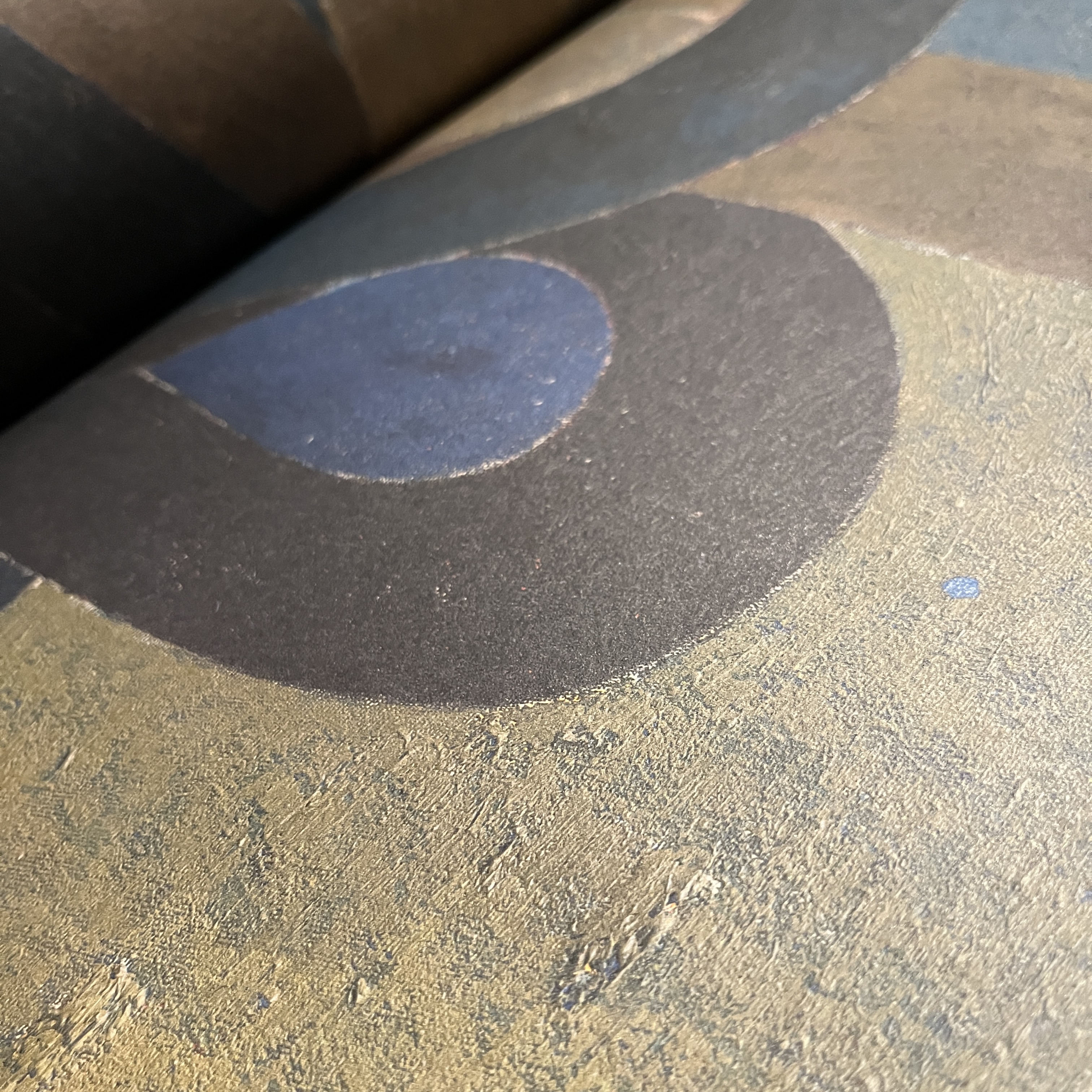
These two arenas – solid text and quality images – really set this publication apart. From the beautiful debossed cover (front AND back) to the matte surfaces of the large full color spreads, this book delivers. The sense of texture and painted action is wonderfully realized in these pages. I kept being surprised by the surfaces of the paintings coming to life. This is an ESSENTIAL book for anyone interested in mid-20th century painting generally, or Miyoko Ito in particular. To finally have one volume that really pulls it all together is just wonderful.


Front and back covers of Heart of Hearts.
This book is an appropriate celebration of Miyoko Ito as a person and as an artist. It includes nearly all of her work, some of which have been lost. While not technically a catalogue raisonne, it might be the next best thing, as it provides the most complete picture of her work that we’ve ever had. For this, we can thank Jordan Stein and Pre-Echo Press.
In my opinion Miyoko Ito: Heart of Hearts is the most important publication dealing with American painting since Yale’s four-volume catalogue raisonne of the work of Richard Diebenkorn. Go buy it.


