The Kasper Collection of Contemporary Biblical Art

Over the last five or six years, I’ve been involved with a project by an artist and collector named Jim Kasper. In January 2026, that project will come to fruition with the publication of a new book featuring the work of many excellent painters and drafts-persons. These artists are drawn from a range of generations, backgrounds, and faith traditions, but they were commissioned by Jim to build a current vision of artworks that take on the complex themes and histories that form the bible.

Two incredible essays – as well as writings by the artists themselves – help contextualize the works and elucidate the ways these artists add their current voices to ancient conversations.

Also, as part of the upcoming initial dual-site exhibition in Columbia, MO (more info on that when it’s ready), I am offering prints of 5 of my works in the Kasper Collection. I hope you’ll click below and check them out – it’s always good to support artists instead of billionaires, especially in times such as the ones in which we’re living.

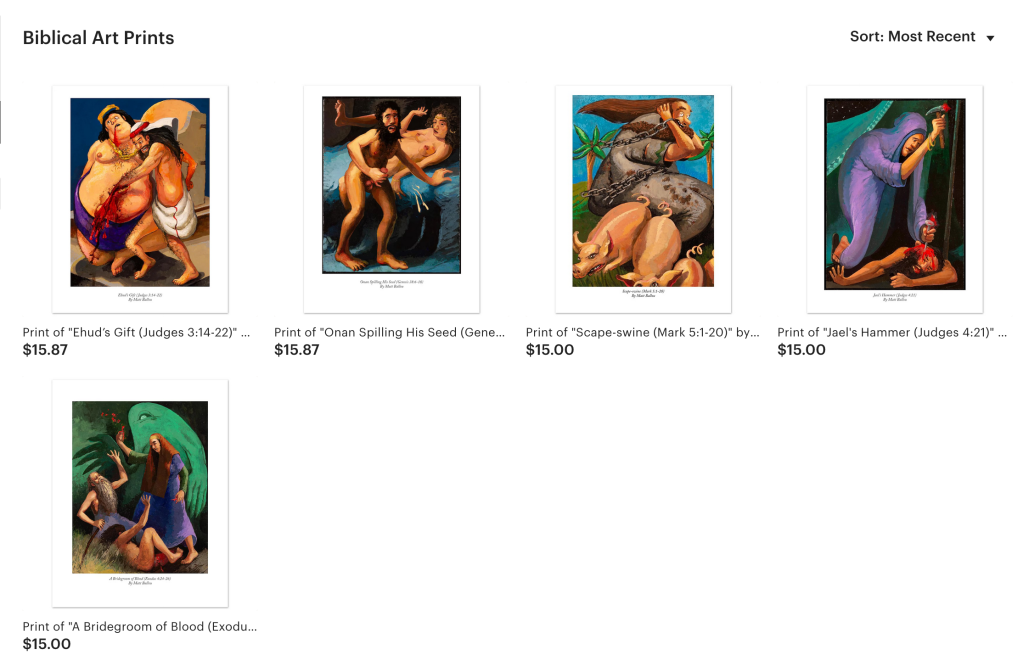
My contributions to the Collection are varied. I was glad that Jim allowed me to pursue more straightforward “traditional” painting, but also to work in relief carving and enigmatic, abstract imagery. With the five images above, I was inspired by everything from Correggio’s Jupiter and Io to the physical stylization in the mythology-based paintings of Kyle Staver. I wanted the works to embrace their illustrative side, with strong visual dynamics, weird bodies to match weird activities, and intense colors.

I hope you’ll take a look!

Mark Staff Brandl Is On To Something

I’ve been following Dr. Mark Staff Brandl for quite a while now. I particularly enjoy his Dr Great Art podcast, which has, of late, begun to feature some ideas from chapters of his forthcoming book (to be published by Bloomsbury).

Two current works in progress.

His most recent podcast episode, linked below, definitely intrigues me and syncs up with a lot of the ways I’ve been thinking over the last couple of decades. Specifically, my wheneverWHEN and An Ensign For Miyoko Ito works are borrowing significantly from the kinds of ideas Professor Brandl is elucidating. My 2019-2020 collaboration with Joel T. Dugan, Phoneme, also deals with some of this.

An Ensign For Miyoko Ito (#16). Ink on paper, 12×10 inches, 2018. Private collection.

This is how I talk about some of the motivational ideas for these series of works:

“…I seek out the compacted and the overdrawn; the enclosed and the layered; the transformed and the solidified. I look for shapes, colors, and spaces that go far beyond a simple tension between figuration and abstraction, trying instead to suggest a layered arena of observational and haptic information.

Miyoko Ito (Japanese-American, 1918-1983) – whose work has been a key influence on me over the last 20 years – was able to activate subtle surfaces with the illusion of space and an evocative sense of palpability. This is what I’m investigating: the experience of perception apart from particular, representational depiction. In my exploration, questions arise: Does flat form appear to move away from my angle of view? Will color resolve into both static surface and suggested movement? Can space and color align to reinforce both static structure and an expression of time? Might the poetics of silent, unmoving images actually produce phenomena akin to those found in dreams, memories, ecstatic sensations, and atemporal musings?”

Take a listen to the Dr Great Art podcast and see if maybe some of the things I’m saying resonate with how Dr. Brandl is thinking:

While there are many points Brandl brings up that are worth exploring (I greatly anticipate getting to read his book once it comes out), I find myself particularly drawn to the explications he makes regarding ambiguity and conceptual blending. In these areas he distills and clarifies a number of philosophers and intellectual traditions into something artists can really wrap their minds – and artworks – around.

WHENEVERwhen (Michigan), inks on paper, 10×7 inches, 2018. Collection of the Artist.

Beyond the artists he references in his text, I think that there are a few more that very strongly connect with Mark Staff Brandl’s ideas, particularly Marcelo Bonevardi, Nicholas Byrne, Diebenkorn, Vincent Fecteau, Magalie Guérin, Miyoko Ito, and Kyle Staver, among others.

It’s exciting for my own passion for these artists to dovetail with the serious scholarship that Dr. Brandl is bringing forward. I know that I’ll be incorporating concepts from his book into my teaching for years to come. I hope you’ll join me in listening to the podcast and exploring what these ideas can mean for making and experiencing artworks.

Visiting The Milwaukee Art Museum with Marcus

milwaukeesail3

My good friend and former student Marcus met up for a day at the Milwaukee Art Museum today. While there, we took in the wonderful and hilarious Thomas Sully exhibition that was on view. We visited old favorites, like the two Richard Diebenkorn works they own. We also enjoyed a couple new friends, like the Audubon piece below:

marcus7

While taking in the Thomas Sully: Painted Performance exhibition, I decided to do a number of quick sketches. I spent between 30 seconds and two minutes on these pieces. If you click on my drawing, you’ll see what the original piece looked like.

They really reminded me of the fantastic Kyle Staver’s work. Staver, who just recently had a show at Tibor de Nagy in NYC, often uses classic themes and large, dynamic compositions in her work. She also manifests a unique sense of the shaping of forms, particularly in how she develops the figures in her paintings. Sully, though very different from Staver and far removed from her in time, also had a feeling for the strange shapes that flesh may take on. What he lost in correct anatomy (foreshortening, proportion) was gained in drama and formal structure. The strange figures he painted often loom from the surfaces in terms of their abstract shapes rather than their representational effect. In some way Sully feels like a progenitor of Staver.

Anyway, here are the sketches – click to see the originals. Enjoy!

image-a

Sketch of Thomas Sully’s Self Portrait, 1807.

image-6a

Sketch of Thomas Sully’s portrait of Mary Ann Paton, 1836.

image-1a

Sketch of Thomas Sully’s portrait of Major Thomas Biddle, 1832.

image-5-a

Sketch of Thomas Sully’s portrait of Mary Siddons Whelen, 1812.

image-9a

Sketch of Thomas Sully’s portrait of Rosalie Kemble Sully as The Student, 1848.

image-4a

Sketch of Thomas Sully’s portrait of John Terford David, 1813.

image-8a

Sketch of Thomas Sully’s portrait of Mrs George Lingen, 1842.

~

All in all it was a pretty nice day. Here’s one more shot of Marcus for the road…

marcus2