On this day ten years ago I had a cardiac arrest. My heart was stopped for 10 minutes. I’ve written about this event every year on the Traumaversary, and I’m glad I have. Ten years. Every day I’ve been thankful. I’ve tried to make my life and my family better. I’ve tried to become a good teacher. Ten grateful years. Hard to believe that’s about 20% of my whole experience… all after that heart attack.
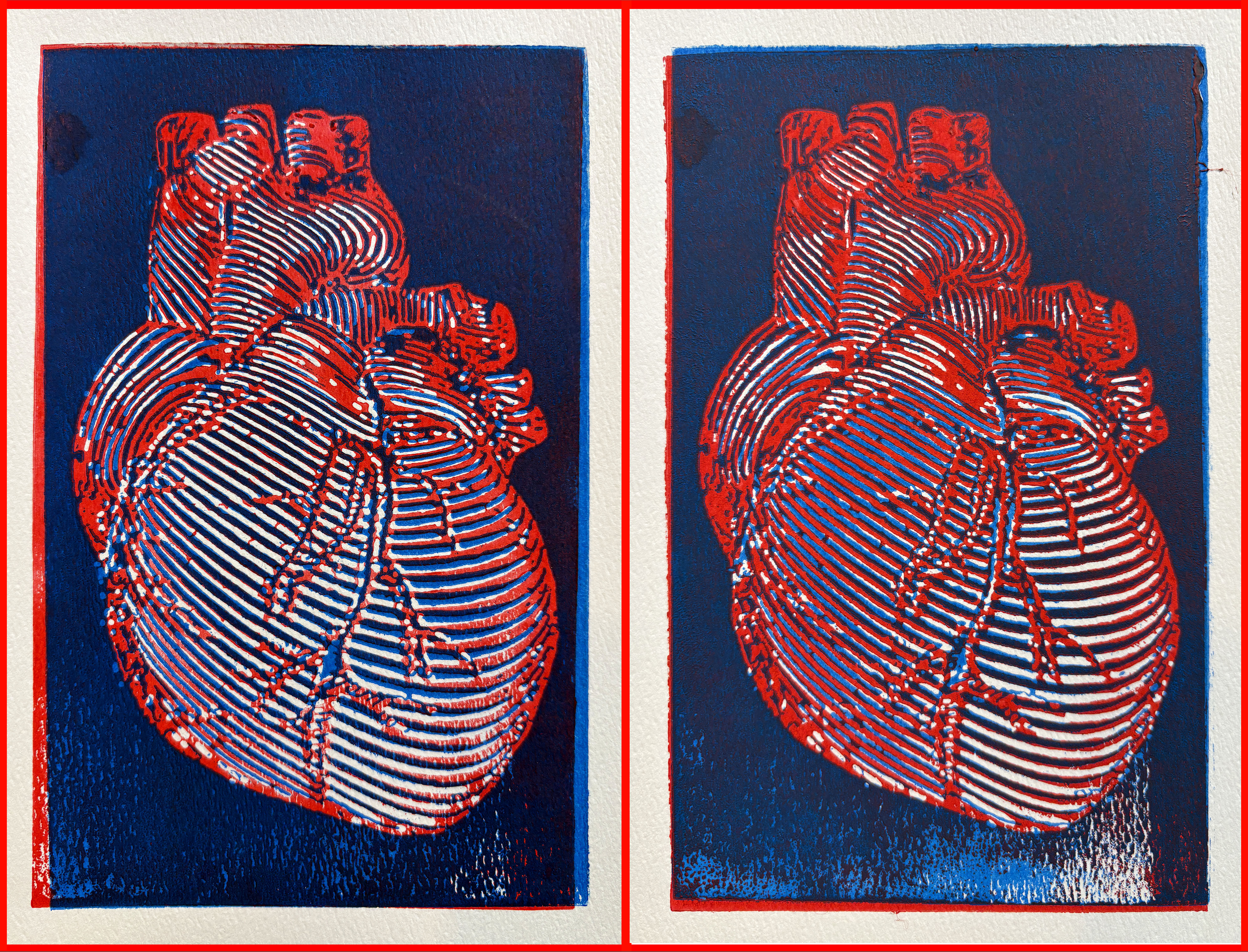
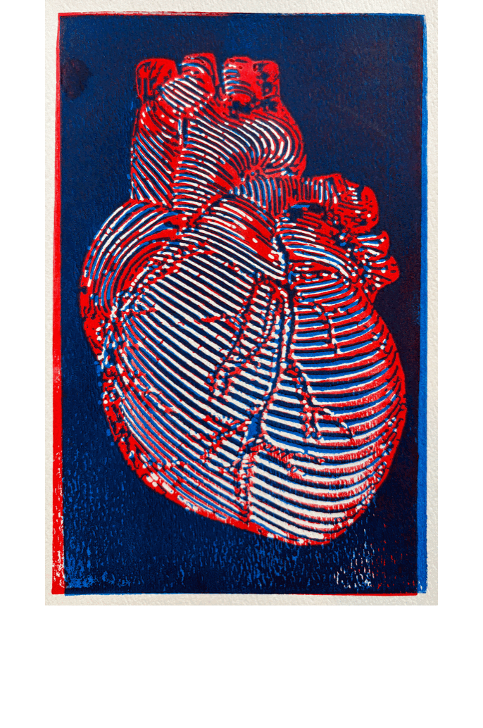
Above are two of my heart prints. These are two-block woodcuts , each printed in two colors (8.25 x 5 inches). The blocks are slightly de-registered so that they overlay and make dynamic line and color action over the heart. When made into a gif, they pulse like a real heart…
I feel extremely blessed to have been able to carry on, but also to have been transformed in many ways over this decade. I want to make the most of my time, convey a spirit of generosity and kindness, to be a good father and encourage my kids, to advocate for my students, to support my friends and colleagues… and to find more about beingness by which to be astounded. In a time when so much has gone wrong in this country and the wider world, I am still hopeful that when I leave this world I will find it to have become better, because I know that I have gotten so. Every day I find something to love, to passionately explore, to laugh with my family about – and that dual outpouring/indwelling experience is the great joy. I have been rewarded by my practice of attention over these years.
Every year is an amalgamation of the years that came before. While there might be touchstones and specific events keyed to one year or another, no year can be entirely of itself. So some of what follows is tied to this past year, but some of it is from outside of that temporal container. Regardless, I wanted to make a few notes about what struck me and what stuck with me this year without a whole lot of thinking about ranking or hard and fast lists. It’s good to take stock and look back so that the turning to look forward can have some context.
At a great party with former students in Rocheport, MO.
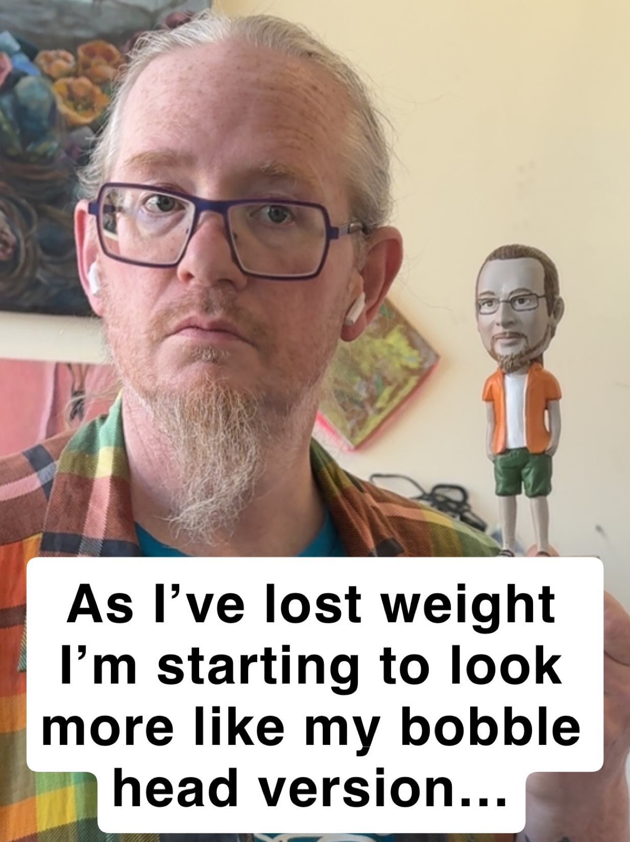
100 Pounds Down
2025 is the year that I lost 100 pounds. On January 18, 2024, I was 291.6 lbs. Today, I’m 186.6lbs. This is a testament to medicine, determination, consistent workouts, and finding ways to manage my own instincts about food and drink and effort. But what changed in January 2024? Why do I think of that as the start of something new? That’s when I began to supplement my daily workouts, efforts to eat and sleep well, and overall stress-reduction with Zepbound.
What it did was take the edge off of my constant feeling of hunger… what many people describe as “food noise” in the mind. Zepbound was the little tweak that enabled me to no longer have an inner insistence that I endlessly had to fight. I felt satiated, FINALLY. My portion sizes went down. My need to just eat everything on the plate – or to have a double or triple portion – disappeared. All of that went away. It became much easier to control my desires in much the same way that antidepressants helped me focus on what was truly important for my family and for my life.
This tirzepatide medication enabled me to turn around years of baggage in my thinking and habitual activity. I was disciplined with working out for nearly a decade, but I still struggled with knowing that it was time to stop eating or drinking. With Zepbound, I was able to do what I needed to do and hear my inner rational voice about what was important. It has definitely been a life changer. My whole world is so much better. Without that extra 100 pounds everything – working out, teaching, playing with my kids – is so much easier and more fulfilling. My knees, ankles, and back feel DECADES younger.
In The Ear and Eye Holes
Another great aspect of 2025 was experiencing (or re-experiencing) some amazing podcasts and movies from a bit of a different perspective. One of the things that I did was watch a bunch of vampire movies with Miranda, my oldest daughter. Seeing those films again (starting back with the original 1922 Murnau Nosferatu and then watching the 1979 Werner Herzog Nosferatu, not to mention a half dozen others) was a unique and dynamic endeavor. It was wonderful to watch those monster and horror movies with Miranda (and sometimes some of her siblings), ask her about her interpretations, and explore how she was understanding all of it. I greatly enjoyed the Robert Eggers 2024 version as well (but I didn’t take my kid to watch that one).
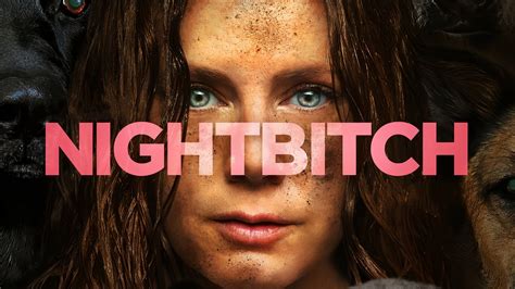
Another powerful experience early in 2025 was when I watched a movie starring Amy Adams called NIGHTBITCH (2024). Based on the novel by Rachel Yoder, it’s “a magical realism-style story of a stay-at-home mom who sometimes transforms into a dog.” I encourage everyone to go watch it. It’s about embodiment, change, parenthood, meaning, self-actualization, and hope. Such a great movie. Amy Adams goes SO HARD in this film… an award-worthy performance.
Amy Adams in NIGHTBITCH
Movie Highlights: Watching The Shining with my kids and seeing Eggers’s Nosferatu in the theater with Jesse. Experiencing NIGHTBITCH on a whim.
In the podcast realm I enjoyed going back through the Futility Closet podcast episodes. This phenomenal podcast is no longer is being produced, but that doesn’t mean they’re out of date or stale. The married team of Sharon and Greg Ross made 365 episodes, then called it quits. The episodes are infinitely re-listenable, there are NO ADS, and the opportunity to be astounded by the world and get inspired to research events is just solid gold. I’m almost done with a full listen-though in 2025, and it was so worth it. Futility Closet really is a cohesive account of global culture and what we try to do as human beings. The writing and the presentation overall are very much accessible. This is not highfalutin fare. It’s not the multi-hour-long episodes of people like Dan Carlin, not a dry lecture about history. Futility Closet gives you tight 30-minute episodes that hit on the main takeaways. They give you the backbone, all the resources so you can look up more, and they’re just really personable, sweet people.
Music in 2025
My students get me hooked on so much good music. This year, these are the heavy-hitters that stuck in my studio rotation. I’m not ranking them, just telling you to get on the train and listen.
Ecca Vandal
Key: Band/Artist – My Suggested Description of Genre
One of my great joys is teaching. I love working with my students and seeing what they do when they graduate. In 2025 I saw one of my grads, Andrew Long, graduate with an amazing thesis exhibition and text, then immediately get a great job.
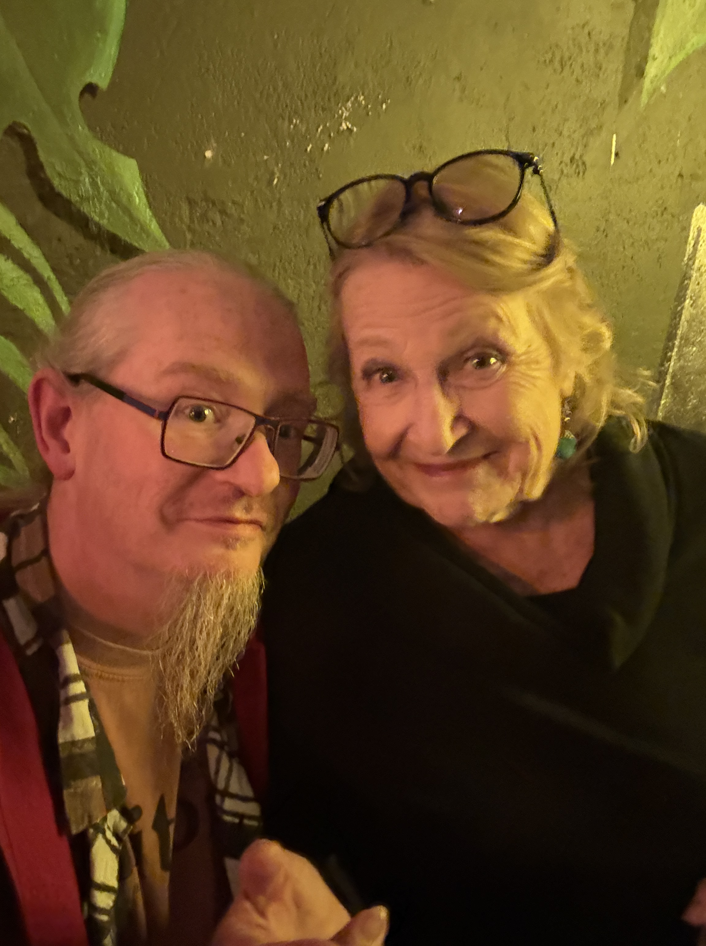
Me and Dr. Kerr at her retirement partyIn deep conversation with Andrew at a conference
Another transition was the amazing Dr. Barb Kerr retiring after nearly 50 years of teaching and scholarship. It was an honor to be at her celebration party. She’s been such a mentor and inspiration to me.
RIP Dad
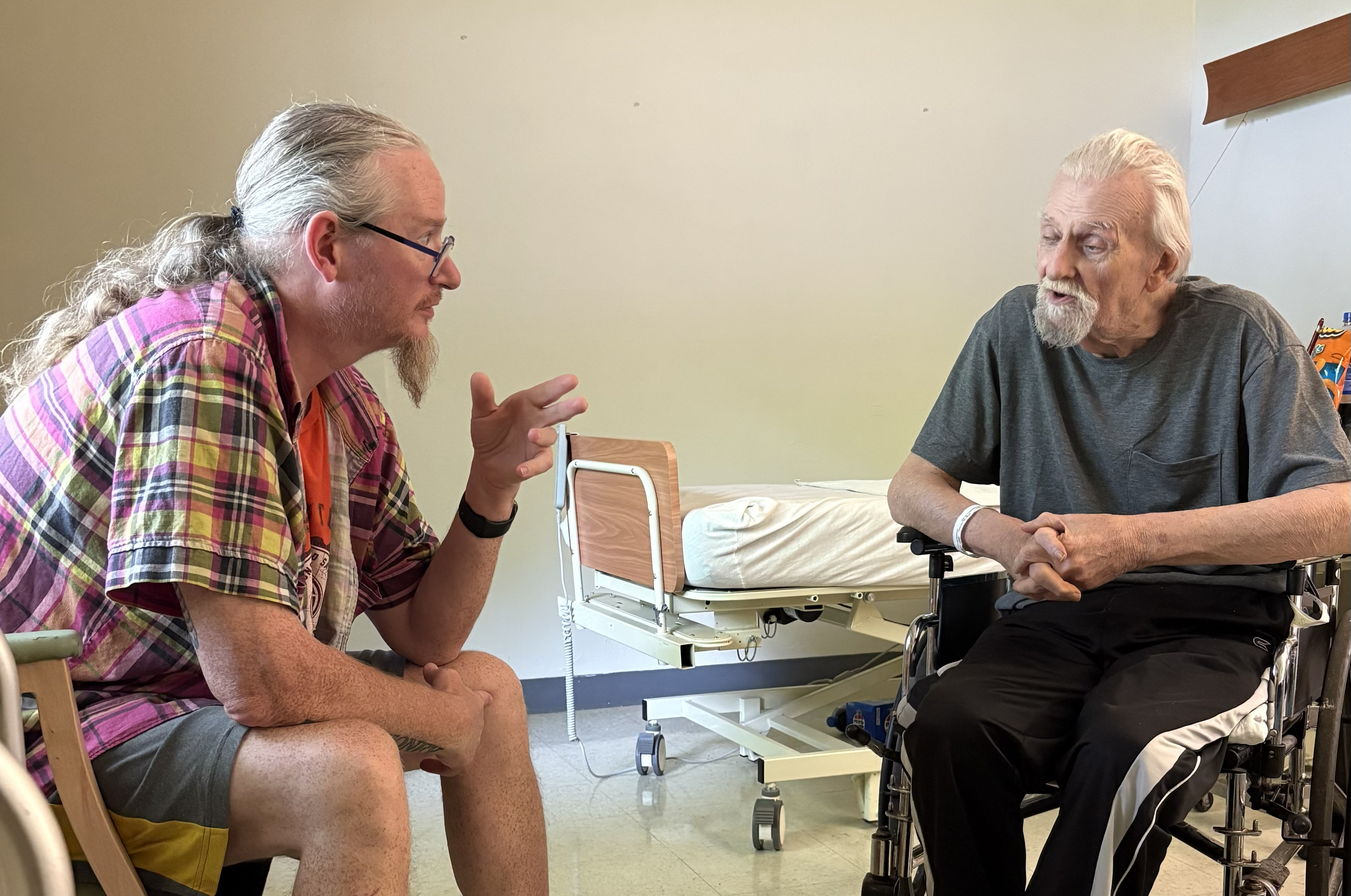
My dad passed this year. He was 83. For years I wrote to him with photos and updates in physical letters… and now at least once a week I think “I should write to Dad” only to remember that he’s gone. I’m glad he lived on his terms and did just about everything he wanted to do and not much that he didn’t. And I’m glad I got to speak at his funeral and give him the send off he wanted.
Speaking at Dad’s burialOne of the final conversations we had
Thankfulness
One thing I’m taking away from 2025 is the understanding that I was able to have positive growth and a grateful mindset in my family, job, and art-making in spite of the horror show going on in the world. Straight up state-sponsored murder and genocidal activity on one hand, and obvious grift and obfuscation of the truth on the other, all wrapped up in nationalism and religion. It’s enough to put anyone into a high stress crash-out. But I’m thankful that I’ve been able to find a balance where I can be informed about that stuff and take steps to counter it in my own small ways (as a parent, educator, and community member) without letting it put me in the ground. In 2026 I want to keep living with hope and joy, not through some abstract pie-in-the-sky platitudes, but though real life with my family, honest interactions with my students and colleagues, and deep exploration of ideas and meaning in the things I read, watch, write, listen to, and make.
Over the last five or six years, I’ve been involved with a project by an artist and collector named Jim Kasper. In January 2026, that project will come to fruition with the publication of a new book featuring the work of many excellent painters and drafts-persons. These artists are drawn from a range of generations, backgrounds, and faith traditions, but they were commissioned by Jim to build a current vision of artworks that take on the complex themes and histories that form the bible.
Two incredible essays – as well as writings by the artists themselves – help contextualize the works and elucidate the ways these artists add their current voices to ancient conversations.
Also, as part of the upcoming initial dual-site exhibition in Columbia, MO (more info on that when it’s ready), I am offering prints of 5 of my works in the Kasper Collection. I hope you’ll click below and check them out – it’s always good to support artists instead of billionaires, especially in times such as the ones in which we’re living.
My contributions to the Collection are varied. I was glad that Jim allowed me to pursue more straightforward “traditional” painting, but also to work in relief carving and enigmatic, abstract imagery. With the five images above, I was inspired by everything from Correggio’s Jupiter and Io to the physical stylization in the mythology-based paintings of Kyle Staver. I wanted the works to embrace their illustrative side, with strong visual dynamics, weird bodies to match weird activities, and intense colors.
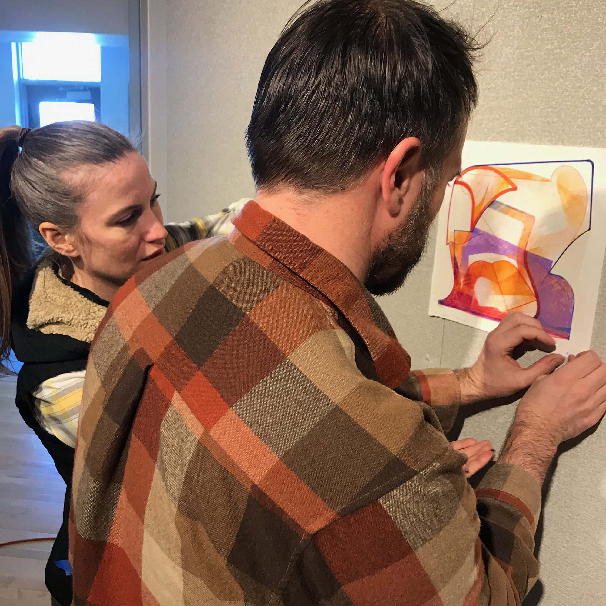
I think back to this show fondly because Jen is awesome and I like having exhibitions with former students (and have done so a number of times, with Jane, Jacob, and most recently with Simon). I took a bunch of images during the installation and recorded some audio of us talking about the work. After listening to it a couple months ago I decided I wanted to celebrate our little show and the work we made there.
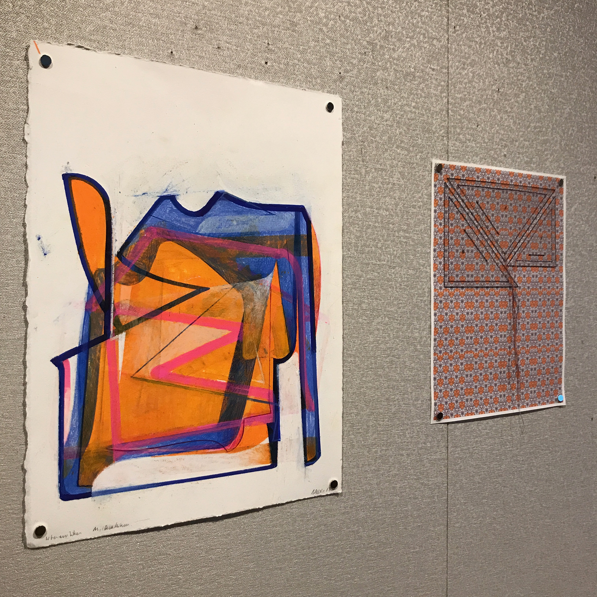
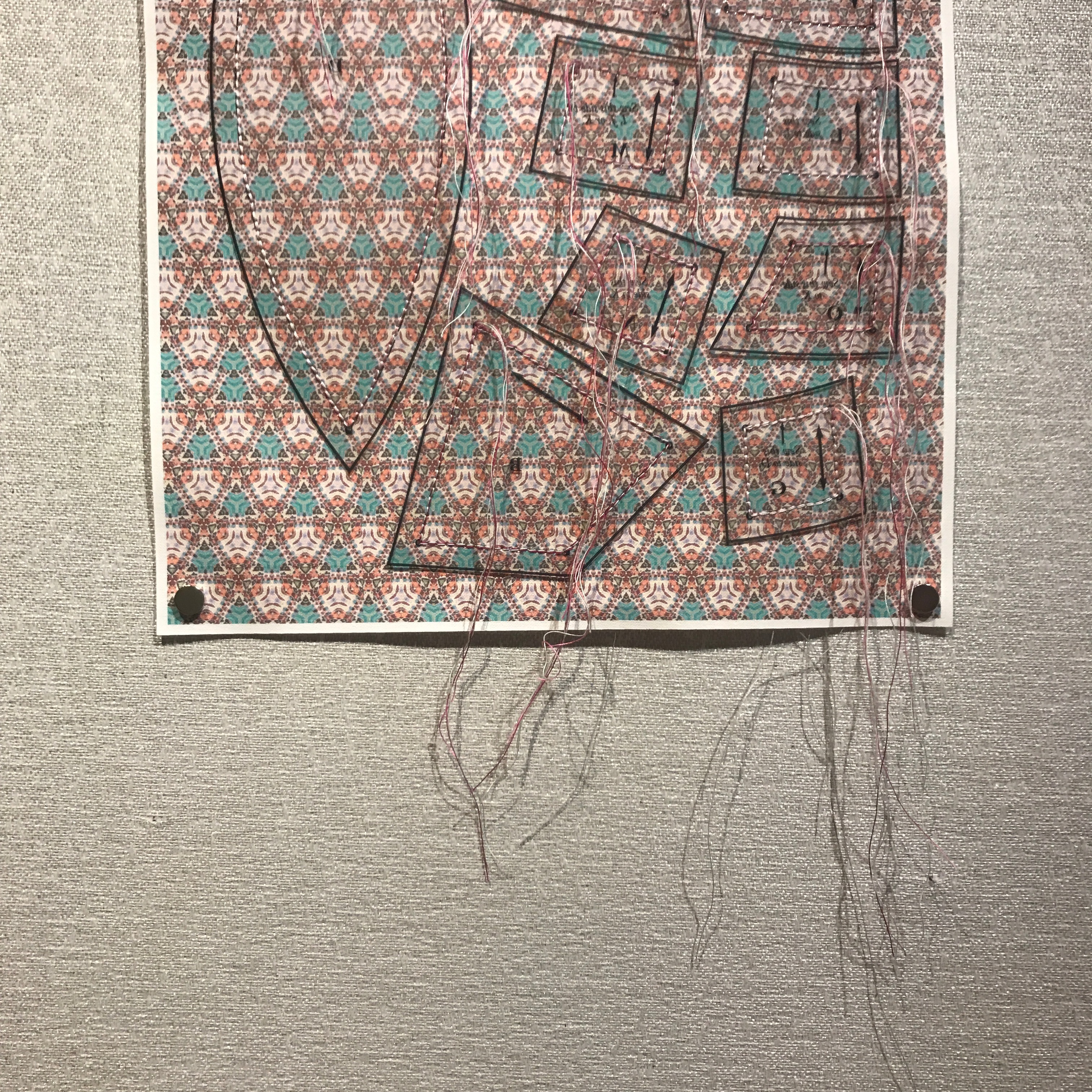
I was making my An Ensign for Miyoko Ito series, and experimenting with drawing robots – at the time very cheap ones that couldn’t make very large pieces. I was taking cues from Ito’s works and, as a response to that, Jen decided to use my artworks as the basis for her pieces. Using my work to create tessellated fields of colorful geometry printed on fabric, she then sewed cutting patterns onto them. The notion of a interference pattern felt particularly resonant to the work we both made for the show. This layering of influences and predilections still feels rich to me, and I wanted to share them with everyone again. Thanks so much for doing this show with me, Jen! Though her MFA was in a Fibers focus, these days she does a lot of dynamic photography, mostly in black and white. Check it out here!
Below you can see some images from our installation session and my statement for the show, as well as see more work and hear us talk about it in the video here:
Statement for BALLOU/BENNETT: INTERFERENCE PATTERN
In my recent body of work, titled An Ensign for Miyoko Ito, I seek out the compacted and the overdrawn; the enclosed and the layered; the transformed and the solidified. I look for shapes, colors, and spaces that go far beyond a simple tension between figuration and abstraction, trying instead to suggest a layered arena of observational and haptic information.
Miyoko Ito (Japanese-American, 1918-1983) – whose work has been a key influence on me over the last 20 years – was able to activate subtle surfaces with the illusion of space and an evocative sense of palpability. This is what I’m investigating: the experience of perception apart from particular, representational depiction. In my exploration, questions arise: Does flat form appear to move away from my angle of view? Will color resolve into both static surface and suggested movement? Can space and color align to reinforce both static structure and an expression of time? Might the poetics of silent, unmoving images actually produce phenomena akin to those found in dreams, memories, ecstatic sensations, and atemporal musings?
By pairing my work with Jen’s extrapolations from that work, I hope to suggest the multiplicity of information that may be gathered from surface, color, and texture. She perceives something of Miyoko Ito through my translations. Beyond this, Jen’s artworks add other layers – of visual logic, of aesthetic influences, and of categories of understanding. In this modest exhibition, Jen and I participate in the ongoing interrogation of received knowledge and sensation.
Receiving anything – taking it into our mind and heart – always changes it. It is what it is and it is what we perceive it to be. We are forever adding our own unique inflection to the language of the world pouring into us. That is why I see my own proclivities in the shapes and patterns that Jen uses… and so I see my heroes, my influences, and my hopes there as well.
In March 2003 I had been working at Good’s of Evanston for about 18 months. I worked there after earning my undergraduate degree, and at the time was getting ready to get married and head to grad school.
I worked at Good’s with an amazing cast of characters: Ronnie Boykin Junior, David Gracie, Micah Ebbe, Fred Sturkey, and so many others. One of the people there was Jeremiah Ketner, a man who has gone on to a long and fruitful art career. One day I saw Jeremiah’s coffee cup and we mused together about coffee sometimes being a main meal during the work day. I decided to paint a view of his so-called lunch.
Jeremiah’s Lunch 3/14/2003. Watercolor and graphite on paper. 5×6 inches on 14×11 sheet. 2003.
As the Shipping and Receiving Manager, I often had some time between shipments to make art in my little office. I loved that space. Did a lot of thinking back there.
A picture of me in my shipping and receiving office at Good’s of Evanston. 2003.
During this time Alison and I lived in a 3rd floor apartment that had this amazing accumulation of paint and interesting architectural details. Of course, anyone who has lived in Chicagoland is familiar with paint slathered over outlet holes, quirky entryways, specific brick hues, and questionable back stairwells. We had arches throughout the apartment, and I found myself ruminating on them between doing more “important” work. I made my whole portfolio to apply to grad school in that apartment. It’s strange to think that these two small watercolors ended up being special to me. I wouldn’t have guessed it at the time.
Arching Corner. Watercolor and graphite on paper. 12×11 on 14×11 inch paper. 2003.
Anyway, as we round out another year I find comfort in these small contemplations. Maybe the lesson is that all of my grand attempts to make statements or contribute to important conversations weren’t the best or most effective offering I could make. Maybe it was the fact that I noticed and paid attention to the poetry of spaces, moments, in-between time, and life being lived that really mattered.
One of the weirdest objects that used to exist in Columbia, Missouri is pictured below.
Benjamin Franklin in a tub shaped like a shoe, conducting a meeting, all the while stoking a fire beneath his own ass. Just look at it. AMAZING.
Sadly, the painting is now destroyed. I took pictures of it in 2013 when I did some art conservation work for Riback Pipe and Steel Company. The image below is a digital collage of shots because it was so hard to get the right angle on the work (there was a large, north-facing window opposite the painting.
My understanding is that the tub DID NOT ACTUALLY look like a slipper, but was what is called a “slipper tub” and was fairly common. I can find no reference to a tub shaped exactly like a shoe/slipper anywhere. I think Larson was taking some creative license here.
“France, Late 18th Century” by Sidney Larson
Missouri painter Sidney Larson completed this painting entitled “France, Late 18th Century” in 1969 as part of the “The Riback Mural,” commissioned by Harold H. Riback for the Riback Pipe and Steel Company building, which is situated at the east end of Business Loop 70 in Columbia, Missouri.
The Ribacks sold the business to Plumb Supply Company in 2015. Eventually, the building housing the mural was remodeled and the paintings were destroyed. According to the State Historical Society of Missouri’s Art Collections Manager Greig Thompson, the mural couldn’t be preserved due to the methods by which it was installed.
Notley Hawkins took photographs of the mural in December 2021, at the request of Vicky Riback-Wilson to preserve a record of the paintings. Hawkins studied painting and drawing with Sidney Larson at Columbia College in the 1980s.
In 1980, Larson published a booklet entitled “The Riback Mural” which included the following description of painting:
“Benjamin Franklin landed in France in December of 1776 and soon after set up quarters at Passy outside of Paris. His purpose was to solicit aid from the French toward the defeat of the British during the American Revolution. He proved to be a very popular man and was in great demand. He did suffer from attacks of gout for which his doctor recommended hot baths. For this, Franklin had the slipper tub, pictured above, built for him. He took hot baths twice a week, each one lasting as long as two hours. Hence the occasional meeting held while in his tub.”
Top left quarter: Marie Antoinette prior to losing her head. Top right quarter: Empress Josephine looking a bit like “The Death of Marat” in her bath. Bottom half: Franklin taking a meeting in the shoe tub. So weird.
Since 2019 I’ve worked as a portrait painter celebrating Mizzou student athletes. This last year was a high mark for Mizzou Football, with four of the squad being named All-American.
The University has a posh facility located in the south end zone area of the stadium where they hang all of the All-American portraits, stretching back into the 1930s. The great illustrator Ted Watts (1942-2015) created most of the portraits over the course of more than three decades, so I’ve got a big act to follow.
The All-American portrait wall at Mizzou Football’s South End Zone facility.
The display is pretty cool, and it’s cool to have my work extend that tradition. Portraits of Kentrell Brothers and Harrison Mevis are two of my works currently on display, and four new ones will appear soon (Fall 2024).
When I began to create my paintings, I went on a tour to see the previous works up close and to evaluate the aesthetic through-lines (format of names, dates, poses, backgrounds, etc), as well as the techniques prior artists used.
I take a central role in the design process, creating digital mockups which are approved at Mizzou Football before I begin the paintings. I generally work with ink on paper, which is mounted on panel and sealed, then painted over with layers of acrylic. I try to maintain a painterly quality, with texture and dynamic brushwork on display. I also attempt to bring the digital effects which naturally appear in the preliminary studies into a physical realm with semi-transparent washes of paint.
Working on the portrait of Cody Schrader.
As the projects have developed I’ve found my own approach to the portraits. I want them to have kinship with the portraits of Watts and other previous artists, but I make sure to give the works my own unique inflection.
I’m excited for the new crop to go on display. Kris Abrams-Draine, Luther Burden III, Javon Foster, and Cody Schrader are the 2023 All-Americans for Mizzou Football. See images of the works below, but also be sure to stop by the All-American wall if you ever get into the South End Zone building!
Recently I rotated a bunch of the art in our home, and so I felt that an update to my ongoing series of posts featuring various artworks I’ve collected over the years was in order.
My most recent purchase is this wonderful gouache painting on handmade paper by Mary Sandbothe.
Mary Sandbothe. Mystery Snowball. Gouache on handmade paper. 7×5 inches. 2023.
Mary is an awesome artist and educator here in Columbia, MO, and has been a pillar of the art community here for many years. She had a wonderful show at the Columbia Art League late in 2023 that really stood out to me. Called “Heritage Unfolded: Gouache Interpretations of Missouri Quilts,” (you can see the works here), the show featured some evocative, intimate works. I knew I needed to jump on one of them, and I’m glad I did.
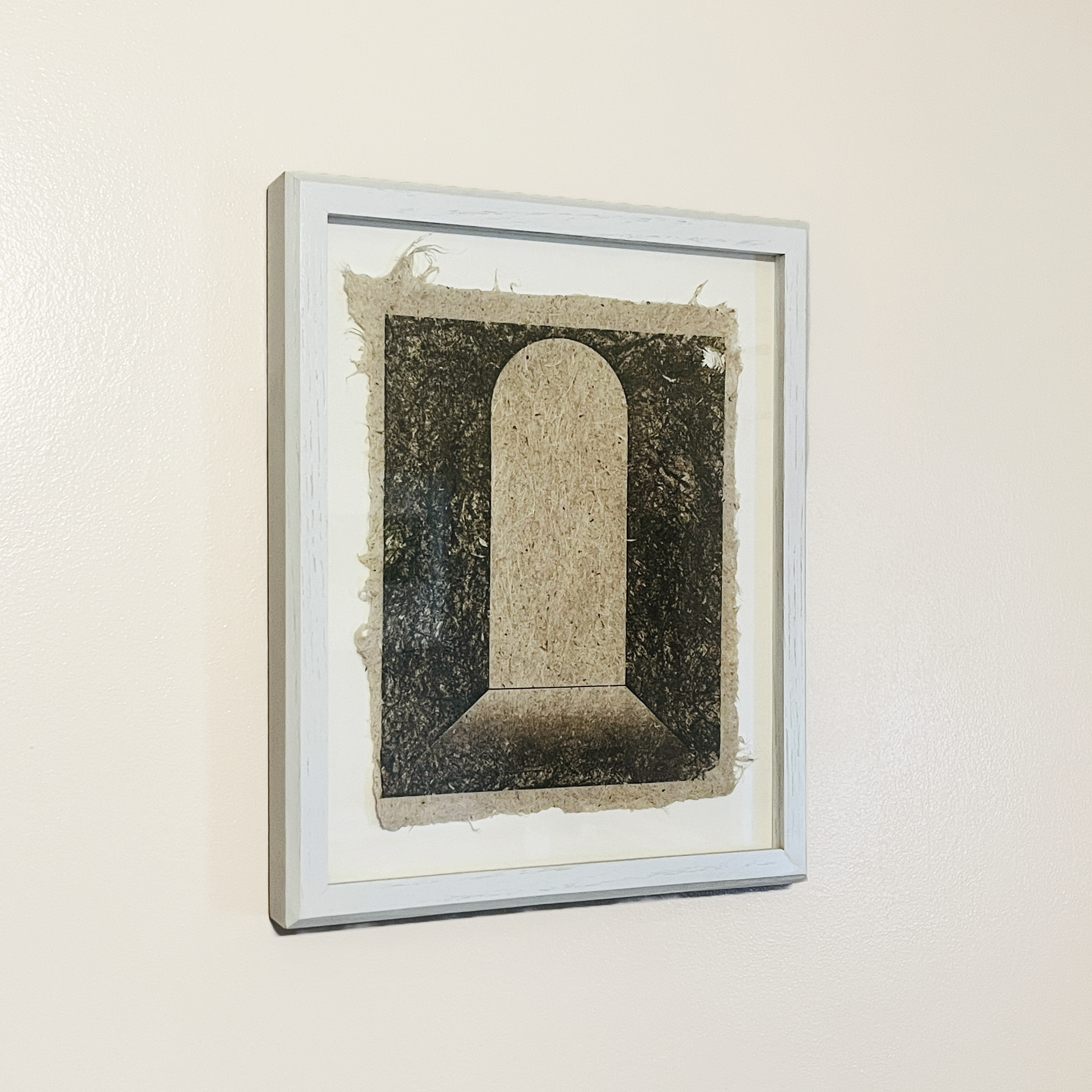
Next to the Sandbothe Mystery Snowball piece is a striking print on handmade Yucca paper by Caleb McMurray. The untitled work features a doorway or aperture, something that McMurray has returned to again and again.
I also have a sister print to this one, but it features an arching opening that is in the distance rather than up close like this one. Windows, doors, and other passageways are features of many of the works I’ve collected over the years.
Lastly, a small painting by Hayley Auxier‘s shares the wall with the two works I’ve shared above. Hayley was one of my stand out undergraduate students, and I love seeing her carry on her artwork as she has since graduating. This piece is one of a series she made celebrating National Parks and celebrating her experiences of them. Hayley shows a strong affinity for gouache, so I’m glad to have an example of her painting in that medium.
Hayley Auxier. Acadia National Park. Gouache on paper. 4 by 6 inches. 2018.
Acadia National Park is special to me because that’s where my partner and I went on our honeymoon all those years ago, so I like the piece because of it’s connection to my own history. But it’s also got a wonderful note from Hayley on the verso, and so the small work feels like it connects all of these different threads of my life: personal, professional, aspirational, and historical. That synergy of references – those that I bring to the work and those the artist embeds within the piece – is what makes art special.
I’m loving seeing these three works every day as I have a meal or hang out with my family. Art that lives with us is the best kind. Really thankful to have these pieces close to me.
Eight years ago today one of the few most significant pivots of my life happened. My cardiac arrest is intimately tied to the death of my sister, to my experience of my home town, to my understanding of life and spirituality, and to my way of moving through every day life.
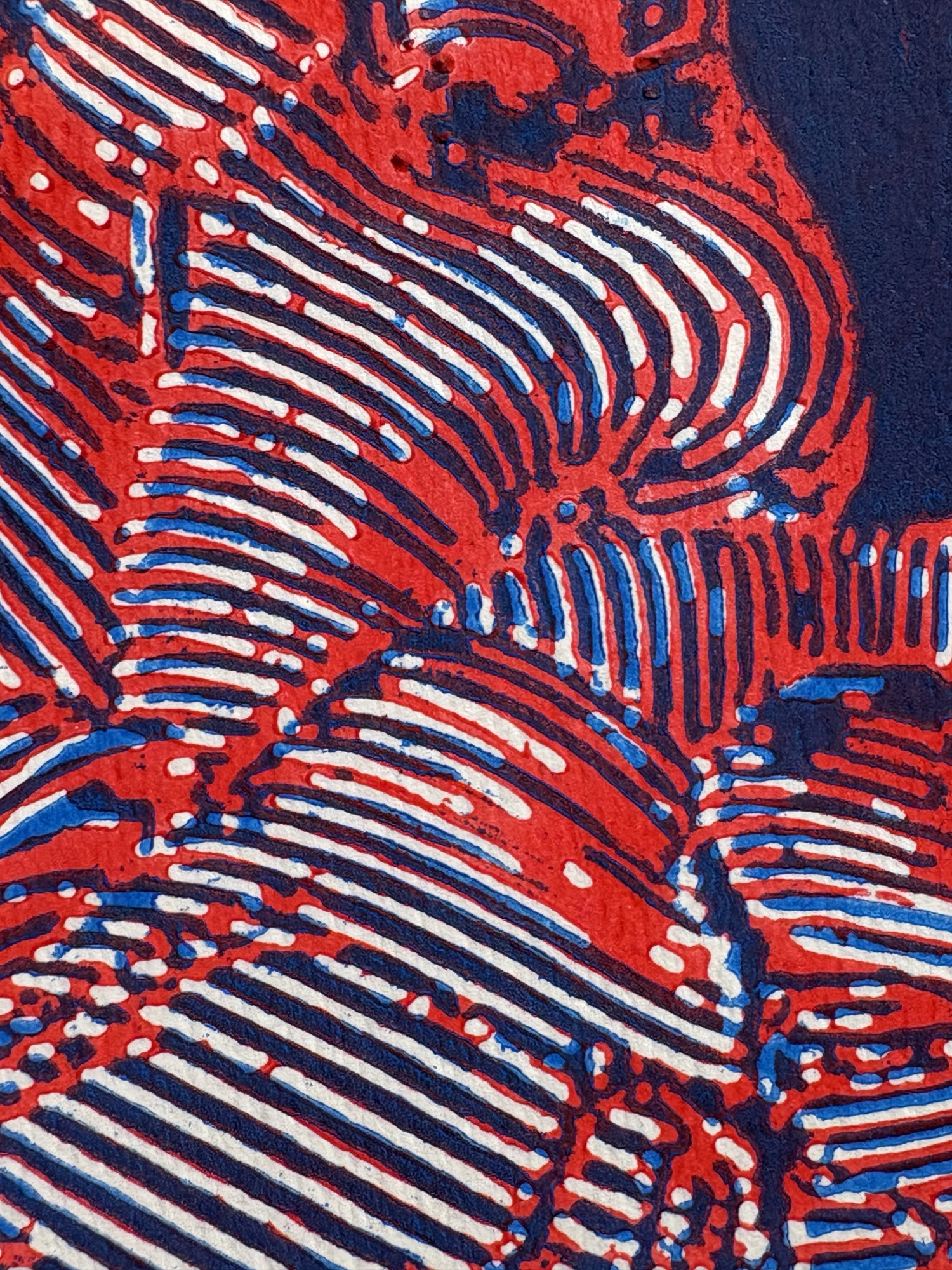
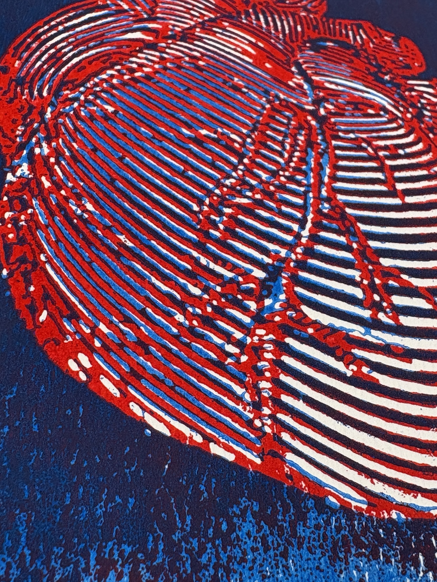
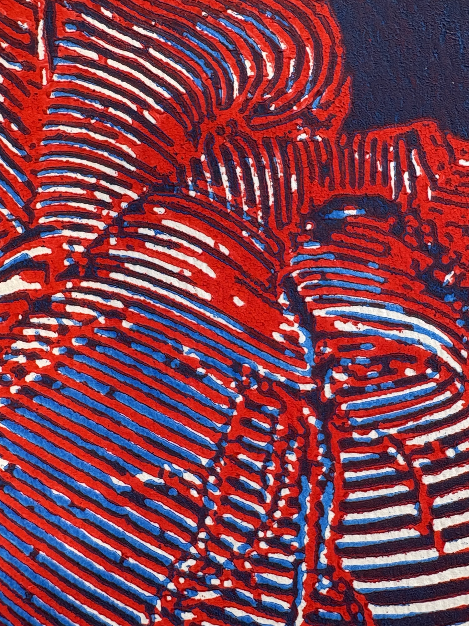
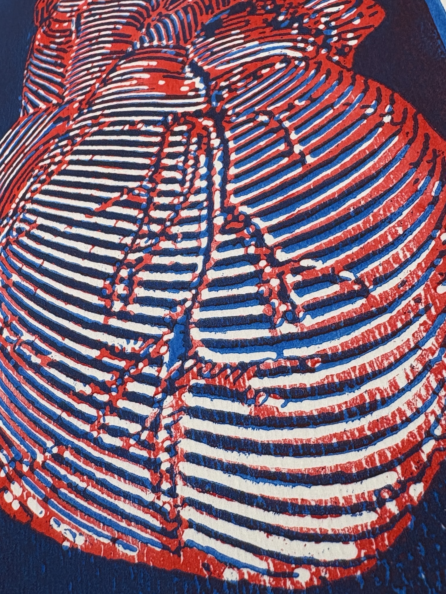
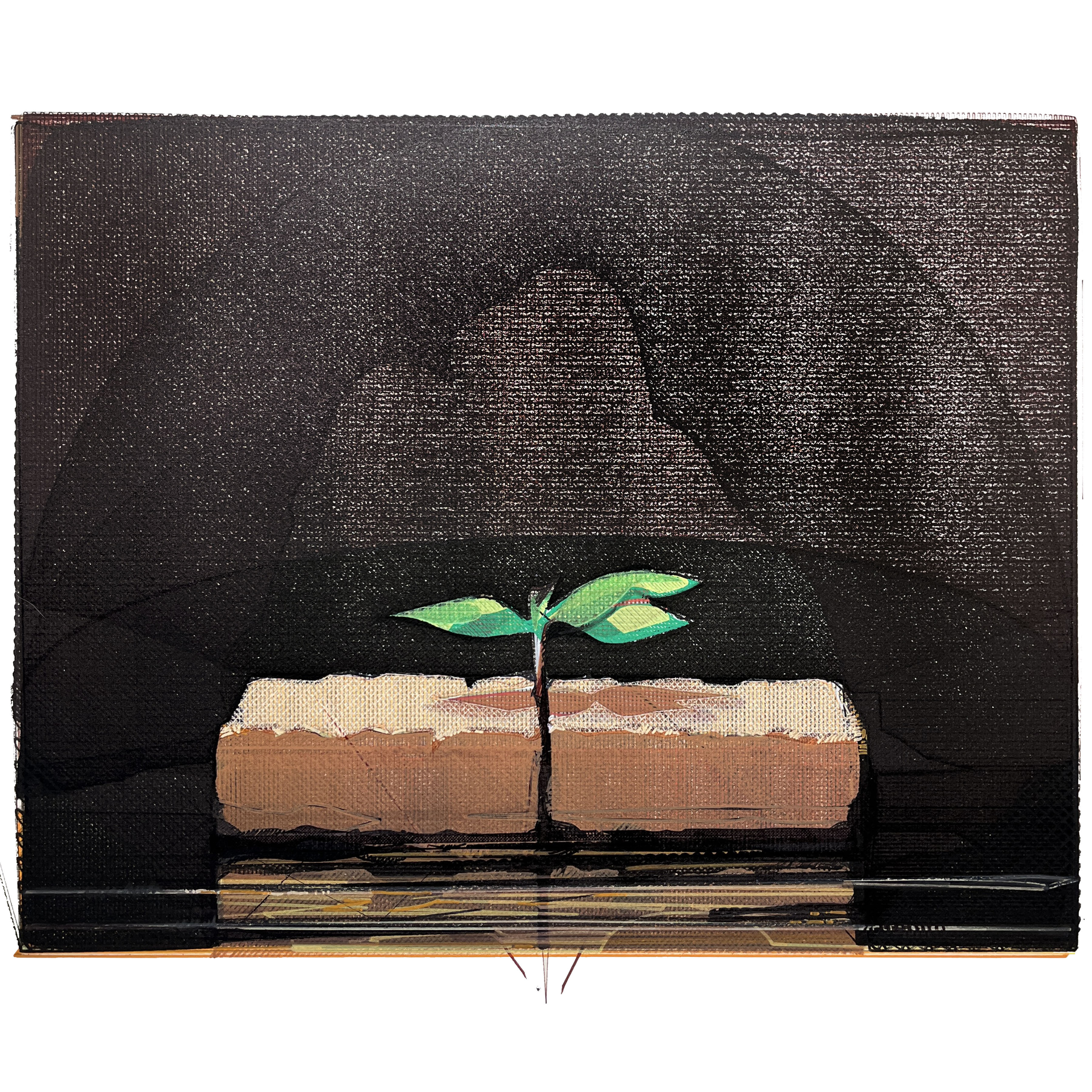
This year I’m commemorating the traumaversary with a new version of an old work. I first created Situation and Circumstance Overcome in 2003. It is definitely my most successful and most owned work, as I’ve created many copies – both paintings and prints – of the work as fundraisers for adoptions and other charitable occasions. For this version I chose to use my AxiDraw X&Y plotter. Using a new print of my old mezzotint plate of the piece (fig. 1) as a visual source, I created a large vectored image in Inkscape that had roughly 30 layers printed upwards of 5 times each (fig. 2).
Fig. 1: Situation and Circumstance Overcome. Mezzotint print on paper. 16×20 inches. 2023.
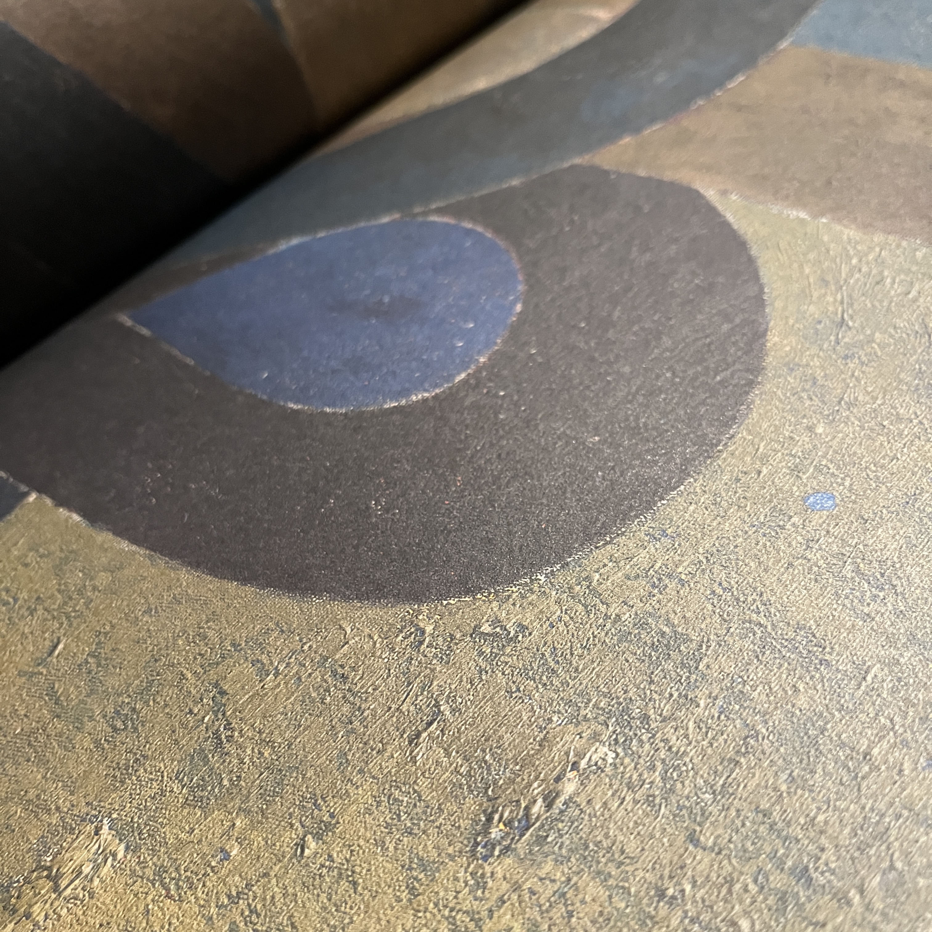
Ink the vectored image you can see many of the layers along with the direction of the hatch fills and choices I made for density of pigment load. Each color was created with Sharpies, Posca acrylic markers, and a few other ink-based markers. The layers shown in the Inkscape file don’t correspond fully to the final image (fig 3.) because I made adjustments/changes to individual layers as I moved through building the image. There is a call and response between the digital and physical realms here that I really appreciate. I’ve also included a few details of the piece so you can see the finer textures and lines.
Fig. 3: Situation and Circumstance Overcome (’24 Traumaversary Version). Ink and acrylic on Arches paper. 16×20 inches. 2024.
I like having a rich, sentimental image like this following me through life. I’m convinced we’re all sentimental (if we’re honest and not sociopathic). By this word I don’t mean any kind of unexamined, saccharine idealization of some past version of reality. Rather, I mean that we really did experience real things in our pasts, and those things carry with them real emotions, real artifacts of our real selves. In some sense, sentimentality can give us momentary access to who we used to be in the past. It is a simultaneous connection and rupture. We know we can’t return to that person or that experience. And we know that we can’t really feel anything the same way again. And yet… some part of that reality is there for us in our sense of sentimentality. It’s akin to a certain scent or song taking us back to a prior state of being. There’s nothing wrong with this. Moreover, I suspect it has some adaptive advantage for the species by stimulating social/familial/relational/tribal/spatial cohesion.
In any case, I think making the image of life in the form of tiny sapling breaking up between the bricks has been a worthy thing for me. It’s a little picture of triumph in the midst of hardship. I’m glad it resonates with so many people. I’m glad variations of this piece hang in homes all over the world. And I’m glad I’m still here to appreciate it and add to its legacy.
I’m glad I didn’t miss these last eight years. There have been a lot of situations to overcome, but the life I’ve seen makes it all worth it. Here’s to another year. Peace.
If you’d like to inquire about purchasing the traumaversary robot version of Situation and Circumstance Overcome, contact me over here.
I have mentioned the importance of Miyoko Ito many times before (here, here, and here), but there’s a little more to celebrate this Christmas day: I just received the new book Miyoko Ito: Heart of Hearts hot off the press.
Published by Pre-Echo Press, and featuring the research and writing of Jordan Stein, Heart of Hearts is the major publication that Miyoko Ito and her work deserve. Jordan Stein is an active and insightful curator who has developed a major presence nationally over the last decade. His research into and presentations on Ito are extremely significant, adding great depth to what is available on the artist.
Detail of Orange Cloud from 1977 by Miyoko Ito as shown in Heart of Hearts.
Loaded with chromatically accurate images, Heart of Hearts is the most complete compendium of Ito’s work available. Beyond this, the book provides a single place from which students and admirers of her painting can find all pertinent information about her life and process. Stein’s essay provides key context, deftly connecting Ito to not only her roots in the Chicago art scene but the broader aesthetic superstructure to which she belonged.
Detail of Susquehanna (The River) from 1959 by Miyoko Ito as shown in Heart of Hearts.
These two arenas – solid text and quality images – really set this publication apart. From the beautiful debossed cover (front AND back) to the matte surfaces of the large full color spreads, this book delivers. The sense of texture and painted action is wonderfully realized in these pages. I kept being surprised by the surfaces of the paintings coming to life. This is an ESSENTIAL book for anyone interested in mid-20th century painting generally, or Miyoko Ito in particular. To finally have one volume that really pulls it all together is just wonderful.
Front and back covers of Heart of Hearts.
This book is an appropriate celebration of Miyoko Ito as a person and as an artist. It includes nearly all of her work, some of which have been lost. While not technically a catalogue raisonne, it might be the next best thing, as it provides the most complete picture of her work that we’ve ever had. For this, we can thank Jordan Stein and Pre-Echo Press.
In my opinion Miyoko Ito: Heart of Hearts is the most important publication dealing with American painting since Yale’s four-volume catalogue raisonne of the work of Richard Diebenkorn. Go buy it.