Inspiration – Richard Serra

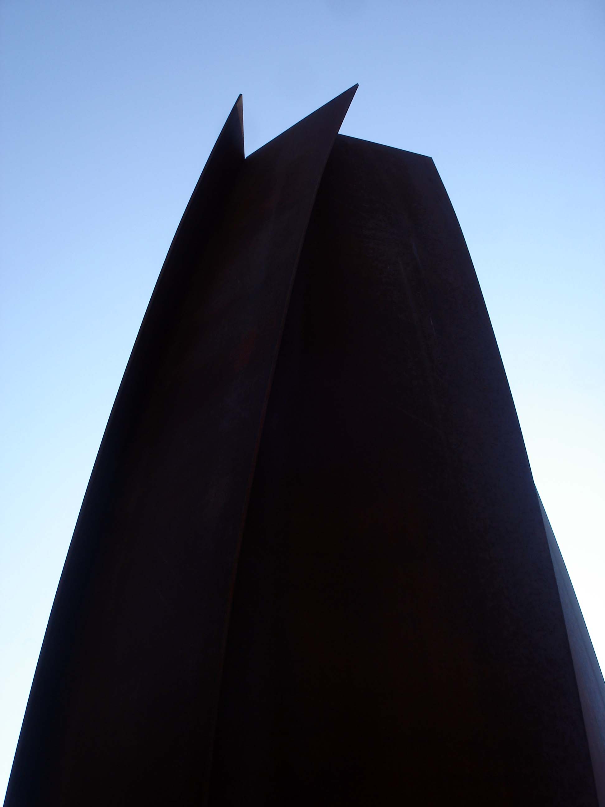
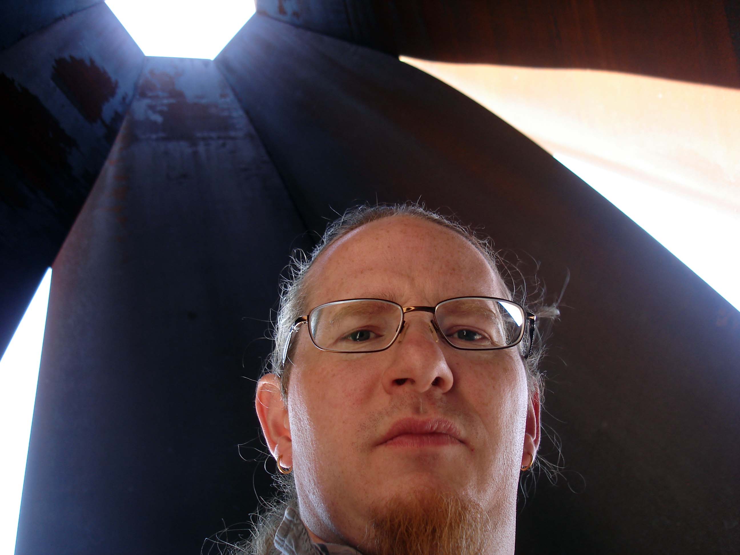
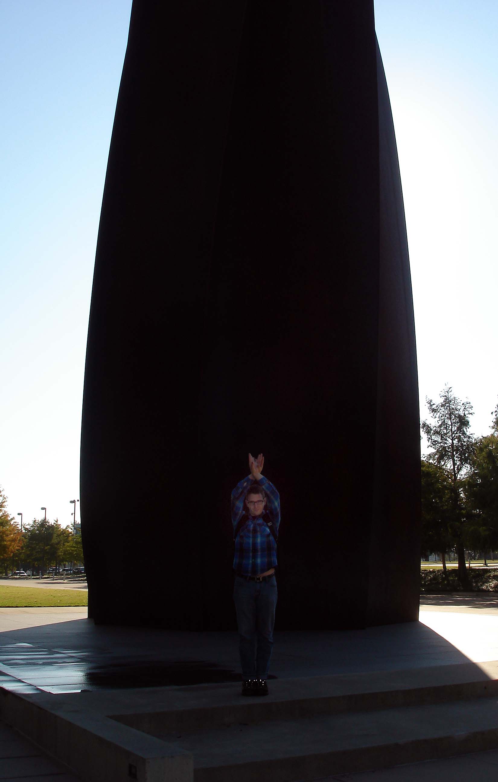
Just got back from a trip to Dallas/Fort Worth to visit the Diebenkorn Ocean Park retrospective at the Modern Art Museum of Fort Worth. It was stunning, and I’ll be writing my reflections on the show soon. But before we even got inside, we experienced one of the best Richard Serra sculpture I’ve ever seen. Below are some shots from my visit – I’m with one of my best students and friends, Marcus Miers.

Marcus at the base.

A shot of the cor-ten behemoth against the sky.

A spire of light wedging into the interior of the piece.

Gazing upward from within.

And here I am against the space and light.

Serra’s piece at MMA in Fort Worth is spectacularly aural in its manifestation. There is the quintessential feeling of massive heaviness, the sense of the density of the steel, the way the work shapes the space and the sky and the light within its parameters – but the sense of sound is truly unique. In most of Serra’s semi-enclosed works there is a kind of stillness to the air and the sound, a weightiness similar to the feeling of walking through a forest heavy with new-fallen snow. In this piece, however, the sound is fast and expansive, and every slight movement or sound is magnified and compressed within the interior space. What happens inside is heightened for those within, but people outside have their sense of the interior sound scape dampened. This inside and outside duality of sound is integral to the piece and makes the normally ominous quality of Serra’s steel more whimsical and lightly-felt.

Looking Over the Overlooked at MACC

Jacob Maurice Crook and I have a show together at Moberly Area Community College. We installed today and the exhibition opens this coming Monday, June 6th. I hope you can get there to see the show – MACC’s gallery space is quite nice – but if you can’t make it, check below for some shots of the work installed. Click each image for enlargement.

1 ) Crook’s main wall arrangement. One larger oil painting, a small work in oil, and a mezzotint.

2 ) Crook’s inner room set – two oil paintings flank a beautiful graphite and gouache work.

3 ) Crook’s side wall, with an oil piece, two large mezzotints, and a graphite work.

4 ) Crook’s behemoth Hitt Street Garage, an 18 foot, 7 inch oil painting.
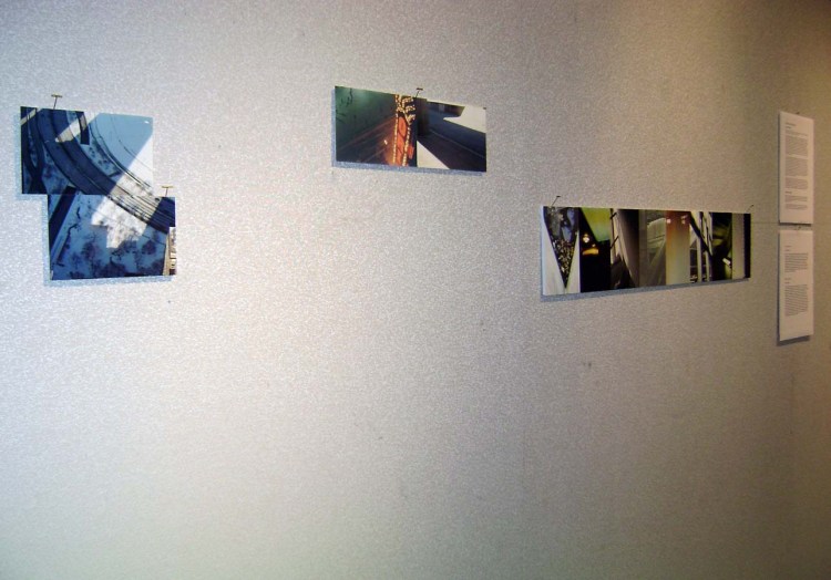
5 ) Ballou’s main wall set, with images from Chicago during 2000 and 2001.

6 ) A grouping from Ballou’s 2008 Illinois beach house series.

7 ) Ballou’s 2008 Michigan light photos.

8 ) The 2004 Whitney Ceiling set, installed physically for the first time here (I presented them online during 2010 at this link.)

If you are now sufficiently inspired to see the show for real, MACC is located at 101 College Ave. Moberly, MO 65270.

And here are our statements for your perusal:

Looking Over the Overlooked Exhibition Statement

Matt Ballou and Jacob Crook present work that engages with the proliferation of commonplace, yet ignored, spaces in the urban and suburban landscape.

Using primarily photographic images, Ballou depicts an iconography of geometries and formal tensions based on his experiences with specific interior and exterior spaces over the last decade. Several bodies of work from very different locations around the United States take center stage. These include a latticework of appropriated images showing the ceiling of the Whitney Museum of American Art in New York City, a multitude of manipulated photographs of a skylight in a rural northern Michigan home, and a series of images of the degrading arcs and angles of a dilapidated municipal beach house in northern Illinois. Installing the images in broad arrays allows for a serialized, comparative reading that creates interplay between the total effect of the group and the specific characteristics of individual images. The works are not meant to be singular expressions but rather cumulative contemplations of space, place, light, and the modular effects of specific structures.

A dedicated representational painter and draftsperson, Jacob Crook’s work starts with repeated observation and detailed consideration of the overlooked arenas that quietly dominate the American landscape. Relying heavily on James Howard Kunstler’s book The Geography of Nowhere, Crook’s paintings, drawings, and prints attempt to come to terms with what Kunstler describes as the American “obsession with mobility, the urge to move on every few years” and the results of that tendency: “we choose to live in Noplace, and our dwellings show it.” Casting his eye on the margins of suburbia, Crook tries to locate the dynamic tension that exists between the land and our mundane domination of it. Crook carries on the legacy of landscape painting while rejecting its inherent valorization of the subject matter. Instead of merely creating pleasant pictures, his work uses the historical authority of both painting and the landscape to project a subversive series of questions toward viewers.

Together the work of these two artists is a vision of what American space has become. Not an entirely negative perspective, the work is meant to provoke an introspective attitude in viewers, challenging assumptions and calling questions to mind: “What spaces do I want to live in? What has dictated the sorts of spaces I live in by default? What is my responsibility for the reality of these spaces?” The artists hope that by bringing their own investigations – as humble or as banal as they might seem – to viewers, a thoughtfulness and contemplation might be stimulated.

Biographical Information

Ballou is an Assistant Teaching Professor at the University of Missouri where he has taught since 2007. In 2011 he presented a major solo show at Gordon College in Wenham, MA and will exhibit with internationally renowned artist Tim Lowly at the 930 Art Center in Louisville, KY during the summer of 2011.

Crook earned his BFA from the University of Missouri in 2009. His work was recently included in the prestigious Fort Wayne Museum’s Contemporary Realism Biennial. He has been accepted to Syracuse University’s graduate printmaking program for the fall of 2011.

Jacob Maurice Crook | Artist Statement

My work is a contemplation of how the physical design of our surroundings can influence social behavior and also offer insight to cultural practices that inform the nature of such designs. In choosing the subject matter of my imagery, I focus my sights on the fringe of suburbia, attempting to locate dynamic tensions existing between the landscape and the homogeneous developments quietly dominating its topography. I chose to reject the idealized depiction of subject matter inherent in the history of American landscape painting. Instead of merely creating pleasant pictures, I use the history of both painting and landscape to project a subversive series of questions to viewers: What spaces do I want to live in? What dictates the spaces I live in by default? What responsibility (if any) do I take for the reality of these spaces?

Matthew Glenn Ballou | Artist Statement

These photographs were never meant to be artworks per se. Over the course of many years I have used photography as a way to decipher my own eye, as a way to better understand what visual dynamics draw me to certain scenes or arrangements of form and space. So most of what you see here was entirely reactive and instinctive at the beginning. I was attempting to see something in what others might easily overlook. Ultimately it worked, and in many ways these images have become historical and canonical to me. They are also nostalgic in that they are documents of places and times that carry personal significance. In them I see my own eye remixed, my own memory re-contextualized. In them I see a field of visual forces at play, which I have taken and used, reused, and reapplied. I present them in this way at this time to heighten my experience of their formal tension and balance in contrast with my emotional feeling for the spaces and times they represent. I present them so as to experience all of this again, anew. It is the contrasts and resonances made possible by this new context that bring artfulness to the work. The images themselves remain snapshots while the relationships among these fragments become a place for art experiences to reside: between the lines, in the overlooked spaces, around corners, beyond sight.
The Larry Show Postcards!!!

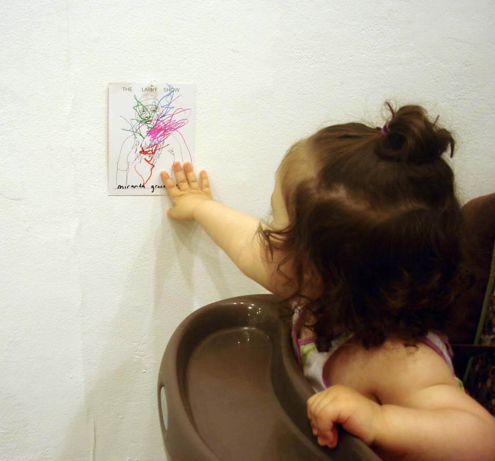
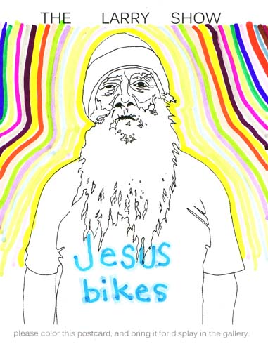
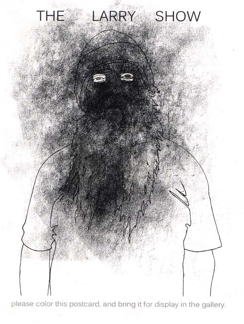
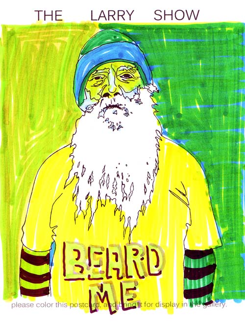
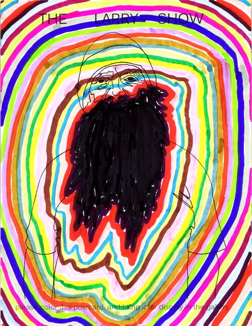
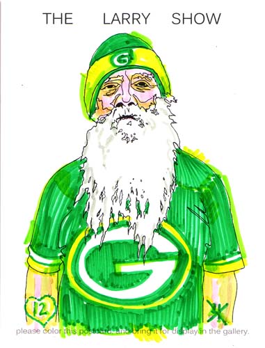
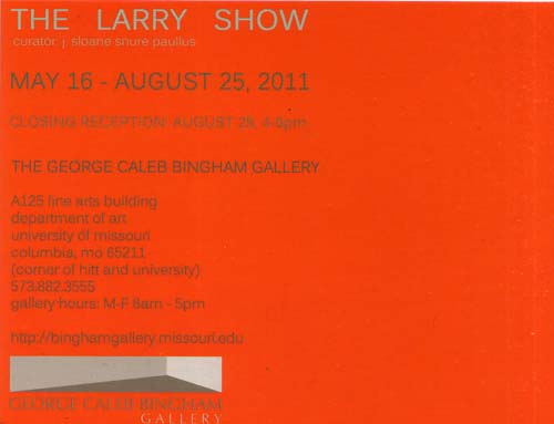
So the upcoming “Larry” show, curated by the awesome Sloane Snure Paullus, has postcards that solicit drawing upon said postcard (to be exhibited alongside the work of 40+ artists [including me and some of my best students] at the George Caleb Bingham Gallery at the University of Missouri this summer)… Below are some of my very own “The Larry Show” postcard drawings. Enjoy, and click for larger versions :)

And here’s the verso, giving details about the show… I hope you can make it. There’ll be a whole wall of visitor-submitted card drawings (including a few more of my own), so be sure to see the show!


Beginning Color Drawing Spring 2011 Group Project

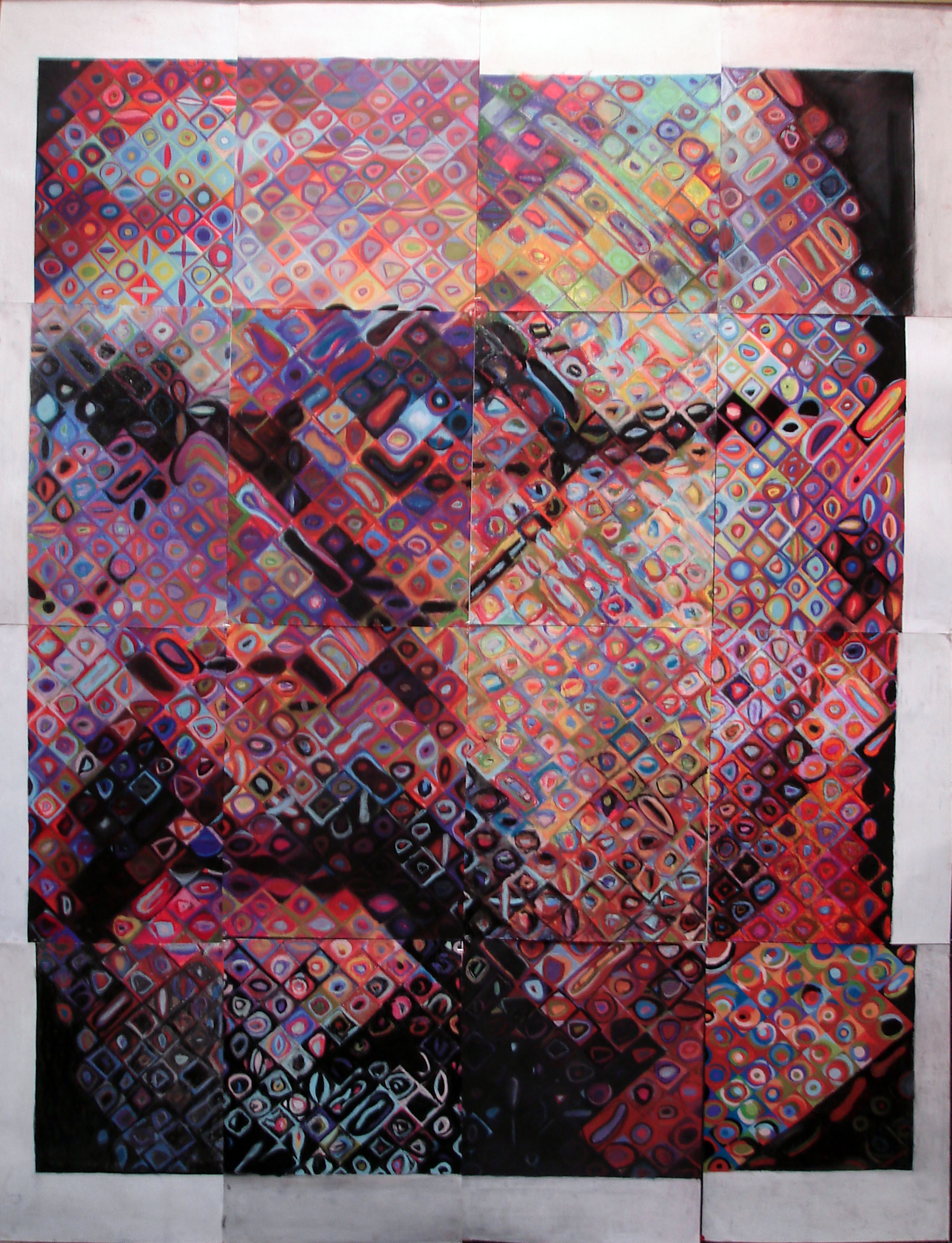
Once again, my Beginning Color Drawing class at the University of Missouri has created a large work together as a capstone to the semester. Seeing these big drawings happen has been a very rewarding aspect of my teaching.

This one is obviously a copy of one of Chuck Close‘s self portraits. And below is how it looks from the hallway. Click on the images to see them in larger glory!

These are mostly fun, low-pressure way to create something unifying after spending the whole semester developing and practicing skills. I love  this project. Click here and here to see some past efforts!

Inspiration: Natalie Hellmann

Natalie Hellmann, a wonderful ceramist and person, is holding her MFA Thesis Exhibition this month. She has been an absolute joy to work with over the last three years, and I know I’ve learned much that I would never have known if not for our discussions.

Aarik Danielsen talks to Natalie about her trajectory as an artist in this feature in the Columbia Daily Tribune.

And here’s a link to a shorter article about her and her show.

I was asked a number of questions about Natalie and her work for that short article. Obviously space didn’t permit them to publish all of my thoughts, so I want to include them here as a way to honor Natalie.


Interview Question: “What do you enjoy most about her growth as an artist since you’ve met her? How has she grown?”

My response: “I am most impressed with how Natalie has held onto the core things she has cared about for many years while at the same time found ways to grow in her understanding of the materials and integrated relationships of form, content, and emotion with which she has worked while in grad school. Practically, this means that she has made numerous attempts to invest her project with fresh investigations, often working with different forms, structures (and orientations of these two) in order to determine what felt right. In many ways what she presents in this Thesis work seems inevitable, as if it all just had to be. But this is not the case. Natalie has studied her own work and intuitive expressions while also looking to other artists, writers, and philosophers who seek poetical understandings of human experience rather than just rational, direct, closed meanings in that experience. Natalie’s work is thus not meant to function as didactic communication first and foremost. Instead, it has grown to become a kind of emotional sounding board, wherein viewers may, if they are inclined, examine themselves via the suggestions of the forms. The work is more about awareness of being than declaring some specific message. I enjoy the fact that I got to participate in her exploration, be around her welcoming spirit, and grow in my own apprehension of what art can do through my time with her. ”

Interview Question: “What do you think her viewers are going to enjoy most from her exhibition this coming week?”

My response: “I think that viewers who allow themselves to intuitively consider the objects and arrangements in Natalie’s show will find a resonance in their own past experiences of feeling, seeing and being. What I mean is that, to me, the strength of Natalie’s work has always been in its gentle invitation to participate in awareness and emotional connection to shapes, colors, and surfaces. Being with Natalie’s artworks is something akin to standing by a stream and looking at the smoothed stones beneath the undulating water – if you’re in the right frame of mind, your emotional and psychological experience can become one of calm awareness. I think that’s the “repose” that Natalie suggests in the title for her exhibition. I hope that viewers will both experience and appreciate that quietude and tenderness; it’s something not often seen in art.”

Thank you, Natalie, for your work, your spirit, and your presence.

Collage, by Zeinab Chaichi Raghimi

One of my grads has developed a booklet containing a number of her collage works from last year. Please go over to Lulu and check it out by clicking the image below (it’s one of my favorites of the ones she made last summer). The booklet is pretty cheap to purchase (you can download a full-color, 25 page version for a couple bucks) and has some excellent images as well as a statement in English and Farsi. I think Zeinab is doing some great work here at the University of Missouri and I hope a few people will support and encourage her by picking up a copy of the booklet. Just click on the image below to go to the Lulu page where it’s for sale.

Inspiration: Ian Shelly

Ian Shelly was a graduate student at the University of Missouri in ceramics, working with the great Bede Clarke. He was among the first grads I taught and eventually developed good relationships with. His work, balanced in an evocative place between technical precision and playfulness, utilizes a modular methodology to arrive at installations that are unique and impressive. I sense dualities in his work: it’s emotional and flippant, gentle and muscled, intentional and intuitive. But it is in the continuum between those poles that deep meaning is conveyed. His project while at MU was impressive, and he’s continued that during his long-term residency at Hub-Bub in South Carolina. His work is now featured on the accessCeramics website.

Another Semester, Another Round of Glory

Yes, it’s Beginning Color Drawing time again… Once again it’s been a great start to the semester. I feel pretty astounded at the talent of my Beginning Color students; even though they’ve all taken Drawing 1, and some have had other studio courses as well, they’re all making big strides. It’s fantastic work. Take a look:

Andrew Vincent “Grid #1” Chalk Pastel, 24 by 18 inches, 2011.

Melissa Hoefer “Grid #2 Colored Pencil, 18 by 18 inches, 2011.

Emily Armstrong “Two Colored Pencil Object Group Studies” Colored Pencil, 24 by 18 inches, 2011.

Lauren Roberts “Grid #1” Chalk Pastel, 18 by 24 inches, 2011.

Mitchell Baggett “Colored Pencil Object Group Study” Colored Pencil, 12 by 18 inches, 2011.

I know I’ll be posting more work from this group…