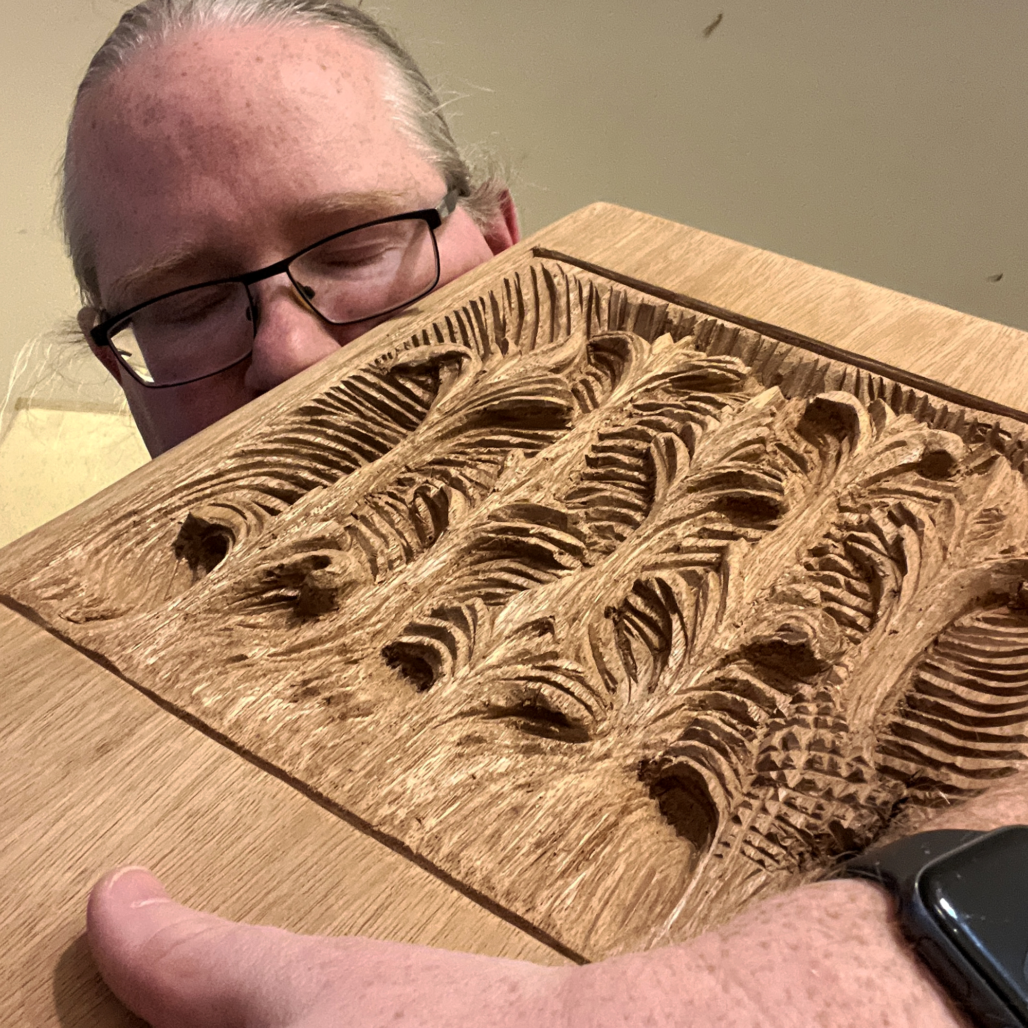
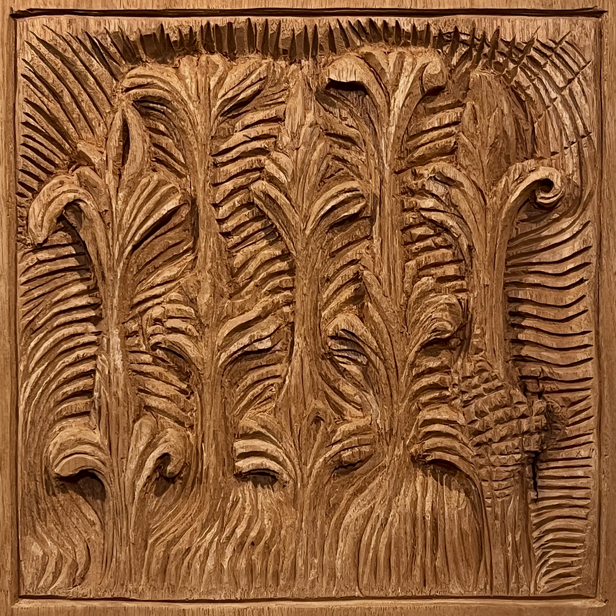
Late last year I talked about how Geo and I were working back and forth with some artwork/carving/A.I./carving/artwork-type collaborative stuff. The process has continued.
I know, I know. You see the initials A.I. and you’re skeptical. As you should be. I’ve been doing a lot of research on A.I. generated images, and while I think the majority of the A.I. space is trashy, there are a few people doing some amazing exploration. Joey Borovicka over in The Timeout Zone is doing quite interesting “synthography” using A.I. models. Wolfe von Lenkiewicz is also making intensive forays into image-making with precision A.I. models.
I have been interested in using image-generation tools in a limited way. Basically, I’ve been incorporating them into the workflow. This means we start with ideas, images that we’ve made ourselves, or carvings that Geo has made. Then, uploading the images as a baseline source for the A.I. generator to use, we add text prompts to encourage various modifications. In this way we use our own images in the A.I. system and calibrate them using the wording we input. Obviously, since the models have been trained on images borrowed from the wider world, we’re viewing this as a limited experiment, but I think it’s worth it.
Here’s a sequence of explorations that we’ve done with imagery of the acanthus and my own artwork: first, I used some wording from Geo in the Dream by WOMBO A.I. app, then I loosely drew over the generated images. After making a various edits and selecting one of the versions that I’d drawn, I sent a copy to Geo, who used it as a basis for his carving.


The image above, Living Carve, was built by using words of Geo Weissler in Midjourney, then modified digitally in Procreate on my iPad. I took that result, printed it on a large format Epson printer using Epson Enhanced Matte paper. I then used colored pencils and gouache to develop the image and enhance the richness of color and depth of surface. Below you can see a shot of the piece framed. You can see some of the surface treatment, the sense of the material accumulating to present the image. I like the chiaroscuro and quality of light. There is a subtle feeling of trompe l’oeil to this piece, which is something I’ve only tried to do a few times before. I may try a composition like this once again. If you’d like to inquire about work like this, visit me on Instagram.

