The School of the Art Institute of Chicago, Ten Years On

I graduated from SAIC nearly 10 years ago, and I’ve got a lot of memories from there. At first, right after I graduated, I was pretty negative about my experience. I felt as if they’d denied me some aspect of my education necessary to my future, that they’d tried to indoctrinate me, that they’d treated me like a number, not an artist.

In ways I was right, but in a lot of ways I was wrong. I’ve since gotten over it and look back with fondness, thankful that I grew so much during those years. One of the ways in which I grew was in my attention to the things that drew my eye. I began to document heavily, shooting thousands of photographs in the last couple years of my undergraduate career. Below I’ve posted some of those images. These are all from SAIC hallways and environs circa 1999/2000. I was obsessed with the angles, passages of light, and transitioning spaces in the places I saw every day.

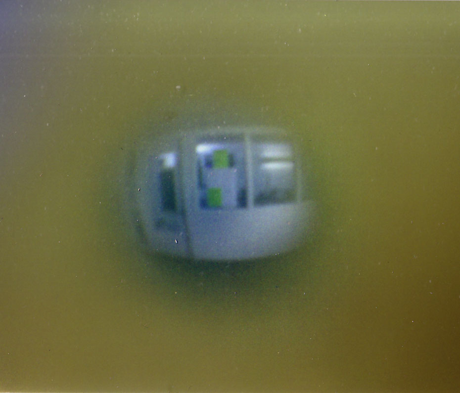
Above, looking through the peep hole of my dorm door, 112 South Michigan Ave, 9th floor. This space no longer exists. Below, the elevator I took so many times.

Dead birds (they constantly flew headlong into the bank of windows on that facade, then fell, in droves, into the water below), dead leaves, and my shadow in a pool outside the lake side of the Art Institute of Chicago.

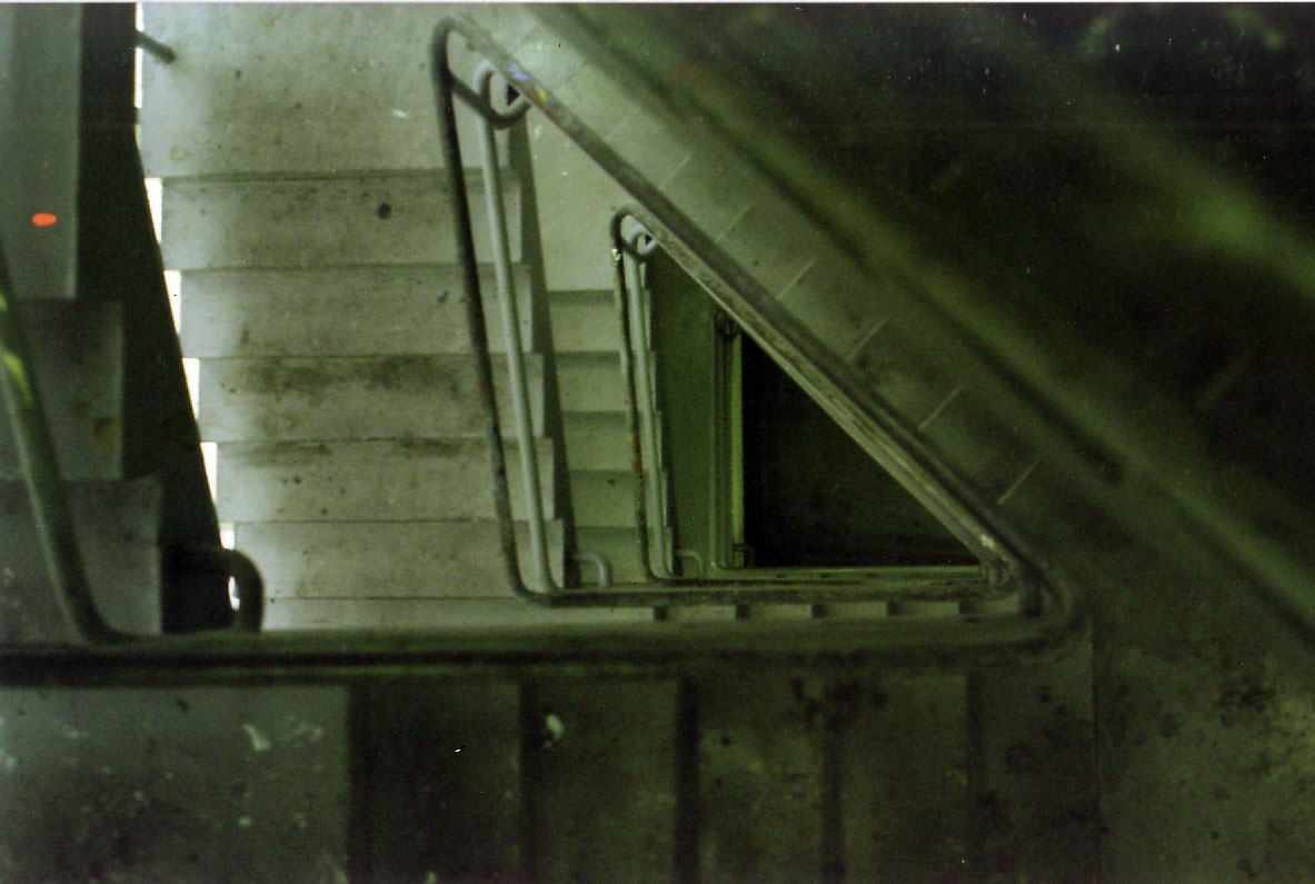
Two stairwell views on the way to the Advanced Painting studios (above and below).

Another stairwell view, light on the landing.

Glass and light, looking up toward the Advanced Painting studios.

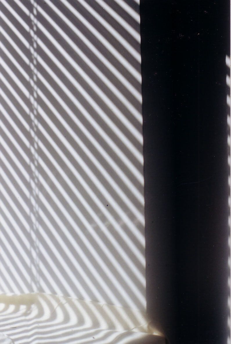
Sunlight glances through the shades of my 13th floor (the smoking floor) dorm at 162 North State Street.

I’m Verso

Sharon Butler‘s great blog, Two Coats of Paint, carried an interesting piece today about how artists sign their work and what that might mean.

I’m a verso, pretty much always signing the back or in a place where it won’t be seen when prepped for display. It’s a specific choice… the signature is a formal element and a conceptually potent one at that. Putting mine on the verso sets identification but lets the image be image. It’s not a conceit of preciousness or faux-humility; I just don’t want the text of my name in the way of a picture I’ve constructed for certain reasons. Click each image to see the front side.

And here you can see a short review of one of my paintings Ms. Butler wrote, via the Thinking About Art blog. Thinking About Art was a project of J.T. Kirkland, a fantastic artist in his own right. Check out his site here.

Ideal Forms

As if I didn’t have enough to do (60 piece solo show to prep for, summer teaching, fall teaching, writing, shows, reading, service to students and church, loving my wife and being a new dad, seamlessly integrating the domestic and the transmundane, all the while calling out to others on the mythic quest for a transcendent evocative intersubjectivity), I’ve also started a new series of works; guess I’m a glutton for punishment. I actually think it all keeps me on point…

In any case, I’m contemplating the notion of ideal forms. Some of this springs from my interest in the trans-historic and very influential Platonic Solids, which I’ve talked about a lot in the past. With these works, I’ve taken physical shapes I’ve created for my painting and drawing students to work from and begun investigating why I have my students focus on them. In the future I’ll enumerate some of the reasons why I’m (somewhat tongue-in-cheek) calling them “ideal.”

Ideal Form 02 (Mixed Media Variant), Mezzotint print and gouache on Hahnemuhle paper, 7 inches in diameter, 2010. Click to see large version.

Ideal Form 01, Mezzotint print on Hahnemuhle paper, 5 inches in diameter, 2010. Click to see large version.

Some Current Projects

A (detail of a) commission in graphite…

A (detail of a) commission in charcoal…

Continuing my Lamentations 3 series of mezzotints… Verse 4 is above (reversed to show how it’ll print).

And framing a drawing for friends; I created the drawing (in 2008) as an illustration for a poem.

MAGNITUDE 7 at Manifest

My work, titled Galaxy (Shell, Fecundity, Emanation), will be seen at the 6th annual MAGNITUDE 7 exhibition at Manifest coming up at the end of this month. The piece is a mezzotint print that has been embossed with a unique collograph print.

And here’s my statement about the work for the show:

Over the last two years I have become increasingly enamored with the mezzotint printmaking process. I have used mezzotint as a way to find new and different access to some of the subject matter I have used for years in my paintings and drawings. Bricks, shells, geometric forms, and bodies have all become part of my mezzotint repertoire. Those geometric forms – specifically the Platonic solid called the dodecahedron – have begun to inform my mezzotints beyond simple representation; I have started using the angles of the dodecahedron and its constituent, the pentagon, as dimensional embossments upon the mezzotint prints.

In the work I present here at MAGNITUDE 7, titled Galaxy (Shell, Fecundity, Emanation), the beautiful gradients and milky consistency mezzotint is known for are used to display a shell, spinning in an amorphous space. Yet a fine tracery of lines and angular counterpoints shifts the surface level of the image itself, creating a bas-relief. The angles are formed using a collograph print over the final mezzotint. This collograph is a unique, one-time embossment; though the edition of mezzotints is all the same, the embossment seen in each print is one of a kind.

By embedding these angles (taken directly from the dodecahedron) onto the image of the spiral form shell, I reintegrate their inherent relationship, since both the spiraling of the shell and the angles of the quintessential Platonic solid display the natural mathematical beauty of Phi, the golden ratio. While the depiction of the shell can be a visual entry point for contemplation, the angles of the subtle embossment encode a physical reality into the artifice of the image. This duality is something I am hoping to develop more and more. I want the image and the icon, the depiction and the object, the picture of the idea and the idea itself, to become manifest in these prints as I continue them.

Color Drawing, Spring 2010

A year ago I started teaching all levels of Color Drawing (Beginning, Intermediate, and Advanced) at the University of Missouri. While I really enjoy all of my classes, the Color Drawing sections have been particularly special to me.

So here’s just a review of some of the great work from this semester…

Danielle Moser, Beginning Color Drawing: Reflection Project Drawing, Oil Pastel, 24 by 18 inches.
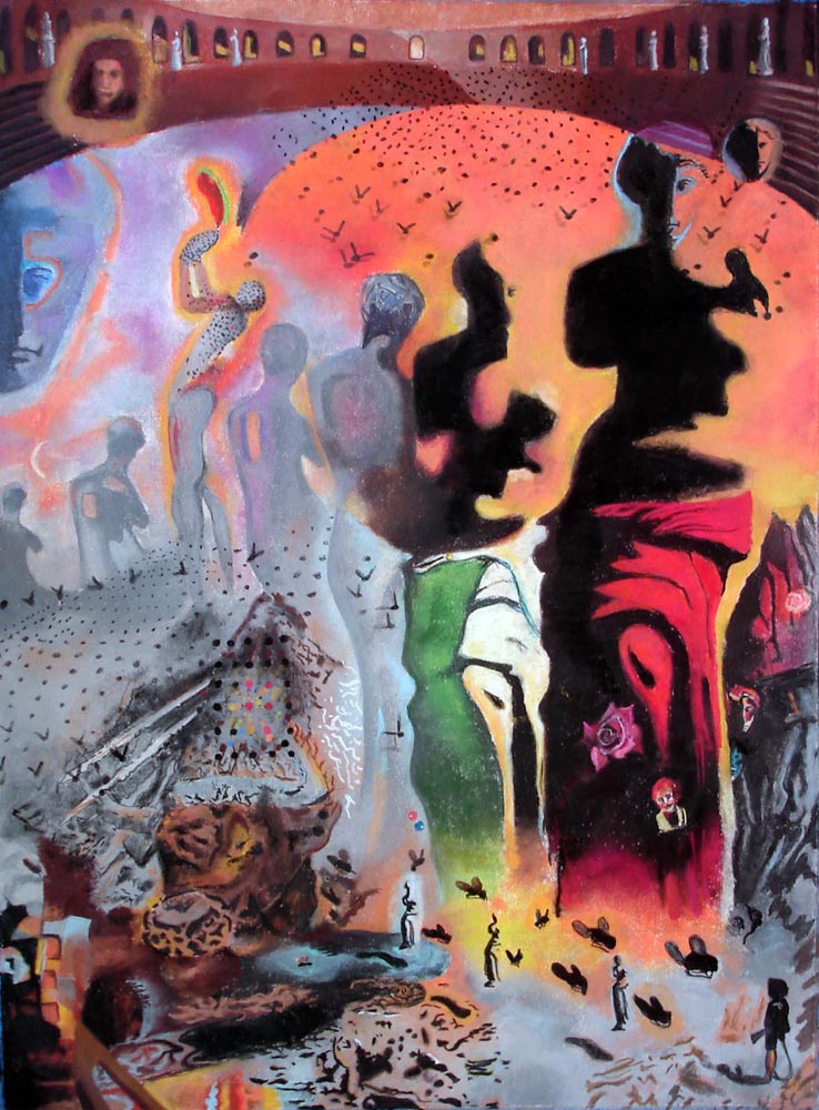
Jillian Blanck, Beginning Color Drawing: Master Copy Drawing (after Dali’s The Hallucinogenic Toreador), Chalk Pastel, 30 by 22 inches.

Scott Fisher, Beginning Color Drawing: Master Copy Drawing (after Michelangelo’s Libyan Sibyl from the Sistine Chapel), Chalk Pastel, 30 by 22 inches.

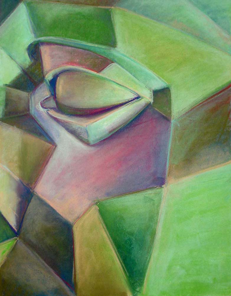
Holly Meador, Intermediate Color Drawing: Head Planes Model Drawing, Chalk Pastel, 44 by 30 inches.
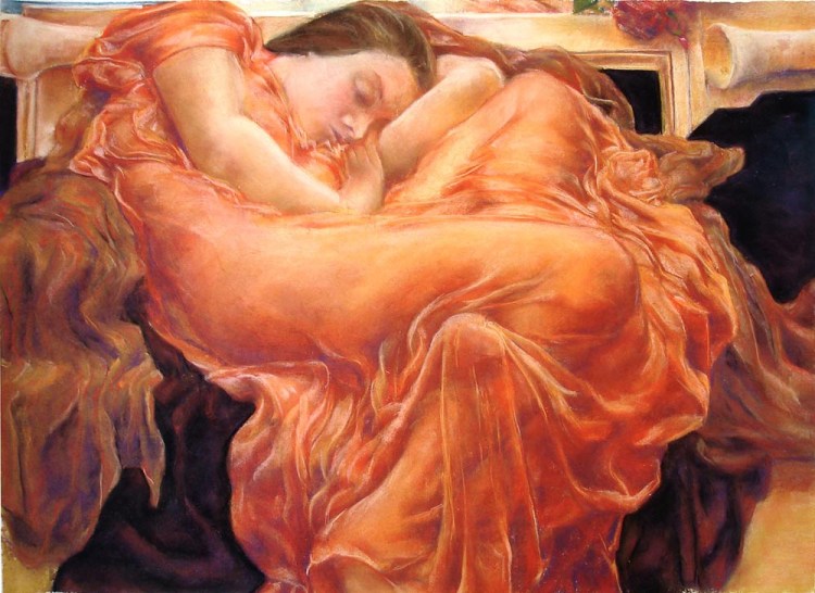
Holly Meador, Intermediate Color Drawing: Self Portrait as Flaming June (after Lord Frederic Leighton’s Flaming June), Chalk Pastel, 30 by 36 inches. (Unfortunately, this drawing was stolen from my flat files at the University – I’m actually pretty pissed off about it. How can we expect our students to be willing to put forth their best efforts when their peers don’t respect that work? Really unbelievable.)
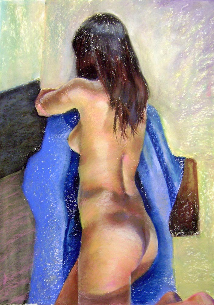
Roxanne Kueser, Advanced Color Drawing: Courtney, Chalk Pastel, 24  by 18 inches.
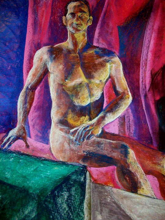
Brittany Carney, Advanced Color Drawing: Neil (The Proper Posture), Chalk Pastel, 24  by 18 inches.

Marcus Miers, Advanced Color Drawing: Untitled Composition, Chalk Pastel, 60  by 45 inches.

I want to thank all of my Color Drawing students for making the class so enjoyable. I could have easily had 100 drawings to show from the production of my 24 students; I don’t mean any disrespect to those I’ve not displayed here. These works do show the overall quality and worth ethic I’ve seen throughout all of the students this semester. I’m so glad I got to work with them. Here’s to setting the bar high for next semester!