I think back to this show fondly because Jen is awesome and I like having exhibitions with former students (and have done so a number of times, with Jane, Jacob, and most recently with Simon). I took a bunch of images during the installation and recorded some audio of us talking about the work. After listening to it a couple months ago I decided I wanted to celebrate our little show and the work we made there.
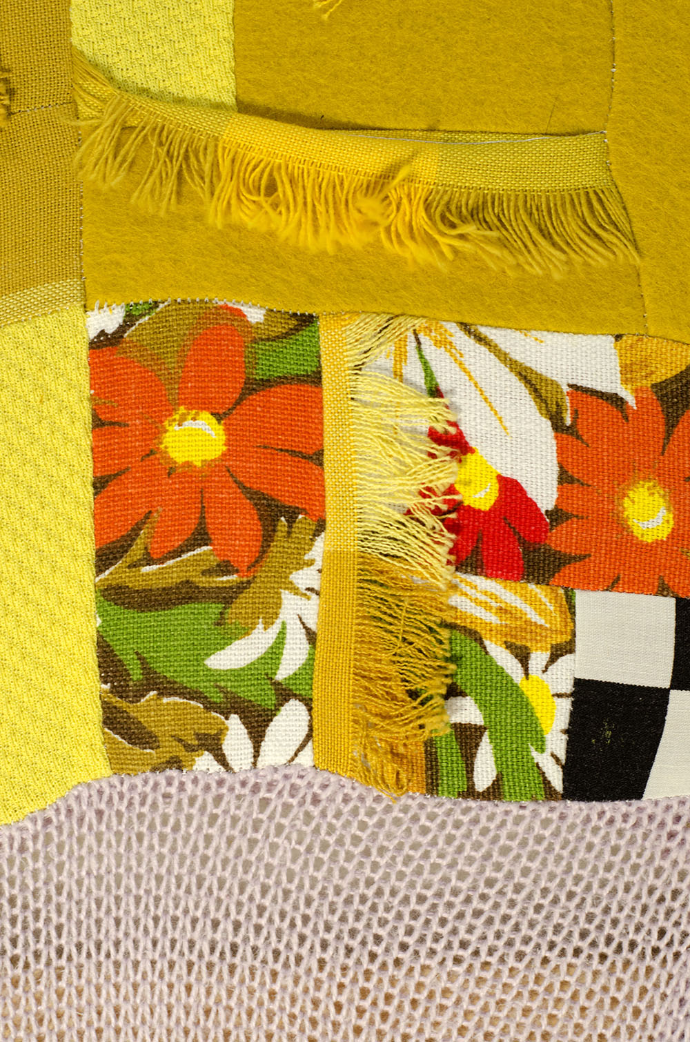
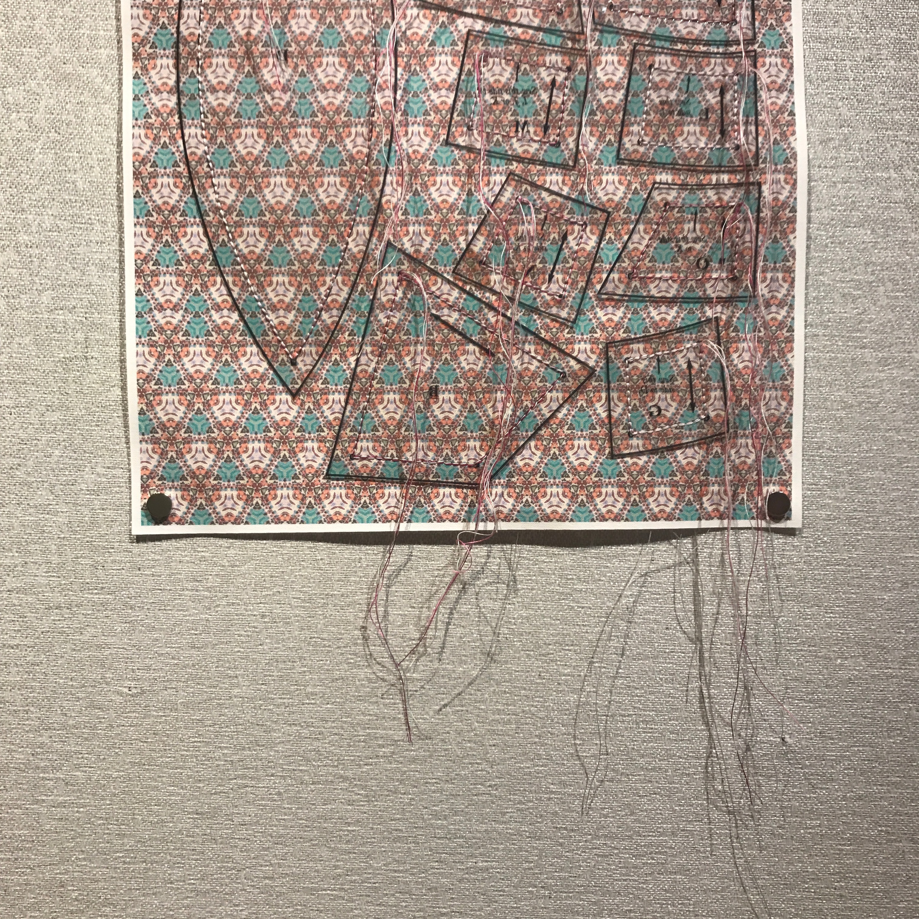
I was making my An Ensign for Miyoko Ito series, and experimenting with drawing robots – at the time very cheap ones that couldn’t make very large pieces. I was taking cues from Ito’s works and, as a response to that, Jen decided to use my artworks as the basis for her pieces. Using my work to create tessellated fields of colorful geometry printed on fabric, she then sewed cutting patterns onto them. The notion of a interference pattern felt particularly resonant to the work we both made for the show. This layering of influences and predilections still feels rich to me, and I wanted to share them with everyone again. Thanks so much for doing this show with me, Jen! Though her MFA was in a Fibers focus, these days she does a lot of dynamic photography, mostly in black and white. Check it out here!
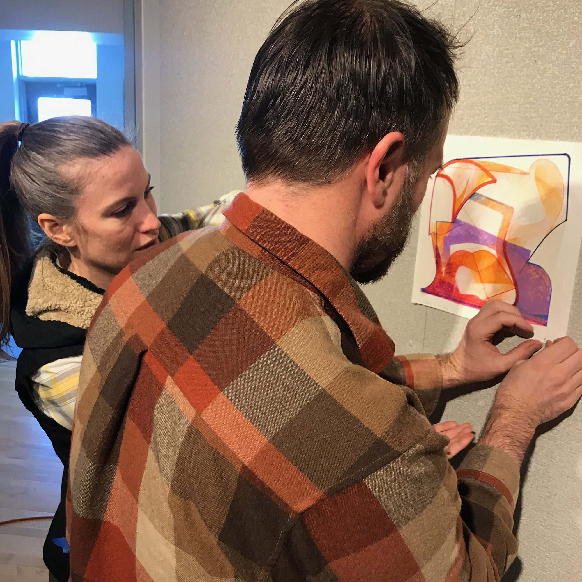
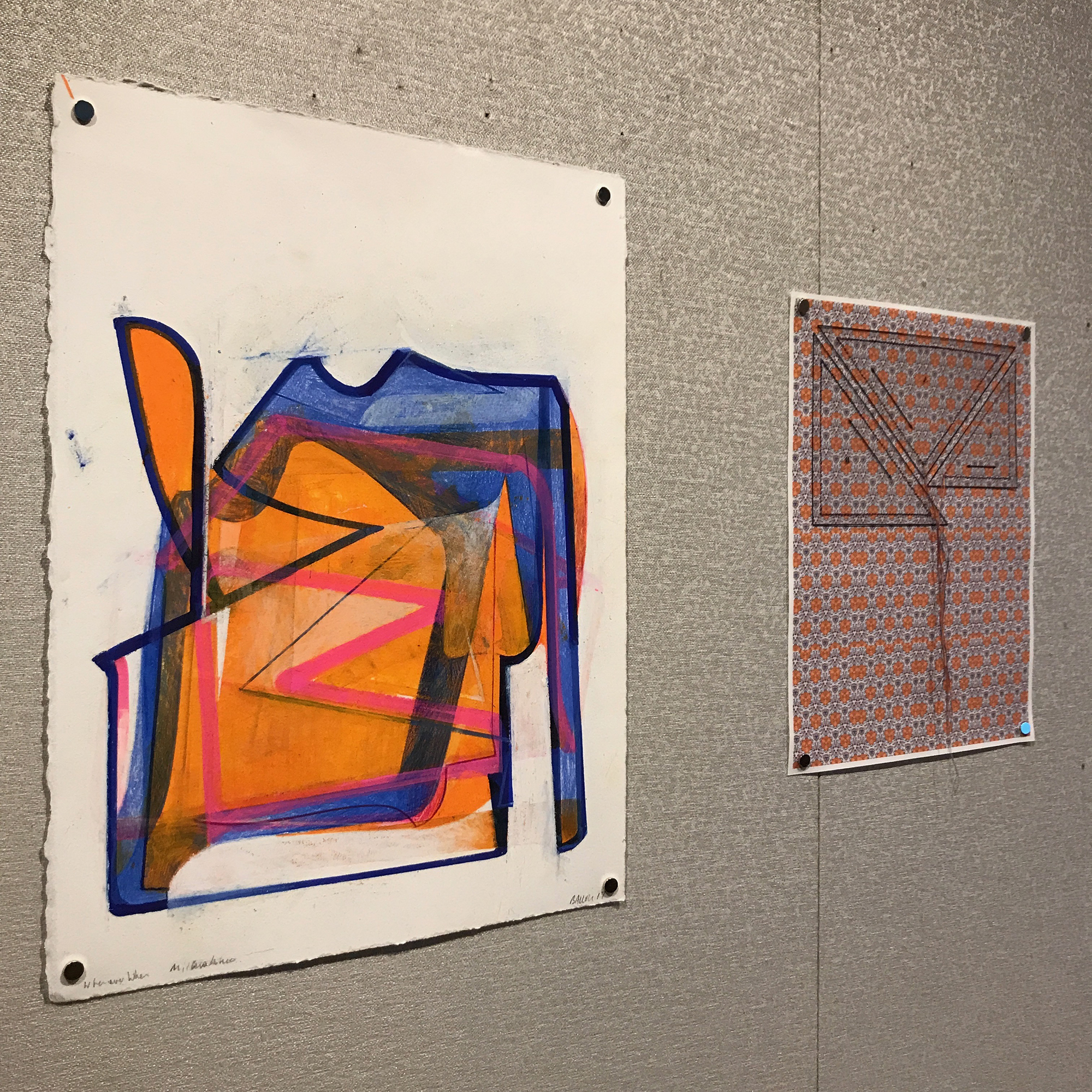
Below you can see some images from our installation session and my statement for the show, as well as see more work and hear us talk about it in the video here:
Statement for BALLOU/BENNETT: INTERFERENCE PATTERN
In my recent body of work, titled An Ensign for Miyoko Ito, I seek out the compacted and the overdrawn; the enclosed and the layered; the transformed and the solidified. I look for shapes, colors, and spaces that go far beyond a simple tension between figuration and abstraction, trying instead to suggest a layered arena of observational and haptic information.
Miyoko Ito (Japanese-American, 1918-1983) – whose work has been a key influence on me over the last 20 years – was able to activate subtle surfaces with the illusion of space and an evocative sense of palpability. This is what I’m investigating: the experience of perception apart from particular, representational depiction. In my exploration, questions arise: Does flat form appear to move away from my angle of view? Will color resolve into both static surface and suggested movement? Can space and color align to reinforce both static structure and an expression of time? Might the poetics of silent, unmoving images actually produce phenomena akin to those found in dreams, memories, ecstatic sensations, and atemporal musings?
By pairing my work with Jen’s extrapolations from that work, I hope to suggest the multiplicity of information that may be gathered from surface, color, and texture. She perceives something of Miyoko Ito through my translations. Beyond this, Jen’s artworks add other layers – of visual logic, of aesthetic influences, and of categories of understanding. In this modest exhibition, Jen and I participate in the ongoing interrogation of received knowledge and sensation.
Receiving anything – taking it into our mind and heart – always changes it. It is what it is and it is what we perceive it to be. We are forever adding our own unique inflection to the language of the world pouring into us. That is why I see my own proclivities in the shapes and patterns that Jen uses… and so I see my heroes, my influences, and my hopes there as well.
I make playlists every semester for my classes. These collections of songs are largely built from the ice-breaker/introduction discussion assignment I give to my students on the first day. I want to know what they listen to, what moves them, inspires them, sticks with them. And then I want to serve up songs during focused working time. With studio art classes at Mizzou lasting about 2 hours and 20 minutes, there’s plenty of time to get a vibe going. This way they can be both exposed to the things their peers love but also get the excitement of hearing their own personal deep cuts. I love the feeling of sharing some of my favorites with them, as well as discovering what “the youth” like today.
My interests in music are very eclectic, and that’s down to my exposure to so much variety through my students. But it didn’t start there. Below I am featuring a few of the most iconic Mix CDs I’ve been given over the last 25 years. I’m including Spotify playlists for each one. Go! Listen to them! In situations where the original song is not available on that platform I’m linking to YouTube videos.
I also want to shout out the amazing people who shared these four mixes with me. They are creative people and much cooler than I ever could be. I will link to some of their current projects. I’ll also talk about some of the tracks in each section and give some background on how these united groups of songs have stayed with me for a quarter century.
Ox-Bow is a lot more institutionalized now. Back then, it was a true bohemian type situation. What happened at Ox-Bow, stayed at Ox-Bow. The vibe there was a hold over from the 60s and 70s in a lot of ways, and this was before the world was really turned on its head by the US response to 911. The internet was still new and slow, there was practically no social media, and almost no one I knew had a cell phone. It was just a different time. There was room to go a little wild as well as room to explore your own thoughts and perspectives.
One of the best things that we did at Ox-Bow was have intense, blow-out parties every weekend. The cohort of fellowship residents did work during the main part of the week (maintenance, housekeeping, kitchen duties, etc), so when we partied, we went hard. A large meeting tent would be raised in the central field, a few turntables would be installed, and speakers deployed. Then our resident DJ, Eric May (with help from others) would spin records and CDs deep into the Michigan night.
I discovered a lot of great music that summer (The Beta Band, AIR, Massive Attack) and fell more in love with acts I’d always liked (Mazzy Star, Radiohead, PJ Harvey, Cat Stevens). Most of that stuff wasn’t being played at the parties, though, as they’re a bit too contemplative and musically less conducive to drunken dancing and themed costumes. Hence, the mix we all left with was something closer to late-90s college party than artsy hipster fare.
We definitely burned some calories to these songs…
*Eric checked in with me about this mix – he mentioned in the comments that Mikey H. and Reid T. had a larger hand in crafting it than he did! Shout out to Mikey and Reid! Reid has gone on to an amazing career as a scenic designer and has an amazing portfolio of exceptional design work. Go check him out!
Kitchens of Distinction – Under the Sea, Inside the Sky
Fred Sturkey worked with me at Good’s of Evanston. I started overseeing shipping and receiving for the art and frame store a couple weeks after 911 and about 4 weeks after the end of my Ox-Bow residency. I’ve written about Fred a bit before, and was very sad when he died in 2019. He was a high quality human, and was always happy to hold forth about music or politics, history or philosophy. Just a gentle, sweet guy.
This mix CD is one of the greatest gifts anyone has given me. This introduced me to HUM and Talk Talk and Kitchens of Distinction, three bands that have been in my life ever since. So different from one another, but totally unique and important. KoD is particularly interesting as a group from the late 80s/early 90s that championed the expression of queer relationships and perspectives. They did it in a matter-of-fact way, with a sense of imagery and poetry that draws the listener into shared human experience. I really love the texture of the guitar sound and the soaring vocals.
Structurally, the mix isn’t tracked perfectly, but it stands out for me purely because of the music it introduced me to. I’ll be forever grateful, Fred. RIP, sir.
Nikki is a successful artist who was also in the first drawing class I taught while in graduate school at Indiana University. She was dedicated, confident, and effortlessly cool. Those qualities have stayed with her as she built her career, had kids, and mounted major international shows of her work. She gave me this CD after we compared notes on music in that class, and she really got me hooked on The Shins, Spoon, and Nick Drake. An interesting combination of indie rock and mainstream(-ish) alt-pop, this mix is just a rich, comfortable listen. There are some great gems here, like Soul Coughing’s singer/creative engine Mike Doughty’s solo work in The Rising Sign.
Tina has an amazing energy. She’s a true go-getter, someone who is actively working to make the world better. As the founder and managing editor of The New Territory, she’s forging a space for the stories of the people and places that make up the Midwest to shine. She was a stand-out in my classes way back when, and she’s always a treat to collaborate with. I have written for The New Territory and made artworks for the magazine, as well as spoken at the Missouri Scholars Academy, which is one of Tina’s favorite annual summer projects.
This mix is highlighted by driving, raging, bloody tracks like the Peel Session version of Down to the Well by The Pixies, Saul Williams’s – List of Demands (Reparations), Ima Robot’s intensely violentPaint the Town Red, and Pistol of Fire by Kings of Leon. There’s definitely some serial killer vibes going on in this mix, but interesting moments of calm are interspersed throughout (Donovan’s Celia of the Seals or Blur’s Out of Time). There’s a variety of attitude in this mix – some of it is very serious, or even anxiety-producing (Greenwood’s Proven Lands or Williams’s List of Demands) – while other songs are tongue-in-cheek or just hilarious (Modern Lovers – Pablo Picasso or Miwa Gemini’s Traveling Man) I like the range of time across the tracks, as well as the tension between related genres/styles.
It’s loaded with bangers, all-time classics, and deeper cuts that stand the test of time. I’ve kept bringing these songs into my classroom since the day Tina handed the CD to me!
For some reason, the track order that was burned onto the CD itself is not the order that Tina wrote on sleeve – I ended up listening to it wrong for all these years…
The best part about these mixes is that they are palpable, physical artifacts made for me. Sure, we can listen to the music without the object, but the object is proof of something. It was there with me, and it was there with the people I mentioned. It shared space and time with us, and it travels along with us. The meaning is not only in the music, it’s in the fact of human interaction and sharing deeply human concerns.
Recently I rotated a bunch of the art in our home, and so I felt that an update to my ongoing series of posts featuring various artworks I’ve collected over the years was in order.
My most recent purchase is this wonderful gouache painting on handmade paper by Mary Sandbothe.
Mary Sandbothe. Mystery Snowball. Gouache on handmade paper. 7×5 inches. 2023.
Mary is an awesome artist and educator here in Columbia, MO, and has been a pillar of the art community here for many years. She had a wonderful show at the Columbia Art League late in 2023 that really stood out to me. Called “Heritage Unfolded: Gouache Interpretations of Missouri Quilts,” (you can see the works here), the show featured some evocative, intimate works. I knew I needed to jump on one of them, and I’m glad I did.
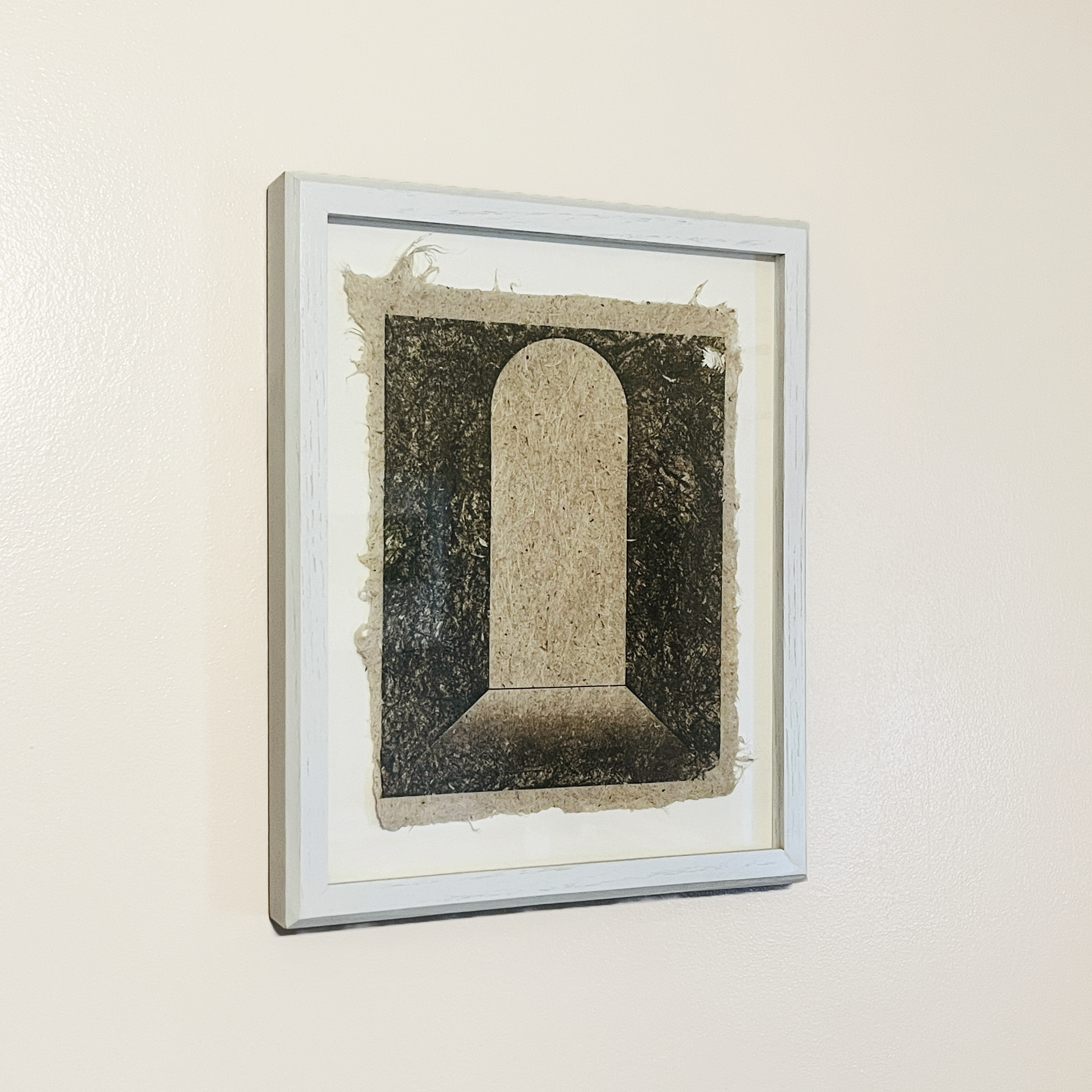
Next to the Sandbothe Mystery Snowball piece is a striking print on handmade Yucca paper by Caleb McMurray. The untitled work features a doorway or aperture, something that McMurray has returned to again and again.
I also have a sister print to this one, but it features an arching opening that is in the distance rather than up close like this one. Windows, doors, and other passageways are features of many of the works I’ve collected over the years.
Lastly, a small painting by Hayley Auxier‘s shares the wall with the two works I’ve shared above. Hayley was one of my stand out undergraduate students, and I love seeing her carry on her artwork as she has since graduating. This piece is one of a series she made celebrating National Parks and celebrating her experiences of them. Hayley shows a strong affinity for gouache, so I’m glad to have an example of her painting in that medium.
Hayley Auxier. Acadia National Park. Gouache on paper. 4 by 6 inches. 2018.
Acadia National Park is special to me because that’s where my partner and I went on our honeymoon all those years ago, so I like the piece because of it’s connection to my own history. But it’s also got a wonderful note from Hayley on the verso, and so the small work feels like it connects all of these different threads of my life: personal, professional, aspirational, and historical. That synergy of references – those that I bring to the work and those the artist embeds within the piece – is what makes art special.
I’m loving seeing these three works every day as I have a meal or hang out with my family. Art that lives with us is the best kind. Really thankful to have these pieces close to me.
This past week I gave a talk for The Honors College at The University of Missouri. The theme this fall was The Art and Science of Living, and they asked me to give a guest lecture about the nature of the body in the context of my work. I chose to focus on a number of artists who have shaped my ideas about the meaning of the body. – from Anne Harris and Robin F. Williams to Kathe Kollwitz and Charles White.
To hear the talk and see all of the artists and images I explore in the presentation, click the link here.
I had the opportunity to sit on a panel at The Columbia Art League on October 12, 2023. Moderated by Diana Moxon and including CAL Executive Director Kelsey Hammond, the wide-ranging talk engaged with a lot of what artists are thinking about in the age of AI. Watch the video below to see a visual presentation of our research, examples, opinions (and humorous asides) as you follow along with the discussion.
Miyoko Ito’s work has such intense gravity for me. In the midst of the high strangeness of our time I find solace in her works.
Miyoko Ito: Heart of Hearts. Installation view, Artists Space, 2018. Photo: Daniel Peréz.
The only major professional goal I have left is to work on an exhibition or book about her work. It is a crime that we have dozens of books on the likes of Richter or Pollock but really only a single TINY volume on Ito – and it’s currently out of print.
Miyoko Ito’s work hanging above the stairwell in the Roger Brown House, Chicago.
I first encountered Ito’s work in person at the Roger Brown House in Chicago in the fall of 1999. I spent a good deal of time roving around the Chicago area to see all the Ito’s that are available in and around the city.
One of my main teachers at the School of the Art Institute of Chicago was Barbara Rossi. Rossi is an incredibly influential artist and educator who knew Ito and impressed me with her own work and her knowledge of the contexts surrounding art making in Chicago.
In 2015 I got close to arranging an exhibition of Ito’s lithographs but could not secure proper funding and loans of works. I’ll try again sometime soon. In that process I began to correspond with Vera Klement, a contemporary of Ito and a paragon of Chicago art. Via email interviews I got some fun backstory on the life and times of Ito, Rossi, and Klement. I’d love to get the chance to explore these artists and their works again.
Miyoko Ito, Island in the Sun, 1978. Oil on canvas, 38 x 33 inches.
The second iteration of an exhibition exploring trends in contemporary abstract art is now on view at Nebraska Wesleyan University’s Elder Gallery. The first version of the show took place last year at The University of Missouri and the exhibition will travel again in 2019 and 2020.
The main change in this 2018 version is that additional artists have been added, moving the roster up to 20 individuals – 13 women and 7 men. The works have also grown in diversity, with more sculpture, assemblage, photography, and fibers works entering the constellation.
Works by Erin King (wall) and Sumire Taniai (on pedestals) appear along the title wall.Two works by Ryan Crotty, a tiny relief fibers piece by Hali Moore, and four digital works displayed on iPads by Sharon Butler.This show centers on the work of Anna Buckner, Sharon Butler, and Gianna Commito. A constellation of 17 other artists appear in this view into contemporary abstraction, and their work incorporates Painting, Drawing, Digital Drawing, Photography, Fibers, Assemblage, Collage, Sculpture, Relief carving, and other forms.
Sarah Arriagada, Anna Buckner, Sharon Butler, Gianna Commito, Ryan Crotty, Joel T. Dugan, Dan Gratz, Michael Hopkins, Erin King, Kristen Martincic, Marcus Miers, Hali Moore (Oberdiek), Justin Rodier, Elise Rugolo, Amanda Smith, Lauren Steffens, Sumire Taniai, Jm Thornton, and Jennifer Ann Wiggs have work in this exhibition. Click on their names to see their websites and find out more about their work.
Three works by Gianna Commito engage with three works by Amanda Smith in this view of the exhibition.
As you can see from the exhibition listing at NWU’s website, I’ll be at the gallery on December 7 to talk about the show and answer questions. I’ll also spend some time meeting with students and engaging with the school community. I love the chance to spend time in the space with the work and field questions in the moments of viewer experience. The works are meant to be seen, interpreted, and extrapolated.
Three collaborative works – collectively a “Curator’s Statement” – by myself and Joel T Dugan are seen here on the left. A wonderful dimensional graphite and folded paper drawing by Marcus Miers and two sculptures by Lauren Steffens continue to the right.This wall, featuring tight formations by Sarah Arriagada and Kristen Martincic, is one of my favorite views of the show.
These few views can’t really give you a true impression of the show. I hope if you’re nearby you’ll stop in. My efforts to curate interesting collections of works are definitely becoming more and more important to me as an artist and educator. Particularly, with an exhibition such as this one, I am afforded the chance to expand and contract a specific intellectual and aesthetic gesture. I find that tremendously exciting. This iteration of the Restraint and Limitation show is probably the most expansive version that will happen, so it’s intriguing to sense how constrained it still feels. I am passionate about small works that distill meaning and experience, defying long-held notions about what art is supposed to do.
Three amazing fiber works by Anna Buckner hold a wall next to a strangely evocative photographic/found object assemblage by Justin Rodier.
To close out this announcement post, here’s the bit of writing I had affixed to the title wall:
The logic of abstraction cannot be reduced to a few dudes painting in mid-20th century America. This exhibition is meant to present another view. Anna Buckner, Sharon Butler, and Gianna Commito, the three core artists presented here, show commitment to the aesthetics and procedures inherent in abstract painting while bringing diverse pressures, materials, and processes to the form.
Examples of various line manifestations from my foundations drawing course.
I’ve taught hundreds and hundreds of students beginning observational drawing methods for over a decade at Mizzou. This is something I’ve been stimulated, encouraged, and challenged by. It’s wonderful to be a part of an ancient tradition.
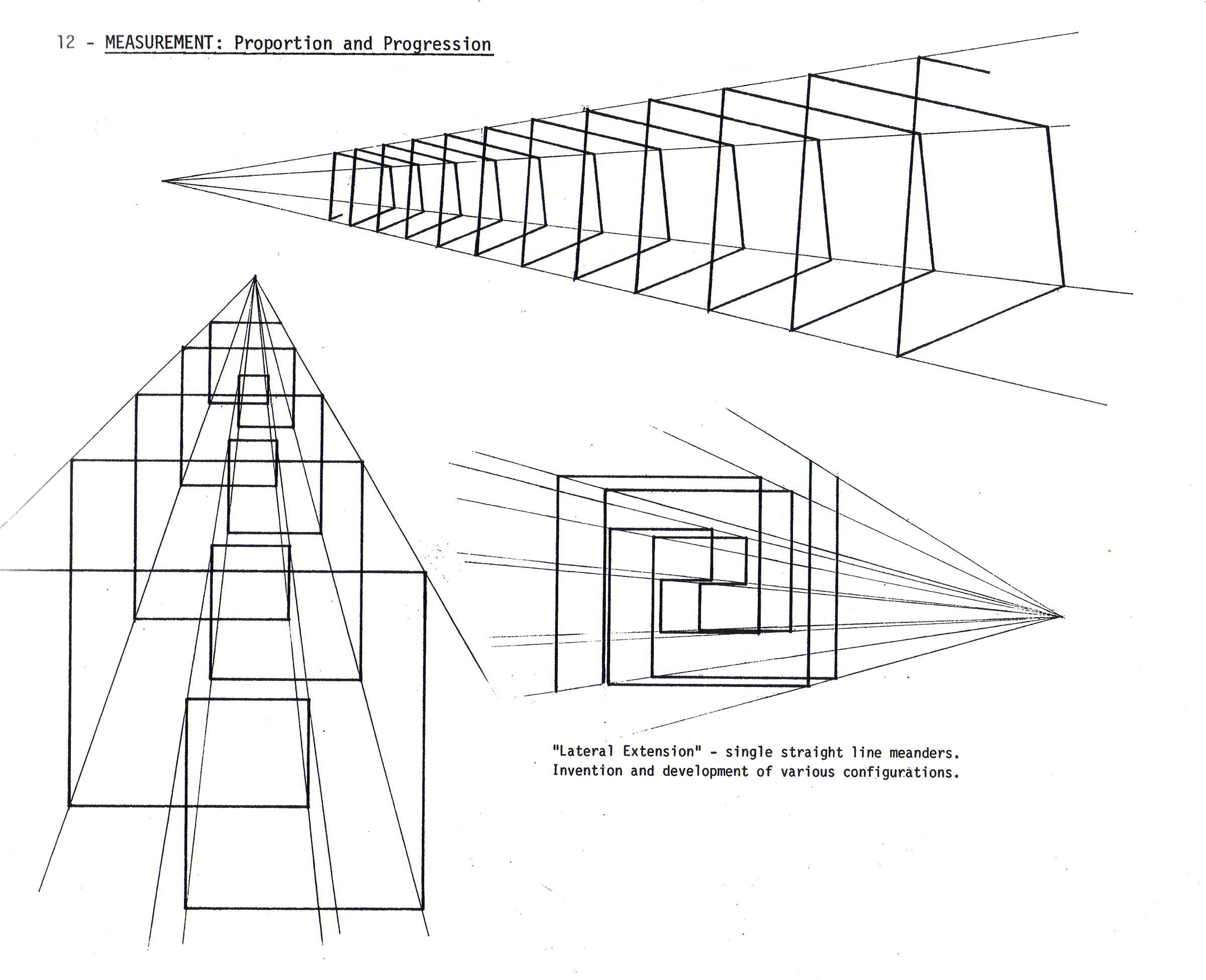
One of the main points of the first few weeks of my Drawing: Materials and Methods course (foundations level drawing for beginning students) is the notion that line, in and of itself, doesn’t make an illusion of space (fig. A). Rather, value – the quality of light and dark – creates a perception of space (fig. B, C). To develop value we accumulate lines, adjust pressure on the tool, or blend the material with which we’re drawing (among other actions) in order to attenuate or amplify the line quality. The coalescing lines form a varied superstructure representing – in 2D form – the perception we have of 3D space (fig. D). These and many other lessons are certainly intuitive and, though they are not an exclusive method, do help novices recognize space and how to translate it. The first few drawings my students make are centered around these concepts. It was Professor William Itter’s Fundamental Studio Drawing text that I used in developing my own pacing, scope, and sequence in the teaching of Beginning Level drawing.
At Indiana University, Itter was a strong force. Having taught there for more than 35 years when he retired in 2009, Bill crafted and then honed a foundational drawing system that influenced me and many of my fellow grads. Over the years a number of the projects he either developed or adapted have been a part of my teaching. In particular, I have been inspired by his Cornice Combo and Linear Topographic Contour projects. Most of us ended up with physical copies or PDF prints of Bill’s collection of projects and syllabus materials (pictured above).
I think you can see the through-line of intention when you see Bill’s project examples and compare them to what I do in class. While I no longer directly reference Professor Itter’s text, it is a strong part of the pedagogical lineage I claim as an educator. Below you can see some of Itter’s Radial and Lateral Extensions, which were influential in my own Atmospheric Beams project.
Atmospheric Beams by Robert McAnelly. 18×24 inches.
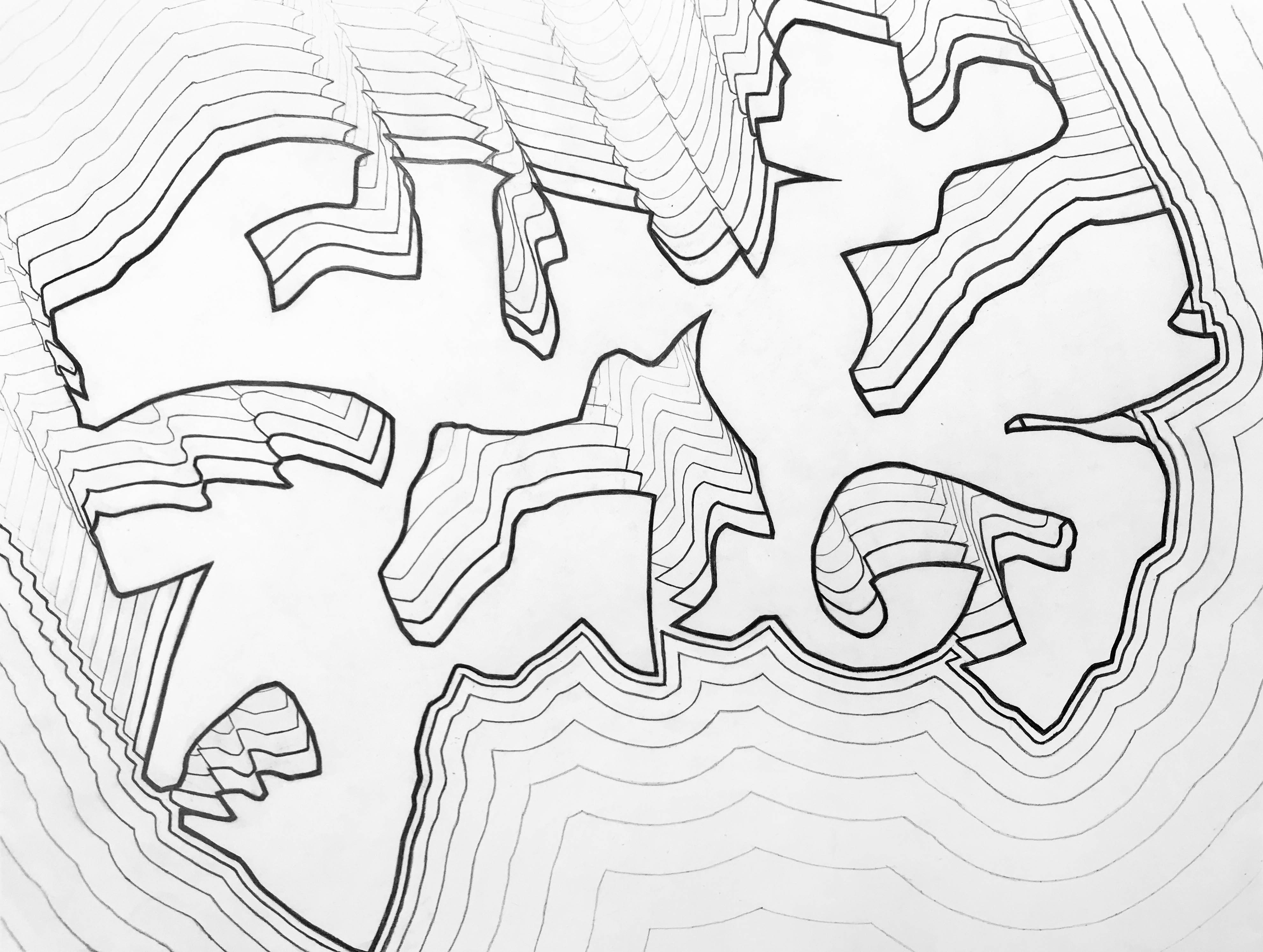
Of all of the various projects crafted by Bill that I used back in the early days, only three are truly and deeply connected to my foundations drawing teaching today. Of primary importance is Meandering Band, as well as the aforementioned Atmospheric Beams. You can see that Professor Itter’s example images are still being reiterated through time in the work of my students.Notice how this Cornice Combo image relates to my recent students’ Meandering Band works:
Meandering Band by Hannah Westhoff. 18×24 inches, graphite on paper.
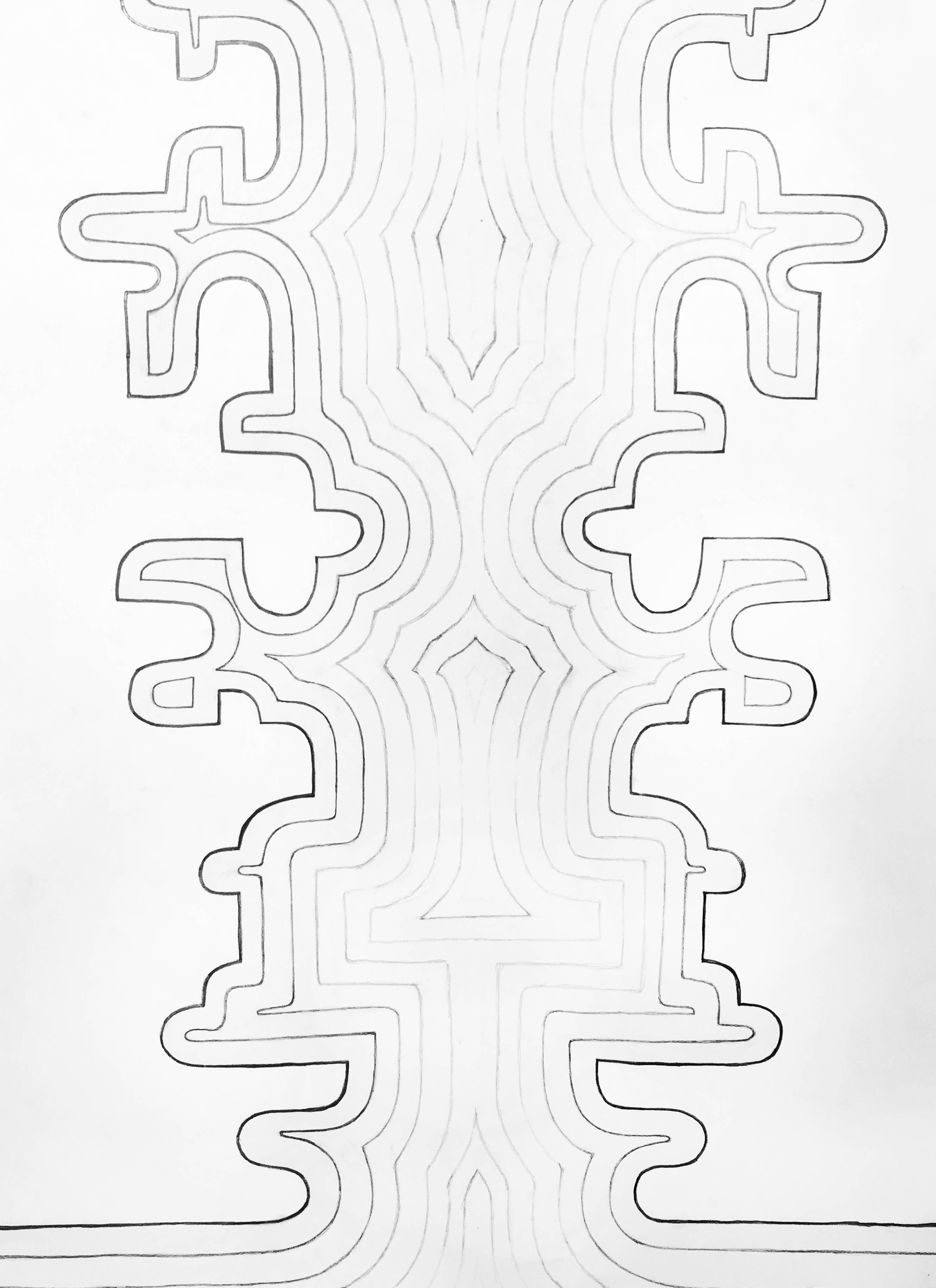
Professor Itter used many examples of gradients in his projects, and he began by asking students to conceptualize line quality through the idea of space and physical pressure upon the tool (at least that’s how I integrated his ideas into my thinking). So sample studies from Itter such as this one (which I use as a first class ice breaker project)…
…translate into more formal Meandering Band works such as this:
Meandering Band by Katie O’Russa. 18×24 inches, graphite on paper.
…or this:
Meandering Band by Seth Steinman. 24×18 inches, graphite on paper.
My ultimate aim in carrying on a very truncated version of Bill’s foundational drawing projects is really an attempt to establish the importance of observational iteration in my classes. All of my classes are, at their deepest center, about attention and awareness. My hope is that continuing to use a few of Professor Itter’s projects my students gain an understanding of what their eyes are doing in the world. The way we amalgamate visual and material structures into meaningful ideas is part of what makes us human. Now that we are living in an age where algorithms designed to manufacture our purchasing consent drive much of our cultural events and expressions, it is so important to grow in our awareness of how we are being manipulated by these systems. This understanding begins with a knowledge of visual dynamics and the ability to take command of how our eyes operate. I think Itter knew this when he created his foundational drawing projects, and I try to bring that tradition of thoughtfulness into the 21st century.
Chris Hall – Thrustmasters. Oil on panel, 7×10 inches, 2012.
Chris Hall is a great guy. He’s a solid dude. He’s easy to get along with, to talk about Dune with, to consider the pros and cons of kayfabe with, and to think about art with. Back in 2011 Chris came into the MFA program at Mizzou and quickly stood out. Not only was he a good painter with interesting ideas, he was also willing to let his assumptions go to grow. His thesis work was among the strangest and most unique I’ve had the privilege to see. Check out his ongoing work at his website.
Chris has the unique ability to draw out both mirth and serious, intense thought in those around him. I’ve loved partying with him over the years, and I look forward to more fun in the future.
Above: Chris as Nosferatu and me as Igor in a drawing I made… this is how we party, people. Ballou digital drawing, 2017.
I have two artworks from Chris in my home. The first, Thrustmasters, is at the top of this post. And here is an untitled fridge interior from around the same time – 2012 or 2013, just as Chris was moving into his Thesis work.
Chris Hall- Untitled Fridge Interior (Vampiric Food). Oil on panel, 7×10.5 inches, 2013.
Chris is one of my favorite subjects for illustration (I’ve drawn caricatures of my friends, family, and students for many years). Not to be outdone, Chris had me pose for a number of his paintings early on, and those sessions are some of my favorite moments in academia!
Me posing for Chris… meme-ified.
Chris shaking his groove thang… Ballou digital drawing, 2016.
Lauren Steffens’s floor piece, Rugolo’s encaustic work, and Gianna Commito’s sharp-edged abstraction in the exhibition.
It is a spare, economically arranged show. It’s openness grew out of my musings on abstraction of all sorts. I have long felt that bigger is not really better when it comes to abstraction, and I set out to bring together just a few examples of works that do this. Here is my curatorial statement for the show (a text/painting pair) with a number of shots of the installation interspersed. There will be a catalog of this exhibition available soon.
Detail shot of Ballou’s Curator’s Statement.
Curator’s Statement for Restraint and Limitation
Contemporary abstraction is a huge, multifaceted project. From Katharina Grosse, Julie Mehretu, or El Anatsui to Cordy Ryman, Odili Donald Odita, or Amy Sillman, the range of potential and diversity of referent available to artists is obvious.
There are no clear boundaries, no distinct definitions that provide a unified perspective on the practice of abstract painting. That contemporary abstraction utilizes the history, physical interactions, and conceptual structure of painting is axiomatic. Yet to suggest that it is limited to the realm of painting is a dramatic misunderstanding.
Detail of Anna Buckner’s Dutch Still Life.
The old discourse that endlessly returns to the interplay between abstraction and representation has lost any potency to report on what is actually happening in much of contemporary abstraction. With this exhibition, I hope to present a sliver-like view into the modes of abstraction that intersect with painting as a form and which, in unique ways, demonstrate the limitations of depiction and representation to clarify the kinds of experiences that abstraction affords us. I also seek to show how smaller works may defy the conceit that abstraction is most powerful in its more monumental expressions.
The three primary artists here are women from different stages of their careers. They show commitment to the aesthetics and procedures inherent in painting practice today, yet bring diverse pressures to the form. Buckner – a newly minted MFA – pieces scraps of fabric into small, taut grid fields. Butler – with decades of art making and writing behind her – brings us small digital drawings created on her iPhone. Commito – a mid-career educator and artist with broad impact – focuses on sharp geometries and wonderful chromatic synergies. Their influences – ranging from post-paint materiality to provisionality to traditional hard-edged painting – form an invigorating view into a restrained yet evocative corner of artmaking.
Detail of an Elise Rugolo work.
Grouping of Wiggs pieces, with Commito off to the right.
Post Script ~
I was particularly excited to have Butler in this exhibition – ten years ago we participated in an online “shared critique” event that took place on the now defunct Thinking About Art blog. I was writing about the work of someone else, but Butler was assigned to write about one of my paintings. I thought her response sharp, knowledgeable, and strong. Though she did seem to dismiss that work, I was pleased to have her voice address my art making, and I have followed her closely ever since. Her art making, writing, and blogging – especially with the influential site Two Coats of Paint – are important. I’m really glad to have be a part of this.
Another view of the installation of Butler’s works.


 Meandering Band by Hannah Westhoff. 18×24 inches, graphite on paper.

 Chris Hall – Thrustmasters. Oil on panel, 7×10 inches, 2012.
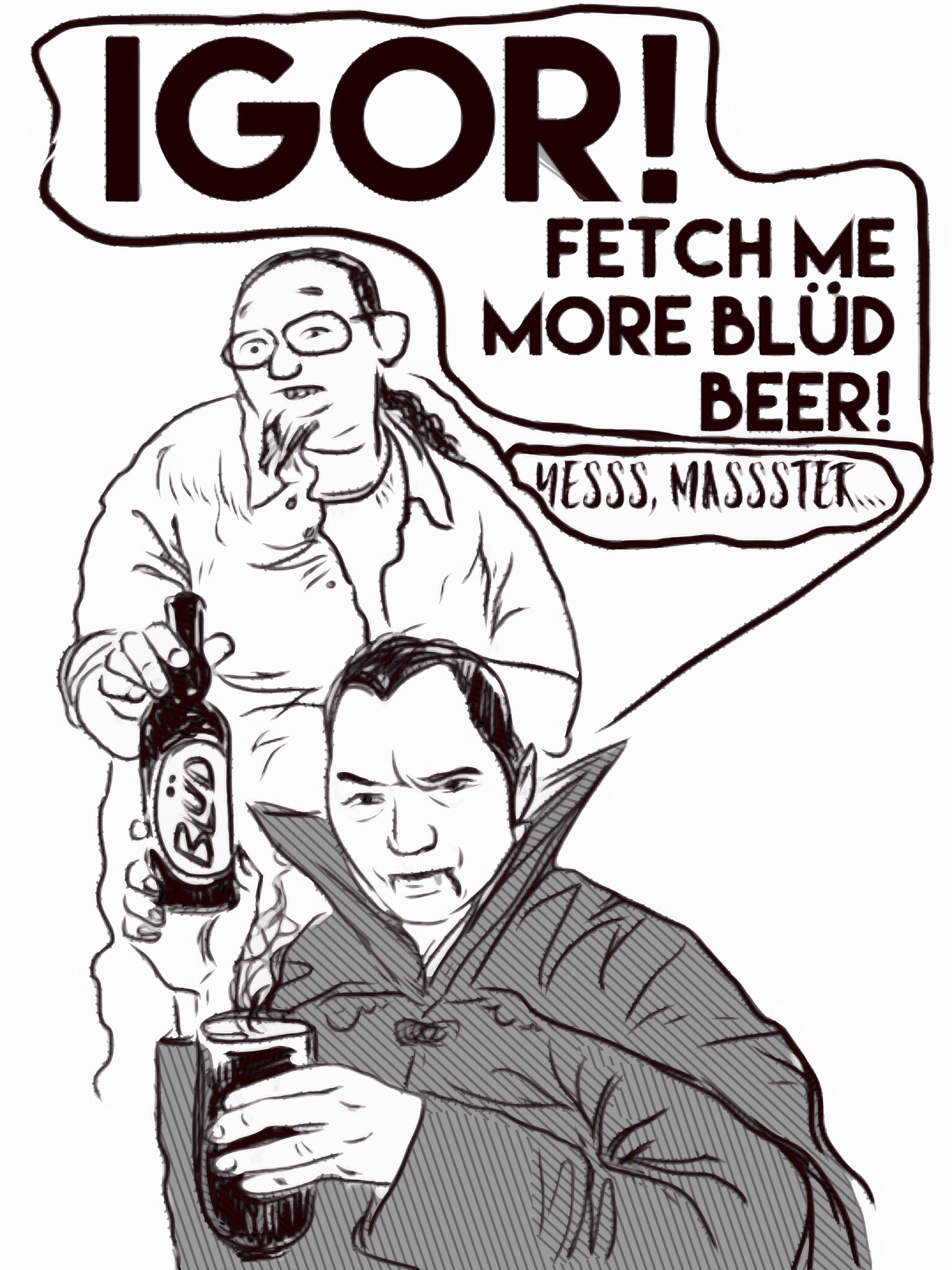
 Chris Hall- Untitled Fridge Interior (Vampiric Food). Oil on panel, 7×10.5 inches, 2013.
 Me posing for Chris… meme-ified.