Mark Staff Brandl Is On To Something

I’ve been following Dr. Mark Staff Brandl for quite a while now. I particularly enjoy his Dr Great Art podcast, which has, of late, begun to feature some ideas from chapters of his forthcoming book (to be published by Bloomsbury).

Two current works in progress.

His most recent podcast episode, linked below, definitely intrigues me and syncs up with a lot of the ways I’ve been thinking over the last couple of decades. Specifically, my wheneverWHEN and An Ensign For Miyoko Ito works are borrowing significantly from the kinds of ideas Professor Brandl is elucidating. My 2019-2020 collaboration with Joel T. Dugan, Phoneme, also deals with some of this.

An Ensign For Miyoko Ito (#16). Ink on paper, 12×10 inches, 2018. Private collection.

This is how I talk about some of the motivational ideas for these series of works:

“…I seek out the compacted and the overdrawn; the enclosed and the layered; the transformed and the solidified. I look for shapes, colors, and spaces that go far beyond a simple tension between figuration and abstraction, trying instead to suggest a layered arena of observational and haptic information.

Miyoko Ito (Japanese-American, 1918-1983) – whose work has been a key influence on me over the last 20 years – was able to activate subtle surfaces with the illusion of space and an evocative sense of palpability. This is what I’m investigating: the experience of perception apart from particular, representational depiction. In my exploration, questions arise: Does flat form appear to move away from my angle of view? Will color resolve into both static surface and suggested movement? Can space and color align to reinforce both static structure and an expression of time? Might the poetics of silent, unmoving images actually produce phenomena akin to those found in dreams, memories, ecstatic sensations, and atemporal musings?”

Take a listen to the Dr Great Art podcast and see if maybe some of the things I’m saying resonate with how Dr. Brandl is thinking:

While there are many points Brandl brings up that are worth exploring (I greatly anticipate getting to read his book once it comes out), I find myself particularly drawn to the explications he makes regarding ambiguity and conceptual blending. In these areas he distills and clarifies a number of philosophers and intellectual traditions into something artists can really wrap their minds – and artworks – around.

WHENEVERwhen (Michigan), inks on paper, 10×7 inches, 2018. Collection of the Artist.

Beyond the artists he references in his text, I think that there are a few more that very strongly connect with Mark Staff Brandl’s ideas, particularly Marcelo Bonevardi, Nicholas Byrne, Diebenkorn, Vincent Fecteau, Magalie Guérin, Miyoko Ito, and Kyle Staver, among others.

It’s exciting for my own passion for these artists to dovetail with the serious scholarship that Dr. Brandl is bringing forward. I know that I’ll be incorporating concepts from his book into my teaching for years to come. I hope you’ll join me in listening to the podcast and exploring what these ideas can mean for making and experiencing artworks.

Miyoko Ito

Miyoko Ito’s work has such intense gravity for me. In the midst of the high strangeness of our time I find solace in her works.

Six paintings are hung on white walls at eye level. The paintings contain muted and vibrant warm colors depicting abstract shapes.
Miyoko Ito: Heart of Hearts. Installation view, Artists Space, 2018. Photo: Daniel Peréz.


The only major professional goal I have left is to work on an exhibition or book about her work. It is a crime that we have dozens of books on the likes of Richter or Pollock but really only a single TINY volume on Ito – and it’s currently out of print.

Here is a review of the last major exhibition of her work: Light Effects: On Miyoko Ito’s Abstract Inventions, from The Paris Review, 2018. The most significant exhibition exploring Ito was mounted in 2012 at Veneklasen Werner in Berlin. Go here for a great selection of exhibition shots.

Miyoko Ito’s work hanging above the stairwell in the Roger Brown House, Chicago.

I first encountered Ito’s work in person at the Roger Brown House in Chicago in the fall of 1999. I spent a good deal of time roving around the Chicago area to see all the Ito’s that are available in and around the city.

One of my main teachers at the School of the Art Institute of Chicago was Barbara Rossi. Rossi is an incredibly influential artist and educator who knew Ito and impressed me with her own work and her knowledge of the contexts surrounding art making in Chicago.

In 2015 I got close to arranging an exhibition of Ito’s lithographs but could not secure proper funding and loans of works. I’ll try again sometime soon. In that process I began to correspond with Vera Klement, a contemporary of Ito and a paragon of Chicago art. Via email interviews I got some fun backstory on the life and times of Ito, Rossi, and Klement. I’d love to get the chance to explore these artists and their works again.

Gradient red and green, curved and cusped shades. A red pointed mound sits atop a pale green inverted triangle inside angular red and green rectangles.
Miyoko Ito, Island in the Sun, 1978. Oil on canvas, 38 x 33 inches.

Restraint and Limitation at Nebraska Wesleyan University

The second iteration of an exhibition exploring trends in contemporary abstract art is now on view at Nebraska Wesleyan University’s Elder Gallery. The first version of the show took place last year at The University of Missouri and the exhibition will travel again in 2019 and 2020.
The main change in this 2018 version is that additional artists have been added, moving the roster up to 20 individuals – 13 women and 7 men. The works have also grown in diversity, with more sculpture, assemblage, photography, and fibers works entering the constellation.
Works by Erin King (wall) and Sumire Taniai (on pedestals) appear along the title wall.
Two works by Ryan Crotty, a tiny relief fibers piece by Hali Moore, and four digital works displayed on iPads by Sharon Butler.

This show centers on the work of Anna Buckner, Sharon Butler, and Gianna Commito. A constellation of 17 other artists appear in this view into contemporary abstraction, and their work incorporates Painting, Drawing, Digital Drawing, Photography, Fibers, Assemblage, Collage, Sculpture, Relief carving, and other forms.
Sarah Arriagada, Anna Buckner, Sharon Butler, Gianna Commito, Ryan Crotty, Joel T. Dugan, Dan Gratz, Michael Hopkins, Erin King, Kristen Martincic, Marcus Miers, Hali Moore (Oberdiek), Justin Rodier, Elise Rugolo, Amanda Smith, Lauren Steffens, Sumire Taniai, Jm Thornton, and Jennifer Ann Wiggs have work in this exhibition. Click on their names to see their websites and find out more about their work.
Three works by Gianna Commito engage with three works by Amanda Smith in this view of the exhibition.
As you can see from the exhibition listing at NWU’s website, I’ll be at the gallery on December 7 to talk about the show and answer questions. I’ll also spend some time meeting with students and engaging with the school community. I love the chance to spend time in the space with the work and field questions in the moments of viewer experience. The works are meant to be seen, interpreted, and extrapolated.
Three collaborative works – collectively a “Curator’s Statement” – by myself and Joel T Dugan are seen here on the left. A wonderful dimensional graphite and folded paper drawing by Marcus Miers and two sculptures by Lauren Steffens continue to the right.
photo-oct-25-6-34-55-pm.jpg
This wall, featuring tight formations by Sarah Arriagada and Kristen Martincic, is one of my favorite views of the show.

These few views can’t really give you a true impression of the show. I hope if you’re nearby you’ll stop in. My efforts to curate interesting collections of works are definitely becoming more and more important to me as an artist and educator. Particularly, with an exhibition such as this one, I am afforded the chance to expand and contract a specific intellectual and aesthetic gesture. I find that tremendously exciting. This iteration of the Restraint and Limitation show is probably the most expansive version that will happen, so it’s intriguing to sense how constrained it still feels. I am passionate about small works that distill meaning and experience, defying long-held notions about what art is supposed to do.
Three amazing fiber works by Anna Buckner hold a wall next to a strangely evocative photographic/found object assemblage by Justin Rodier.
To close out this announcement post, here’s the bit of writing I had affixed to the title wall:
The logic of abstraction cannot be reduced to a few dudes painting in mid-20th century America. This exhibition is meant to present another view. Anna Buckner, Sharon Butler, and Gianna Commito, the three core artists presented here, show commitment to the aesthetics and procedures inherent in abstract painting while bringing diverse pressures, materials, and processes to the form.

 – Matthew Ballou, October 2018.


Photos in this post are by Michael Larsen.

Statement for a new exhibition of WHENEVERwhen works, January 2018

Note: I’m getting the opportunity to show a new group of WHENEVERwhen pieces right off the bat in 2018. Here is my statement for the exhibition, with a few of the works interspersed within the text. I’ve enjoyed some wonderful experiences at Sager Braudis Gallery over the years, and this is the high point. I’m pleased with their installation and think the work looks great there. Of course, I’m biased. I’d love to hear what you think. You can see some gallery information here.

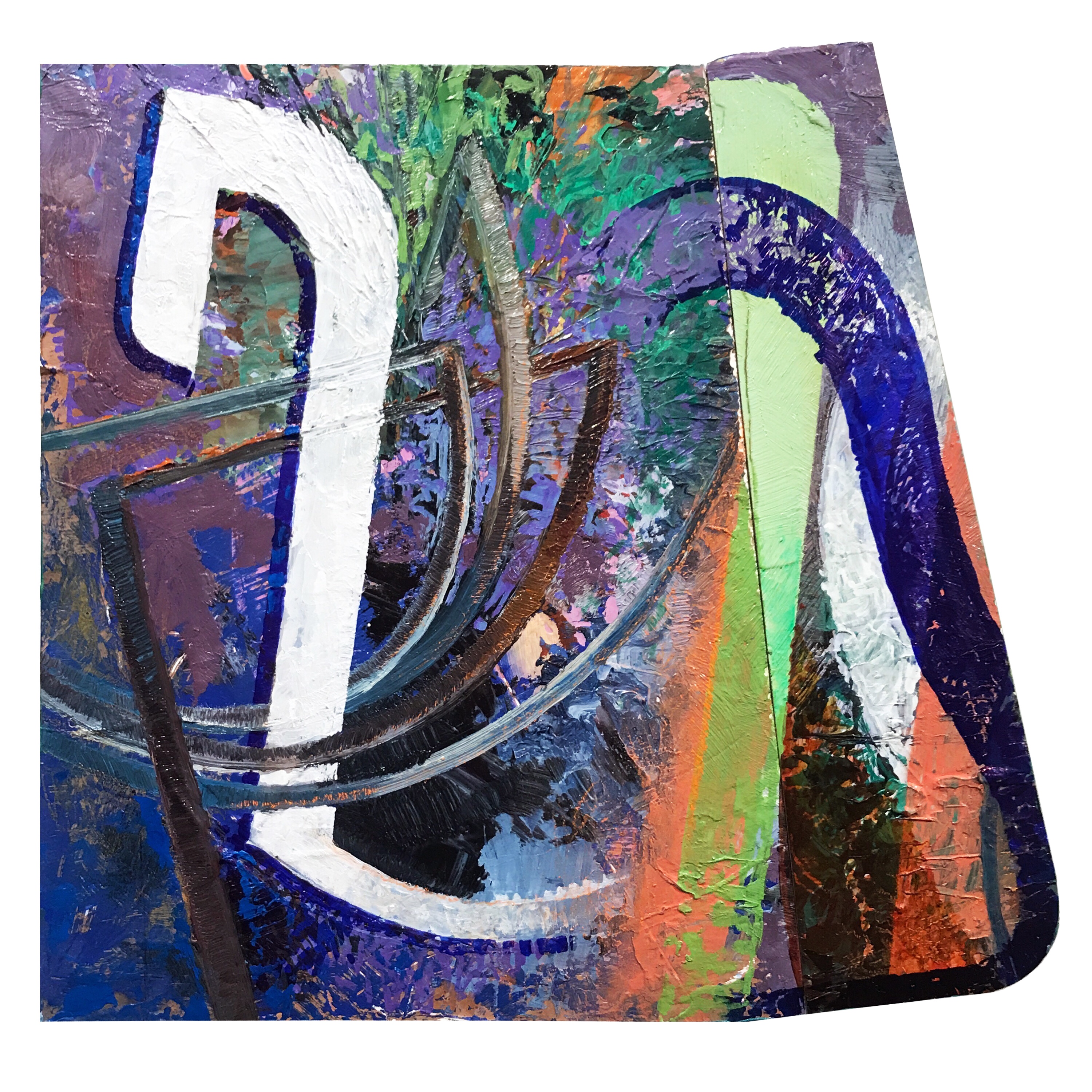
Splint – Oil on panel with custom oak frame. 2015-2017.

For more than twenty years, my painting, drawing, and printmaking have oscillated between symbolism-heavy representational imagery and formal explorations in the tradition of 20th century abstraction. This seemingly broad swing of subject and purpose in my work is directly related to my conviction that the core visual dynamics of either mode are, essentially, the same. I often tell my students that I’ve been making the same picture for my entire artistic life.

Sometimes I have felt led to apply those underlying compositional forces to the service of representational imagery, and other times I have felt the need to strip away everything but color, material, and surface. When I pursue abstraction, the resulting work is a foray into perceptual and physical experience. Thus, even though the works do not depict discernible objects, they are still – to me – realist in the sense that they focus on observational and haptic (sense of touch) phenomena. Conversely, my representational paintings are always abstract inquiries into the nature of meaning, purpose, and human engagement.

Periodically, when the communication of abstract, metaphorical ideals feels incongruous to me, I move intuitively into abstraction. The last time this shift occurred was about two years ago. I was coming out of a long period of working exclusively in the tondo format and had begun to readdress the rectilinear format standard to most painting and drawing. I had rejected it previously because it felt too much like a window or door space. I was looking to depict my ideas in some other form of oculus, something more subjective and mysterious. I started, in sketches and digital studies, to break the picture plane in a number of specific ways. These breaks were related to the work and ideas of artists such as Magalie Guerin, Vincent Fecteau, and Marcelo Bonevardi (among others). I was also greatly influenced by my research into Eastern and Western mandala forms as well as the newer generations of digital painting and drawing apps I was using.

Then, at age 39, I had a heart attack.

The near-death I experienced purged my interests. Though I have completed a few straight representational works since that cardiac arrest in February 2016, the vast majority of my work has focused on a series of abstract investigations I call WHENEVERwhen. In the WHENEVERwhen series I deploy an array of formal strategies that accumulate over time and leave a record within the work. These strategies are diverse; they might function in terms of simultaneity of form – for example, an area may appear to manifest as both light and solid structure – or display a counterintuitive sense of weight and balance. I have also incorporated a significant amount of collage, relief cutting, carving, and digital prototyping into my working methods.

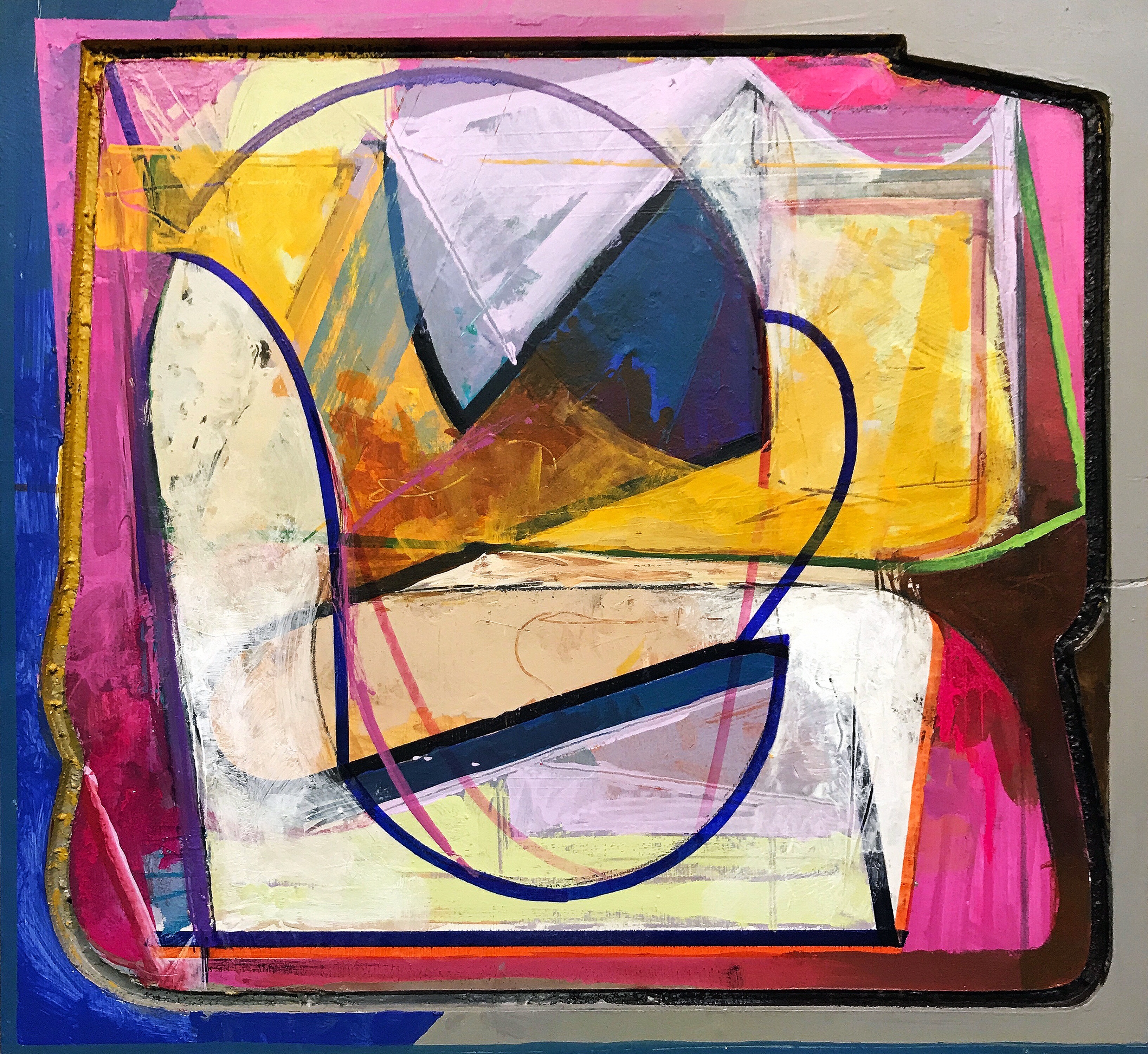
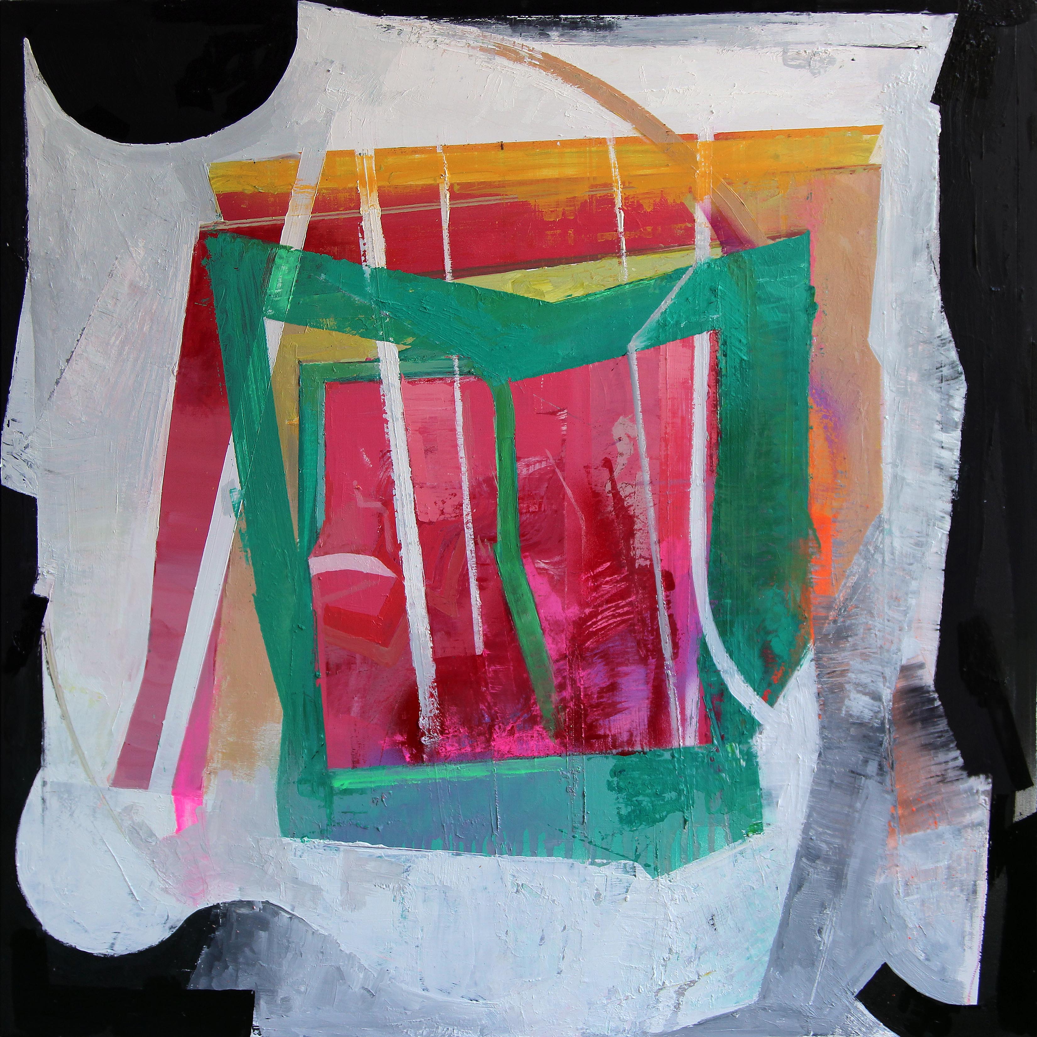
Icon Eikon – Oil, acrylic, marker, and spray-paint on shaped panel. 2016-2017.

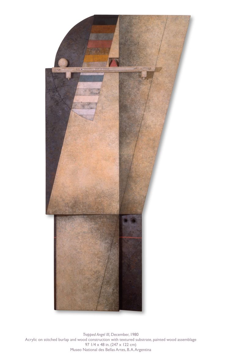
Another significant development of the WHENEVERwhen series was my use of shaped surfaces and disrupted framing. I have been obsessed with making frames a part of the work for many years. At first I used clean, minimal float frames. More recently the frames both hold the work and are painted on or defied in specific ways – often through cutting and reassembly – in order to fit them into the pictorial language of the work. This integration of the frame is important to the sense of edge, continuity/discontinuity of the visual field, and aesthetic structure I seek. A number of my WHENEVERwhen works are framed in vintage oak reclaimed from old church pews and University of Missouri drawing desks. This 50 to 70 year old wood adds a density that corresponds to the surfaces and textures comprising my work.

The WHENEVERwhen series is serving as a kind of pivot within my life as an artist. I am bridging influences across history and media in ways I have not done in the past. I am pushing through old modes of working and thinking. My proclivities are both affirmed and challenged. My assumptions are acknowledged, and either used or left aside. Of course, this pivoting is also happening in the paintings, drawings, and prints themselves. Somewhat disheveled and awkward, yet bursting with chromatic beauty, these works are artifacts of aesthetic exploration, distillations of influence, and tributes to rigorous play.

Matthew Ballou – December 2017

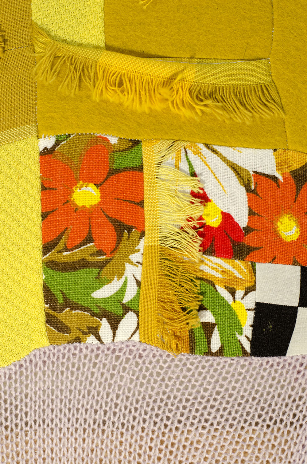
A la Lutes – Acrylic, gouache, Sharpie, and graphite on relief structure. 2015-2017.

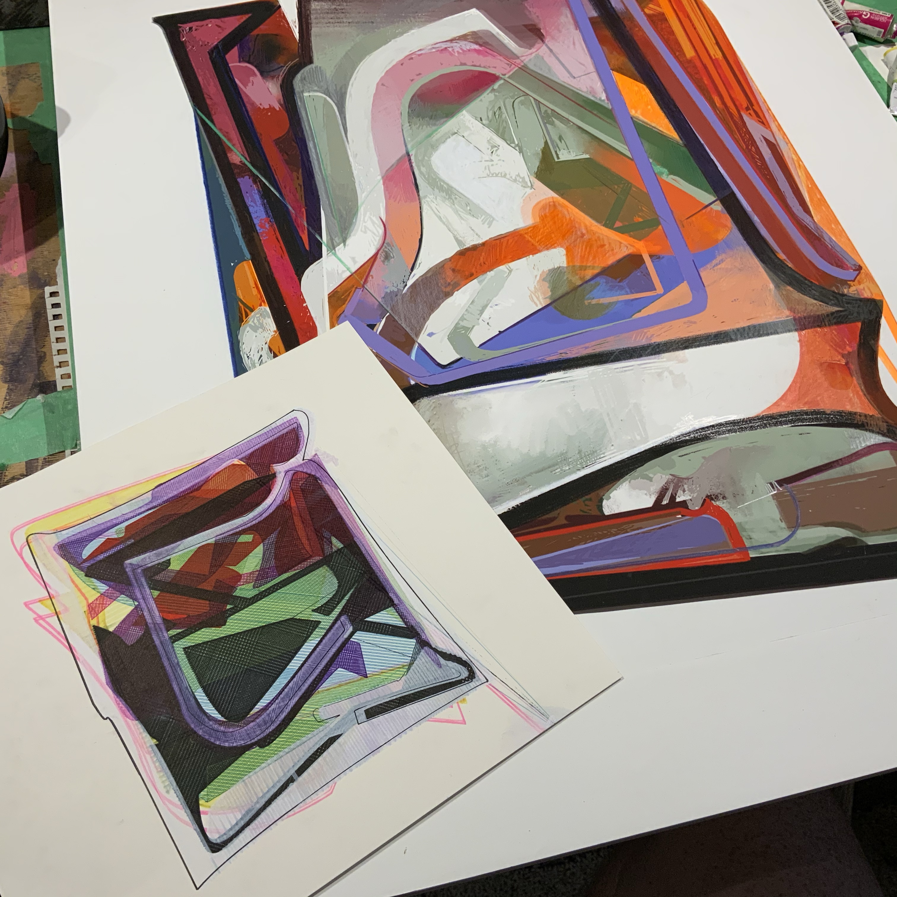
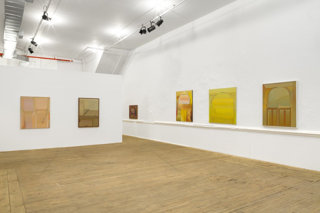
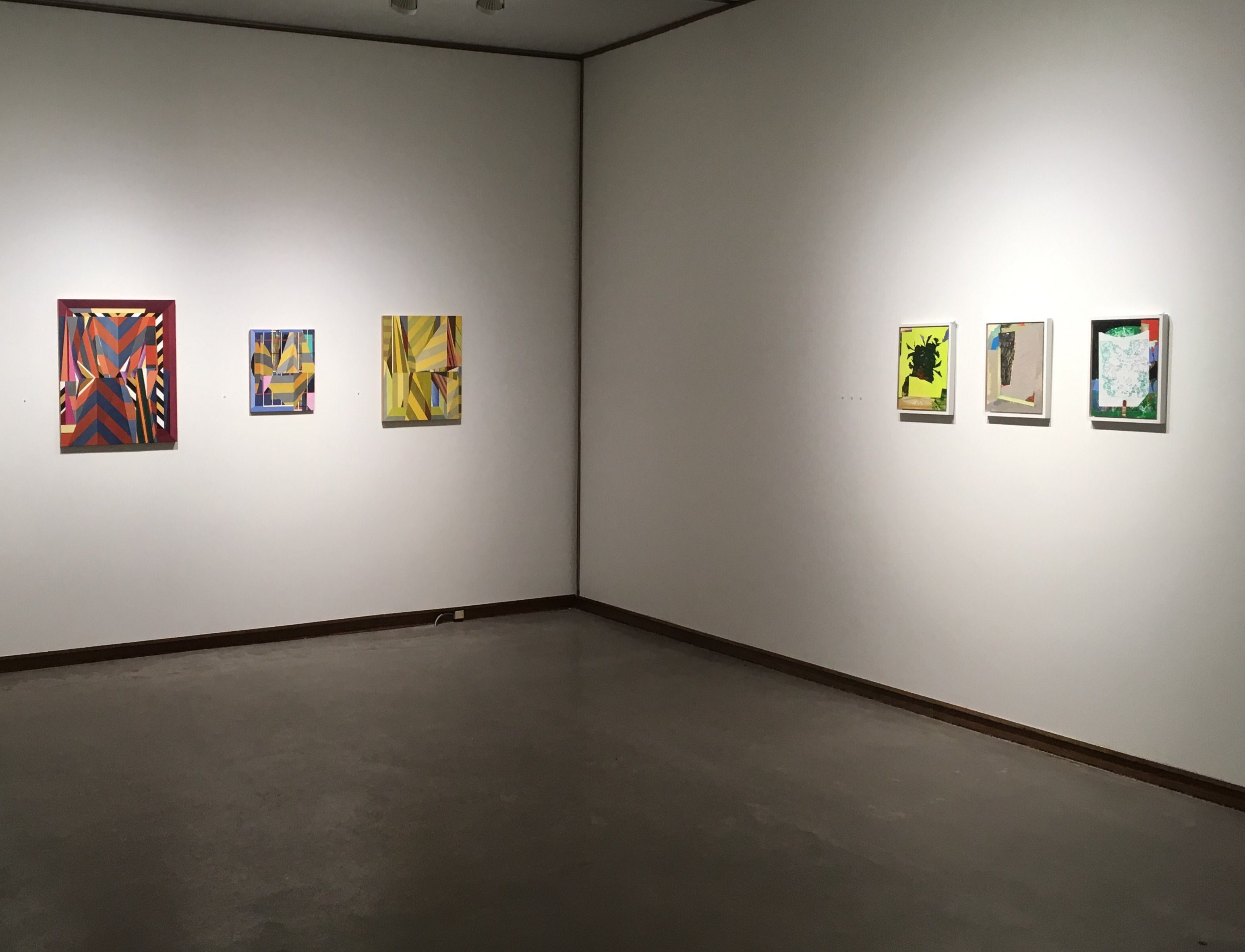
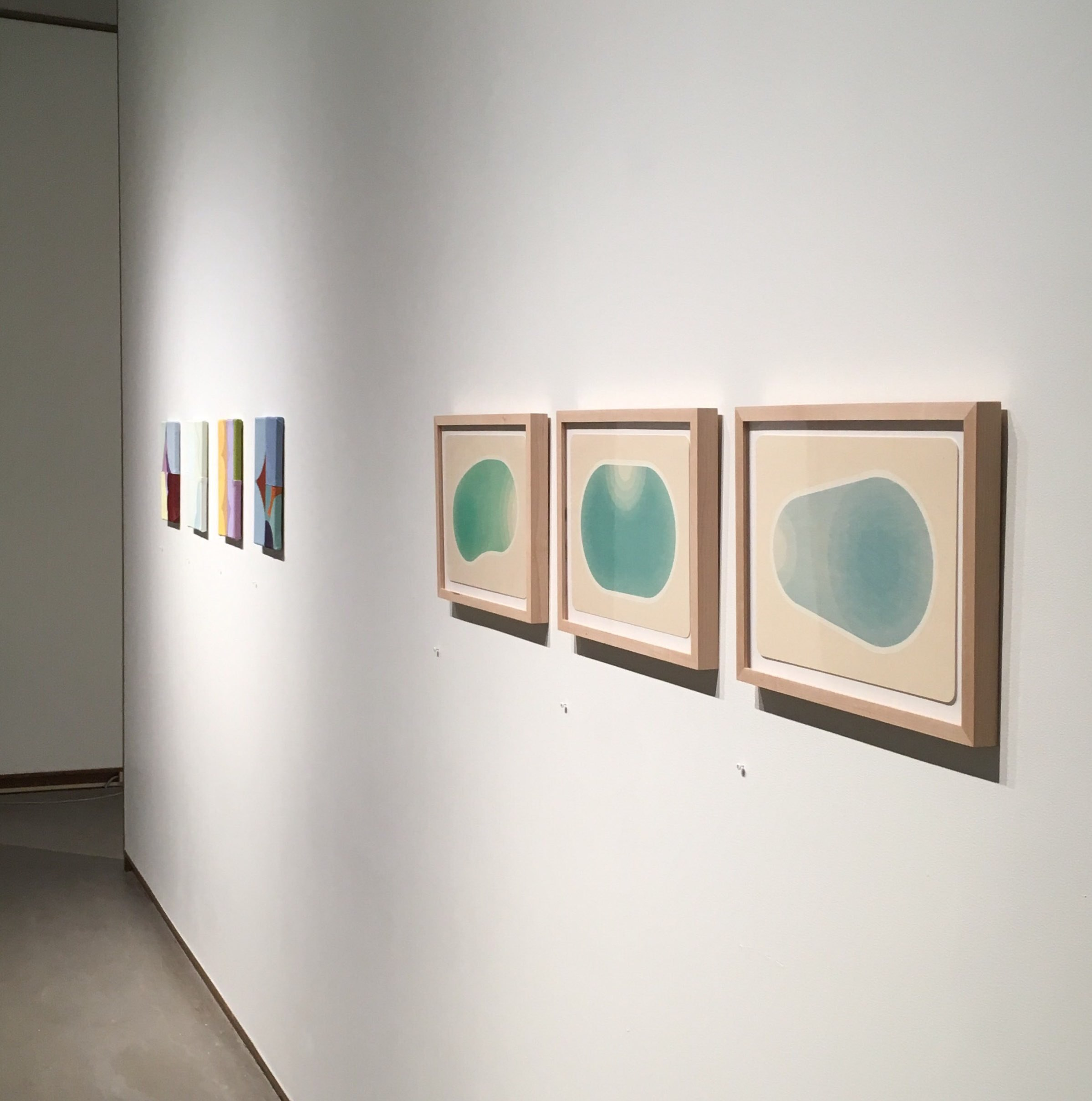
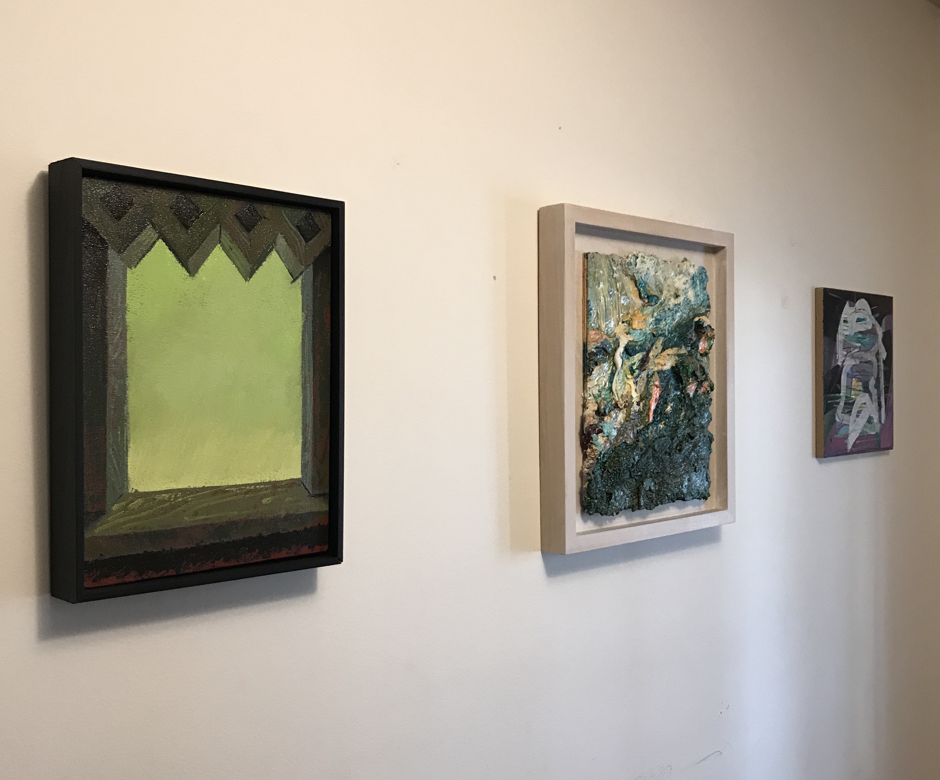
Here are some installation shots of some of the work… I hope you can come and see the work before the show closes at the end of January.

img_0259img_0262img_0261img_0260


The Ballou Collection – Borovicka, Gealt, Ballougan

Last year I started a periodic series about artworks that I’ve collected – through purchase, gifting, or exchange – over the years. I’ve been thinking of moving some art around in our home recently, so I gathered up a couple nice pieces that I have gotten – one very recently – and put them together with one of the collaboration pieces I made with Joel T. Dugan.

Here they are – A wonderful Joey Borovicka window painting that I got just this past month, a thick Barry Gealt work of juicy saturation, and that collaboration piece that Joel and I made. I really think they hang well together. A little song at the front door of our home.

Here’s a nice detail of the Borovicka piece, entitled 4 Minus 3 Equals zero. Check out Joey’s wonderful Instagram feed for lots more of this enigmatic, compelling work. Below is a close shot of the Barry Gealt piece Waterfall III. Barry is one of the most important people in my life. He has an influence within me that is almost unparalleled. There are perhaps only 6 other voices that guide me more than his has.

Finally, the collaboration piece with Joel – Pile. Joel and I are in the midst of a collaboration of nearly a half decade at this point. We’ve been recouping recently, digging in for another push. With a number of shows together and a collection of roughly 40 works, our partnership has been a long term joy ride into the space between understanding and complete mystification. It’s been powerfully transformative for me.

So there it is. Another installation of The Ballou Collection. Hopefully I’ll get back around to it before another year has passed. Buy art, people! Fill your spaces with art from people you KNOW and CARE about!

Restraint&Limitation Exhibition at Mizzou

I have curated an exhibition at the George Caleb Bingham Gallery at the University of Missouri called Restraint&Limitation. This show features the work of Anna Buckner, Sharon Butler, and Gianna Commito, along with some people with connections to Columbia, Missouri – Hali Oberdiek, Jessica Thornton, Elise Rugolo, Lauren Steffens, and Jennifer Ann Wiggs.

Lauren Steffens’s floor piece, Rugolo’s encaustic work, and Gianna Commito’s sharp-edged abstraction in the exhibition.

It is a spare, economically arranged show. It’s openness grew out of my musings on abstraction of all sorts. I have long felt that bigger is not really better when it comes to abstraction, and I set out to bring together just a few examples of works that do this. Here is my curatorial statement for the show (a text/painting pair) with a number of shots of the installation interspersed. There will be a catalog of this exhibition available soon.

Detail shot of Ballou’s Curator’s Statement.

Curator’s Statement for Restraint and Limitation

Contemporary abstraction is a huge, multifaceted project.  From Katharina Grosse, Julie Mehretu, or El Anatsui to Cordy Ryman, Odili Donald Odita, or Amy Sillman, the range of potential and diversity of referent available to artists is obvious.

There are no clear boundaries, no distinct definitions that provide a unified perspective on the practice of abstract painting. That contemporary abstraction utilizes the history, physical interactions, and conceptual structure of painting is axiomatic. Yet to suggest that it is limited to the realm of painting is a dramatic misunderstanding.

Detail of Anna Buckner’s Dutch Still Life.

The old discourse that endlessly returns to the interplay between abstraction and representation has lost any potency to report on what is actually happening in much of contemporary abstraction. With this exhibition, I hope to present a sliver-like view into the modes of abstraction that intersect with painting as a form and which, in unique ways, demonstrate the limitations of depiction and representation to clarify the kinds of experiences that abstraction affords us. I also seek to show how smaller works may defy the conceit that abstraction is most powerful in its more monumental expressions.

Commito and Buckner works hanging in the show.

A side view of Butler’s four goodmorningdrawings and their presentation.

The three primary artists here are women from different stages of their careers. They show commitment to the aesthetics and procedures inherent in painting practice today, yet bring diverse pressures to the form. Buckner – a newly minted MFA – pieces scraps of fabric into small, taut grid fields. Butler – with decades of art making and writing behind her – brings us small digital drawings created on her iPhone. Commito – a mid-career educator and artist with broad impact – focuses on sharp geometries and wonderful chromatic synergies. Their influences – ranging from post-paint materiality to provisionality to traditional hard-edged painting – form an invigorating view into a restrained yet evocative corner of artmaking.


Detail of an Elise Rugolo work.

Grouping of Wiggs pieces, with Commito off to the right.

Post Script ~

I was particularly excited to have Butler in this exhibition – ten years ago we participated in an online “shared critique” event that took place on the now defunct Thinking About Art blog. I was writing about the work of someone else, but Butler was assigned to write about one of my paintings. I thought her response sharp, knowledgeable, and strong. Though she did seem to dismiss that work, I was pleased to have her voice address my art making, and I have followed her closely ever since. Her art making, writing, and blogging – especially with the influential site Two Coats of Paint – are important. I’m really glad to have be a part of this.

Another view of the installation of Butler’s works.

Current Influences

As I prepare for a few up-coming exhibitions I think it’s important to state plainly what has been stuck in my aesthetic craw for a while.

Certainly my experience of working with Joel T. Dugan the last 4 years has been huge. He has definitely been a catalyst for a number of important changes and new foci in my work. But for an even longer time, the following artists have been steadily putting pressure on me. One is dead. A number are around my own age. I’m going to list them in alphabetical order – I encourage you to research them. I’ll link to a decent page on their work, but poke around the web on your own. Really good stuff.

Marcelo Bonevardi – Bonevardi, along with Diebenkorn and Manuel Neri, has been a massive influence on my sense of plasticity, composition, haptic maneuvering, and surface. Do yourself a favor and get the major book on his work here.Sharon Butler – An important artist and writer, Butler has been a wonderful champion of abstraction during her career. She’s also a part of a traveling exhibition that I’ve curated (I’ll post separately about that, but here’s a link to the blurb about its first incarnation at the University of Missouri).

Sharon Butler – Good Morning Drawings. Digital work. Dimensions variable. 2016.

Nicholas Byrne – Byrne’s dynamic surfaces, use of a kind of template system, and expansion beyond the rectilinear format of painting have all been inspirational to me. I particularly love his works on copper. Wonderful stuff. This piece. WOW.

Gianna Commito – Commito’s dense surfaces – taped off, gritty, solid, vibrant – are like jewels. I have had the great privilege of handling her works as she is also in the traveling exhibition I’ve organized, set to open at The University of Missouri at the end of this month. These paintings, while mostly small, do not shrink from the viewer’s eye. They are sharp, palpable, and fierce. I love them.

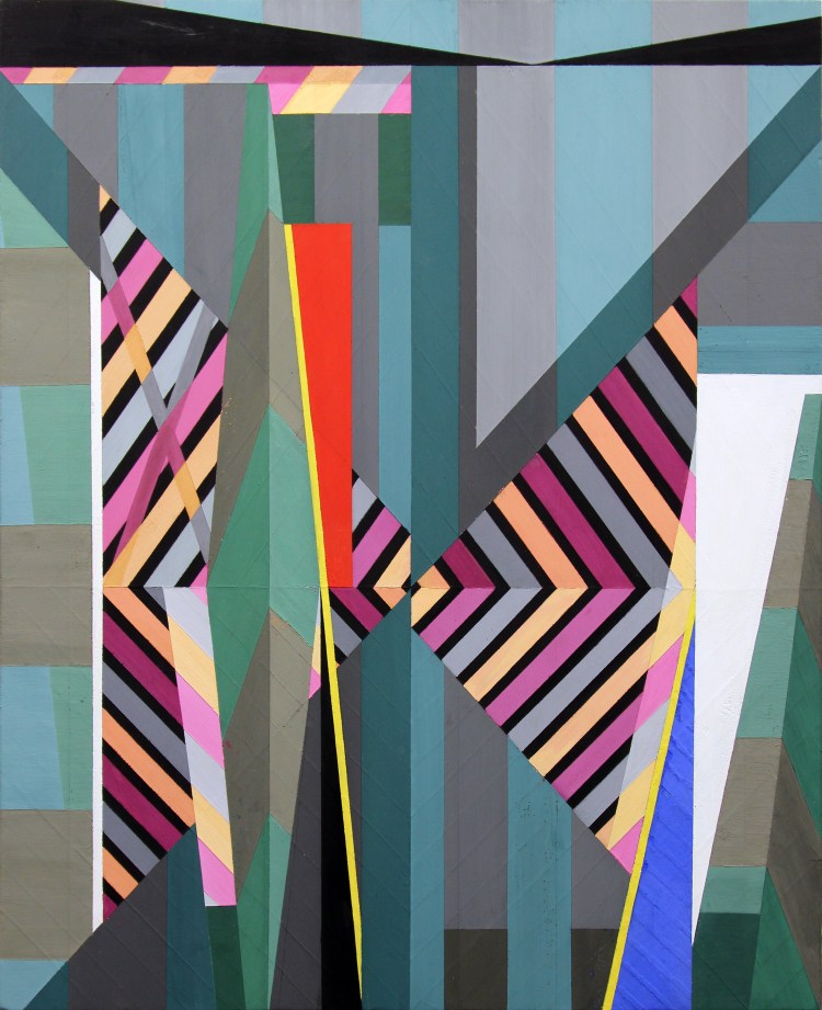
Gianna Commito – Plas. Casein and marble dust on panel. 2015.

Vincent Fecteau – I have mentioned Fecteau to people for nearly a decade. His work is mysterious, shapely, and finely-fitted, yet organic. It is strange to behold. See it in person if you can.

Magalie Guerin – Guerin is a staple of the Chicago art landscape these days. Her modest-sized works defy their scale, becoming means to mine the distance between observational notation and suggestive shape. I love their interlocking, colliding parts.

Julian Hoeber – Julian Hoeber’s slathered-on paintings are, in all of their scummy, impasto glory, treatises to precision and formal rigor. They GLOW. They are illuminated with some kind of Cherenkov light. Epic and weird. See an example below:

Emil Robinson – A powerhouse operating in Ohio currently, Robinson has been working on a series of works that is at once confusing and inspirational. He is a huge influence on a number of artists, especially in terms of his pastel-based figure studies. See his latest work on his website; a few are below. Ecstatic Spaces 1, 2, and 3. Oil on panel, 41×29, 2017.

For each of these there are a half dozen contemporary artists who are important to me as well (like Brian Guidry, Catherine Kehoe, Sangram Majumdar, Hanneline Røgeberg, and Linnea Spransy. As I continue to live and make art, I find that so many people touch me, transform me, make me what I am.

Keep your eyes open for news of new publications, exhibitions, and work. All are coming SOON.

~

PS: I love being floored by seeing a fresh work by an artist new to me. Here’s something that really caught my eye this past week: Amy Sinbondit‘s Section Break. Red eartheneware, engobe, terra sigillata glaze. 14.5 x 18 x 11.5 inches, 2011.

A Couple Early 2017 Highlights

This Friday, a show of my collaborative works created with the great Joel T. Dugan goes up in Brooklyn, at es ef eff gallery. Head over to 893 Bergen Street at 7pm this Friday, February 17.


Above: a work from the exhibition, “Crest” – Acrylic, oil, pastel, colored pencil, and graphite with woodblock printing on paper mounted on panel. 11 by 11 inches, 2016-2017.

I’m also pleased to share that the Manifest Gallery painting anthology I was selected for has finally been published. It’s a beautiful volume (buy it here).


Above: one of my personal favorite paintings, beautifully reproduced. The INPA6 book features some amazing work by a lot of great artists, as well as friends and colleagues… like Nathan Sullivan and Melanie Johnson:


Above: detail of a Nathan Sullivan work from the book. Below: Melanie Johnson’s included work.


Pretty cool stuff! I’m thankful! There are a number of additional events happening this year that I will share soon – exciting times!

Continuing Direction of New Work

I have been working on a series of abstractions off and on for nearly a year. Here’s where they were last October. Here’s where they were more recently in my last exhibition, WHENEVER/WHEN, two months ago.

Over the last week or so I’ve taken another step, completing two works (one is below) and starting a number of smaller studies.

ballou-interferometryInterferometry. Oil, oil stick, spray paint, window marker on panel, 25 by 25 inches, 2016. Collection of Bobby and Laura Schembre.

The new smaller studies are attempts to integrate my digital drawings with my physical hand. After printing the works out at roughly 10 by 10 inches (on an Epson 9900 printer), I worked back into them using high quality acrylic inks and some acrylic paint. See a first pass of works below.

KIC Document 1-2smallUntitled Study (Meaningful Shape), Acrylic and ink on canvas mounted on panel, roughly 10 by 10 inches, 2016.

Untitled-1smallUntitled Study (AU), Acrylic and ink on canvas mounted on panel, roughly 10 by 10 inches, 2016.

KIC Document 1-1smallUntitled Study (NV), Acrylic and ink on canvas mounted on panel, roughly 8 by 9 inches, 2016.

Untitled-1aasmallUntitled Study (Zig), Acrylic and ink on canvas mounted on panel, roughly 9 by 10 inches, 2016.

~

While I have worked on a couple representational images since my heart attack in February, I haven’t really felt the impulse to make those works. It’s strange, since that was my aim for 20 years. Not sure what it all means, though I do have an exhibition of representational works (which were completed in 2015, for the most part), so seeing those on display may get me going in that direction again. Who knows.


Current Abstractions

Over the last 6 months I’ve been moving back into some more serious abstract paintings. Since beginning my education, these periods of return to non-representational, non-observational work have been important to me. Usually, this work is a release from more intensive perceptual-process paintings. Often it doesn’t resolve into a clear body of work, yet once every 3 or 4 years it does.

Much of the new abstraction is directly related to three distinct events that have been taking place in my studio. First, I’ve been collaborating with Joel T Dugan on a series of works that, while mostly resolving into representation and pictorial symbolism, often begin with evocative surface and color explorations. Secondly, I’ve found myself contemplating the kinds of decisions my daughters make when they work in my studio alongside me. They have none of the philosophy or theory behind making art, and so they offer a kind of pure aesthetic and material reactivity that I find refreshing and exciting. Lastly, I have been obsessed with a print made for a Penguin edition of the book The Cloud of Unknowing. The print was apparently made by artist Diana Bloomfield around 1961. Ms Bloomfield, who died in 2010, was a very successful printmaker who worked on many imprints of the Penguin publishing house.COUAbove, left to right: the 1961 edition, and a late 70’s edition, both featuring Bloomfield’s medieval-inspired cloud.

Such an enduring image.

I’ve got a lot of thoughts about this image and the ideas in The Cloud of Unknowing, but those are for another time. Right now, here are a number of the recent abstractions.

IMG_8893

Night Sky Sliver. Oil, acrylic and adhesive tape on canvas, 12 by 12 inches, 2015.

IMG_8889

Pink Wedge. Oil, acrylic, digital print and adhesive tape on canvas, 12 by 12 inches, 2015.

IMG_8888

Locking Diagonal. Oil, acrylic, collage and adhesive tape on canvas, 12 by 12 inches, 2015.

img_8890

Crossover. Oil, acrylic and adhesive tape on canvas, 12 by 12 inches, 2015.

IMG_8887

The Unfold. Oil on panel, 24 by 24 inches, 2015.

IMG_8891

Bent Icon. Oil on panel, 24 by 24 inches, 2016.

I’ve certainly been influenced in these by my ongoing love of the work of Marcelo Bonevardi and Richard Diebenkorn, but I think that watching Christian Ramirez’s recent work (mostly via Instagram) has been instrumental as well. Most important has been working up close on Dugan’s effervescent surfaces and trying to wrestle with them.

I’ve got a few more of these in the works – I’ll share them as they manifest.