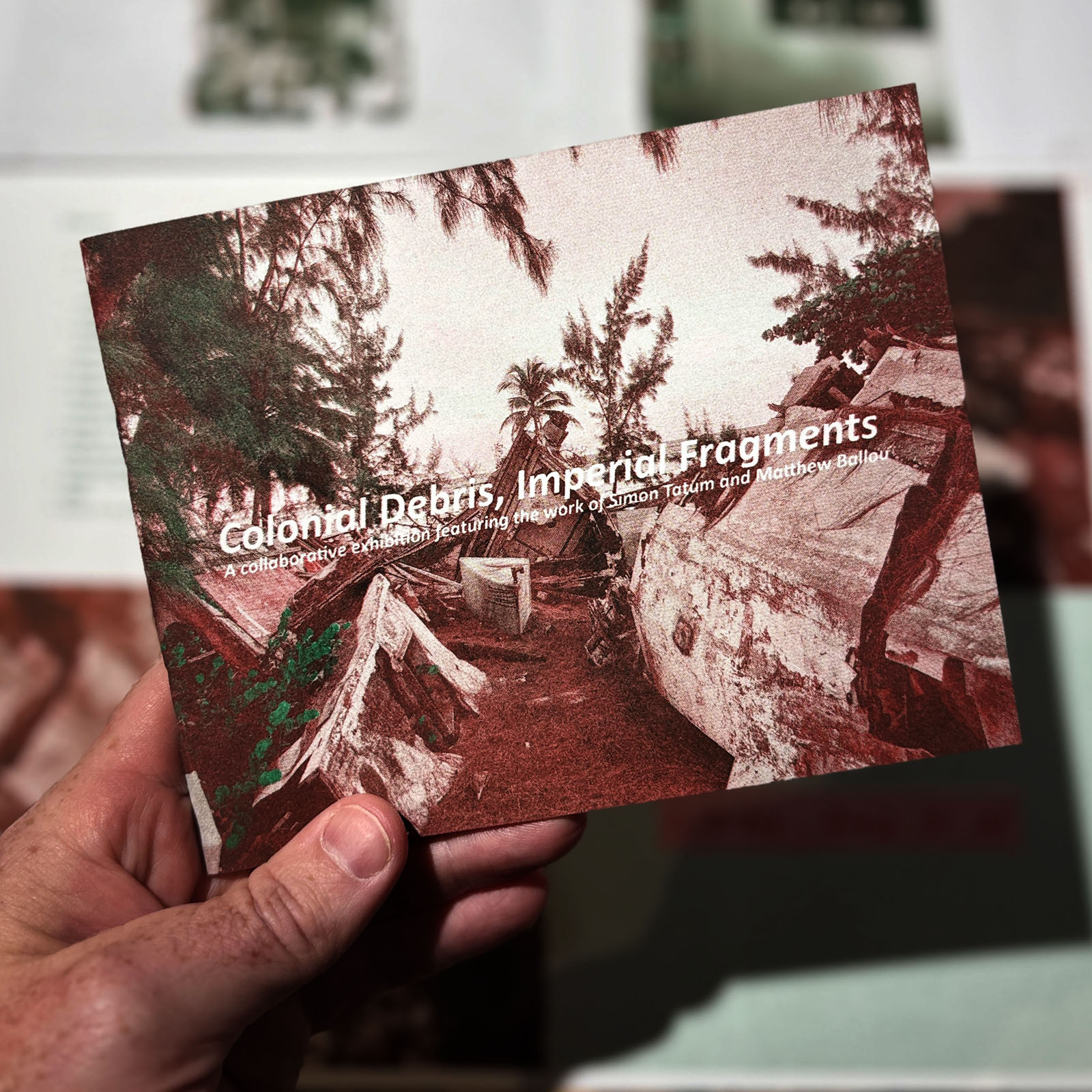
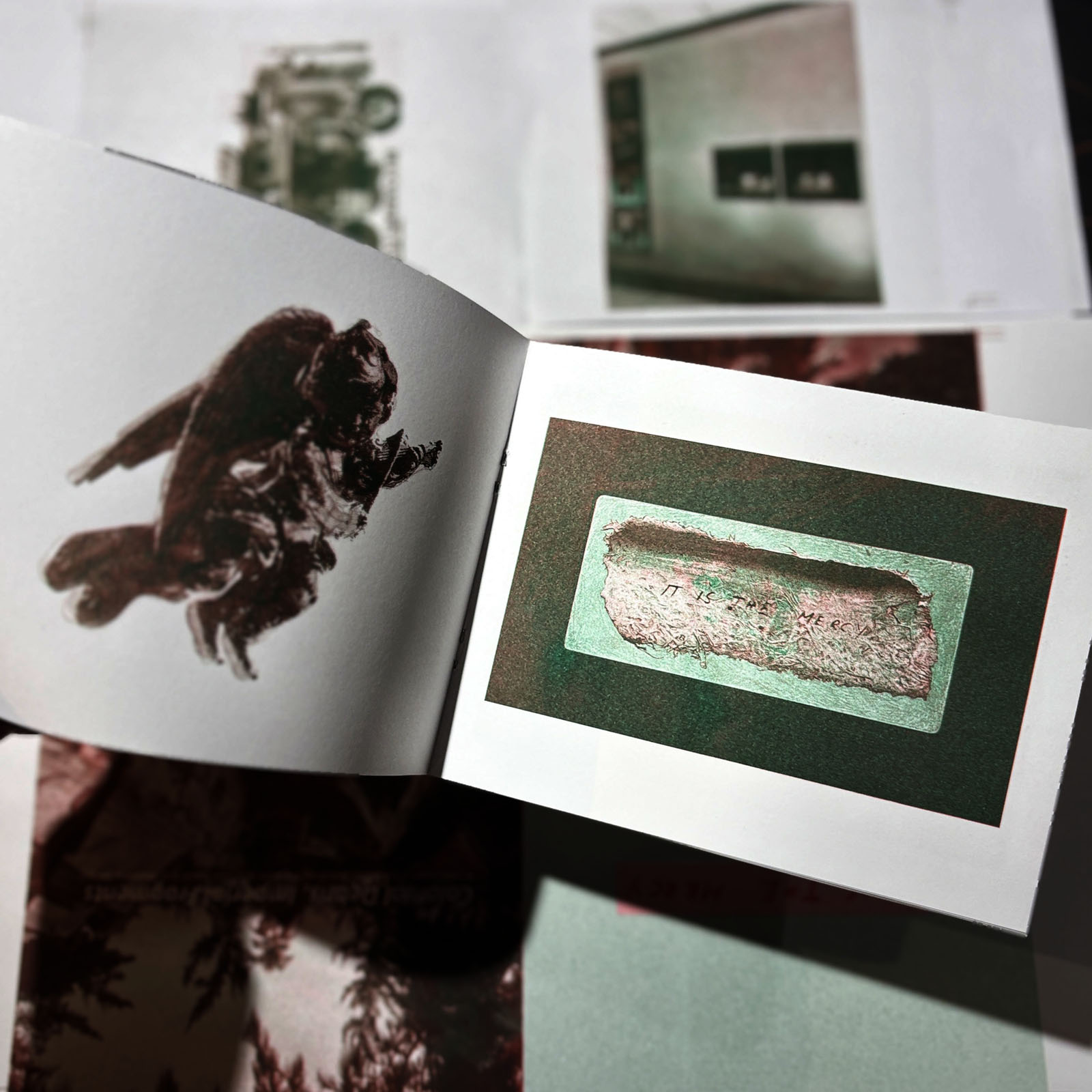
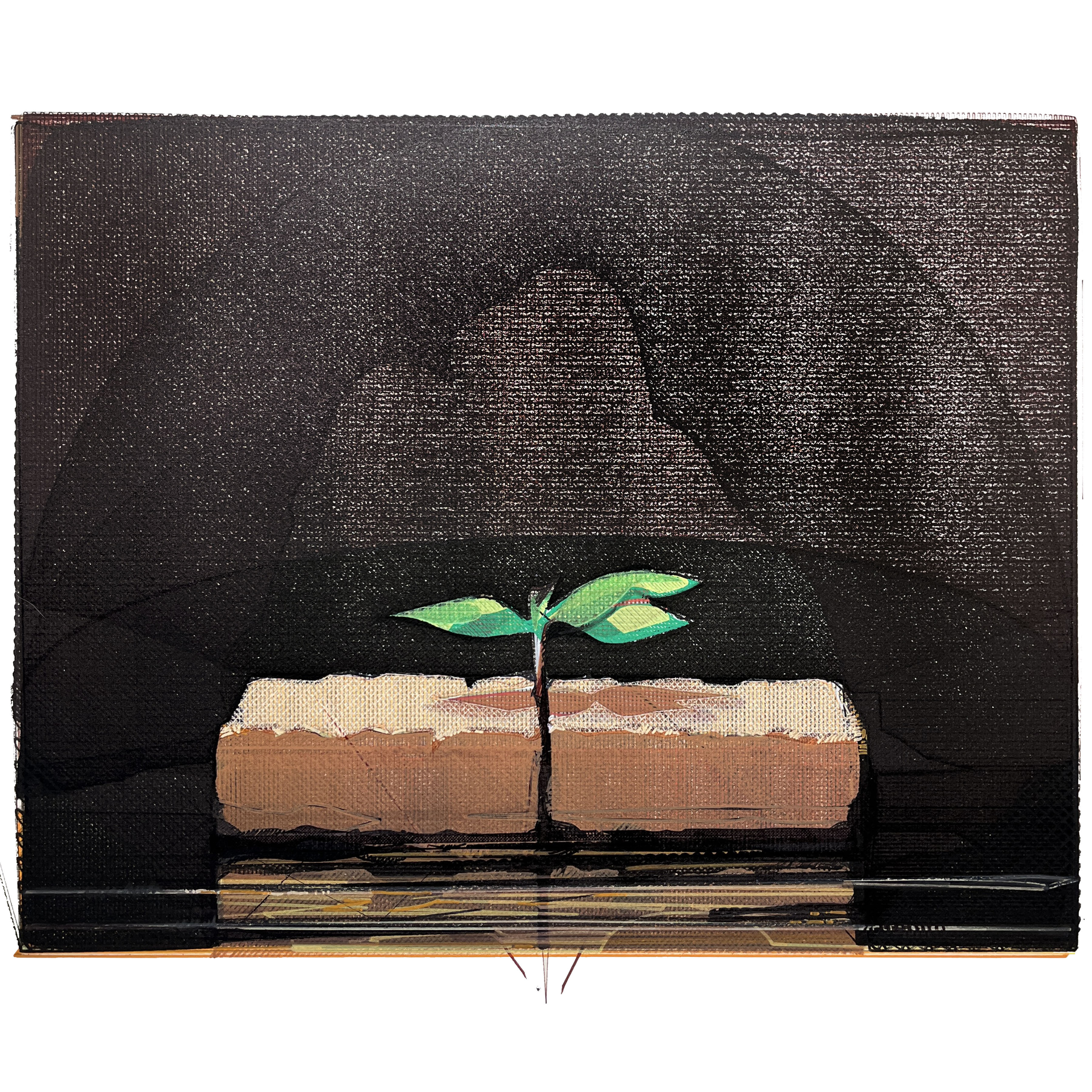
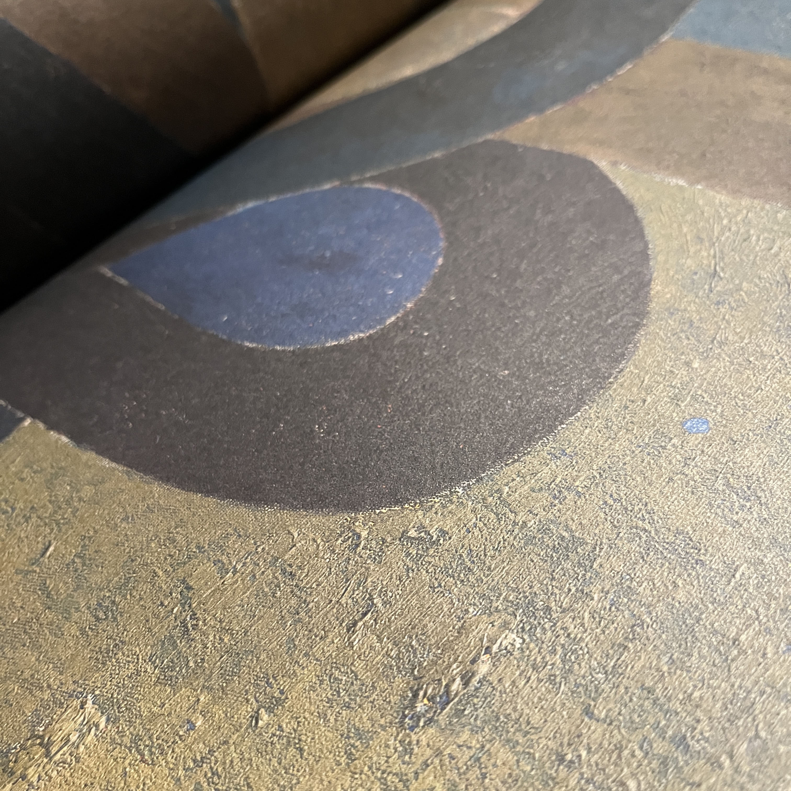
I’m pleased to announce the publication of a catalog about the exhibition that Simon Tatum and I had at Vanderbilt University last year. Working with Oswaldo Garcia at The Riso Room, housed within Mizzou’s School of Visual Studies, I was able to produce a slim volume that highlights some of the work and writing that Simon and I produced for this show. We hope to take the exhibition around to other venues, and these catalogs feel like a great physical supplement to proposals. Click below to take a look inside.
The images show representative examples of the work we include, as well as updated texts that give an overview of the history and context we’re working within. I’m excited by how the risograph process has captured the documentary quality of Simon’s work and the surface development of my own pieces. I love the way the back cover shows Donald Crowhurst’s final coda, “IT IS THE MERCY.” Taken from his logs, this is Crowhurst’s actual writing reproduced.
If you’re interested in obtaining a copy for $25, please send payment via one of the options below:
See this fantastic blog from 11 years ago linked below. A nice tribute to Ray Johnson, who died on this day in 1995. He was a strange, unique man. At the intersection of queerness, neurodivergence, and mental illness, Johnson lived his whole adult life as an artwork. The amazing documentary How To Draw A Bunny (click the title to watch it), is a celebration of this one-of-a-kind life. Every semester I show this to my 2000 level drawing students as a way to demonstrate how mature artists create a vernacular of form and idea in their works, a way of creating and speaking that forms the architecture and language of their art. Ray’s life (and even his way of dying, in a sense) was inspirational.
In March 2003 I had been working at Good’s of Evanston for about 18 months. I worked there after earning my undergraduate degree, and at the time was getting ready to get married and head to grad school.
I worked at Good’s with an amazing cast of characters: Ronnie Boykin Junior, David Gracie, Micah Ebbe, Fred Sturkey, and so many others. One of the people there was Jeremiah Ketner, a man who has gone on to a long and fruitful art career. One day I saw Jeremiah’s coffee cup and we mused together about coffee sometimes being a main meal during the work day. I decided to paint a view of his so-called lunch.
Jeremiah’s Lunch 3/14/2003. Watercolor and graphite on paper. 5×6 inches on 14×11 sheet. 2003.
As the Shipping and Receiving Manager, I often had some time between shipments to make art in my little office. I loved that space. Did a lot of thinking back there.
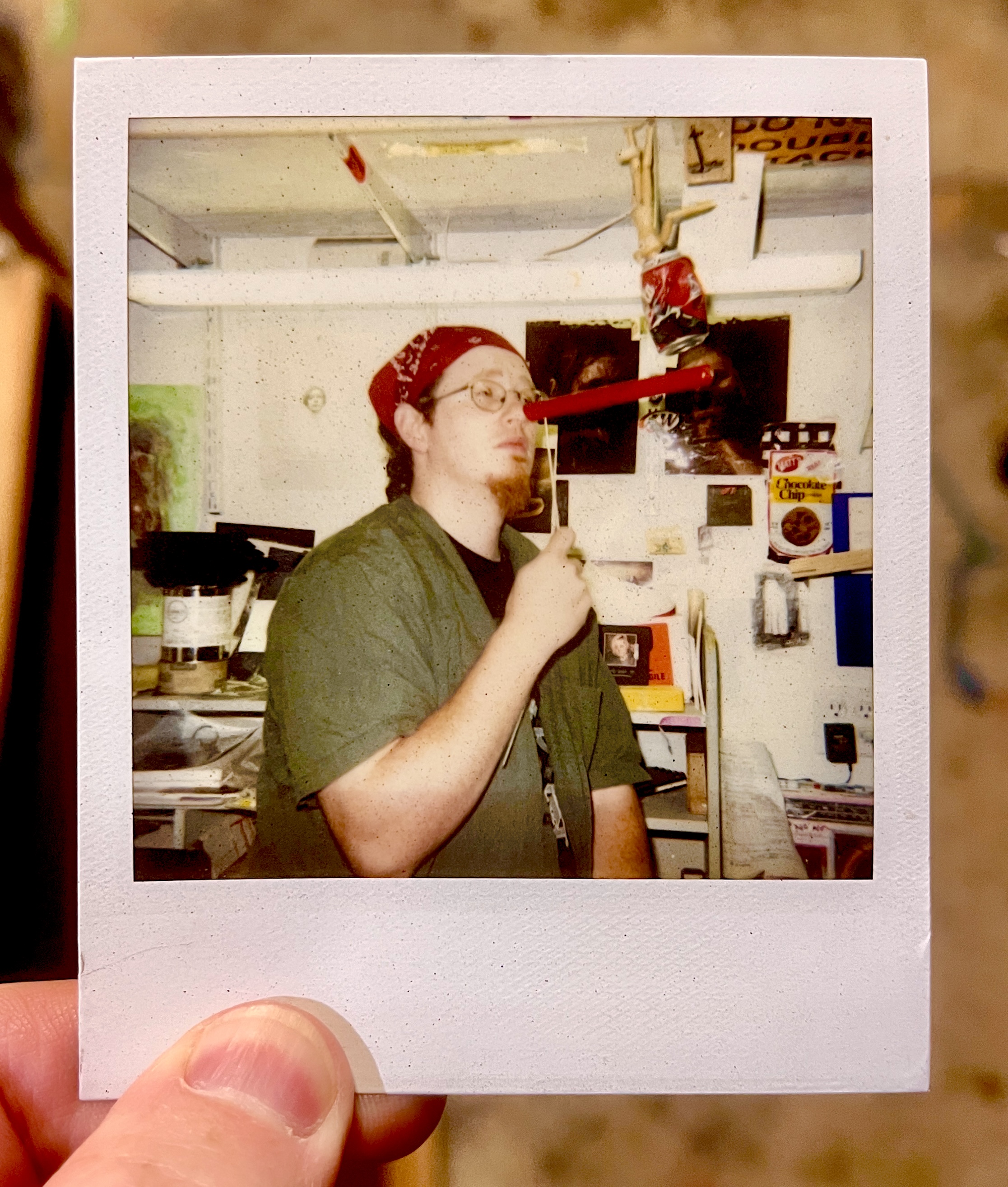
A picture of me in my shipping and receiving office at Good’s of Evanston. 2003.
During this time Alison and I lived in a 3rd floor apartment that had this amazing accumulation of paint and interesting architectural details. Of course, anyone who has lived in Chicagoland is familiar with paint slathered over outlet holes, quirky entryways, specific brick hues, and questionable back stairwells. We had arches throughout the apartment, and I found myself ruminating on them between doing more “important” work. I made my whole portfolio to apply to grad school in that apartment. It’s strange to think that these two small watercolors ended up being special to me. I wouldn’t have guessed it at the time.
Arching Corner. Watercolor and graphite on paper. 12×11 on 14×11 inch paper. 2003.
Anyway, as we round out another year I find comfort in these small contemplations. Maybe the lesson is that all of my grand attempts to make statements or contribute to important conversations weren’t the best or most effective offering I could make. Maybe it was the fact that I noticed and paid attention to the poetry of spaces, moments, in-between time, and life being lived that really mattered.
Since 2019 I’ve worked as a portrait painter celebrating Mizzou student athletes. This last year was a high mark for Mizzou Football, with four of the squad being named All-American.
The University has a posh facility located in the south end zone area of the stadium where they hang all of the All-American portraits, stretching back into the 1930s. The great illustrator Ted Watts (1942-2015) created most of the portraits over the course of more than three decades, so I’ve got a big act to follow.
The All-American portrait wall at Mizzou Football’s South End Zone facility.
The display is pretty cool, and it’s cool to have my work extend that tradition. Portraits of Kentrell Brothers and Harrison Mevis are two of my works currently on display, and four new ones will appear soon (Fall 2024).
When I began to create my paintings, I went on a tour to see the previous works up close and to evaluate the aesthetic through-lines (format of names, dates, poses, backgrounds, etc), as well as the techniques prior artists used.
I take a central role in the design process, creating digital mockups which are approved at Mizzou Football before I begin the paintings. I generally work with ink on paper, which is mounted on panel and sealed, then painted over with layers of acrylic. I try to maintain a painterly quality, with texture and dynamic brushwork on display. I also attempt to bring the digital effects which naturally appear in the preliminary studies into a physical realm with semi-transparent washes of paint.
Working on the portrait of Cody Schrader.
As the projects have developed I’ve found my own approach to the portraits. I want them to have kinship with the portraits of Watts and other previous artists, but I make sure to give the works my own unique inflection.
I’m excited for the new crop to go on display. Kris Abrams-Draine, Luther Burden III, Javon Foster, and Cody Schrader are the 2023 All-Americans for Mizzou Football. See images of the works below, but also be sure to stop by the All-American wall if you ever get into the South End Zone building!
When I was in undergrad at SAIC, my class visited him while he was installing his 25-Year Survey (Oct 14, 1999 – Jan 9, 2000) exhibition. A classmate and I stood for him to help focus projections in one of his pieces while he talked to the class and led us through the various installations. Such a key memory for me, and an important exhibition for me to see as a young artist.
I love that he embraced sensitivity, even sentimentality, in his work. The art world – and the world in general – is so jaded and navel-gazing at their own foolishness that it’s nice to see someone who really thought about the biggest issues of humanity: our shared conditions, our hopes and dreams and fears, and the strangeness of our embodiment.
MF DOOM (keep caps on that name!) was a highly skilled and influential British rapper. Throughout the years, fans have been drawn to creating various artistic interpretations of his famous mask, behind which the artist almost always appeared/performed.
My good friend Jesse Slade, proprietor of KING THEODORE RECORDS, got me more interested in MF DOOM years ago. I’ve created representations of the mask in the past for illustrations/artworks using in Jesse’s record shop, but I wanted to make a move into a Lego version (or two) after I saw some folx creating them online.
Shout out to The Canvas Don and u/vonaudy for their versions of a building block/Lego MF DOOM mask. Both are awesome. I also like the “blockheadz” versions here and here. These examples served as inspirations, but mostly I just played around with what I’ve got in the old Lego vault.
I created the two versions below in standard light blue-gray, dark gray, and white, but then spray painted them with a chrome silver for proper effect. Take a look and enjoy. The smaller one is 4x5x2 inches and the larger is 5x6x2.5 inches.
Smaller MF DOOM Lego Mask. Click to see larger versions.
Larger MF DOOM Lego Mask. Click to see larger versions.
Recently I rotated a bunch of the art in our home, and so I felt that an update to my ongoing series of posts featuring various artworks I’ve collected over the years was in order.
My most recent purchase is this wonderful gouache painting on handmade paper by Mary Sandbothe.
Mary Sandbothe. Mystery Snowball. Gouache on handmade paper. 7×5 inches. 2023.
Mary is an awesome artist and educator here in Columbia, MO, and has been a pillar of the art community here for many years. She had a wonderful show at the Columbia Art League late in 2023 that really stood out to me. Called “Heritage Unfolded: Gouache Interpretations of Missouri Quilts,” (you can see the works here), the show featured some evocative, intimate works. I knew I needed to jump on one of them, and I’m glad I did.
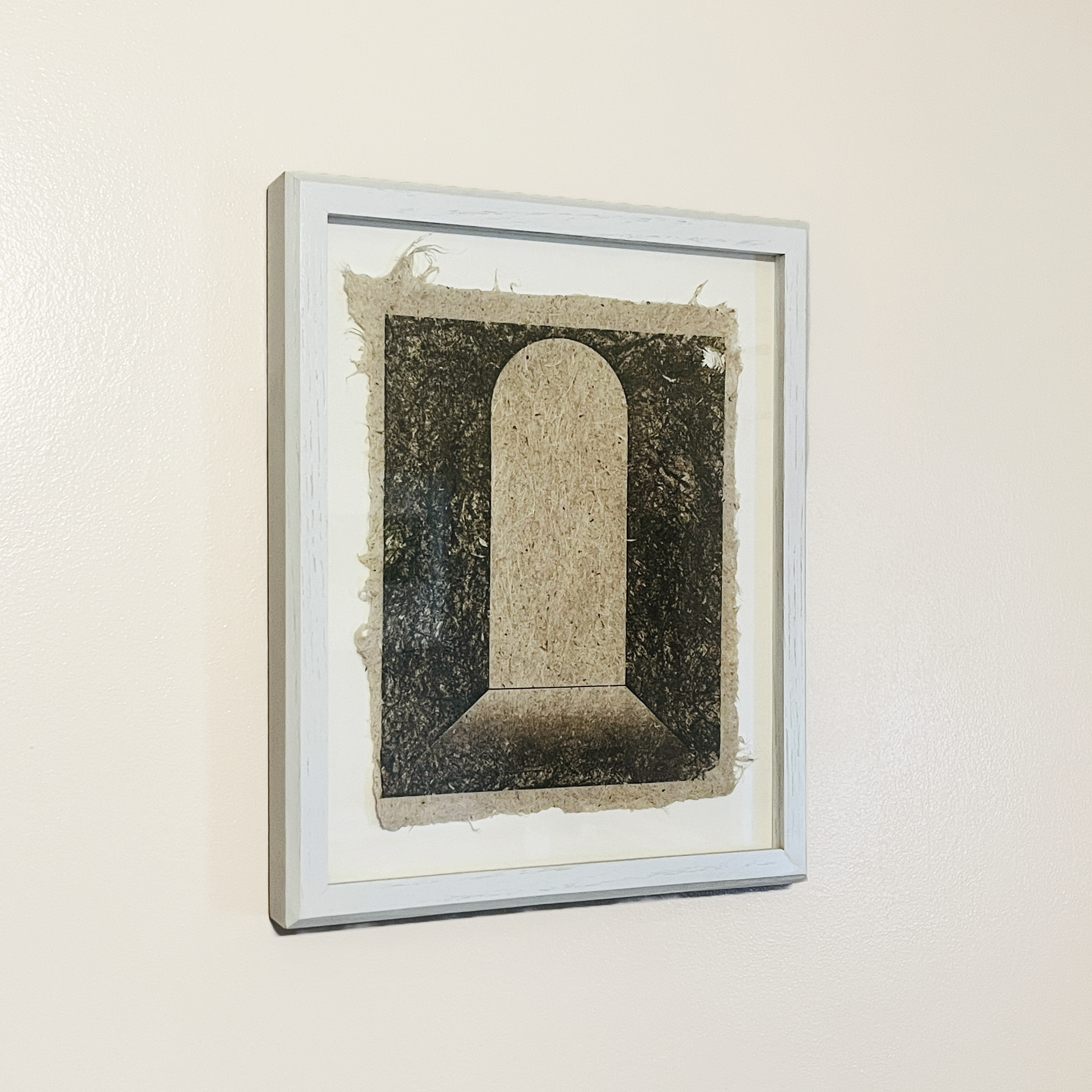
Next to the Sandbothe Mystery Snowball piece is a striking print on handmade Yucca paper by Caleb McMurray. The untitled work features a doorway or aperture, something that McMurray has returned to again and again.
I also have a sister print to this one, but it features an arching opening that is in the distance rather than up close like this one. Windows, doors, and other passageways are features of many of the works I’ve collected over the years.
Lastly, a small painting by Hayley Auxier‘s shares the wall with the two works I’ve shared above. Hayley was one of my stand out undergraduate students, and I love seeing her carry on her artwork as she has since graduating. This piece is one of a series she made celebrating National Parks and celebrating her experiences of them. Hayley shows a strong affinity for gouache, so I’m glad to have an example of her painting in that medium.
Hayley Auxier. Acadia National Park. Gouache on paper. 4 by 6 inches. 2018.
Acadia National Park is special to me because that’s where my partner and I went on our honeymoon all those years ago, so I like the piece because of it’s connection to my own history. But it’s also got a wonderful note from Hayley on the verso, and so the small work feels like it connects all of these different threads of my life: personal, professional, aspirational, and historical. That synergy of references – those that I bring to the work and those the artist embeds within the piece – is what makes art special.
I’m loving seeing these three works every day as I have a meal or hang out with my family. Art that lives with us is the best kind. Really thankful to have these pieces close to me.
Eight years ago today one of the few most significant pivots of my life happened. My cardiac arrest is intimately tied to the death of my sister, to my experience of my home town, to my understanding of life and spirituality, and to my way of moving through every day life.
This year I’m commemorating the traumaversary with a new version of an old work. I first created Situation and Circumstance Overcome in 2003. It is definitely my most successful and most owned work, as I’ve created many copies – both paintings and prints – of the work as fundraisers for adoptions and other charitable occasions. For this version I chose to use my AxiDraw X&Y plotter. Using a new print of my old mezzotint plate of the piece (fig. 1) as a visual source, I created a large vectored image in Inkscape that had roughly 30 layers printed upwards of 5 times each (fig. 2).
Fig. 1: Situation and Circumstance Overcome. Mezzotint print on paper. 16×20 inches. 2023.
Ink the vectored image you can see many of the layers along with the direction of the hatch fills and choices I made for density of pigment load. Each color was created with Sharpies, Posca acrylic markers, and a few other ink-based markers. The layers shown in the Inkscape file don’t correspond fully to the final image (fig 3.) because I made adjustments/changes to individual layers as I moved through building the image. There is a call and response between the digital and physical realms here that I really appreciate. I’ve also included a few details of the piece so you can see the finer textures and lines.
Fig. 3: Situation and Circumstance Overcome (’24 Traumaversary Version). Ink and acrylic on Arches paper. 16×20 inches. 2024.
I like having a rich, sentimental image like this following me through life. I’m convinced we’re all sentimental (if we’re honest and not sociopathic). By this word I don’t mean any kind of unexamined, saccharine idealization of some past version of reality. Rather, I mean that we really did experience real things in our pasts, and those things carry with them real emotions, real artifacts of our real selves. In some sense, sentimentality can give us momentary access to who we used to be in the past. It is a simultaneous connection and rupture. We know we can’t return to that person or that experience. And we know that we can’t really feel anything the same way again. And yet… some part of that reality is there for us in our sense of sentimentality. It’s akin to a certain scent or song taking us back to a prior state of being. There’s nothing wrong with this. Moreover, I suspect it has some adaptive advantage for the species by stimulating social/familial/relational/tribal/spatial cohesion.
In any case, I think making the image of life in the form of tiny sapling breaking up between the bricks has been a worthy thing for me. It’s a little picture of triumph in the midst of hardship. I’m glad it resonates with so many people. I’m glad variations of this piece hang in homes all over the world. And I’m glad I’m still here to appreciate it and add to its legacy.
I’m glad I didn’t miss these last eight years. There have been a lot of situations to overcome, but the life I’ve seen makes it all worth it. Here’s to another year. Peace.
If you’d like to inquire about purchasing the traumaversary robot version of Situation and Circumstance Overcome, contact me over here.
I have mentioned the importance of Miyoko Ito many times before (here, here, and here), but there’s a little more to celebrate this Christmas day: I just received the new book Miyoko Ito: Heart of Hearts hot off the press.
Published by Pre-Echo Press, and featuring the research and writing of Jordan Stein, Heart of Hearts is the major publication that Miyoko Ito and her work deserve. Jordan Stein is an active and insightful curator who has developed a major presence nationally over the last decade. His research into and presentations on Ito are extremely significant, adding great depth to what is available on the artist.
Detail of Orange Cloud from 1977 by Miyoko Ito as shown in Heart of Hearts.
Loaded with chromatically accurate images, Heart of Hearts is the most complete compendium of Ito’s work available. Beyond this, the book provides a single place from which students and admirers of her painting can find all pertinent information about her life and process. Stein’s essay provides key context, deftly connecting Ito to not only her roots in the Chicago art scene but the broader aesthetic superstructure to which she belonged.
Detail of Susquehanna (The River) from 1959 by Miyoko Ito as shown in Heart of Hearts.
These two arenas – solid text and quality images – really set this publication apart. From the beautiful debossed cover (front AND back) to the matte surfaces of the large full color spreads, this book delivers. The sense of texture and painted action is wonderfully realized in these pages. I kept being surprised by the surfaces of the paintings coming to life. This is an ESSENTIAL book for anyone interested in mid-20th century painting generally, or Miyoko Ito in particular. To finally have one volume that really pulls it all together is just wonderful.
Front and back covers of Heart of Hearts.
This book is an appropriate celebration of Miyoko Ito as a person and as an artist. It includes nearly all of her work, some of which have been lost. While not technically a catalogue raisonne, it might be the next best thing, as it provides the most complete picture of her work that we’ve ever had. For this, we can thank Jordan Stein and Pre-Echo Press.
In my opinion Miyoko Ito: Heart of Hearts is the most important publication dealing with American painting since Yale’s four-volume catalogue raisonne of the work of Richard Diebenkorn. Go buy it.
I watched Poltergeist again this year, and am still so impressed with it. There are a lot of reasons, but a few things really stand out.
It’s not just the expertly crafted and paced music (Jerry Goldsmith).
It’s not just the practical, in-camera, optical effects (Richard Edlund, John Bruno, Nilo Rodis-Jamero).
It’s not just the fantastic physical and emotional presence of JoBeth Williams (an absolute classic performance that should have been rewarded).
JoBeth Willams as Diane Freeling
It’s not just the introduction of one of the most compelling characters in all of cinema (Zelda Rubinstein as eccentric medium Tangina Barrons).
Zelda Rubinstein in Poltergeist.
All of that is great and worthy of note.
But it’s also that the children and women are centered. They’re not “hysterical” nor are they “irrational.” They see and know deep realities, even if they can’t understand or entirely describe them (a theme borrowed from Spielberg’s Close Encounters of the Third Kind). These characters are the central interpreters. They stand in for the viewer. We don’t dismiss the father as a moron, but neither do we have to make him the hero. Furthermore, we don’t have to MANUFACTURE the heroism of the Carol Anne, mom Diane, or mystic Tangina. The film naturally makes them function in ways that stimulate the narrative arc without BS or montage-based tropes. They don’t miraculously and instantaneously become triumphant; they live through a trajectory of growth. They don’t automatically know everything; they use their innate characteristics to attend to the film-reality in specific and logical ways.
Heather O’Rourke, JoBeth Williams, and Craig T. Nelson in Poltergeist.
Sure, there are other examples of these qualities in popular (and more niche) media. But an average suburbanite mom coming into contact with a situation so physically and conceptually counter-intuitive gives this movie a sense of genuine humanity. Its influence is still palpable in the the horror genre some forty years on, and it’s an experience always worth a revisit.
See it if you haven’t yet (it’s available on MAX)!