Inspiration – Jusepe Ribera

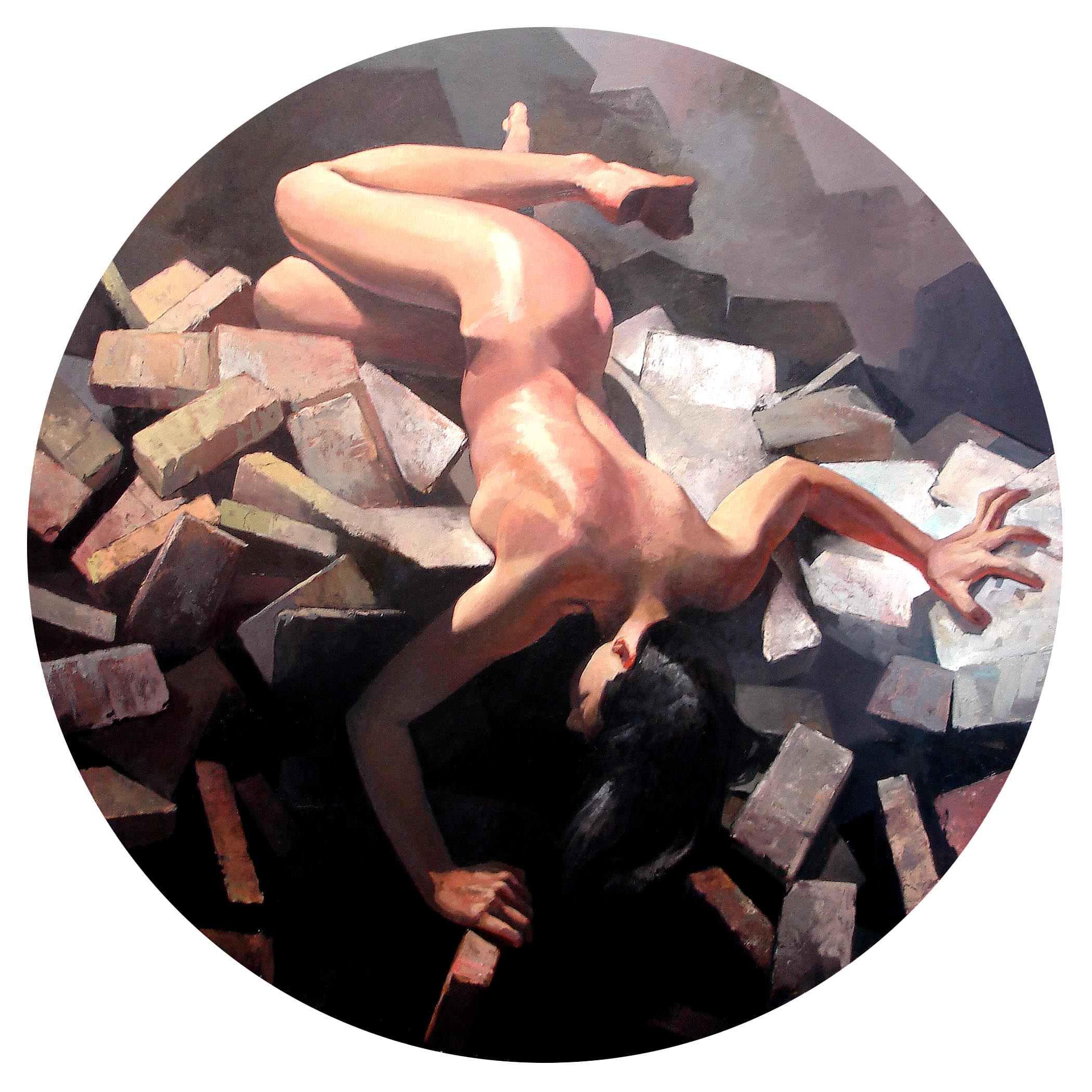
Over the last few years my work has turned on a conception of the natural geometry of the body. You can see how in images like this (“Collapse” oil on canvas on panel, 48 inches in diameter):

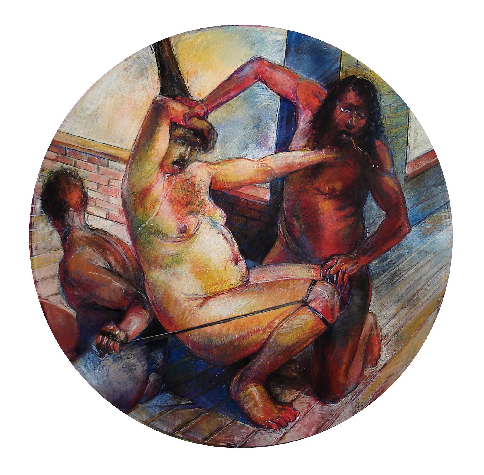
or this (“Revealer, Forced” pastel on paper, 23 inches in diameter):

that I am really focusing on a kind of geometric tension in the positions and movements of the body.

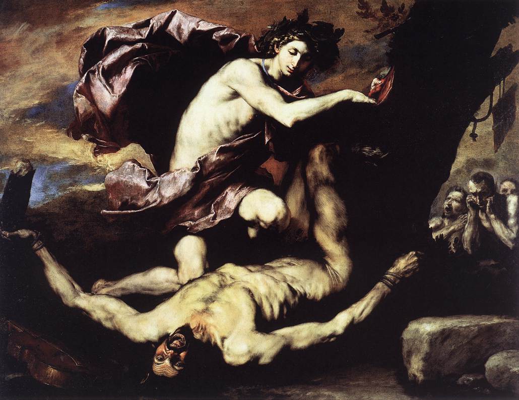
A lot of this has come from my interest in the work of the great Spanish painter Jusepe Ribera. In 1610 he followed the call of Caravaggio (who died that same year) by traveling to Italy to see the master’s work. Here are a couple of my favorites:

“The Flaying of Marsyas”

“The Martyrdom of Saint Phillip”


Color Drawing, Fall 2010

Another semester, another feeling of pride. My beginning color drawing students are pretty awesome.

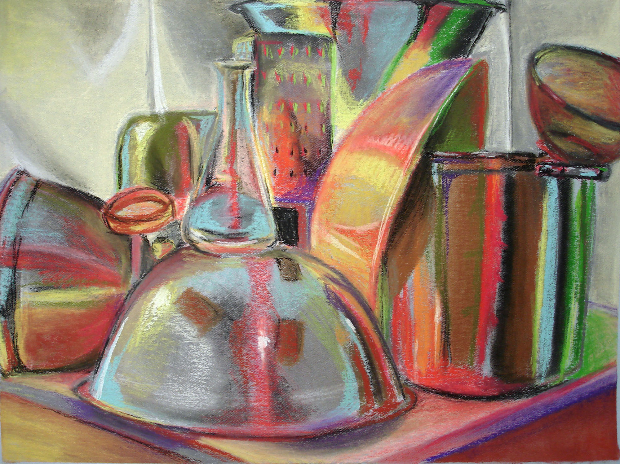
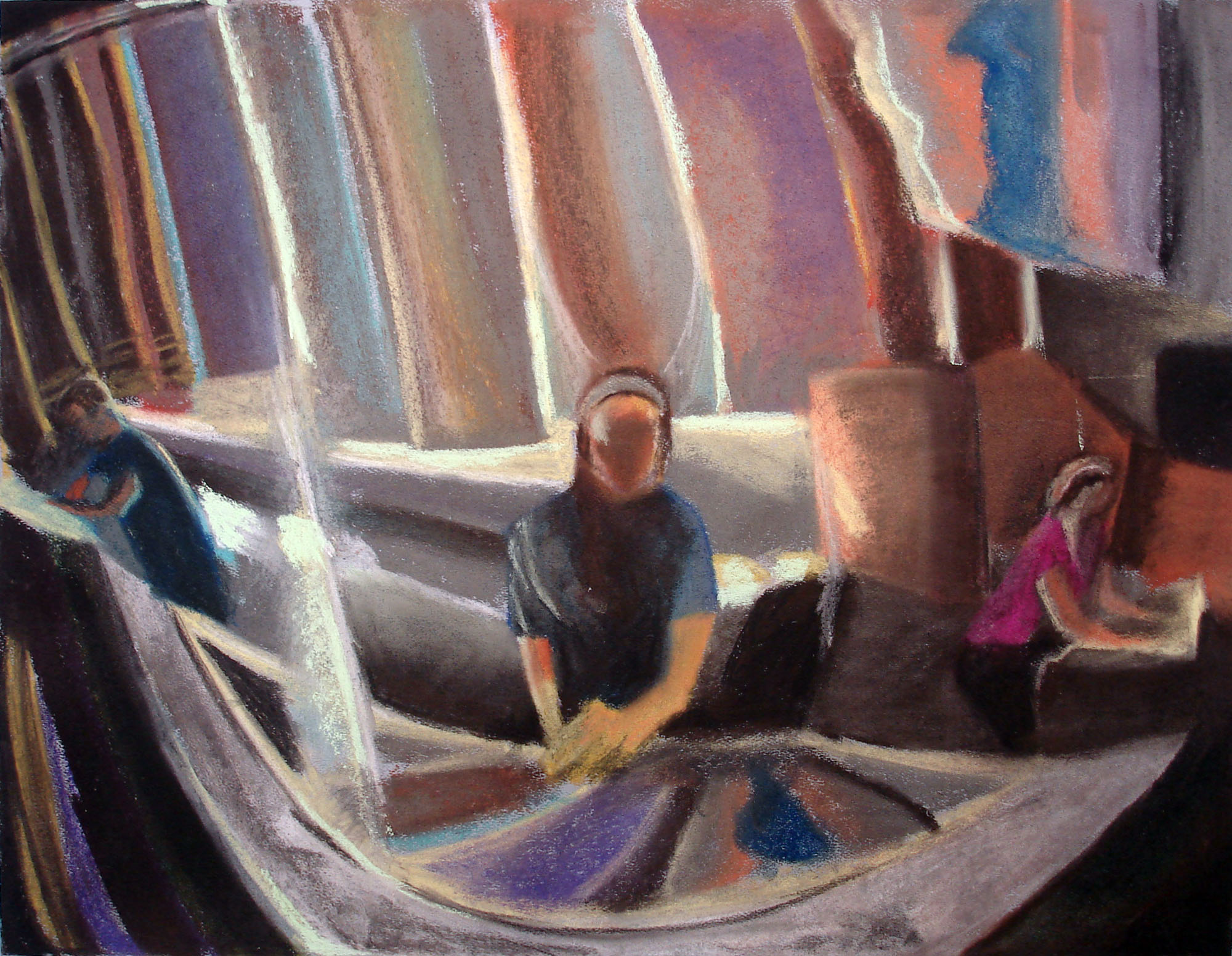
Carrie Casper Reflective Still Life

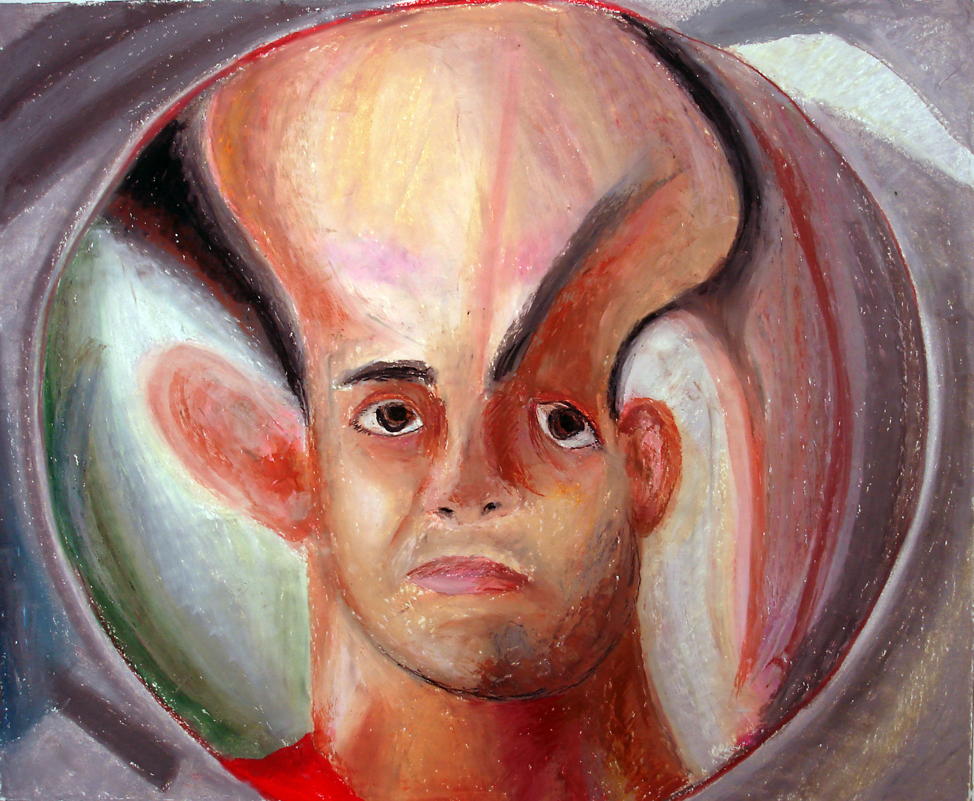
Dustin Roberts Reflection Self Portrait 1

Alex Forkin Reflection Self Portrait 2

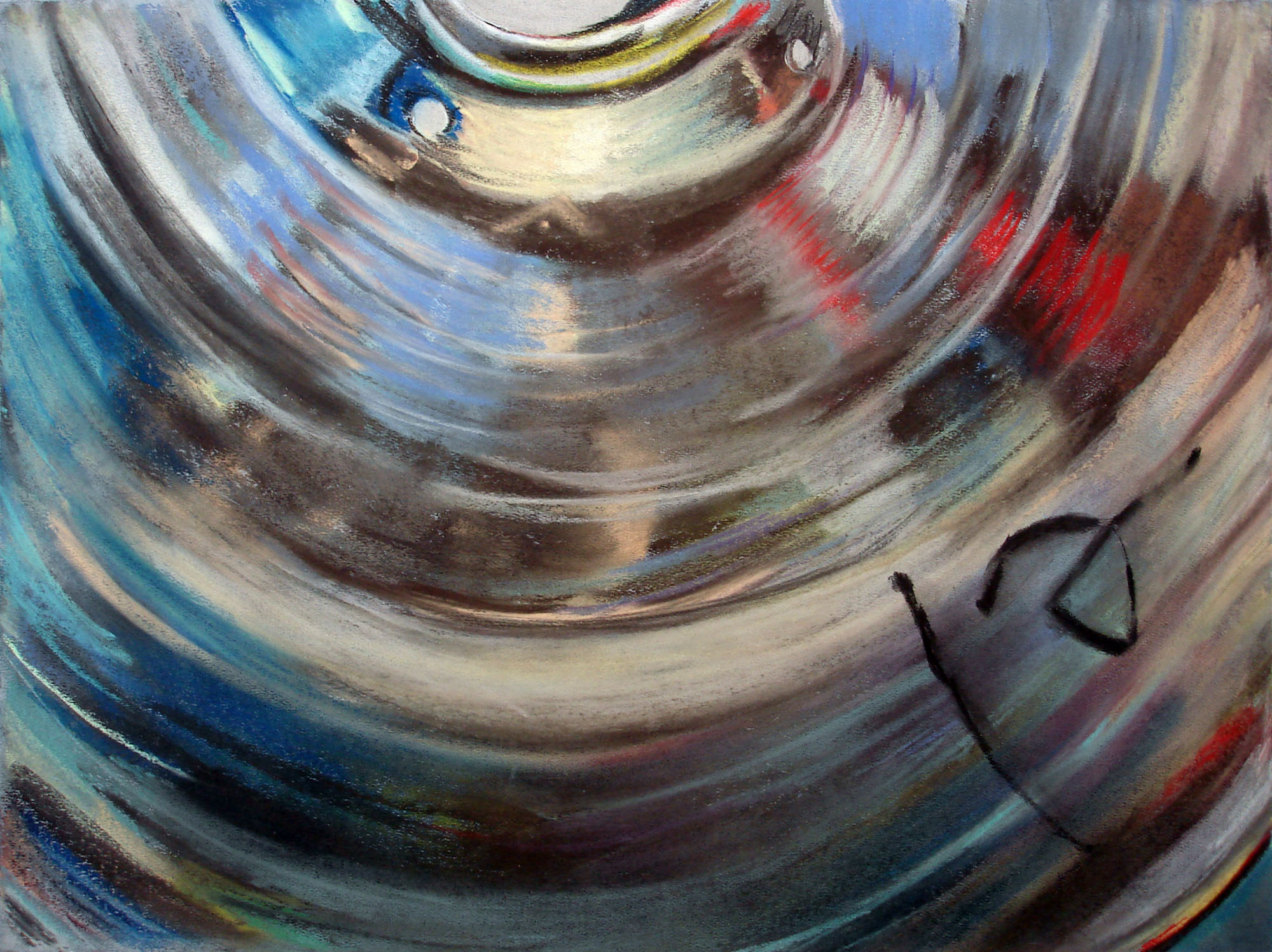
Alex Forkin Reflection Chromatic Environment 2

Katie Kullman – Reflection Self Portrait 1

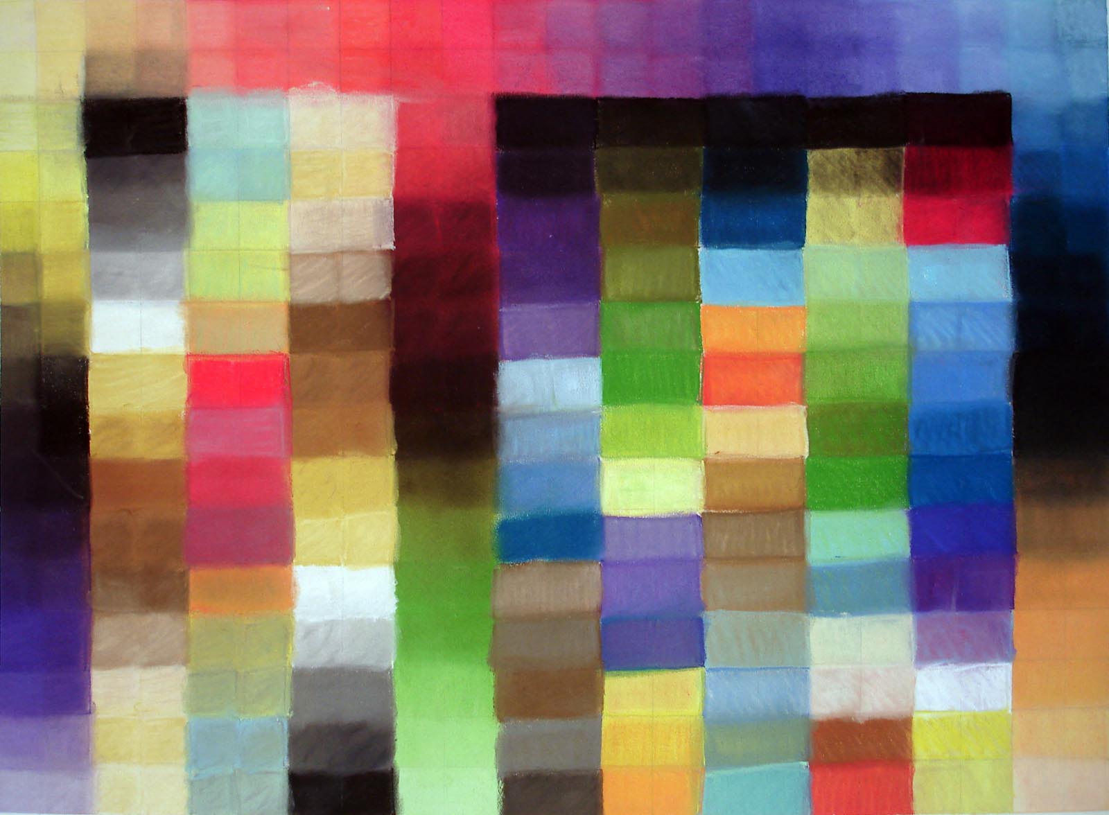
Nikki Warren – Grid Project 2

Ashley Claussen – Reflective Still Life

Inspiration – John Dubrow

A number of years ago I saw John Dubrow’s painting Rephidim. It inspired – eventually, after some gestation – this painting:

The work is titled Taming the Tongue, Study #2. The Dubrow work inspired this sketch, not the previous or subsequent works. After a while I manifested the idea in this work, but I have always been drawn to this small work and its connection to Rephidim. Learn more about that painting and John Dubrow himself here.

Martha Macleish and the Shadows

I took a group of my students (from the University of Missouri at Columbia) over to Kansas City to see a bit of art this past weekend. The main attraction was the Martha Macleish show at Longview Community College. One of the things I found so interesting about her work is the fact that the shadows they cast – being illuminated by the syncopated lamps of a gallery lighting system – are at least as physically striking and necessary to the experience of the art as the objects themselves are. These shadows seem to extend each work in that they transfer the structure and form of the piece into space and onto the surrounding walls and floor. While this seems obvious – it’s what all shadows do – in this case it’s much more significant. This is because the laminated, layered construction of the work is mirrored in the stratified step gradients of the multi-vectored shadows and the negotiated, sometimes grungy, sometimes glossy finish of the materials is echoed in the distended, bending atmospherics created as light falls over their spaces and shapes. The effect is mesmerizing and stimulating, leading viewers to shift their perspective again and again, bobbing and weaving around each piece to see the secrets they hold in their multi-faceted alignments and angles. The work is very much worth seeing if you get the chance. Martha granted me permission to post some images of the shadows her work created at the Longview show. Click on each to enjoy them larger.

Tondo Jig

I’ve finally gotten to set up my tondo making jig in my new woodshop. Here’s a run down of how it looks and an example of what it can do.

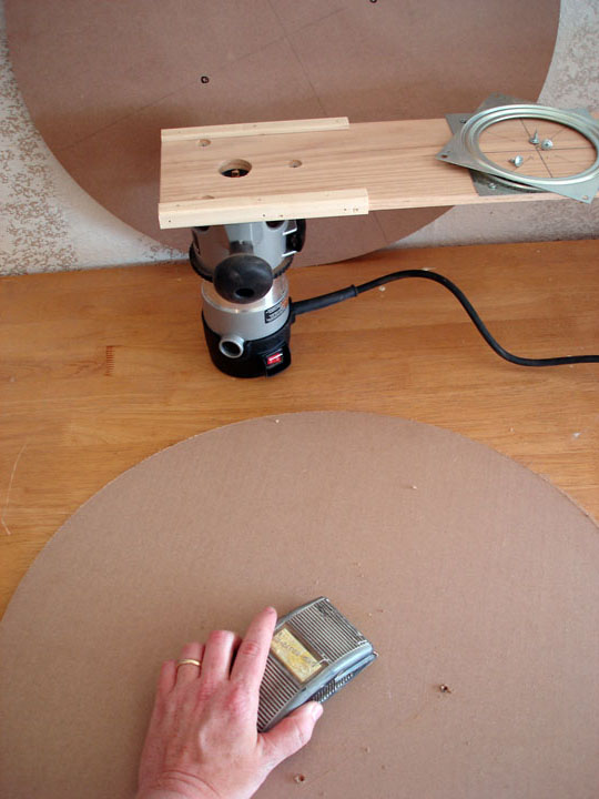
Here you can see the basic layout. I’ve created the body of the jig on a nice piece of half inch by 6 inch by 3 foot oak. Being a hard, strong wood, the oak will hold the mounted router well. The router itself (a nice mid-range Porter Cable model) is attached by removing its base plate and mounting it to the oak board as shown. The screws are recessed to assure good connection to the router.

Then I mounted a small “lazy susan” type ball bearing swivel deck to the other end of the board. I’ve measured and pre-drilled stations for the swivel deck in my standard tondo sizes – 12 inches (to give me a 24 inch tondo), 20 inches (40 inch tondo) and 24 inchs (48 inch tondo). I set it up to move the swivel deck to reduce wear and tear on the router mount area. I don’t want to take the router off at all. You can see how I’ve put some base plates along each edge of the board on the router end so the swivel deck and router approach are level when placed on the board to be cut.

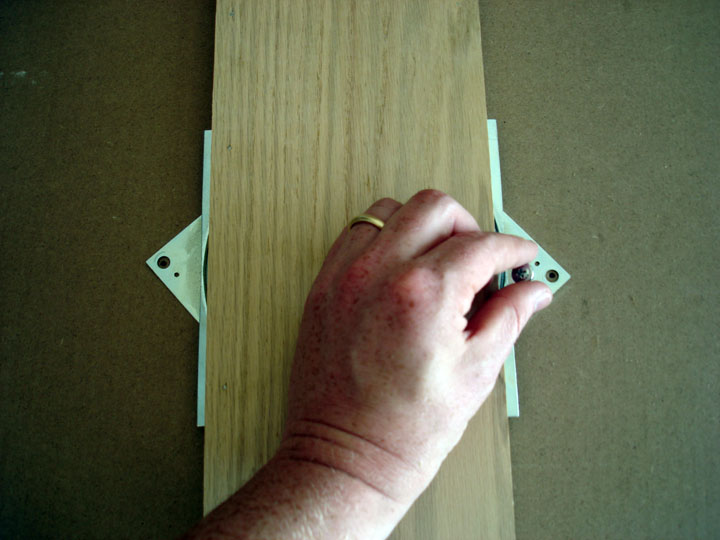
To cut a tondo, I select my size (in this case, I want a 24 inch tondo) and put the swivel deck there (above). Then I screw down the other side of the swivel deck to the board to be cut so things are nice and secure (below).

Then – with the bit still recessed up into the body – I will start the router and slowly plunge the bit about halfway into my wood. I learned in my previous experience with cutting tondos to take it slow and cut in a few passes to ensure a good, smooth cut but also to protect the router. The harder the wood, the more wear on the router – obviously with this piece of MDF the router could have done the entire cut in one pass, but I feel more comfortable taking a few extra minutes to keep the tool nice.

After the first pass – and each subsequent one – I use my compressor to blow out the dust. This increases the ease of the next pass and keeps the risk of charring or actual combustion down. I also make sure to blow out the vents of the router since the sparking within the motor can ignite dust that collects there.

In the above picture you can see the bit being adjusted down for the final pass.

After the final cut I remove the excess wood and blow off the dust (above), then remove the swivel deck and start to sand any burrs (below)

Here’s a look at the edge of the tondo – pretty smooth cut!

And the final products!

Beccafumi Cartoons at the Pinacoteca Nationale in Siena

The next time you’re in Italy, make sure you swing into The Pinacoteca Nationale in Siena to see Beccafumi‘s massive cartoons. I’m posting a few images of them below, photos I took while visiting Italy in 2005 – click on each for a large view.

Siena’s Pinacoteca has a number of other great Beccafumi works as well. His strange use of color and idiosyncratic figuration set him apart – they’re well worth the time to see them in person.

The School of the Art Institute of Chicago, Ten Years On

I graduated from SAIC nearly 10 years ago, and I’ve got a lot of memories from there. At first, right after I graduated, I was pretty negative about my experience. I felt as if they’d denied me some aspect of my education necessary to my future, that they’d tried to indoctrinate me, that they’d treated me like a number, not an artist.

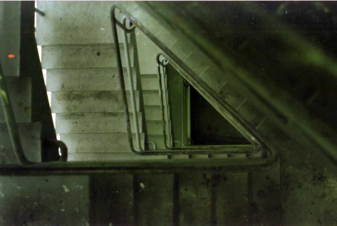
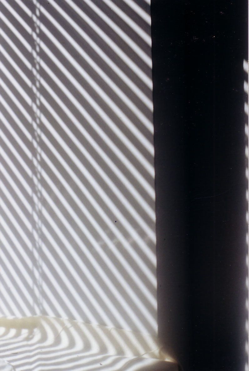
In ways I was right, but in a lot of ways I was wrong. I’ve since gotten over it and look back with fondness, thankful that I grew so much during those years. One of the ways in which I grew was in my attention to the things that drew my eye. I began to document heavily, shooting thousands of photographs in the last couple years of my undergraduate career. Below I’ve posted some of those images. These are all from SAIC hallways and environs circa 1999/2000. I was obsessed with the angles, passages of light, and transitioning spaces in the places I saw every day.

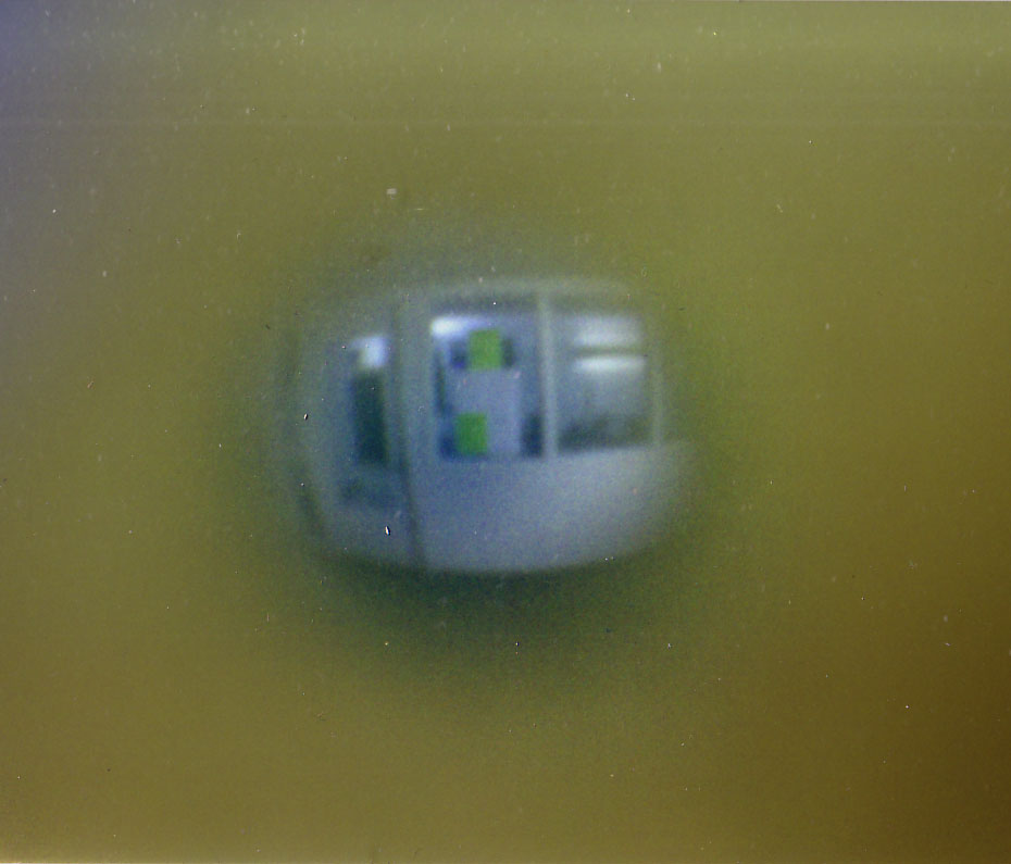
Above, looking through the peep hole of my dorm door, 112 South Michigan Ave, 9th floor. This space no longer exists. Below, the elevator I took so many times.

Dead birds (they constantly flew headlong into the bank of windows on that facade, then fell, in droves, into the water below), dead leaves, and my shadow in a pool outside the lake side of the Art Institute of Chicago.

Two stairwell views on the way to the Advanced Painting studios (above and below).

Another stairwell view, light on the landing.

Glass and light, looking up toward the Advanced Painting studios.

Sunlight glances through the shades of my 13th floor (the smoking floor) dorm at 162 North State Street.

MAGNITUDE 7 at Manifest

My work, titled Galaxy (Shell, Fecundity, Emanation), will be seen at the 6th annual MAGNITUDE 7 exhibition at Manifest coming up at the end of this month. The piece is a mezzotint print that has been embossed with a unique collograph print.

And here’s my statement about the work for the show:

Over the last two years I have become increasingly enamored with the mezzotint printmaking process. I have used mezzotint as a way to find new and different access to some of the subject matter I have used for years in my paintings and drawings. Bricks, shells, geometric forms, and bodies have all become part of my mezzotint repertoire. Those geometric forms – specifically the Platonic solid called the dodecahedron – have begun to inform my mezzotints beyond simple representation; I have started using the angles of the dodecahedron and its constituent, the pentagon, as dimensional embossments upon the mezzotint prints.

In the work I present here at MAGNITUDE 7, titled Galaxy (Shell, Fecundity, Emanation), the beautiful gradients and milky consistency mezzotint is known for are used to display a shell, spinning in an amorphous space. Yet a fine tracery of lines and angular counterpoints shifts the surface level of the image itself, creating a bas-relief. The angles are formed using a collograph print over the final mezzotint. This collograph is a unique, one-time embossment; though the edition of mezzotints is all the same, the embossment seen in each print is one of a kind.

By embedding these angles (taken directly from the dodecahedron) onto the image of the spiral form shell, I reintegrate their inherent relationship, since both the spiraling of the shell and the angles of the quintessential Platonic solid display the natural mathematical beauty of Phi, the golden ratio. While the depiction of the shell can be a visual entry point for contemplation, the angles of the subtle embossment encode a physical reality into the artifice of the image. This duality is something I am hoping to develop more and more. I want the image and the icon, the depiction and the object, the picture of the idea and the idea itself, to become manifest in these prints as I continue them.

Color Drawing, Spring 2010

A year ago I started teaching all levels of Color Drawing (Beginning, Intermediate, and Advanced) at the University of Missouri. While I really enjoy all of my classes, the Color Drawing sections have been particularly special to me.

So here’s just a review of some of the great work from this semester…

Danielle Moser, Beginning Color Drawing: Reflection Project Drawing, Oil Pastel, 24 by 18 inches.
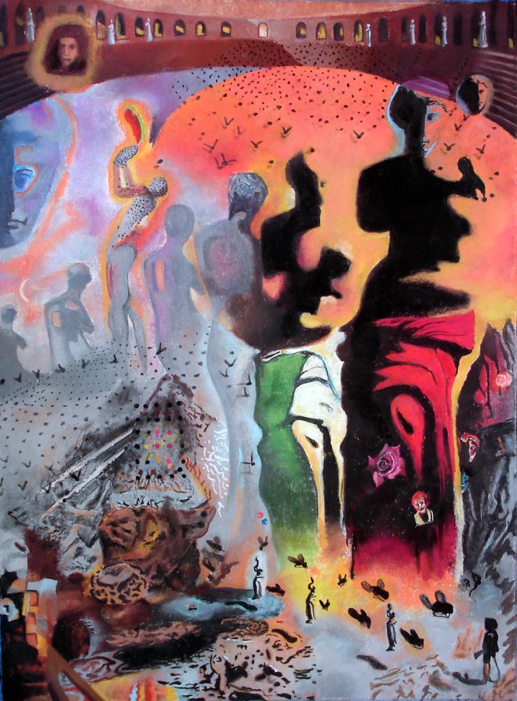
Jillian Blanck, Beginning Color Drawing: Master Copy Drawing (after Dali’s The Hallucinogenic Toreador), Chalk Pastel, 30 by 22 inches.

Scott Fisher, Beginning Color Drawing: Master Copy Drawing (after Michelangelo’s Libyan Sibyl from the Sistine Chapel), Chalk Pastel, 30 by 22 inches.

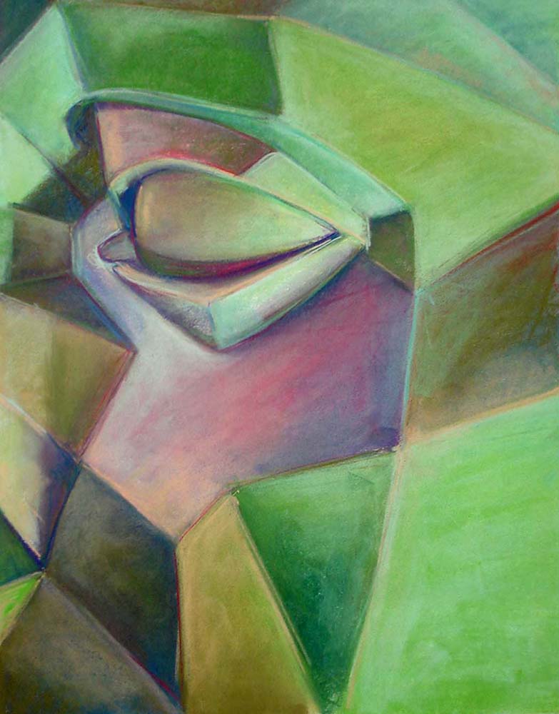
Holly Meador, Intermediate Color Drawing: Head Planes Model Drawing, Chalk Pastel, 44 by 30 inches.
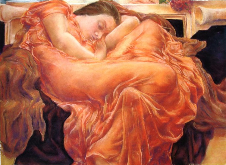
Holly Meador, Intermediate Color Drawing: Self Portrait as Flaming June (after Lord Frederic Leighton’s Flaming June), Chalk Pastel, 30 by 36 inches. (Unfortunately, this drawing was stolen from my flat files at the University – I’m actually pretty pissed off about it. How can we expect our students to be willing to put forth their best efforts when their peers don’t respect that work? Really unbelievable.)
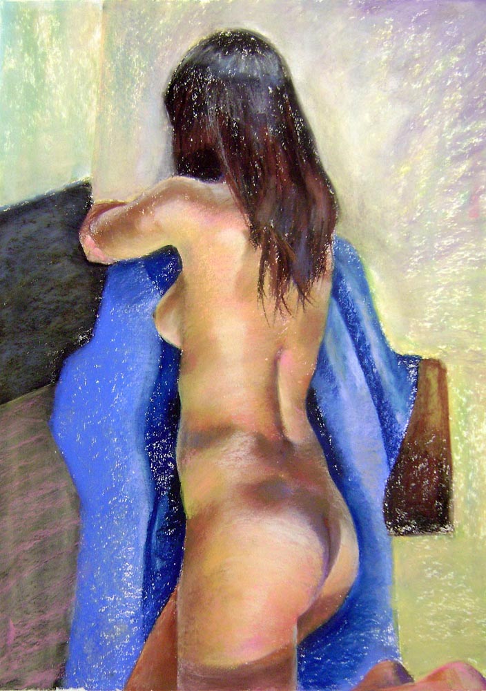
Roxanne Kueser, Advanced Color Drawing: Courtney, Chalk Pastel, 24  by 18 inches.
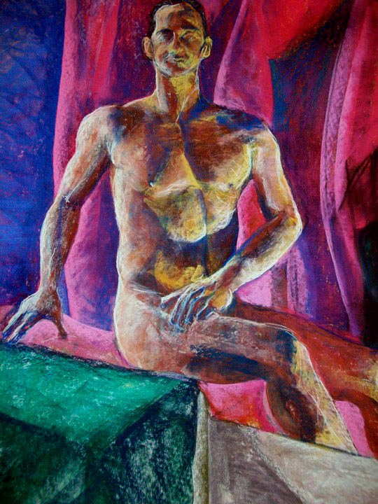
Brittany Carney, Advanced Color Drawing: Neil (The Proper Posture), Chalk Pastel, 24  by 18 inches.

Marcus Miers, Advanced Color Drawing: Untitled Composition, Chalk Pastel, 60  by 45 inches.

I want to thank all of my Color Drawing students for making the class so enjoyable. I could have easily had 100 drawings to show from the production of my 24 students; I don’t mean any disrespect to those I’ve not displayed here. These works do show the overall quality and worth ethic I’ve seen throughout all of the students this semester. I’m so glad I got to work with them. Here’s to setting the bar high for next semester!