Venus Transit 2012

Click on the image to see it large.

Yesterday I had the great opportunity – another with a few thousand other people from Mid-Missouri – to view the Transit of Venus at Mizzou’s Laws Observatory. We had great weather and clear skies for the event. The University handled the situation well – there were perhaps 15 viewing stations beside the larger domed telescope that sits high atop the Physics Building on the eastern edge of campus. See here for more information about the mission and outreach of Laws Observatory.

Exiting Painting MFAs

Jacob Johnson, Jackie Lin, and David Spear all graduated from the University of Missouri Art Department this semester. I was on each of their graduate committees and was with them from the first days of their graduate experience. I could write a lot about their work, their thesis writing, and the things they’ve been trying to do. Instead I want to share just one piece of work (or so) from each of them.

Above: Jacob Johnson, Untitled (Neil’s Back, Green), Oil on Canvas mounted on Panel, 72 by 48 inches, 2009.

Below: Jacob Johnson, The Professor (Portrait of Matt Ballou), Oil on Panel, 8 by 6 inches, 2012. This was a tribute piece Jake made for me…

Above: Jackie Lin, Stir Fry, Oil on Canvas, 66 by 52.5 inches, 2010.

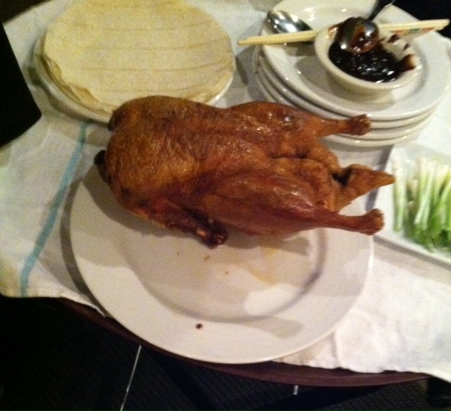
Below: Jackie took my family out for Peking Duck at House of Chow here in Columbia, MO as a gift to me… it was amazing!

Above: Harrison Bergeron (managed, directed and produced by David Spear), Who Are We, Where Do We Come From, Where Are We Going?, Oil on three Panels, 114 by 31.5 inches, 2012.

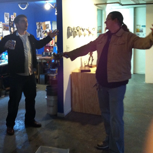
Below: Me and Harrison hamming it up at the Multimedia Extravaganza that was the thesis show…

The paintings above are three of my favorites from the production of these artists. I’m proud to have seen them develop and strive and fail and scream and leap for joy over these years. Here’s to many more years of learning to fail well.

Discussions and Digressions

“In places like universities, where everyone talks too rationally, it is necessary for a kind of enchanter to appear.” – Beuys

“Theory can only describe; it can never justify.” – Ballou
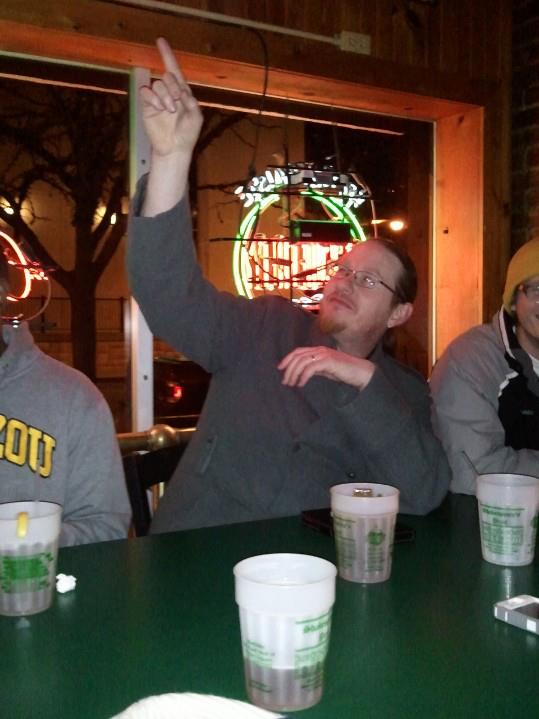
Above: Me with some grads after one of our early sessions, Spring 2012

This semester I got to dig deep with a group of graduate students here at Mizzou. In the discussion-based course I presented a series of texts – grouped into several general themes – and used them to attempt to open up the grads’ approach to thinking about, making, and viewing art. In our reading, discussion, and reflective writing, we took on some of the alternative histories/literacies that function within the art world. I wanted to use this post to give a general overview of the topics and content we touched on this semester, as well as offer a selection of some of the provocative ideas we read. I do this as a huge thank you to the individuals whose work we sampled; their words were encouraging, challenging, enraging, and powerful. I also wanted to take this opportunity to thank the students who took the journey with me. So here’s to Aron, Bethanie, Charlie, Chris, Danielle, Eric, Greta, Jahner, Jane, Matt, and Ron; none of us could have had the experiences we had without each of us being a part of it. As David Abram (or Bachelard, or Emerson, or Dillard) might say – all things are in relation.

Above: A grad class?

1) We began by discussing some key dichotomies through the easy-to-access survey work of Leonard Shlain. Contrasting ideas such as Image/Word, Nonverbal/Verbal, and Truth/Fiction were explored in a number of texts and films, the latter being most importantly represented by Herzog’s Lessons of Darkness and Reggio’s Koyaanisqatsi.

“Of all the sacred cows allowed to roam unimpeded in our culture, few are as revered as literacy.” – Shlain

Key Works:
Reggio, Godfrey. “Koyaanisqatsi.” Color Film, 1983.
Shlain, Leonard. “The Alphabet Versus the Goddess: The Conflict Between Word and Image.” 1998.
Herzog, Werner. “Lessons of Darkness.” Color Film, 1991.

2) Tightening our resolution from the expansive binary tensions in our initial overview, our second focus was to look at how the more central ideas and modes of art and aesthetics were defined/redefined and questioned in the first part of the twentieth century. Looking at early pragmatist philosopher/scholars of art and religion like George Santayana and Ananda Coomaraswamy we took the temperature of a certain corner of the institutional establishment in the throes of the Modernism moment.

“To be sensitive to difficulties and dangers goes with being sensitive to opportunities.” – Santayana
“The artist is not a special kind of man but every man is a special kind of artist.” – Coomaraswamy

Key Texts:
Santayana, George. “Reason in Art.” Originally published in 1905.
Coomaraswamy, Ananda. “Christian and Oriental Philosophy of Art.” From a 1956 Dover edition.

3) In our next group of readings we found ourselves looking away from socialized and received notions of making meaning and gazed into the huge vault of human biology itself. Using primarily Rudolf Arnheim and Ellen Dissanayake, we discovered that a very profound kind of knowledge precedes the cognitive ideas that may calibrate our understanding of art: the psychology of kinesthesis and developmental biology. We took Dissanayake as a jumping off point to engage with Evolutionary Psychology as it pertains to art, art-making, and meaning. Touching on the work of Denis Dutton (as well as his critics), we explored how biology has calibrated how human beings make meaning and put it to work in the world. Coming back to pragmatism, we saw how Dewey and Kupfer connected aesthetic experiences with moral growth.

“It is important to recognize that in large measure everything we know is ultimately based on our bodily senses: what we see, hear, and touch, in particular.” – Dissanayake

“The work of art symbolizes all the levels of reality that lie between the phenomenon and the idea.” – Arnheim

“We take pleasure in watching an athlete break a record, hearing a soprano in full flight, or reading a philosopher of depth and insight. Human accomplishment is the ultimate spectator sport. Apply as much historical analysis to it as we wish, and we’ll not unlock all its mysteries. The continuous capacity of genius to surpass understanding remains a human constant.” – Dutton

Key Texts:
Arnheim, Rudolf. “Toward a Psychology of Art.” 1966.
Dissanayake, Ellen. “Homo Aestheticus.” 1992.
Dutton, Denis. “Aesthetics and Evolutionary Psychology.” The Oxford Handbook for Aesthetics, 2003.
Dewey, John. “Art as Experience.” 1958.
Kupfer, Jospeh. “Aesthetic Experience and Moral Education.” Journal of Aesthetic Education, 1978.

4) Once fully ensconced in the notion that our biology (and the way that biology structured our thinking and making) is key to any real understanding of what art is and does, we looked at the intellectual analysis of artworks. This examination of interpretation – or, as it might be, overinterpretation – was overseen by Arthur C. Danto and Umberto Eco, with a significant dash of Richard Rorty thrown in for good measure.

“Interpretation is in effect the lever with which an object is lifted out of the real world and into the artworld, where it becomes vested in often unexpected raiment. Only in relationship to interpretation is a material object an artwork, which of course does not entail that what is an artwork is relative in any further interesting way.” – Danto

“From a certain point of view everything bears relationships of analogy, contiguity and similarity to everything else.” – Eco

“Reading [artworks] is a matter of reading them in the light of other [artworks], people, obsessions, bits of information, or what have you, and then seeing what happens.” – Rorty

Key Texts:
Danto, Arthur C. “The Philosophical Disenfranchisement of Art.” 2005.
Eco, Umberto. “Interpretation and Overinterpretation.” 1992.

Above: COME AT ME BRO!

5) In some sense our exploration of the hyper-intellectualized/philosophized interpretation of artworks took us from culture into a kind of ritualized, rarified space – albeit a secular one. From there we took a tack back toward culture-making and onward through it toward a more spiritual kind of ritual. We looked first at key texts from the famed philosopher of religion Mircea Eliade. Our perspective was updated to the mid-90s with Suzi Gablik’s The Reenchantment of Art.

“The numinous presents itself as something ‘wholly other’ (ganz andere), something basically and totally different.” – Eliade

“Ritual signifies that something more is going on than meets the eye – something sacred.” – Gablik

Key Texts:
Eliade, Mircea. “The Sacred and the Profane: the Nature of Religion.” 1959.
Gablik, Suzi. “The Reenchantment of Art.” 1991.

6) At this point we began to entertain the implications of the alternative histories/literacies we had explored over the semester. We aimed more directly at poetical understanding, beginning with Emerson as a representative of the American Transcendentalist Movement of the 19th century. From there we allowed Annie Dillard and David Abram to bring us up to the present day – and blow our minds along the way. In this section we spent a good amount of time attempting to understand an intuitive mode of aesthetics as opposed to a rationalist one.

“The life of [humanity] is a self-evolving circle, which, from a ring imperceptibly small, rushes on all sides outwards to new and larger circles, and that without end.” – Emerson

“The feelings that move us – the frights and yearnings that color our days, the flights of fancy that sometimes seize us, the creativity that surges through us – all are born of the encounter and interchange between our life and the wider Life that surrounds us. They are no more ours than they are Earth’s” – David Abram

“I’ve an eyeful of fish-scale and star!” – Dillard

Key Texts:
Emerson, Ralph Waldo. “Nature and Other Writings.” 2003 edition by Shambhala.
Abram, David. “The Air Aware.” 2009.
Dillard, Annie. “Pilgrim at Tinker Creek.” 1974.
For your listening pleasure, click here to hear David Abram read The Air Aware.

Above: They (the grads) were in some frightening trees (grad school)! Click here for more information…

7) Our final readings of the semester centered on Gaston Bachelard. This master dreamer – a giant of 20th century philosophy who influenced Foucault and Derrida – helped us grasp the constellations that populate our own inner universes. Bachelard gave us – through his inflected intonations of the words of Rilke and Baudelaire (among others) – a sense of how our intuitive manifestations might transcend the “geometrical ontological determinations” that dominate the empiricist, rationalist approach to contemporary art-making.

“Everything takes form, even infinity. We seek to determine being and, in so doing, transcend all situations, to give a situation of all situations.Man’s being is confronted with the world’s being.” – Bachelard
“By means of poetic language, waves of newness flow over the surface of being.” – Bachelard

Key Texts:
Bachelard, Gaston. “The Poetics of Space.” 1994.

I want to thank all of the grads for going with me on the journey this semester. Spring 2012 FTW!

Exploring Possibility

Jill Hicks of the Columbia Daily Tribune wrote a piece titled “Exploring Possibility” that ran on Sunday, March 18, 2012. The article follows Allison Reinhart, a student who’s been a major presence in the Art Department here at Mizzou. She’s currently taking an independent study with me. We’ve worked together in the past – most notably on this film by the inimitable Keith Montgomery – and she’s one of my favorite people at MU.

Jill quoted quite a bit of my thoughts on working with Allison. It’s really nice to find that you’ve said something that really rings true and you have to work to live up to it. I feel that way about this particular passage: “…making accommodations for my students isn’t an area of ‘special’ or ‘additional’ effort — it’s the way it ought to be,” […] “All culture-making is about access. When we — as institutions or individuals — legitimize the denial of access to those who wish to participate, we’re functioning as gatekeepers and operating in illegitimate systems of refusal. As an educator and person who deeply believes in the value of university-level teaching, I don’t want to be a part of that.”

Thanks to Jill for the great article and to Allison (and Gina, and others!) for being thoughtful, dedicated students. No, I didn’t say inspirational… Allison wouldn’t like that. :)

Chromatic Intensities


Glory in Color Drawing 2

Marcus, the Assistant, casts chroma

Null’s large drawing in anamorphic distortion

The array of shadows in Color Drawing 1

And another view…

The box, electric.

Did I mention that I love teaching Color Drawing? Epic, every semester. Stay tuned for good shots of current students’ works.


Pulling an Edition of Mezzotints

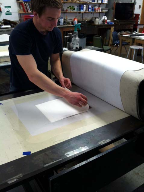
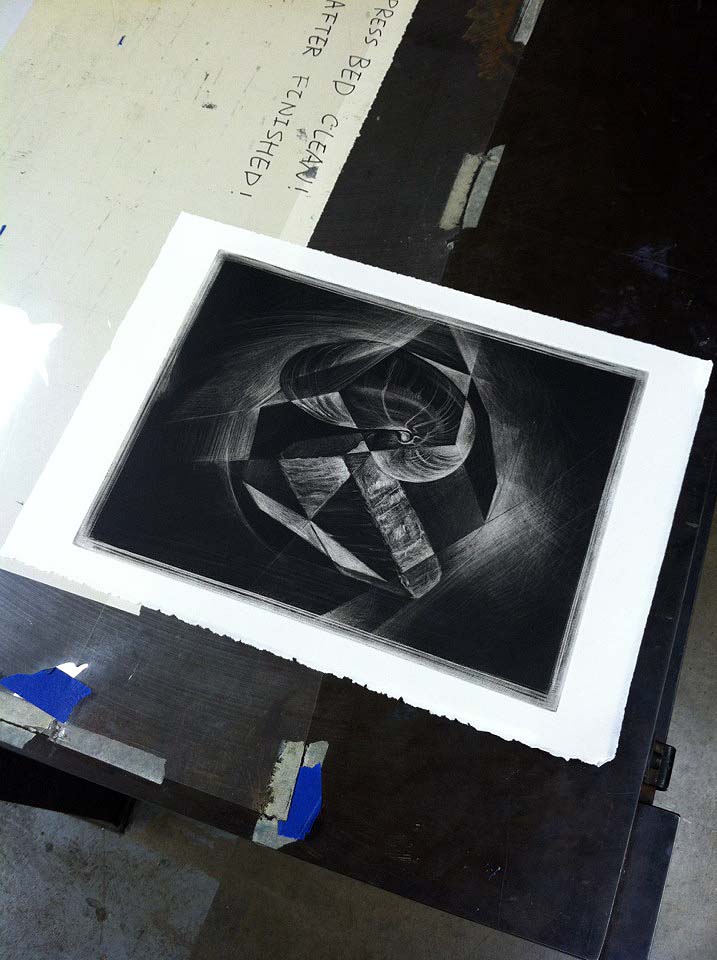
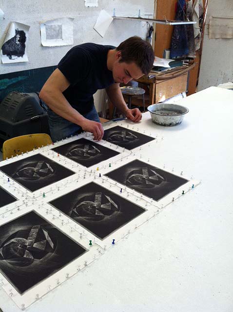
I am a part of an upcoming traveling mezzotint show, a brainchild of printmaker Aaron Coleman. Today and last Friday I worked with Derek Frankhouser to pull 21 mezzotints (an edition of 19 +two artist’s proofs). Derek is also in the show and is a budding master printmaker who held a residency an internship at the Robert Blackburn Printmaking Workshop in 2011. Below is a record of our efforts.


My hand, blackened by hand-wiping, in front of the pinned prints. I used Charbonnel ink.


Derek laying the paper…


…and carefully pulling it off the plate after a pass.


A beautiful pull (this was my first print of the process).


Pinning.


A shot of the whole edition set off to the side for drying.

I’m super thankful to Derek for his help and couldn’t have pulled the entire edition (without mistakes or needing to re-do) without him. This is the also the first time I’ve been able to edition beyond 10 or 12 prints; that’s a testament to Derek’s counsel and help.

Inspiration – Sloane Snure Paullus

The first class I was a part of teaching at the University of Missouri included three grads – Nancy Brown, Ian Shelly, and Sloane Snure Paullus. These three – and a few others, like Catherine Armbrust, Eric Sweet, and Natalie Hellmann (among others) – have defined my experience as a teacher at MU.

Above: Sloane beading back in 2007.

Over the last year or so I’ve seen each of those first three grads finalize a body of work, refine and defend their thesis writing, organize their thesis exhibition, and move on to new things. This week saw Sloane and her husband move away from Columbia and into a new phase of their lives.

Above: Sloane and her peephole boxes, 2008.

For so long Sloane has been a cornerstone of the Art Department, bringing both intellectual excellence and paroxysms of mirth to each of us. She transformed the culture of the department, raising the bar and shaking things up. There’s really no one like her.

Above: Sloane hanging out with Ian at the Annual “Kinkade Christmas Cottage” viewing, 2009.

She was the perfect grad student; engaging as an artist, thoughtful as a friend, cosmopolitan in her views, expansive in her mentality, and distinctively creative in her sense of humor. I am thankful to have known her.

Above: Sloane Loves Britney! Halloween 2009.

Keep us all updated, Sloane! We love you!

Note: No lens flares were harmed in the making of this blog post.

Looking Over the Overlooked at MACC

Jacob Maurice Crook and I have a show together at Moberly Area Community College. We installed today and the exhibition opens this coming Monday, June 6th. I hope you can get there to see the show – MACC’s gallery space is quite nice – but if you can’t make it, check below for some shots of the work installed. Click each image for enlargement.

1 ) Crook’s main wall arrangement. One larger oil painting, a small work in oil, and a mezzotint.

2 ) Crook’s inner room set – two oil paintings flank a beautiful graphite and gouache work.

3 ) Crook’s side wall, with an oil piece, two large mezzotints, and a graphite work.

4 ) Crook’s behemoth Hitt Street Garage, an 18 foot, 7 inch oil painting.

5 ) Ballou’s main wall set, with images from Chicago during 2000 and 2001.

6 ) A grouping from Ballou’s 2008 Illinois beach house series.

7 ) Ballou’s 2008 Michigan light photos.

8 ) The 2004 Whitney Ceiling set, installed physically for the first time here (I presented them online during 2010 at this link.)

If you are now sufficiently inspired to see the show for real, MACC is located at 101 College Ave. Moberly, MO 65270.

And here are our statements for your perusal:

Looking Over the Overlooked Exhibition Statement

Matt Ballou and Jacob Crook present work that engages with the proliferation of commonplace, yet ignored, spaces in the urban and suburban landscape.

Using primarily photographic images, Ballou depicts an iconography of geometries and formal tensions based on his experiences with specific interior and exterior spaces over the last decade. Several bodies of work from very different locations around the United States take center stage. These include a latticework of appropriated images showing the ceiling of the Whitney Museum of American Art in New York City, a multitude of manipulated photographs of a skylight in a rural northern Michigan home, and a series of images of the degrading arcs and angles of a dilapidated municipal beach house in northern Illinois. Installing the images in broad arrays allows for a serialized, comparative reading that creates interplay between the total effect of the group and the specific characteristics of individual images. The works are not meant to be singular expressions but rather cumulative contemplations of space, place, light, and the modular effects of specific structures.

A dedicated representational painter and draftsperson, Jacob Crook’s work starts with repeated observation and detailed consideration of the overlooked arenas that quietly dominate the American landscape. Relying heavily on James Howard Kunstler’s book The Geography of Nowhere, Crook’s paintings, drawings, and prints attempt to come to terms with what Kunstler describes as the American “obsession with mobility, the urge to move on every few years” and the results of that tendency: “we choose to live in Noplace, and our dwellings show it.” Casting his eye on the margins of suburbia, Crook tries to locate the dynamic tension that exists between the land and our mundane domination of it. Crook carries on the legacy of landscape painting while rejecting its inherent valorization of the subject matter. Instead of merely creating pleasant pictures, his work uses the historical authority of both painting and the landscape to project a subversive series of questions toward viewers.

Together the work of these two artists is a vision of what American space has become. Not an entirely negative perspective, the work is meant to provoke an introspective attitude in viewers, challenging assumptions and calling questions to mind: “What spaces do I want to live in? What has dictated the sorts of spaces I live in by default? What is my responsibility for the reality of these spaces?” The artists hope that by bringing their own investigations – as humble or as banal as they might seem – to viewers, a thoughtfulness and contemplation might be stimulated.

Biographical Information

Ballou is an Assistant Teaching Professor at the University of Missouri where he has taught since 2007. In 2011 he presented a major solo show at Gordon College in Wenham, MA and will exhibit with internationally renowned artist Tim Lowly at the 930 Art Center in Louisville, KY during the summer of 2011.

Crook earned his BFA from the University of Missouri in 2009. His work was recently included in the prestigious Fort Wayne Museum’s Contemporary Realism Biennial. He has been accepted to Syracuse University’s graduate printmaking program for the fall of 2011.

Jacob Maurice Crook | Artist Statement

My work is a contemplation of how the physical design of our surroundings can influence social behavior and also offer insight to cultural practices that inform the nature of such designs. In choosing the subject matter of my imagery, I focus my sights on the fringe of suburbia, attempting to locate dynamic tensions existing between the landscape and the homogeneous developments quietly dominating its topography. I chose to reject the idealized depiction of subject matter inherent in the history of American landscape painting. Instead of merely creating pleasant pictures, I use the history of both painting and landscape to project a subversive series of questions to viewers: What spaces do I want to live in? What dictates the spaces I live in by default? What responsibility (if any) do I take for the reality of these spaces?

Matthew Glenn Ballou | Artist Statement

These photographs were never meant to be artworks per se. Over the course of many years I have used photography as a way to decipher my own eye, as a way to better understand what visual dynamics draw me to certain scenes or arrangements of form and space. So most of what you see here was entirely reactive and instinctive at the beginning. I was attempting to see something in what others might easily overlook. Ultimately it worked, and in many ways these images have become historical and canonical to me. They are also nostalgic in that they are documents of places and times that carry personal significance. In them I see my own eye remixed, my own memory re-contextualized. In them I see a field of visual forces at play, which I have taken and used, reused, and reapplied. I present them in this way at this time to heighten my experience of their formal tension and balance in contrast with my emotional feeling for the spaces and times they represent. I present them so as to experience all of this again, anew. It is the contrasts and resonances made possible by this new context that bring artfulness to the work. The images themselves remain snapshots while the relationships among these fragments become a place for art experiences to reside: between the lines, in the overlooked spaces, around corners, beyond sight.

Another Semester, Another Round of Glory

Yes, it’s Beginning Color Drawing time again… Once again it’s been a great start to the semester. I feel pretty astounded at the talent of my Beginning Color students; even though they’ve all taken Drawing 1, and some have had other studio courses as well, they’re all making big strides. It’s fantastic work. Take a look:

Andrew Vincent “Grid #1” Chalk Pastel, 24 by 18 inches, 2011.

Melissa Hoefer “Grid #2 Colored Pencil, 18 by 18 inches, 2011.

Emily Armstrong “Two Colored Pencil Object Group Studies” Colored Pencil, 24 by 18 inches, 2011.

Lauren Roberts “Grid #1” Chalk Pastel, 18 by 24 inches, 2011.

Mitchell Baggett “Colored Pencil Object Group Study” Colored Pencil, 12 by 18 inches, 2011.

I know I’ll be posting more work from this group…