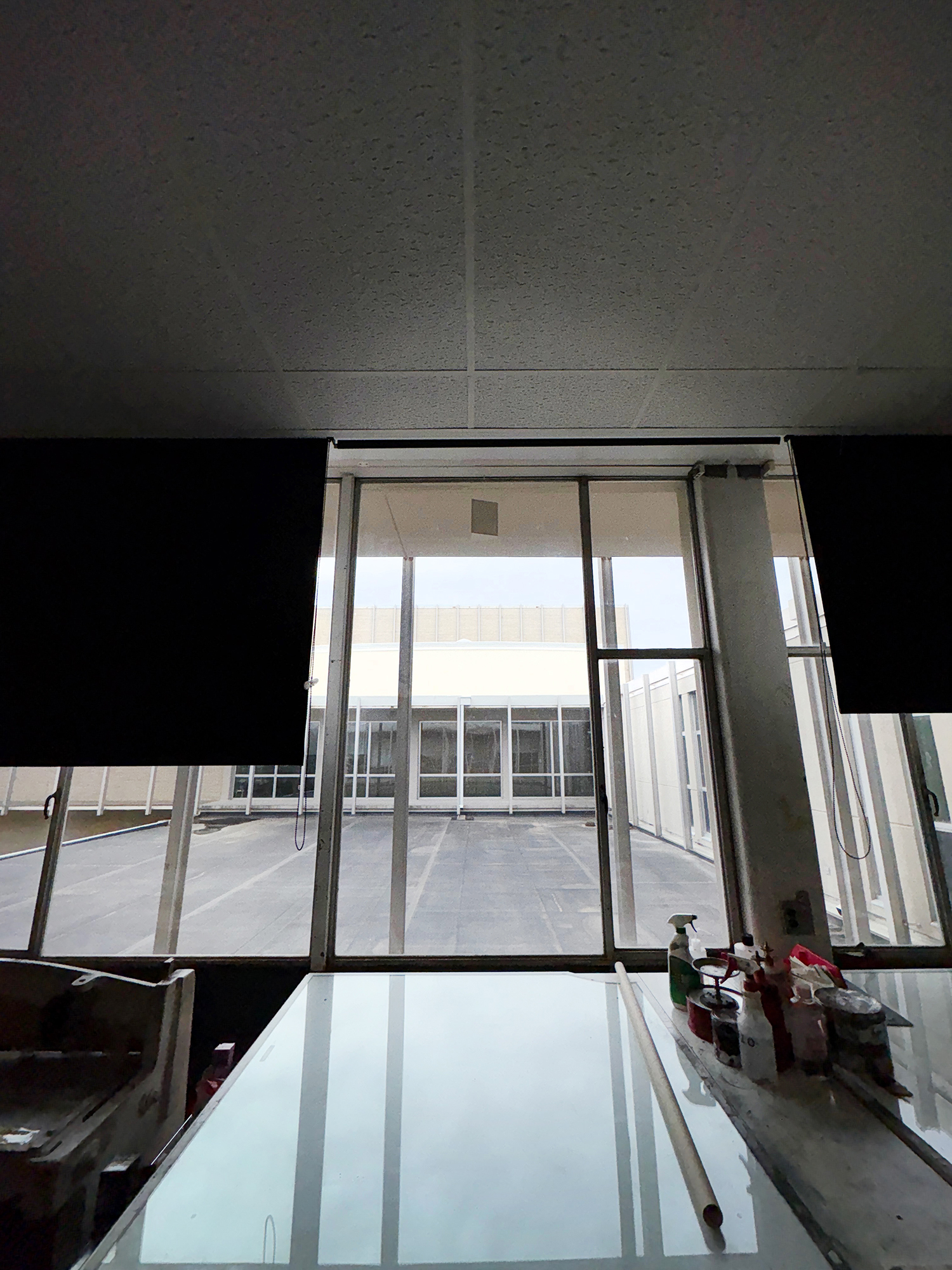
Today I went into the printmaking room at The University of Missouri and placed a lithophane in the widows there.
The idea for this began a few years ago while playing with my drawing robot. I wanted to try different line modes in various images, and happened to throw in a picture of Eric. One of the resulting works was this small ballpoint pen piece:
Head of Sweet. Ink on paper, 5×3 inches. 2022.
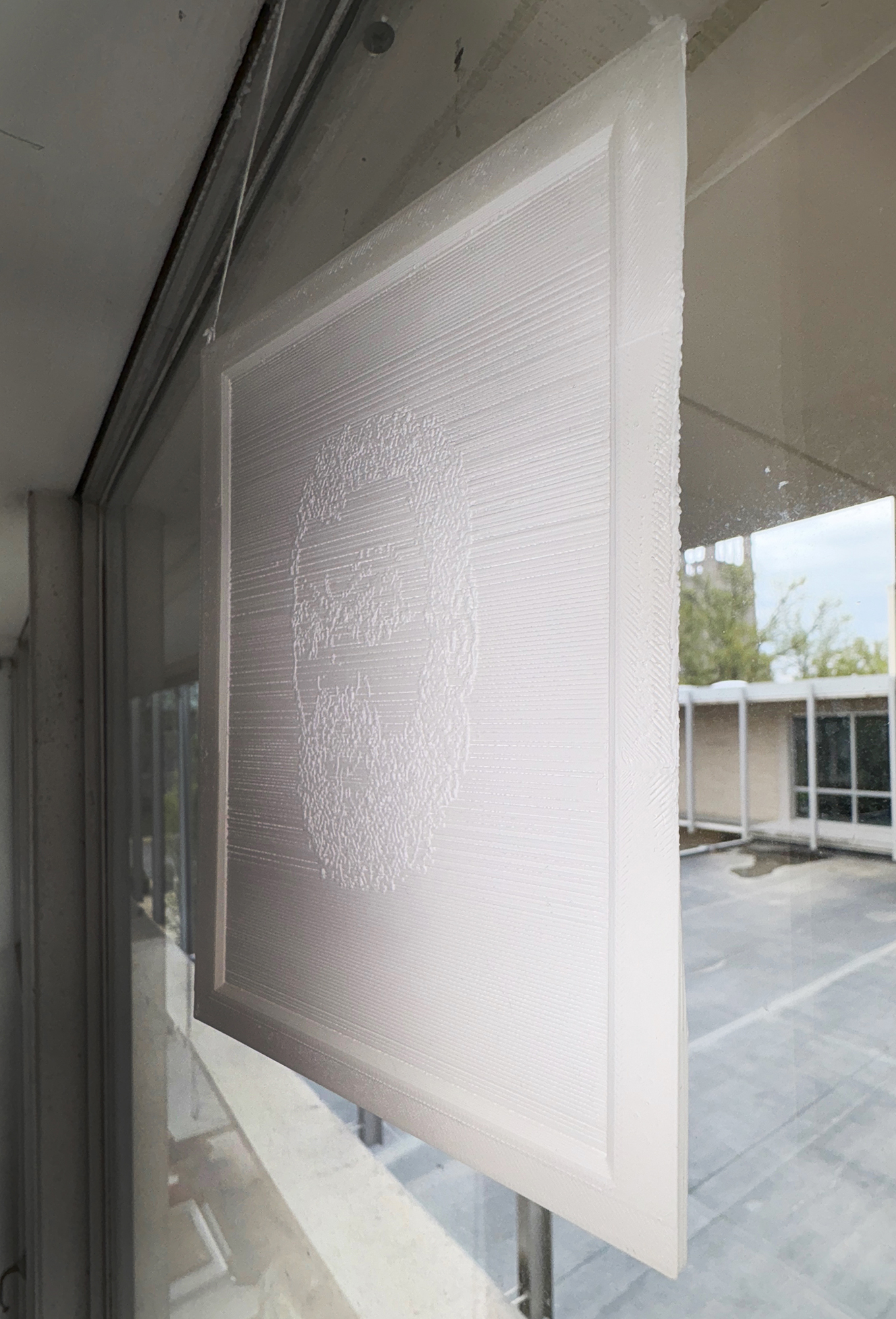
The piece I’ve hung today is intentionally related to Sweet’s MFA thesis works, which featured embossed relief and required specific lighting to be seen. Click here to see examples of these works (and a cool picture of Eric in the very printmaking room where my lithophane is now hanging). The portrait of Eric I’ve made is designed to be somewhat inscrutable unless strongly lit from behind. In the documentary images I’ve posted below, you can see the image is barely visible. I have included some shots with a flash on so you can see the relief dimension of the piece.
Ten Years of Seizing the Sixth. PLA, printed on a FlashForge Adventurer 5M. It’s 7×5.25x.25 in size. 2025.
It’s important to maintain the reality of those who have passed on. This is as much about keeping ourselves real as much as it is celebrating their lives. In reminding ourselves of others’ lives, in being creative in that remembering, we find and define ourselves. Keeping Eric in the world through making and practicing attention is a way of honoring him and the values he held.
Ten Years of Seizing the Sixth. PLA, 7×5.25x.25 in size. 2025. This is what it looks like with strong illumination behind the lithophane.
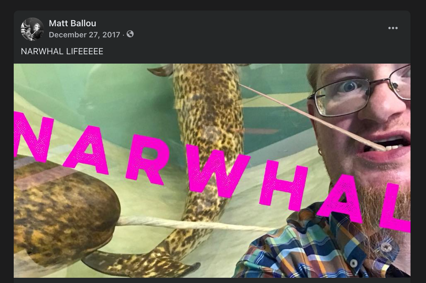
Nine years ago today I experienced cardiac arrest, and I started a journey to becoming a new person. One of the ongoing fun bits related to my heart attack and eventual recovery, was that my friend – famed bookstore co-owner, and local arts organization legend – Kelsey finally accepted the reality of narwhals!
You see, it – the existence of narwhals that is – had been a minor contention between us for quite a while (see above image). I’d mention the unicorn of the sea and she’d push back. But when I woke up from my ordeal and began sorting through the notes, good vibes, and other well-wishes I found a Post-It note from Kelsey. On it she drew the beast and wrote above it, POR VIDA – “for life!” She told me that since I’d pulled through, she could accept the truth of narwhal-kind!
I’ve kept Kelsey’s Post-It note up all these years, right there in my kitchen where I can see it daily. But this year I felt it was appropriate to take it to the next level. I’ve commissioned a local tattoo artist to bring Kelsey’s drawing to life on my very flesh!
Once it is healed up I’ll add a nice shot of it to this post. I’m grateful to people like Kelsey, who have given me so much joy and hope in humanity over the years. She is a true community spirit, someone who understands kindness and laughter. And I’m proud to carry her drawing with me – on me! – from now on, a reminder to seize the day, be happily present, and to embrace the wondrous absurdities all around us.
One of my favorite prints (and a few words) has been reproduced in this new book from Renascence Books., located in Nashville, TN. The book is an anthology of work related to Gaza/Palestine from 30 artists around the globe. 100% of profits will be donated to mutual aid for Gazans. See the blurb from the back of the book below, and follow this link to purchase your own. This book is the creation of a diverse group of people who have a variety of connections to Gaza/Palestine and who come from many different faith traditions and worldviews. But we’ve come together to make a visible, physical artifact of care and support for real folx on the ground over there. They should not be forgotten in all of the vitriol and political obfuscation. Please, support the effort and the artists within this hopeful book if you can.
I offer my work for this project as a prayer that agency, protection, and hope may soon return to this ancient land, that mothers may soon cradle their children in safety, that fathers may soon sing ancient songs to them with confidence and joy.
See this fantastic blog from 11 years ago linked below. A nice tribute to Ray Johnson, who died on this day in 1995. He was a strange, unique man. At the intersection of queerness, neurodivergence, and mental illness, Johnson lived his whole adult life as an artwork. The amazing documentary How To Draw A Bunny (click the title to watch it), is a celebration of this one-of-a-kind life. Every semester I show this to my 2000 level drawing students as a way to demonstrate how mature artists create a vernacular of form and idea in their works, a way of creating and speaking that forms the architecture and language of their art. Ray’s life (and even his way of dying, in a sense) was inspirational.
In March 2003 I had been working at Good’s of Evanston for about 18 months. I worked there after earning my undergraduate degree, and at the time was getting ready to get married and head to grad school.
I worked at Good’s with an amazing cast of characters: Ronnie Boykin Junior, David Gracie, Micah Ebbe, Fred Sturkey, and so many others. One of the people there was Jeremiah Ketner, a man who has gone on to a long and fruitful art career. One day I saw Jeremiah’s coffee cup and we mused together about coffee sometimes being a main meal during the work day. I decided to paint a view of his so-called lunch.
Jeremiah’s Lunch 3/14/2003. Watercolor and graphite on paper. 5×6 inches on 14×11 sheet. 2003.
As the Shipping and Receiving Manager, I often had some time between shipments to make art in my little office. I loved that space. Did a lot of thinking back there.
A picture of me in my shipping and receiving office at Good’s of Evanston. 2003.
During this time Alison and I lived in a 3rd floor apartment that had this amazing accumulation of paint and interesting architectural details. Of course, anyone who has lived in Chicagoland is familiar with paint slathered over outlet holes, quirky entryways, specific brick hues, and questionable back stairwells. We had arches throughout the apartment, and I found myself ruminating on them between doing more “important” work. I made my whole portfolio to apply to grad school in that apartment. It’s strange to think that these two small watercolors ended up being special to me. I wouldn’t have guessed it at the time.
Arching Corner. Watercolor and graphite on paper. 12×11 on 14×11 inch paper. 2003.
Anyway, as we round out another year I find comfort in these small contemplations. Maybe the lesson is that all of my grand attempts to make statements or contribute to important conversations weren’t the best or most effective offering I could make. Maybe it was the fact that I noticed and paid attention to the poetry of spaces, moments, in-between time, and life being lived that really mattered.
Growing up I found intense comfort in the music and lyrics of the iconic Canadian band Rush. Rush hold a particular place in the history of rock music, as they were both iconoclastic and unapologetically moral and humanist in orientation. Their songs were not the realm of edge lords or shock rockers. They didn’t make songs about sex, drugs, violence, or stupidity. Much to the contrary. They thought deeply, expressed those thoughts intensely, and were able to stand out in completely unique ways because of the quality of their unified talents.
Rush pioneered rock music as an intellectual pursuit. They were compelling because they stood on principles, and communicated deep commitment to human concerns without couching it in schmaltz. You can sense honesty in their dedication to their musical craft and in the meaning embedded in the lyrics Neil Peart wrote.
John Dewey, a central philosopher of the pragmatist movement, established much of the foundation surrounding art as a moral structure in society. Don’t misunderstand me; I don’t mean propaganda or dogma being used within art to influence or instruct. I mean deeply human values translated into actionable expressions of yearning and awareness.
“Anthem of the heart and anthem of the mind A funeral dirge for eyes gone blind We marvel after those who sought Wonders in the world”
–Anthem
In Rush we see full expressions of a world where reason, empathy, and the better angels of our nature have had free reign. We find artifacts proving the best human capacities for love, attention, and hope.
When I think back on what inspired me and what stuck with me for all of these years, I think it is the sense of hope and expectation that they created. Actually, maybe hope is the wrong word… I think yearning might be a better way to describe it. Hope, in a sense, lacks agency. It sees life as something that happens to a person rather than what a person chooses, navigates, or constructs for themselves and alongside others.
“They travel on the road to redemption A highway out of yesterday, that tomorrow will bring Like lovers and heroes, birds in the last days of spring We’re only at home when we’re on the wing On the wing
We are young Wandering the face of the Earth Wondering what our dreams might be worth Learning that we’re only immortal For a limited time”
–Dreamline
Yearning, on the other hand, is motivational and self-actualization in process. It’s visualization. It’s being the change you want to see in the world. The ability to reflect, imagine the world you want to inhabit, and take real steps to make it real in some way… that’s yearning. It’s the combination of instinct and clear-sighted determination.
In some very real ways, Rush was the soundtrack to my own determination to at least TRY to expand my world. To get educated. To travel. To live as an artist. To read, think, and feel deeply. Songs like Middletown Dreams and Subdivisions called me to broaden my horizons. The lyrics of Dreamline and Ghost of a Chance made me dream, and then helped me transform those dreams into practical plans.
“Dreams flow across the heartland and feeding on the fires Dreams transport desires Drive you when you’re down Dreams transport the ones who need to get out of town, out of town”
–Middletown Dreams
“Like a million little crossroads Through the back streets of youth Each time we turn a new corner A tiny moment of truth”
–Ghost of a Chance
One of the other realms that Rush inspired me to think about and explore more fully was science. As a young person I was exposed to young earth creationism and other forms of science denial. Songs like Natural Science and, later on, Earthshine, prove that transcendent awe and appreciation for the wonders of the universe are not the purview of religious belief. As I read about the science behind everything from evolution to astrophysics, I unlocked a sense of astonishment and pure joy that had not been available to me before. In reading folx with diverse perspectives, from Stephen J Gould and Annie Dillard to Douglas Adams and Ellen Dissanayake, I found that there was a way to be excited about the glories of space, time, and biology without appealing to supernatural explanations. There’s so much that we can see, hear, touch, measure, and practically explore without needing to imagine things outside of the universe to justify them all.
“Wheel within wheels in a spiral array A pattern so grand and complex Time after time we lose sight of the way Our causes can’t see their effects”
–Natural Science
In some way, the feeling that I’ve always had while listening to Rush is a kind of nostalgia for a past dream of a future where good truths prevail. Where the right thing is done, and everyone can see it. Where the light of knowledge is appreciated. Where attempting to understand “life, the universe, and everything” is given the highest of accolades, appreciated more than fleeting beauty or physical ability. Where honesty, good faith, and mutual aid are seen as true societal values. I think that future is possible, and I think we are actually closer to it than we’ve ever been as a species. In a time where this country is divided and anxious, it’s easy to think that future is not possible. But it objectively is. This is the best time to be alive for most human beings.
This Thanksgiving week, I’m thankful for the world, for life, for music, and for Rush. Here’s a link to a playlist of some of my favorite songs they’ve made:
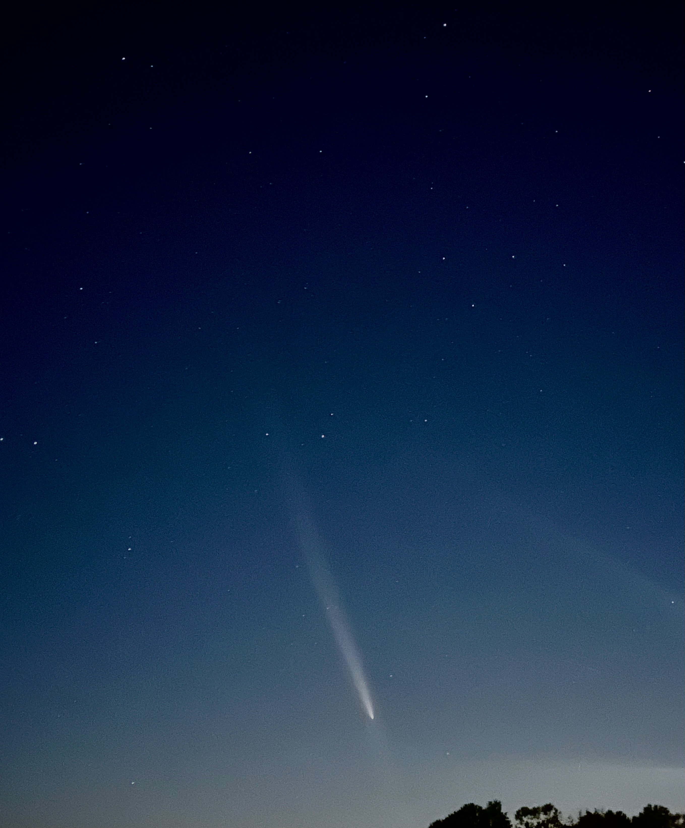
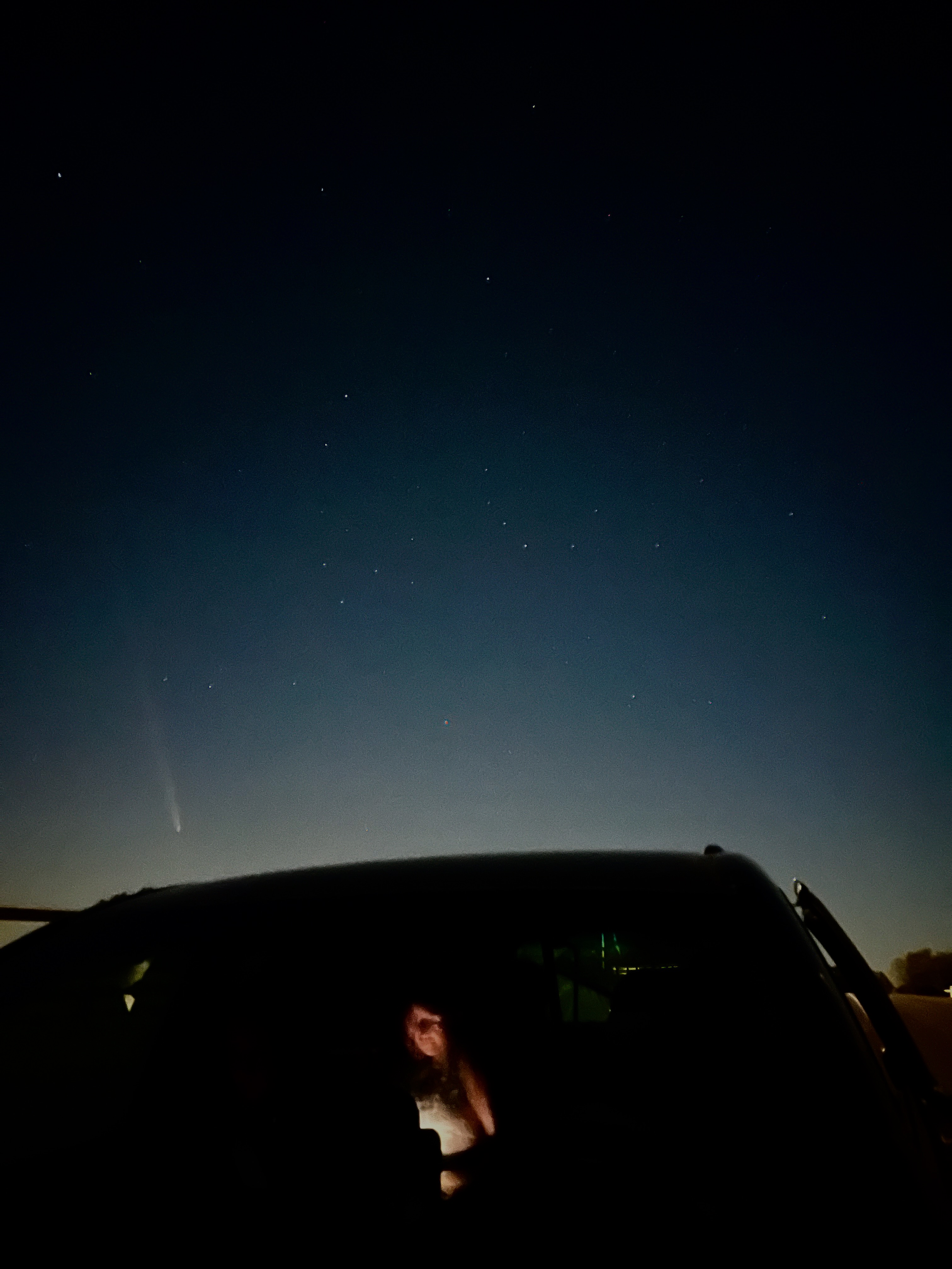
The beginning of the third week of the month was best, with some striking observations made possible with a short exposure time. Each night the viewing has been a little more difficult, and the tail a little shorter, so it may be beyond easy spotting very soon. It’s worth it, though. Once in a lifetime event here, folx.
I’ve gone out each night just to put my eyes on this ancient thing. Perspective is a quality that exhorts and propels the human heart. Seeing our conflicts and passions in the light of cosmic time and distance offers us the chance for true reflection.
One of the weirdest objects that used to exist in Columbia, Missouri is pictured below.
Benjamin Franklin in a tub shaped like a shoe, conducting a meeting, all the while stoking a fire beneath his own ass. Just look at it. AMAZING.
Sadly, the painting is now destroyed. I took pictures of it in 2013 when I did some art conservation work for Riback Pipe and Steel Company. The image below is a digital collage of shots because it was so hard to get the right angle on the work (there was a large, north-facing window opposite the painting.
My understanding is that the tub DID NOT ACTUALLY look like a slipper, but was what is called a “slipper tub” and was fairly common. I can find no reference to a tub shaped exactly like a shoe/slipper anywhere. I think Larson was taking some creative license here.
“France, Late 18th Century” by Sidney Larson
Missouri painter Sidney Larson completed this painting entitled “France, Late 18th Century” in 1969 as part of the “The Riback Mural,” commissioned by Harold H. Riback for the Riback Pipe and Steel Company building, which is situated at the east end of Business Loop 70 in Columbia, Missouri.
The Ribacks sold the business to Plumb Supply Company in 2015. Eventually, the building housing the mural was remodeled and the paintings were destroyed. According to the State Historical Society of Missouri’s Art Collections Manager Greig Thompson, the mural couldn’t be preserved due to the methods by which it was installed.
Notley Hawkins took photographs of the mural in December 2021, at the request of Vicky Riback-Wilson to preserve a record of the paintings. Hawkins studied painting and drawing with Sidney Larson at Columbia College in the 1980s.
In 1980, Larson published a booklet entitled “The Riback Mural” which included the following description of painting:
“Benjamin Franklin landed in France in December of 1776 and soon after set up quarters at Passy outside of Paris. His purpose was to solicit aid from the French toward the defeat of the British during the American Revolution. He proved to be a very popular man and was in great demand. He did suffer from attacks of gout for which his doctor recommended hot baths. For this, Franklin had the slipper tub, pictured above, built for him. He took hot baths twice a week, each one lasting as long as two hours. Hence the occasional meeting held while in his tub.”
Top left quarter: Marie Antoinette prior to losing her head. Top right quarter: Empress Josephine looking a bit like “The Death of Marat” in her bath. Bottom half: Franklin taking a meeting in the shoe tub. So weird.
Since 2019 I’ve worked as a portrait painter celebrating Mizzou student athletes. This last year was a high mark for Mizzou Football, with four of the squad being named All-American.
The University has a posh facility located in the south end zone area of the stadium where they hang all of the All-American portraits, stretching back into the 1930s. The great illustrator Ted Watts (1942-2015) created most of the portraits over the course of more than three decades, so I’ve got a big act to follow.
The All-American portrait wall at Mizzou Football’s South End Zone facility.
The display is pretty cool, and it’s cool to have my work extend that tradition. Portraits of Kentrell Brothers and Harrison Mevis are two of my works currently on display, and four new ones will appear soon (Fall 2024).
When I began to create my paintings, I went on a tour to see the previous works up close and to evaluate the aesthetic through-lines (format of names, dates, poses, backgrounds, etc), as well as the techniques prior artists used.
I take a central role in the design process, creating digital mockups which are approved at Mizzou Football before I begin the paintings. I generally work with ink on paper, which is mounted on panel and sealed, then painted over with layers of acrylic. I try to maintain a painterly quality, with texture and dynamic brushwork on display. I also attempt to bring the digital effects which naturally appear in the preliminary studies into a physical realm with semi-transparent washes of paint.
Working on the portrait of Cody Schrader.
As the projects have developed I’ve found my own approach to the portraits. I want them to have kinship with the portraits of Watts and other previous artists, but I make sure to give the works my own unique inflection.
I’m excited for the new crop to go on display. Kris Abrams-Draine, Luther Burden III, Javon Foster, and Cody Schrader are the 2023 All-Americans for Mizzou Football. See images of the works below, but also be sure to stop by the All-American wall if you ever get into the South End Zone building!
When I was in undergrad at SAIC, my class visited him while he was installing his 25-Year Survey (Oct 14, 1999 – Jan 9, 2000) exhibition. A classmate and I stood for him to help focus projections in one of his pieces while he talked to the class and led us through the various installations. Such a key memory for me, and an important exhibition for me to see as a young artist.
I love that he embraced sensitivity, even sentimentality, in his work. The art world – and the world in general – is so jaded and navel-gazing at their own foolishness that it’s nice to see someone who really thought about the biggest issues of humanity: our shared conditions, our hopes and dreams and fears, and the strangeness of our embodiment.