POR VIDA!

Nine years ago today I experienced cardiac arrest, and I started a journey to becoming a new person. One of the ongoing fun bits related to my heart attack and eventual recovery, was that my friend – famed bookstore co-owner, and local arts organization legend – Kelsey finally accepted the reality of narwhals!

You see, it – the existence of narwhals that is – had been a minor contention between us for quite a while (see above image). I’d mention the unicorn of the sea and she’d push back. But when I woke up from my ordeal and began sorting through the notes, good vibes, and other well-wishes I found a Post-It note from Kelsey. On it she drew the beast and wrote above it, POR VIDA – “for life!” She told me that since I’d pulled through, she could accept the truth of narwhal-kind!
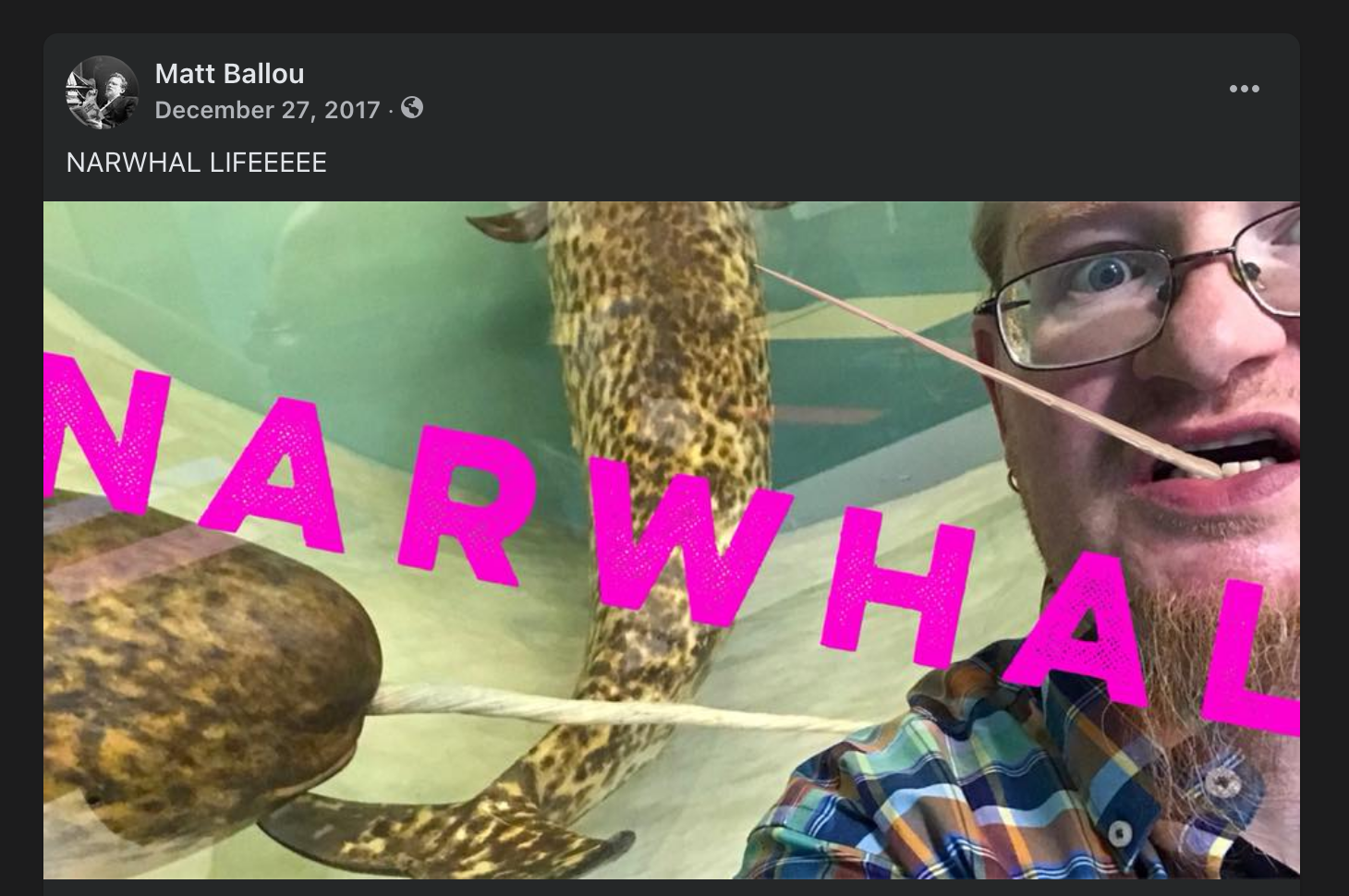
I’ve kept Kelsey’s Post-It note up all these years, right there in my kitchen where I can see it daily. But this year I felt it was appropriate to take it to the next level. I’ve commissioned a local tattoo artist to bring Kelsey’s drawing to life on my very flesh!

Once it is healed up I’ll add a nice shot of it to this post. I’m grateful to people like Kelsey, who have given me so much joy and hope in humanity over the years. She is a true community spirit, someone who understands kindness and laughter. And I’m proud to carry her drawing with me – on me! – from now on, a reminder to seize the day, be happily present, and to embrace the wondrous absurdities all around us.

New Publication: Heaven Replied

One of my favorite prints (and a few words) has been reproduced in this new book from Renascence Books., located in Nashville, TN. The book is an anthology of work related to Gaza/Palestine from 30 artists around the globe. 100% of profits will be donated to mutual aid for Gazans. See the blurb from the back of the book below, and follow this link to purchase your own. This book is the creation of a diverse group of people who have a variety of connections to Gaza/Palestine and who come from many different faith traditions and worldviews. But we’ve come together to make a visible, physical artifact of care and support for real folx on the ground over there. They should not be forgotten in all of the vitriol and political obfuscation. Please, support the effort and the artists within this hopeful book if you can.

I offer my work for this project as a prayer that agency, protection, and hope may soon return to this ancient land, that mothers may soon cradle their children in safety, that fathers may soon sing ancient songs to them with confidence and joy.

Everyone deserves peace and a home.

Sidney Larson, the Riback Murals, and Benjamin Franklin’s “Slipper Tub”

One of the weirdest objects that used to exist in Columbia, Missouri is pictured below.

Benjamin Franklin in a tub shaped like a shoe, conducting a meeting, all the while stoking a fire beneath his own ass. Just look at it. AMAZING.

Sadly, the painting is now destroyed. I took pictures of it in 2013 when I did some art conservation work for Riback Pipe and Steel Company. The image below is a digital collage of shots because it was so hard to get the right angle on the work (there was a large, north-facing window opposite the painting.

My understanding is that the tub DID NOT ACTUALLY look like a slipper, but was what is called a “slipper tub” and was fairly common. I can find no reference to a tub shaped exactly like a shoe/slipper anywhere. I think Larson was taking some creative license here.

“France, Late 18th Century” by Sidney Larson

Missouri painter Sidney Larson completed this painting entitled “France, Late 18th Century” in 1969 as part of the “The Riback Mural,” commissioned by Harold H. Riback for the Riback Pipe and Steel Company building, which is situated at the east end of Business Loop 70 in Columbia, Missouri.

The Ribacks sold the business to Plumb Supply Company in 2015. Eventually, the building housing the mural was remodeled and the paintings were destroyed. According to the State Historical Society of Missouri’s Art Collections Manager Greig Thompson, the mural couldn’t be preserved due to the methods by which it was installed.

Notley Hawkins took photographs of the mural in December 2021, at the request of Vicky Riback-Wilson to preserve a record of the paintings. Hawkins studied painting and drawing with Sidney Larson at Columbia College in the 1980s.

In 1980, Larson published a booklet entitled “The Riback Mural” which included the following description of painting:

“Benjamin Franklin landed in France in December of 1776 and soon after set up quarters at Passy outside of Paris. His purpose was to solicit aid from the French toward the defeat of the British during the American Revolution. He proved to be a very popular man and was in great demand. He did suffer from attacks of gout for which his doctor recommended hot baths. For this, Franklin had the slipper tub, pictured above, built for him. He took hot baths twice a week, each one lasting as long as two hours. Hence the occasional meeting held while in his tub.”

Top left quarter: Marie Antoinette prior to losing her head. Top right quarter: Empress Josephine looking a bit like “The Death of Marat” in her bath. Bottom half: Franklin taking a meeting in the shoe tub. So weird.

You can see the rest of the Riback Murals here.

RIP Bill Viola

RIP Bill Viola.

When I was in undergrad at SAIC, my class visited him while he was installing his 25-Year Survey (Oct 14, 1999 – Jan 9, 2000) exhibition. A classmate and I stood for him to help focus projections in one of his pieces while he talked to the class and led us through the various installations. Such a key memory for me, and an important exhibition for me to see as a young artist.

I love that he embraced sensitivity, even sentimentality, in his work. The art world – and the world in general – is so jaded and navel-gazing at their own foolishness that it’s nice to see someone who really thought about the biggest issues of humanity: our shared conditions, our hopes and dreams and fears, and the strangeness of our embodiment.

A still from his Nantes Triptych, 1992.

Above: A still from his Nantes Triptych, 1992.

MF DOOM Lego Mask

MF DOOM (keep caps on that name!) was a highly skilled and influential British rapper. Throughout the years, fans have been drawn to creating various artistic interpretations of his famous mask, behind which the artist almost always appeared/performed.

My good friend Jesse Slade, proprietor of KING THEODORE RECORDS, got me more interested in MF DOOM years ago. I’ve created representations of the mask in the past for illustrations/artworks using in Jesse’s record shop, but I wanted to make a move into a Lego version (or two) after I saw some folx creating them online.

Shout out to The Canvas Don and u/vonaudy for their versions of a building block/Lego MF DOOM mask. Both are awesome. I also like the “blockheadz” versions here and here. These examples served as inspirations, but mostly I just played around with what I’ve got in the old Lego vault.

I created the two versions below in standard light blue-gray, dark gray, and white, but then spray painted them with a chrome silver for proper effect. Take a look and enjoy. The smaller one is 4x5x2 inches and the larger is 5x6x2.5 inches.

Smaller MF DOOM Lego Mask. Click to see larger versions.

Larger MF DOOM Lego Mask. Click to see larger versions.

The Ballou Collection – Auxier, McMurray, Sandbothe

Recently I rotated a bunch of the art in our home, and so I felt that an update to my ongoing series of posts featuring various artworks I’ve collected over the years was in order.

My most recent purchase is this wonderful gouache painting on handmade paper by Mary Sandbothe.

Mary Sandbothe. Mystery Snowball. Gouache on handmade paper. 7x5 inches. 2023.
Mary Sandbothe. Mystery Snowball. Gouache on handmade paper. 7×5 inches. 2023.

Mary is an awesome artist and educator here in Columbia, MO, and has been a pillar of the art community here for many years. She had a wonderful show at the Columbia Art League late in 2023 that really stood out to me. Called “Heritage Unfolded: Gouache Interpretations of Missouri Quilts,” (you can see the works here), the show featured some evocative, intimate works. I knew I needed to jump on one of them, and I’m glad I did.

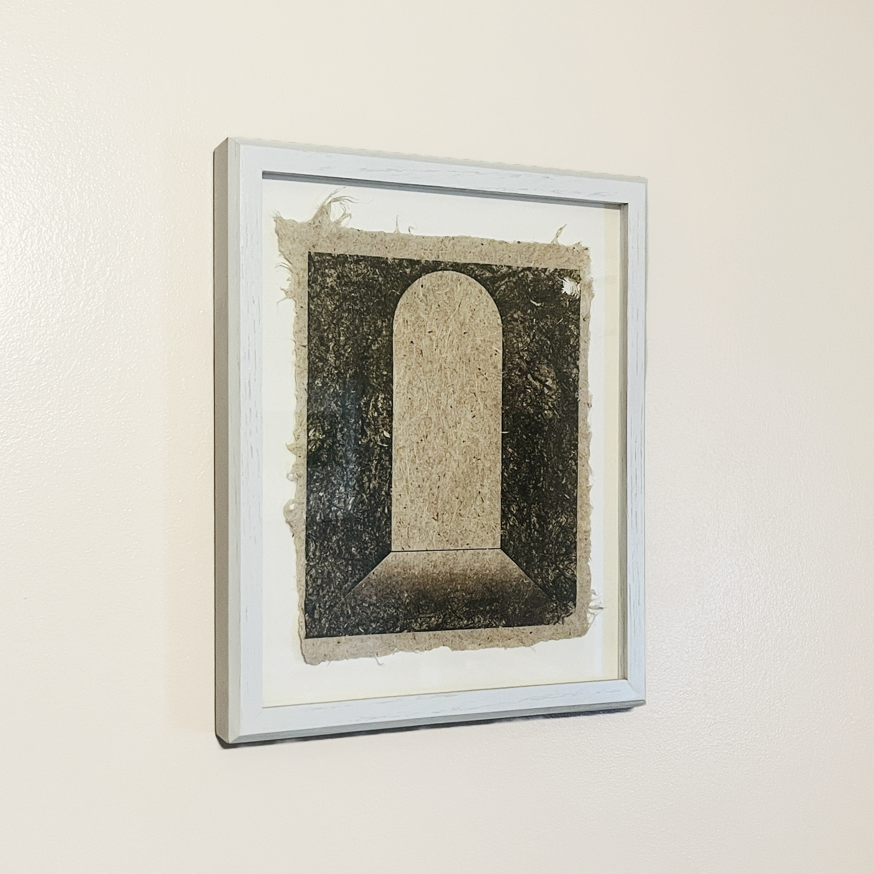
Next to the Sandbothe Mystery Snowball piece is a striking print on handmade Yucca paper by Caleb McMurray. The untitled work features a doorway or aperture, something that McMurray has returned to again and again.

Caleb McMurray. Untitled. Ink on handmade Yucca paper. 10x8 inches. 2014.
Caleb McMurray. Untitled. Ink on handmade Yucca paper. 10×8 inches. 2014.

I also have a sister print to this one, but it features an arching opening that is in the distance rather than up close like this one. Windows, doors, and other passageways are features of many of the works I’ve collected over the years.

Lastly, a small painting by Hayley Auxier‘s shares the wall with the two works I’ve shared above. Hayley was one of my stand out undergraduate students, and I love seeing her carry on her artwork as she has since graduating. This piece is one of a series she made celebrating National Parks and celebrating her experiences of them. Hayley shows a strong affinity for gouache, so I’m glad to have an example of her painting in that medium.

Hayley Auxier. Acadia National Park. Gouache on paper. 4 by 6 inches. 2018.

Acadia National Park is special to me because that’s where my partner and I went on our honeymoon all those years ago, so I like the piece because of it’s connection to my own history. But it’s also got a wonderful note from Hayley on the verso, and so the small work feels like it connects all of these different threads of my life: personal, professional, aspirational, and historical. That synergy of references – those that I bring to the work and those the artist embeds within the piece – is what makes art special.

I’m loving seeing these three works every day as I have a meal or hang out with my family. Art that lives with us is the best kind. Really thankful to have these pieces close to me.

Eight Years Overcoming

Eight years ago today one of the few most significant pivots of my life happened. My cardiac arrest is intimately tied to the death of my sister, to my experience of my home town, to my understanding of life and spirituality, and to my way of moving through every day life.

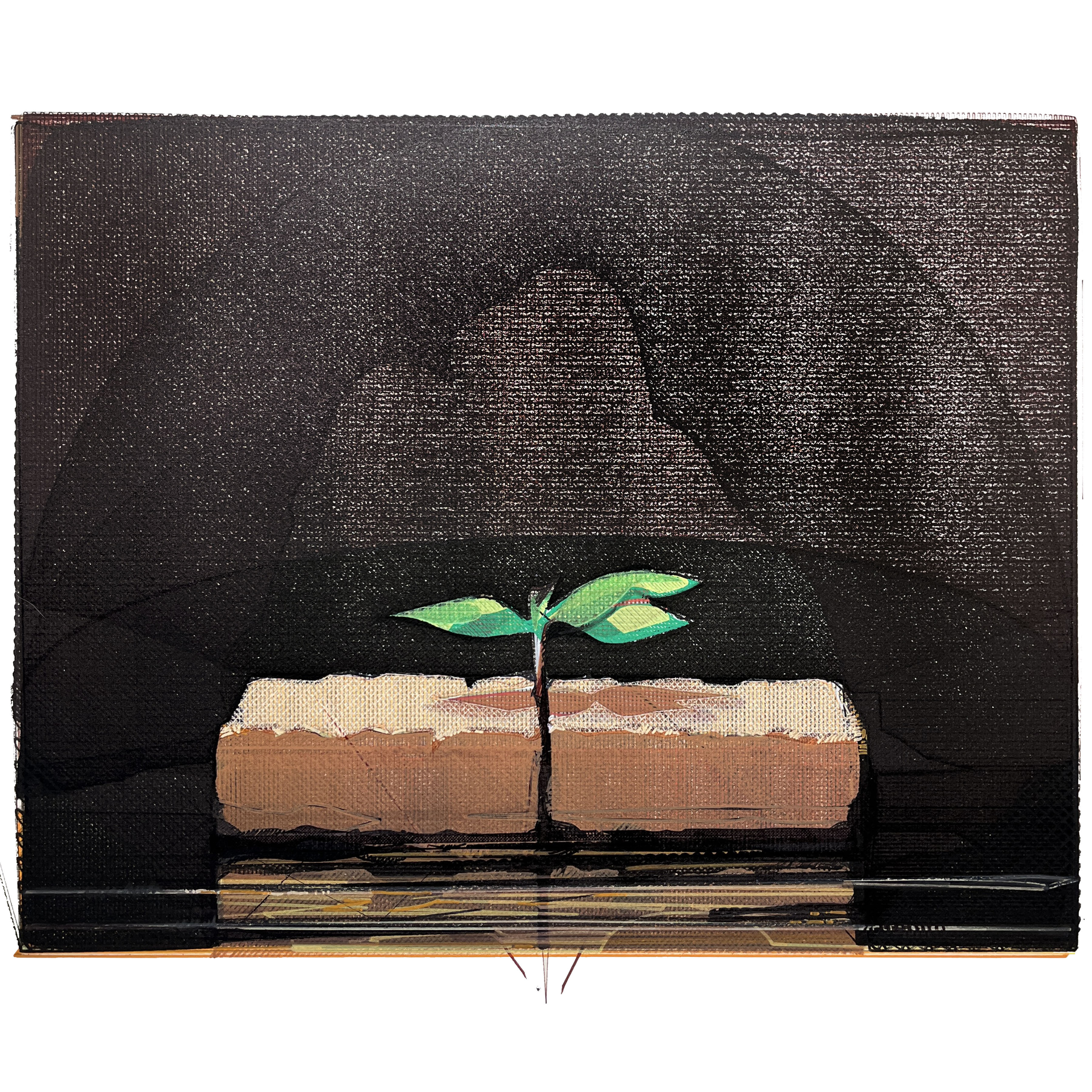
This year I’m commemorating the traumaversary with a new version of an old work. I first created Situation and Circumstance Overcome in 2003. It is definitely my most successful and most owned work, as I’ve created many copies – both paintings and prints – of the work as fundraisers for adoptions and other charitable occasions. For this version I chose to use my AxiDraw X&Y plotter. Using a new print of my old mezzotint plate of the piece (fig. 1) as a visual source, I created a large vectored image in Inkscape that had roughly 30 layers printed upwards of 5 times each (fig. 2).

Fig. 1: Situation and Circumstance Overcome.
Mezzotint print on paper. 16×20 inches. 2023.

Ink the vectored image you can see many of the layers along with the direction of the hatch fills and choices I made for density of pigment load. Each color was created with Sharpies, Posca acrylic markers, and a few other ink-based markers. The layers shown in the Inkscape file don’t correspond fully to the final image (fig 3.) because I made adjustments/changes to individual layers as I moved through building the image. There is a call and response between the digital and physical realms here that I really appreciate. I’ve also included a few details of the piece so you can see the finer textures and lines.

Fig. 2: Situation and Circumstance Overcome (Inkscape layers version).
SVG file. 2024.
Fig. 3: Situation and Circumstance Overcome (’24 Traumaversary Version).
Ink and acrylic on Arches paper. 16×20 inches. 2024.

I like having a rich, sentimental image like this following me through life. I’m convinced we’re all sentimental (if we’re honest and not sociopathic). By this word I don’t mean any kind of unexamined, saccharine idealization of some past version of reality. Rather, I mean that we really did experience real things in our pasts, and those things carry with them real emotions, real artifacts of our real selves. In some sense, sentimentality can give us momentary access to who we used to be in the past. It is a simultaneous connection and rupture. We know we can’t return to that person or that experience. And we know that we can’t really feel anything the same way again. And yet… some part of that reality is there for us in our sense of sentimentality. It’s akin to a certain scent or song taking us back to a prior state of being. There’s nothing wrong with this. Moreover, I suspect it has some adaptive advantage for the species by stimulating social/familial/relational/tribal/spatial cohesion.

In any case, I think making the image of life in the form of tiny sapling breaking up between the bricks has been a worthy thing for me. It’s a little picture of triumph in the midst of hardship. I’m glad it resonates with so many people. I’m glad variations of this piece hang in homes all over the world. And I’m glad I’m still here to appreciate it and add to its legacy.

I’m glad I didn’t miss these last eight years. There have been a lot of situations to overcome, but the life I’ve seen makes it all worth it. Here’s to another year. Peace.


If you’d like to inquire about purchasing the traumaversary robot version of Situation and Circumstance Overcome, contact me over here.

Celebrating the Genius of Miyoko Ito

I have mentioned the importance of Miyoko Ito many times before (here, here, and here), but there’s a little more to celebrate this Christmas day: I just received the new book Miyoko Ito: Heart of Hearts hot off the press.

Published by Pre-Echo Press, and featuring the research and writing of Jordan Stein, Heart of Hearts is the major publication that Miyoko Ito and her work deserve. Jordan Stein is an active and insightful curator who has developed a major presence nationally over the last decade. His research into and presentations on Ito are extremely significant, adding great depth to what is available on the artist.

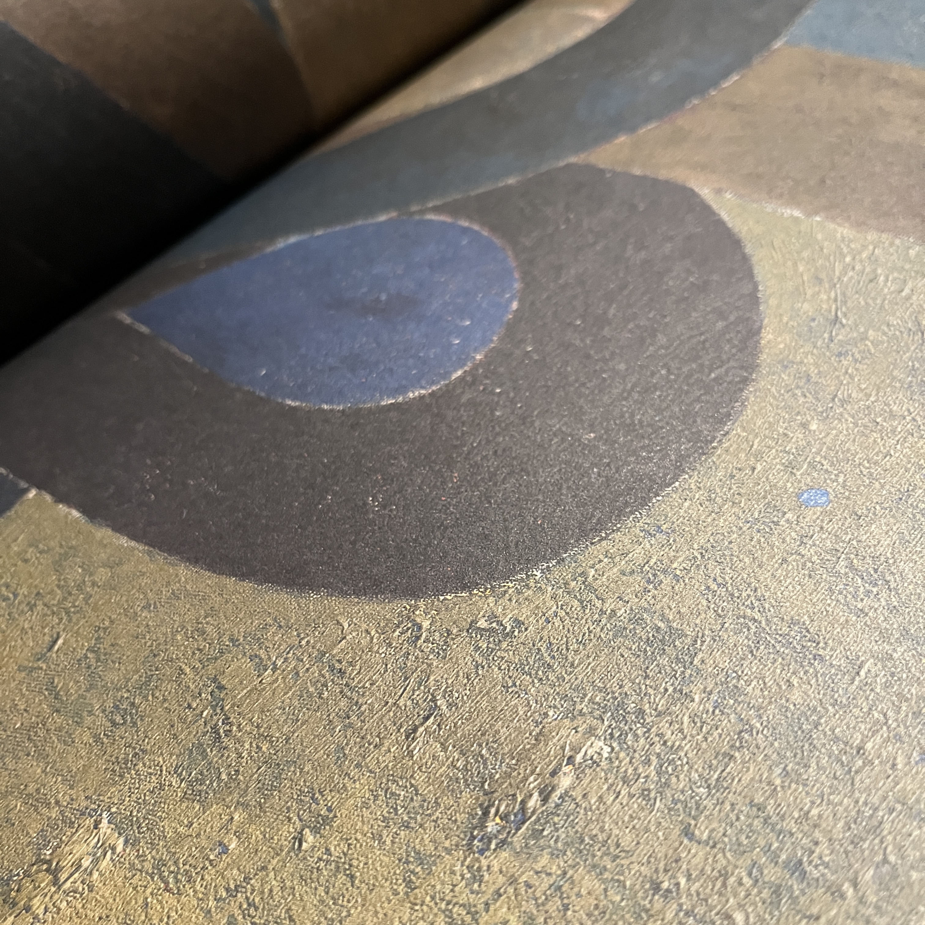
Detail of Orange Cloud from 1977 by Miyoko Ito as shown in Heart of Hearts.

Loaded with chromatically accurate images, Heart of Hearts is the most complete compendium of Ito’s work available. Beyond this, the book provides a single place from which students and admirers of her painting can find all pertinent information about her life and process. Stein’s essay provides key context, deftly connecting Ito to not only her roots in the Chicago art scene but the broader aesthetic superstructure to which she belonged.

Detail of Susquehanna (The River) from 1959 by Miyoko Ito as shown in Heart of Hearts.

These two arenas – solid text and quality images – really set this publication apart. From the beautiful debossed cover (front AND back) to the matte surfaces of the large full color spreads, this book delivers. The sense of texture and painted action is wonderfully realized in these pages. I kept being surprised by the surfaces of the paintings coming to life. This is an ESSENTIAL book for anyone interested in mid-20th century painting generally, or Miyoko Ito in particular. To finally have one volume that really pulls it all together is just wonderful.


Front and back covers of Heart of Hearts.

This book is an appropriate celebration of Miyoko Ito as a person and as an artist. It includes nearly all of her work, some of which have been lost. While not technically a catalogue raisonne, it might be the next best thing, as it provides the most complete picture of her work that we’ve ever had. For this, we can thank Jordan Stein and Pre-Echo Press.

In my opinion Miyoko Ito: Heart of Hearts is the most important publication dealing with American painting since Yale’s four-volume catalogue raisonne of the work of Richard Diebenkorn. Go buy it.

The Body as Zone of Incident Guest Lecture

This past week I gave a talk for The Honors College at The University of Missouri. The theme this fall was The Art and Science of Living, and they asked me to give a guest lecture about the nature of the body in the context of my work. I chose to focus on a number of artists who have shaped my ideas about the meaning of the body. – from Anne Harris and Robin F. Williams to Kathe Kollwitz and Charles White.

To hear the talk and see all of the artists and images I explore in the presentation, click the link here.

Andrew Wyeth. Spring. Tempera on panel. 1978.

Panel Discussion on AI and Art

I had the opportunity to sit on a panel at The Columbia Art League on October 12, 2023. Moderated by Diana Moxon and including CAL Executive Director Kelsey Hammond, the wide-ranging talk engaged with a lot of what artists are thinking about in the age of AI. Watch the video below to see a visual presentation of our research, examples, opinions (and humorous asides) as you follow along with the discussion.

OK Computer Panel Discussion Video

Many artists were mentioned in this presentation, and many others could have been included. A few of them were Daniel Ambrosi, Joey Borovicka, and Geo K. Weissler.