The Latest Color Drawing Totality – Fall 2018

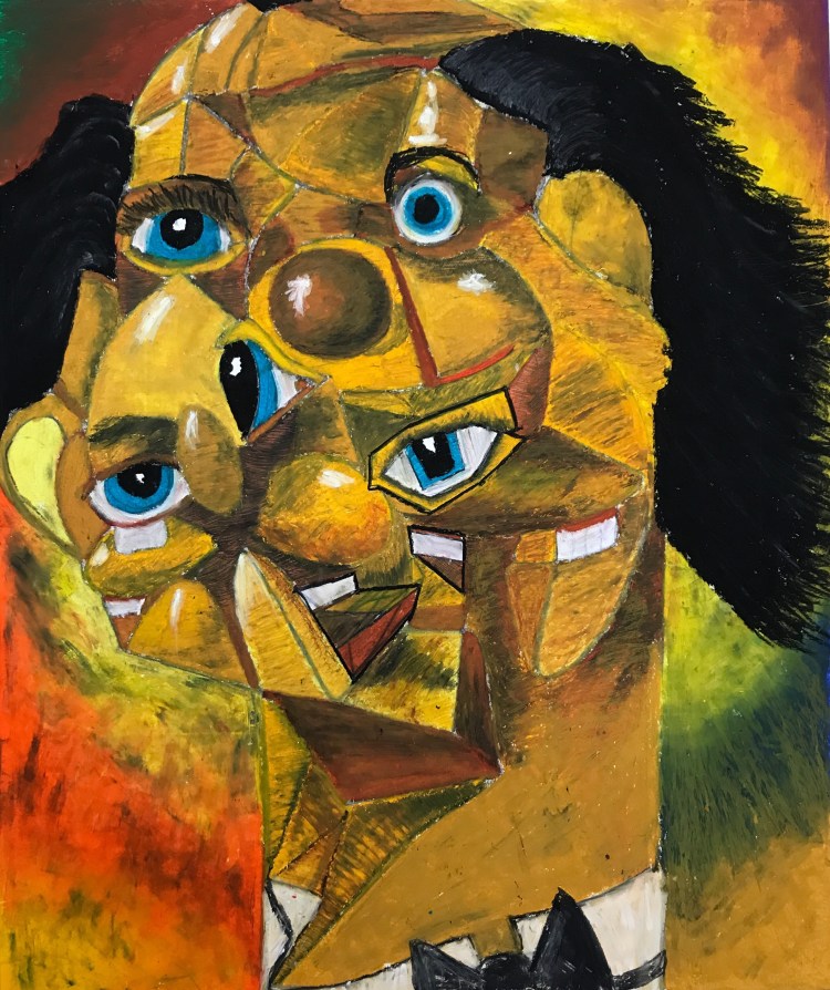
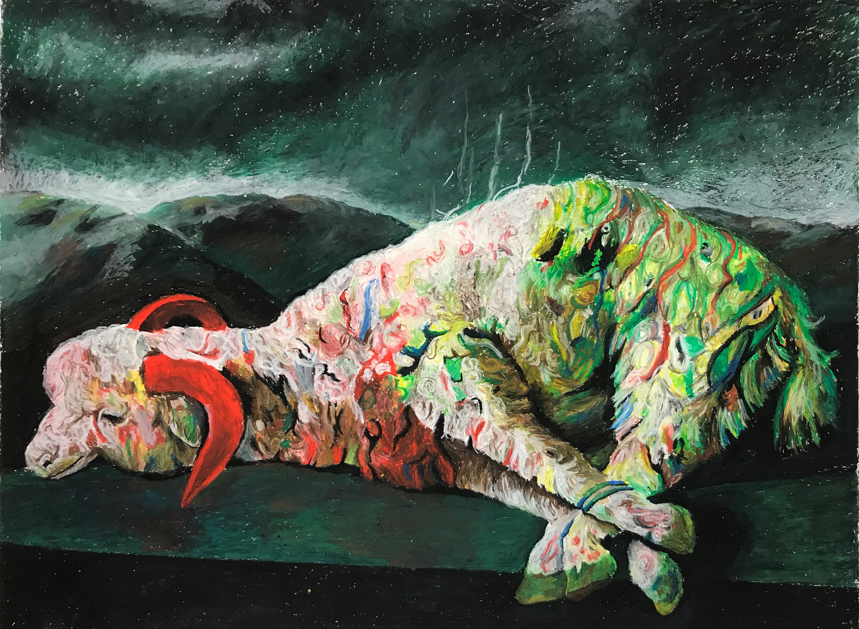
Kevin Frazier. Master Copy after George Condo. Oil pastel on paper, 28×22 inches, 2018.

The current crew of Color Drawing (ART_DRAW 2210) at Mizzou is doing some really nice stuff. I’ve incorporated a number of new variations of my projects, including adding in black lights, new constructed forms, and modified instructions for several Prompts and Assignments.

Michael Flinchpaugh’s Tinfoil Self Portrait Project. 24×18 inches, oil pastel on paper, 2018.

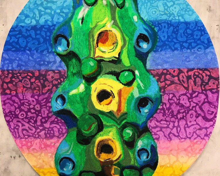
A project that I started last semester, the Tinfoil Self Portrait, has returned. This time I chose to let the students work in whatever size they chose, so I got a wide array of aspect ratios and scales.

Clara Choi’s Tinfoil Self Portrait Project. 18×30 inches, oil pastel on paper, 2018.

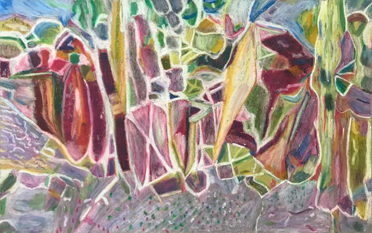
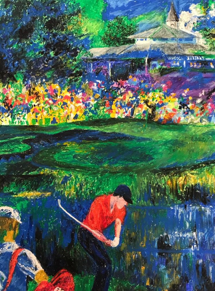
The Master Copy projects were quite wonderful this year, and students drew from many eras of art history. I have also encouraged students who work in Digital Storytelling, Graphic Design, or Interior Design to use significant artists from those arenas as well.

Shannon Kling. Master Copy after Leroy Neiman. 18×14 inches, oil pastel on paper, 2018.
Clara Choi. Master Copy after Elizabeth Murray. Chalk pastel on paper, 30×14 inches. 2018.
Madison Sturr. Master Copy after Alexander Ross. Oil pastel on cut paper, approximately 18×24 inches. 2018.
Stephanie Craven. Master Copy after Glenn Brown. Oil on paper, 22×30 inches, 2018.
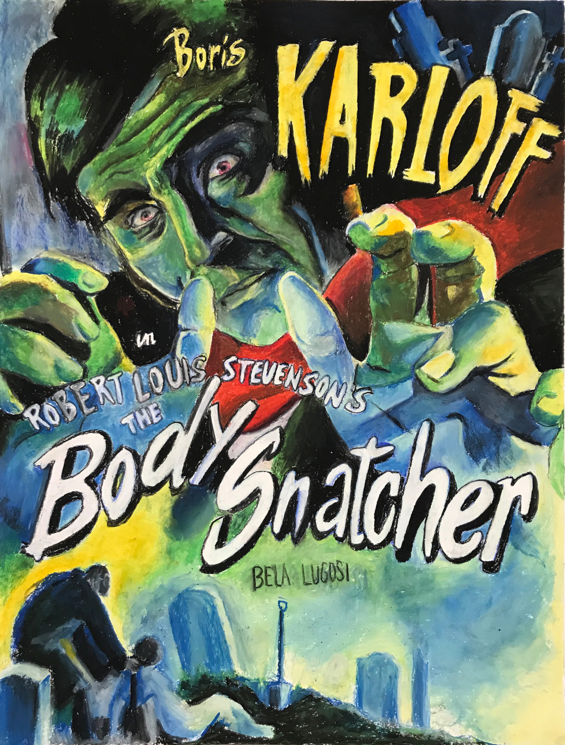
Leah Scott. Master Copy after Vintage Movie Poster. oil on paper, 30×22 inches. 2018.

The works my students create when they look at great works of art and copy them are not mere transcriptions. In undertaking the effort to create a version of a masterwork, the students must ask themselves important questions continuously. These interrogations about composition, color, material density and structure, and a whole slew of other issues, all serve to increase the students’ visual and physical IQ.

My Color Drawing 2 students work primarily with Prompts, which are designed to take them on a journey through questioning and challenging their assumptions. Without showing you the whole track of artworks it would be hard to demonstrate their developmental trajectories, but it has been encouraging to watch. While all of my Fall 2018 Color Drawing 2 students have made some very interesting stuff, Amanda Doyle and Mitch Feyerherm, have made strange and exciting works that have made the most of the personal investigations that the Prompts are meant to encourage.

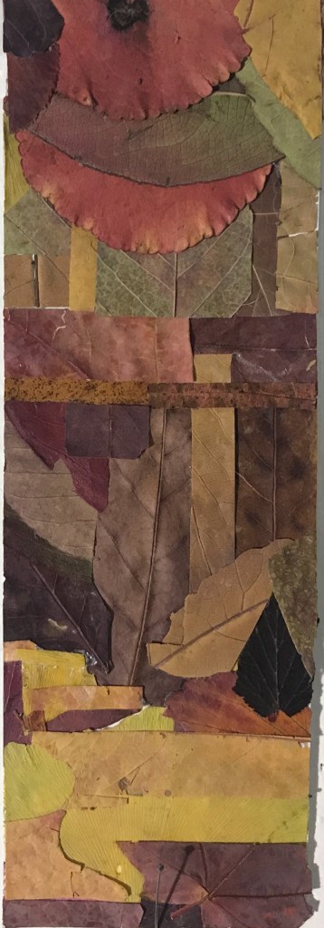
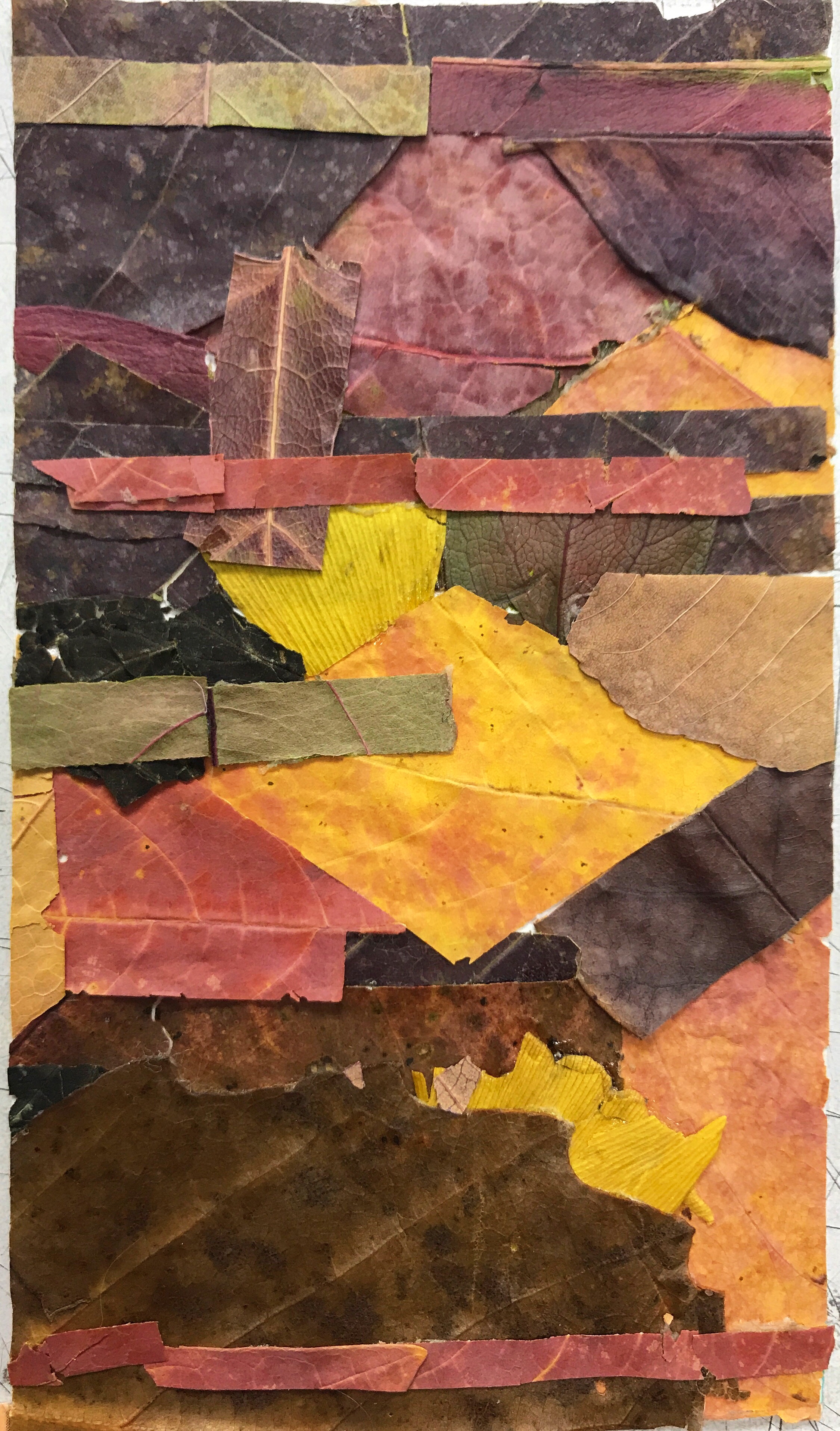
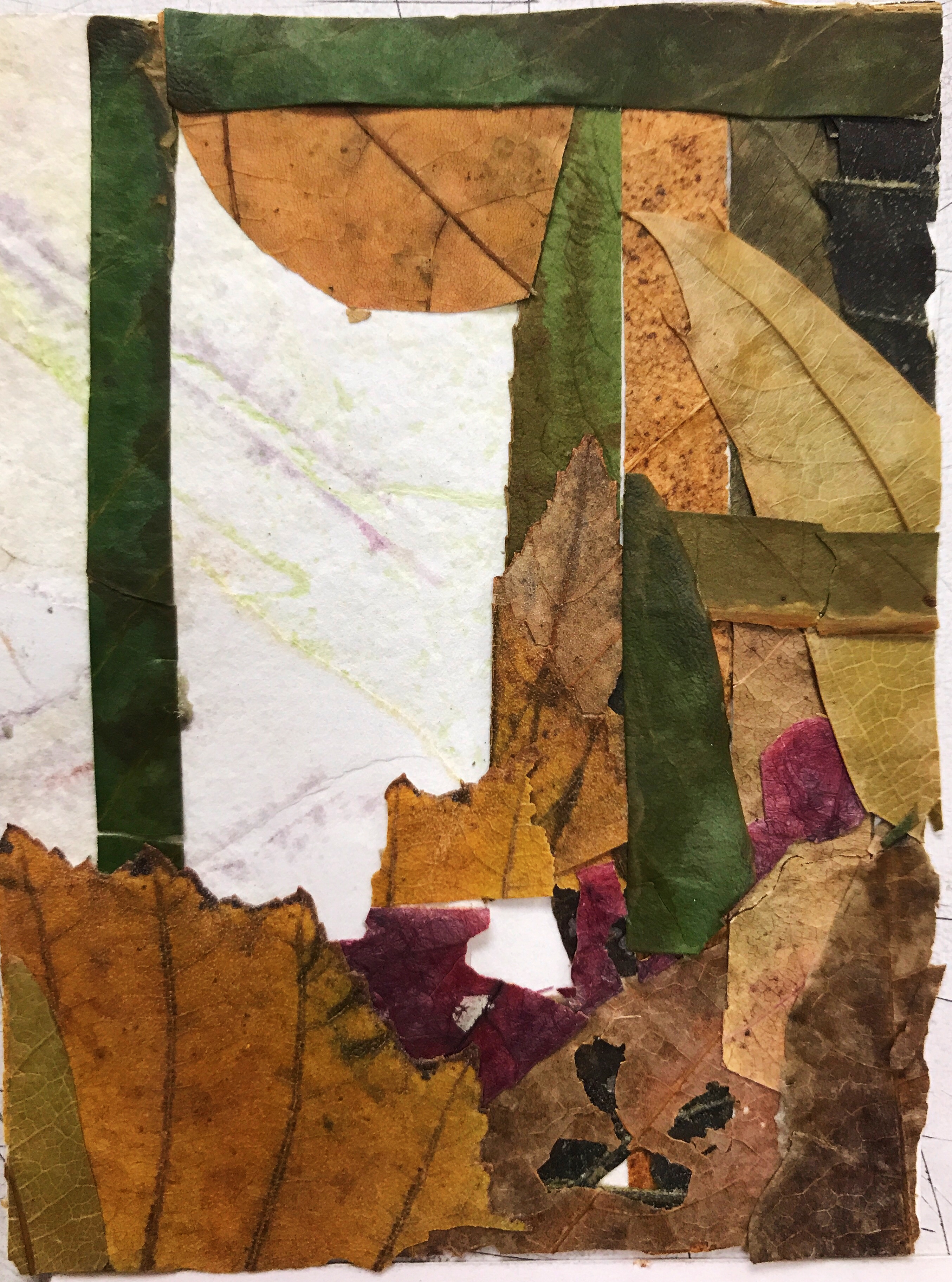
Mitch Feyerherm. Leaf Collage, Prompt 4. Leaves and adhesive on paper, 10×3 inches. 2018. Below, two other, smaller works from Prompt 4:
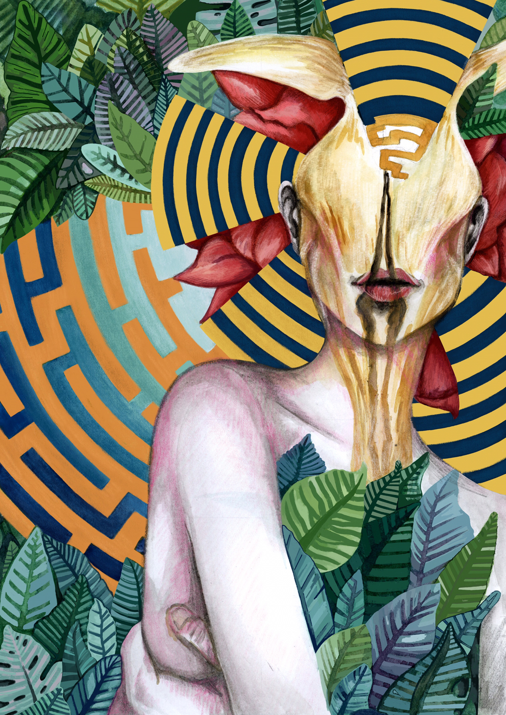
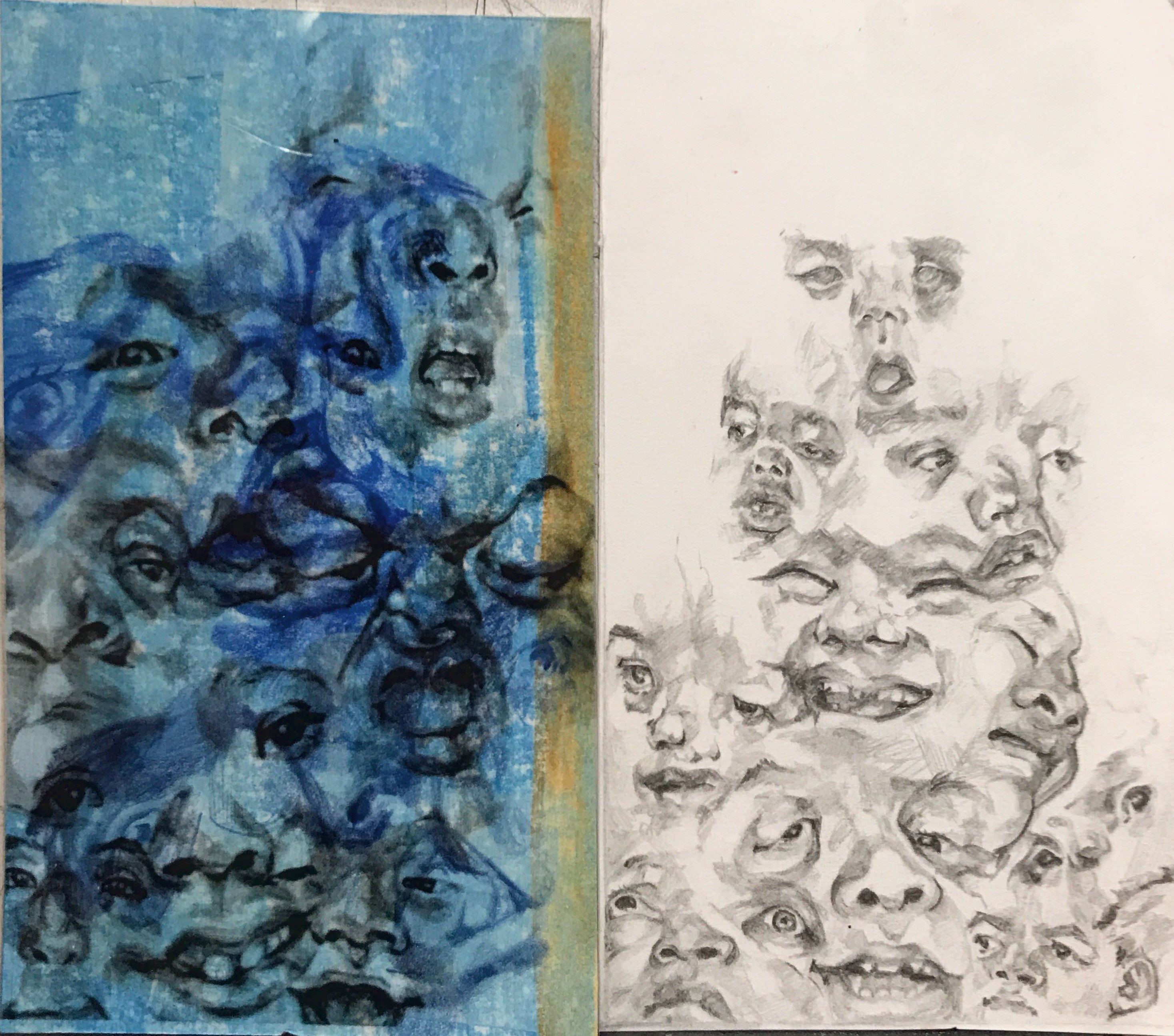
Amanda Doyle. Wild Woman. Collage, colored pencil, gouache, and digital drawing/painting. Dimensions variable, 2018. Below are four works by Nicole Pratte for Prompt 4, based on screenshots from videos. The pieces, in colored pencil, ink, graphite, collage on paper and acetate, explore how deformities and morphological differences change our assumptions about emotion, intelligence, and quality of life:

Overall my students have taken some amazing strides this year. I’m pleased that my own drive to meet them and challenge them has continued to be strong. Here’s to many more years!

Restraint and Limitation at Nebraska Wesleyan University

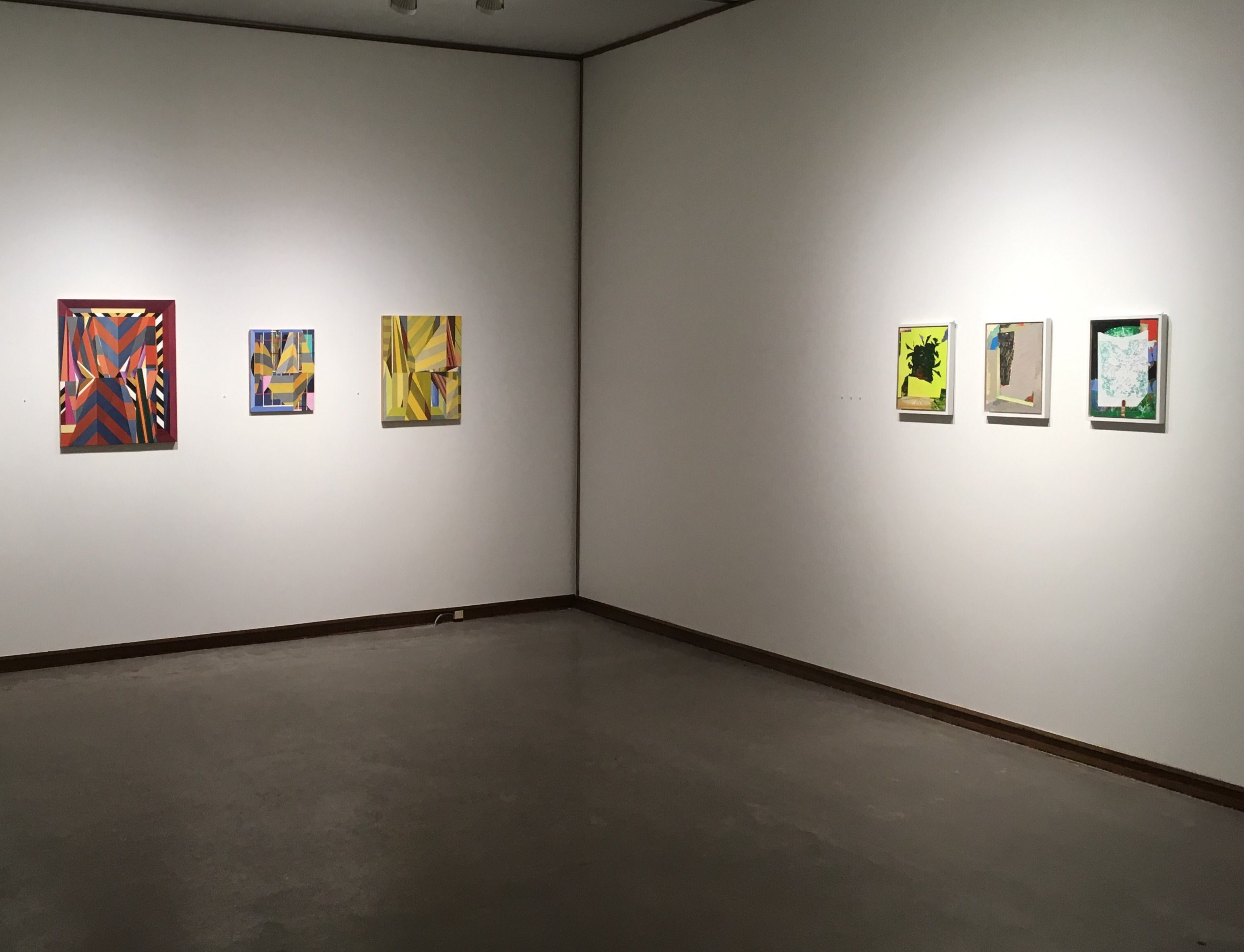
The second iteration of an exhibition exploring trends in contemporary abstract art is now on view at Nebraska Wesleyan University’s Elder Gallery. The first version of the show took place last year at The University of Missouri and the exhibition will travel again in 2019 and 2020.
The main change in this 2018 version is that additional artists have been added, moving the roster up to 20 individuals – 13 women and 7 men. The works have also grown in diversity, with more sculpture, assemblage, photography, and fibers works entering the constellation.
Works by Erin King (wall) and Sumire Taniai (on pedestals) appear along the title wall.
Two works by Ryan Crotty, a tiny relief fibers piece by Hali Moore, and four digital works displayed on iPads by Sharon Butler.

This show centers on the work of Anna Buckner, Sharon Butler, and Gianna Commito. A constellation of 17 other artists appear in this view into contemporary abstraction, and their work incorporates Painting, Drawing, Digital Drawing, Photography, Fibers, Assemblage, Collage, Sculpture, Relief carving, and other forms.
Sarah Arriagada, Anna Buckner, Sharon Butler, Gianna Commito, Ryan Crotty, Joel T. Dugan, Dan Gratz, Michael Hopkins, Erin King, Kristen Martincic, Marcus Miers, Hali Moore (Oberdiek), Justin Rodier, Elise Rugolo, Amanda Smith, Lauren Steffens, Sumire Taniai, Jm Thornton, and Jennifer Ann Wiggs have work in this exhibition. Click on their names to see their websites and find out more about their work.
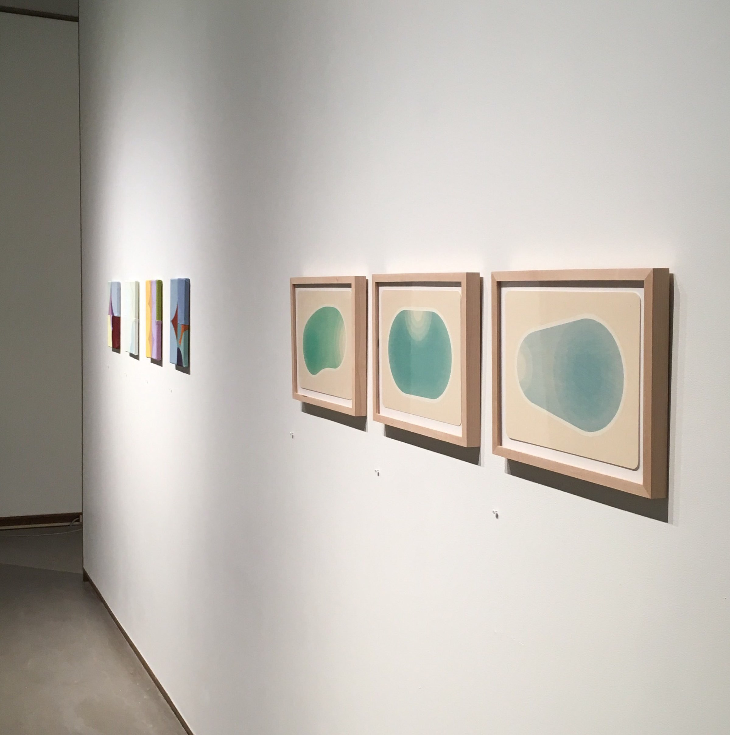
Three works by Gianna Commito engage with three works by Amanda Smith in this view of the exhibition.
As you can see from the exhibition listing at NWU’s website, I’ll be at the gallery on December 7 to talk about the show and answer questions. I’ll also spend some time meeting with students and engaging with the school community. I love the chance to spend time in the space with the work and field questions in the moments of viewer experience. The works are meant to be seen, interpreted, and extrapolated.
Three collaborative works – collectively a “Curator’s Statement” – by myself and Joel T Dugan are seen here on the left. A wonderful dimensional graphite and folded paper drawing by Marcus Miers and two sculptures by Lauren Steffens continue to the right.
photo-oct-25-6-34-55-pm.jpg
This wall, featuring tight formations by Sarah Arriagada and Kristen Martincic, is one of my favorite views of the show.

These few views can’t really give you a true impression of the show. I hope if you’re nearby you’ll stop in. My efforts to curate interesting collections of works are definitely becoming more and more important to me as an artist and educator. Particularly, with an exhibition such as this one, I am afforded the chance to expand and contract a specific intellectual and aesthetic gesture. I find that tremendously exciting. This iteration of the Restraint and Limitation show is probably the most expansive version that will happen, so it’s intriguing to sense how constrained it still feels. I am passionate about small works that distill meaning and experience, defying long-held notions about what art is supposed to do.
Three amazing fiber works by Anna Buckner hold a wall next to a strangely evocative photographic/found object assemblage by Justin Rodier.
To close out this announcement post, here’s the bit of writing I had affixed to the title wall:
The logic of abstraction cannot be reduced to a few dudes painting in mid-20th century America. This exhibition is meant to present another view. Anna Buckner, Sharon Butler, and Gianna Commito, the three core artists presented here, show commitment to the aesthetics and procedures inherent in abstract painting while bringing diverse pressures, materials, and processes to the form.

 – Matthew Ballou, October 2018.


Photos in this post are by Michael Larsen.

Drawing Logic – Teaching Fundamental Drawing at Mizzou from 2007 to 2018

Examples of various line manifestations from my foundations drawing course.

I’ve taught hundreds and hundreds of students beginning observational drawing methods for over a decade at Mizzou. This is something I’ve been stimulated, encouraged, and challenged by. It’s wonderful to be a part of an ancient tradition.

One of the main points of the first few weeks of my Drawing: Materials and Methods course (foundations level drawing for beginning students) is the notion that line, in and of itself, doesn’t make an illusion of space (fig. A). Rather, value – the quality of light and dark – creates a perception of space (fig. B, C). To develop value we accumulate lines, adjust pressure on the tool, or blend the material with which we’re drawing (among other actions) in order to attenuate or amplify the line quality. The coalescing lines form a varied superstructure representing – in 2D form – the perception we have of 3D space (fig. D). These and many other lessons are certainly intuitive and, though they are not an exclusive method, do help novices recognize space and how to translate it. The first few drawings my students make are centered around these concepts. It was Professor William Itter’s Fundamental Studio Drawing text that I used in developing my own pacing, scope, and sequence in the teaching of Beginning Level drawing.

At Indiana University, Itter was a strong force. Having taught there for more than 35 years when he retired in 2009, Bill crafted and then honed a foundational drawing system that influenced me and many of my fellow grads. Over the years a number of the projects he either developed or adapted have been a part of my teaching. In particular, I have been inspired by his Cornice Combo and Linear Topographic Contour projects. Most of us ended up with physical copies or PDF prints of Bill’s collection of projects and syllabus materials (pictured above).

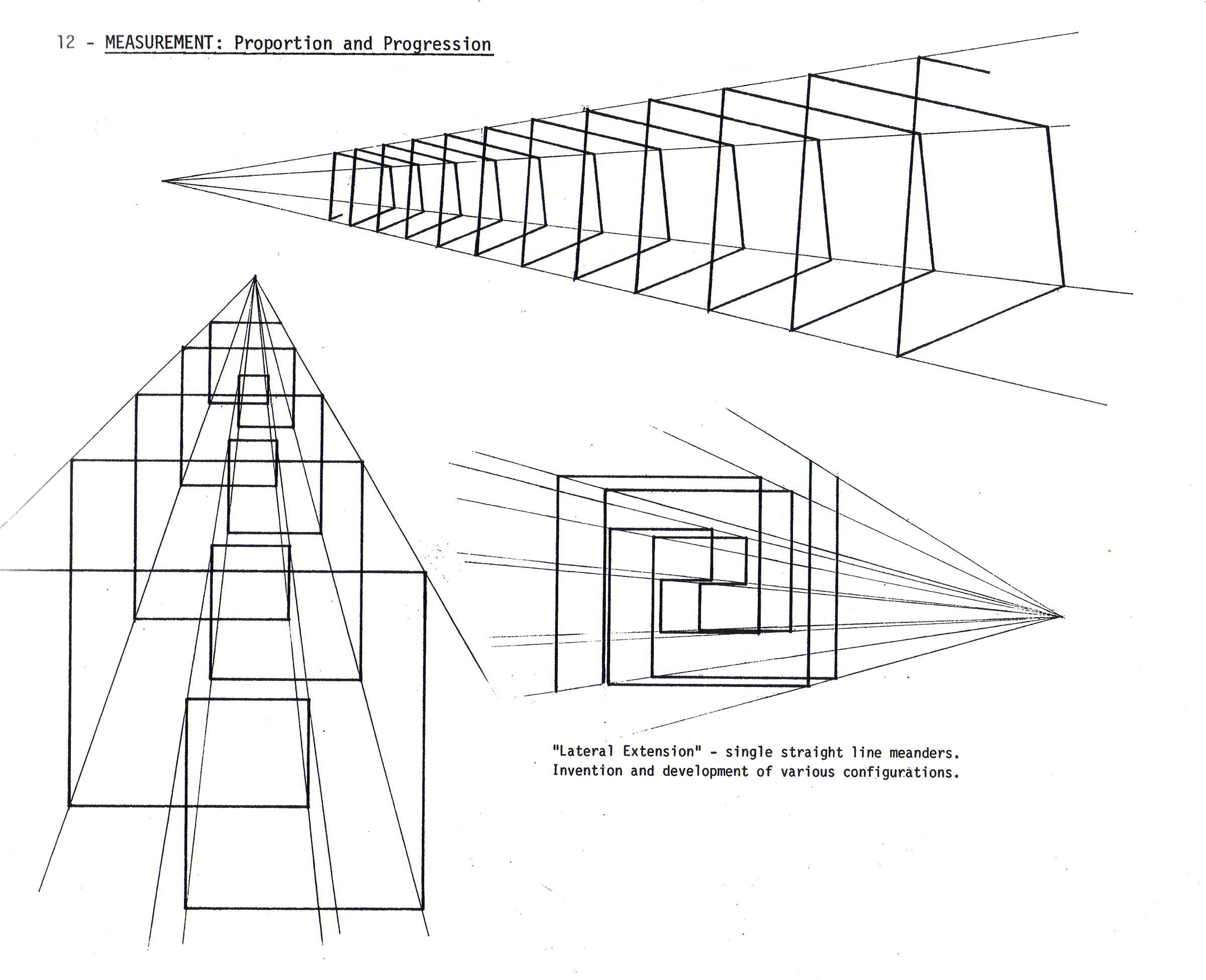
I think you can see the through-line of intention when you see Bill’s project examples and compare them to what I do in class. While I no longer directly reference Professor Itter’s text, it is a strong part of the pedagogical lineage I claim as an educator. Below you can see some of Itter’s Radial and Lateral Extensions, which were influential in my own Atmospheric Beams project.

Atmospheric Beams by Robert McAnelly. 18×24 inches.

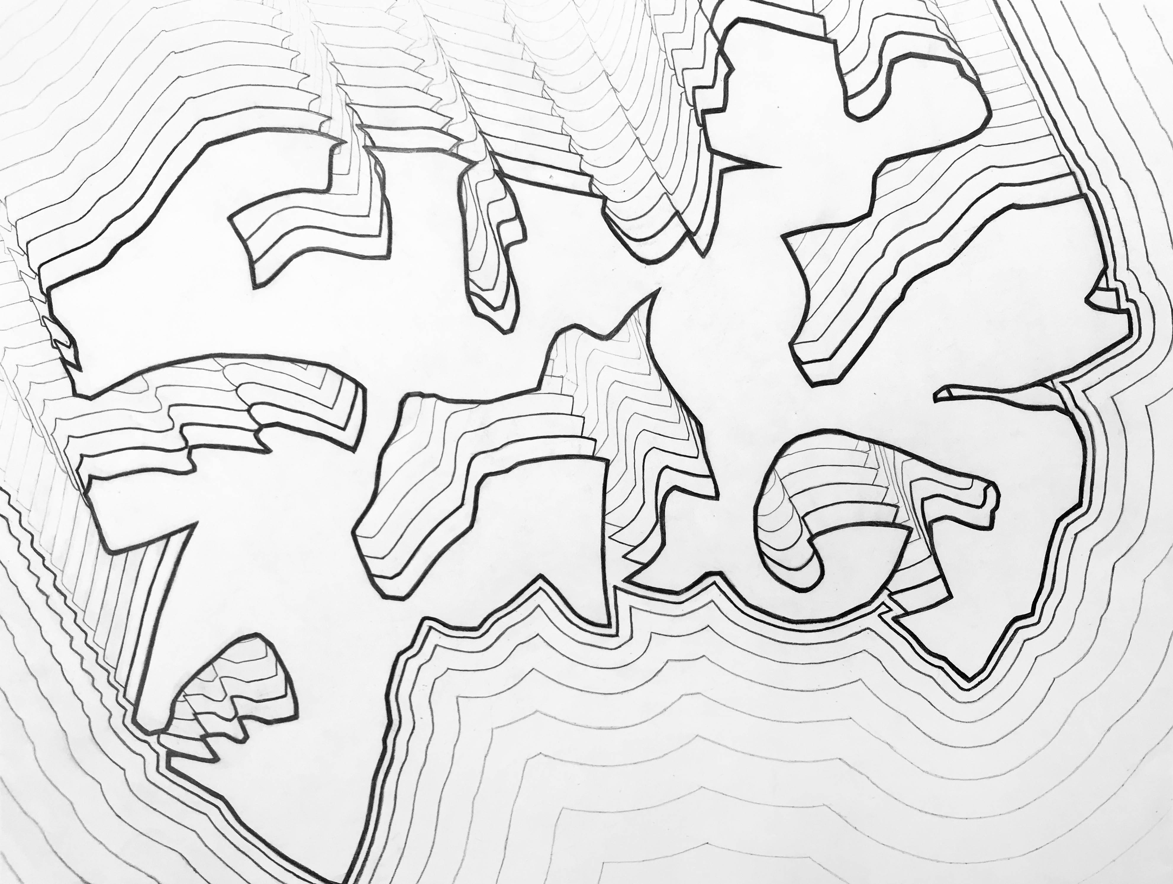
Of all of the various projects crafted by Bill that I used back in the early days, only three are truly and deeply connected to my foundations drawing teaching today. Of primary importance is Meandering Band, as well as the aforementioned Atmospheric Beams. You can see that Professor Itter’s example images are still being reiterated through time in the work of my students.Notice how this Cornice Combo image relates to my recent students’ Meandering Band works:

Photo Aug 31, 10 54 11 AMMeandering Band by Hannah Westhoff. 18×24 inches, graphite on paper.

Professor Itter used many examples of gradients in his projects, and he began by asking students to conceptualize line quality through the idea of space and physical pressure upon the tool (at least that’s how I integrated his ideas into my thinking). So sample studies from Itter such as this one (which I use as a first class ice breaker project)…

…translate into more formal Meandering Band works such as this:

Meandering Band by Katie O’Russa. 18×24 inches, graphite on paper.

…or this:

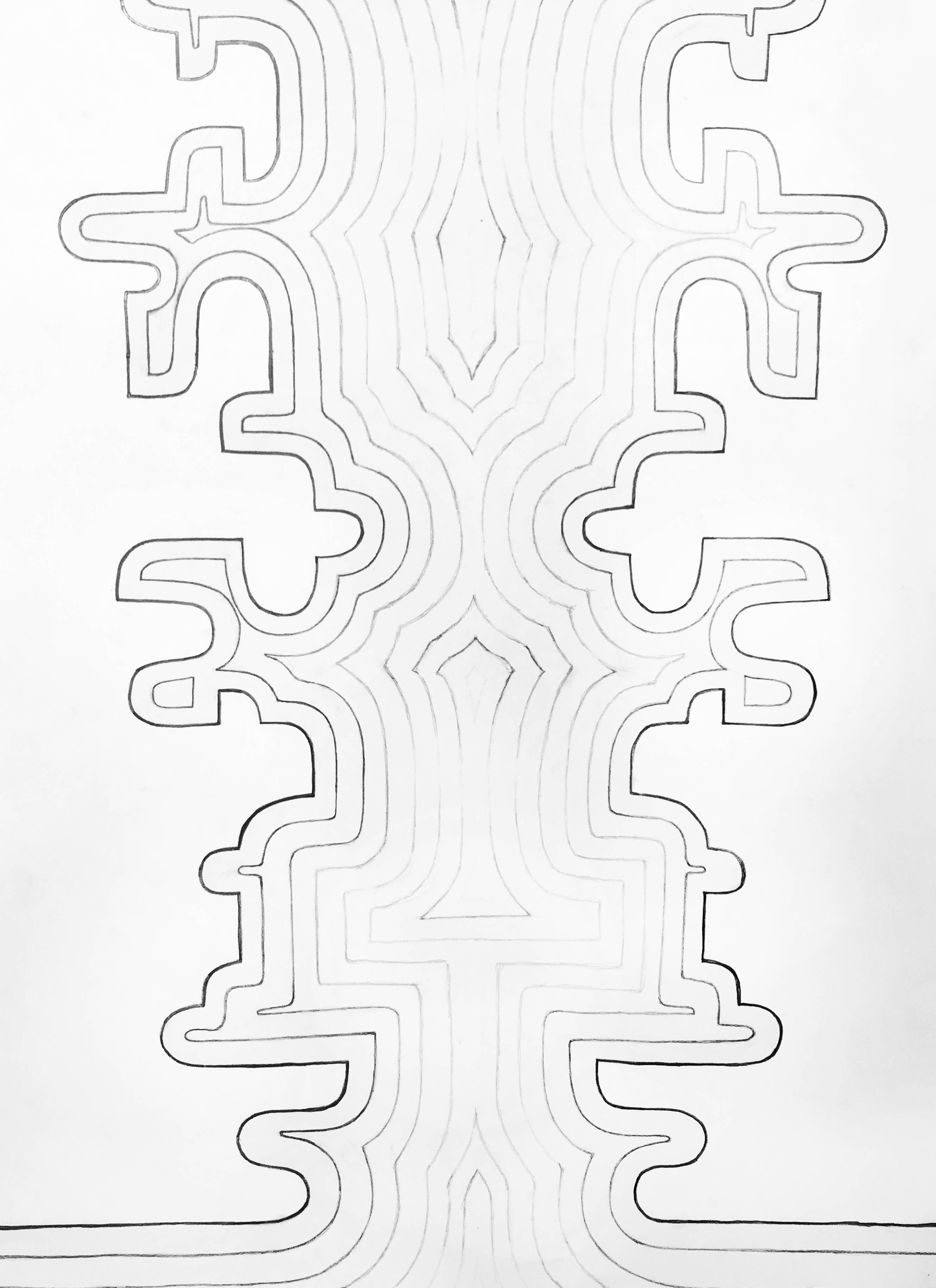
Meandering Band by Seth Steinman. 24×18 inches, graphite on paper.

My ultimate aim in carrying on a very truncated version of Bill’s foundational drawing projects is really an attempt to establish the importance of observational iteration in my classes. All of my classes are, at their deepest center, about attention and awareness. My hope is that continuing to use a few of Professor Itter’s projects my students gain an understanding of what their eyes are doing in the world. The way we amalgamate visual and material structures into meaningful ideas is part of what makes us human. Now that we are living in an age where algorithms designed to manufacture our purchasing consent drive much of our cultural events and expressions, it is so important to grow in our awareness of how we are being manipulated by these systems. This understanding begins with a knowledge of visual dynamics and the ability to take command of how our eyes operate. I think Itter knew this when he created his foundational drawing projects, and I try to bring that tradition of thoughtfulness into the 21st century.


From Then Til Now

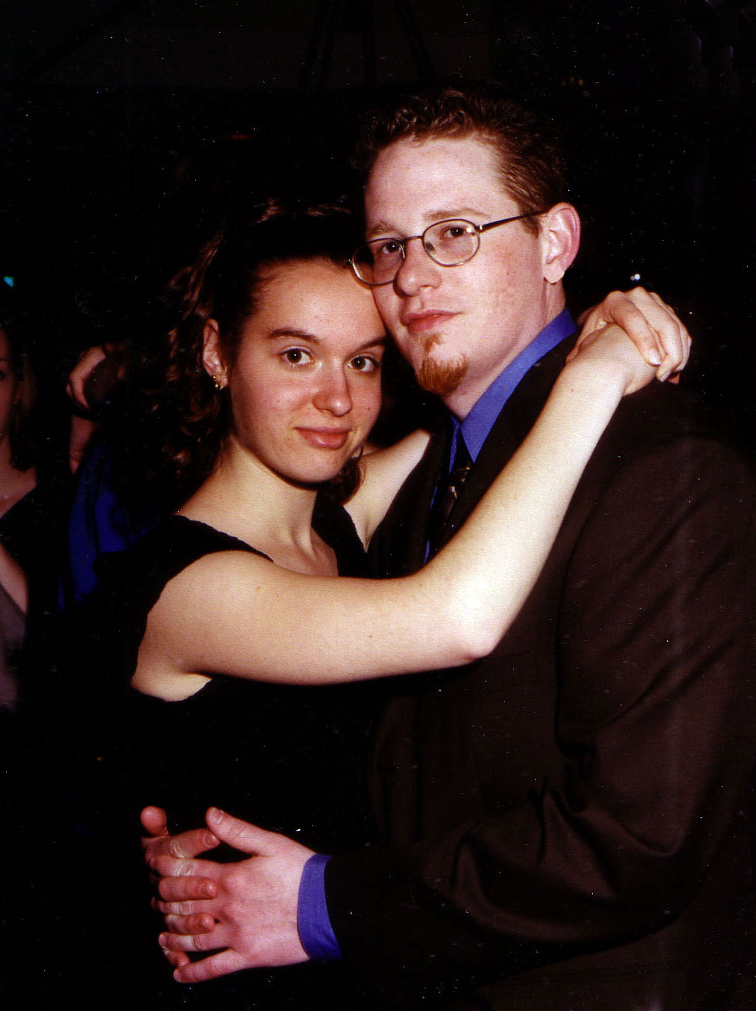
Twenty years ago today I met my future wife for the first time… she had just turned 16 the day before.

Hard to believe from looking at this image that we would end up becoming friends, dating, marrying, and traveling the world on weird adventures…

We had this amazing few years I like to think of as “The Cute Years” – when I was still a beautiful baby. She’s always been a beaut. Look at this:

Undergrad Date Nights…

The night was sultry… SULTRY, I SAY!

SO INNOCENT!

Being six years older than her, I was able to go to both her high school dances AND her college dances… I’m not sure what we were thinking with that garter thing… hmm…

Ah, Chi Omega, the cult sorority that Alison was in back at Northwestern…

We did fun things, like attend fish-eyed art openings…

…and read aloud – A LOT. How many books have we done this way, honey?

Through it all, it was you and me. Twenty years. There’s been a lot of hard stuff, but a whole lot of good. I’m so grateful for you.

xoxoxoxoxo

Inspiration – Miranda Grace Ballou

Miranda Grace helping me with my large mural project, 2018.

My first born child is a spitfire eight year old. She’s great at math. She’s dramatic and feels all the things SUPER intensely. She’s a very good swimmer (winning some heats locally) and is the unequivocal leader of her siblings. She loves horseback riding, Transformers, and Narnia. She has always been a passionate creator; she’s burned through reams of paper and thousands of pens, pencils, and markers. She LOVES joining me in the studio. Recently she helped me out with a large mural I’m working on. She’s a pretty amazing kid. Here’s some of her recent work:

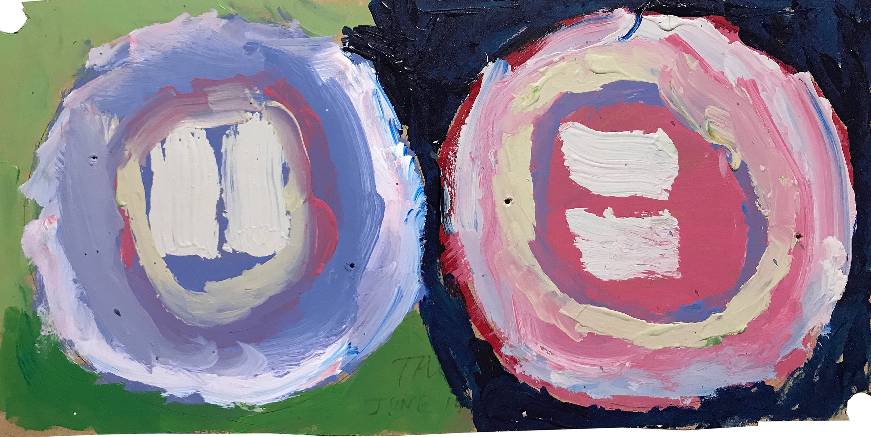
Miranda Grace Ballou. Untitled Abstraction. Acrylic on cardboard, 24×18 inches, 2018.

Miranda has started to get very interested in symmetry and creating katywompus abstractions based on a kind of ‘across the surface’ balance. I really like these. Here are a few more.

Miranda Grace Ballou. Untitled Abstraction. Acrylic on MDF, 20×23 inches, 2018.

Miranda Grace Ballou. Untitled Abstraction. Acrylic on MDF, 6×13 inches, 2018.

Miranda Grace Ballou. Untitled Abstraction. Acrylic on panel, 16×20 inches, 2018.

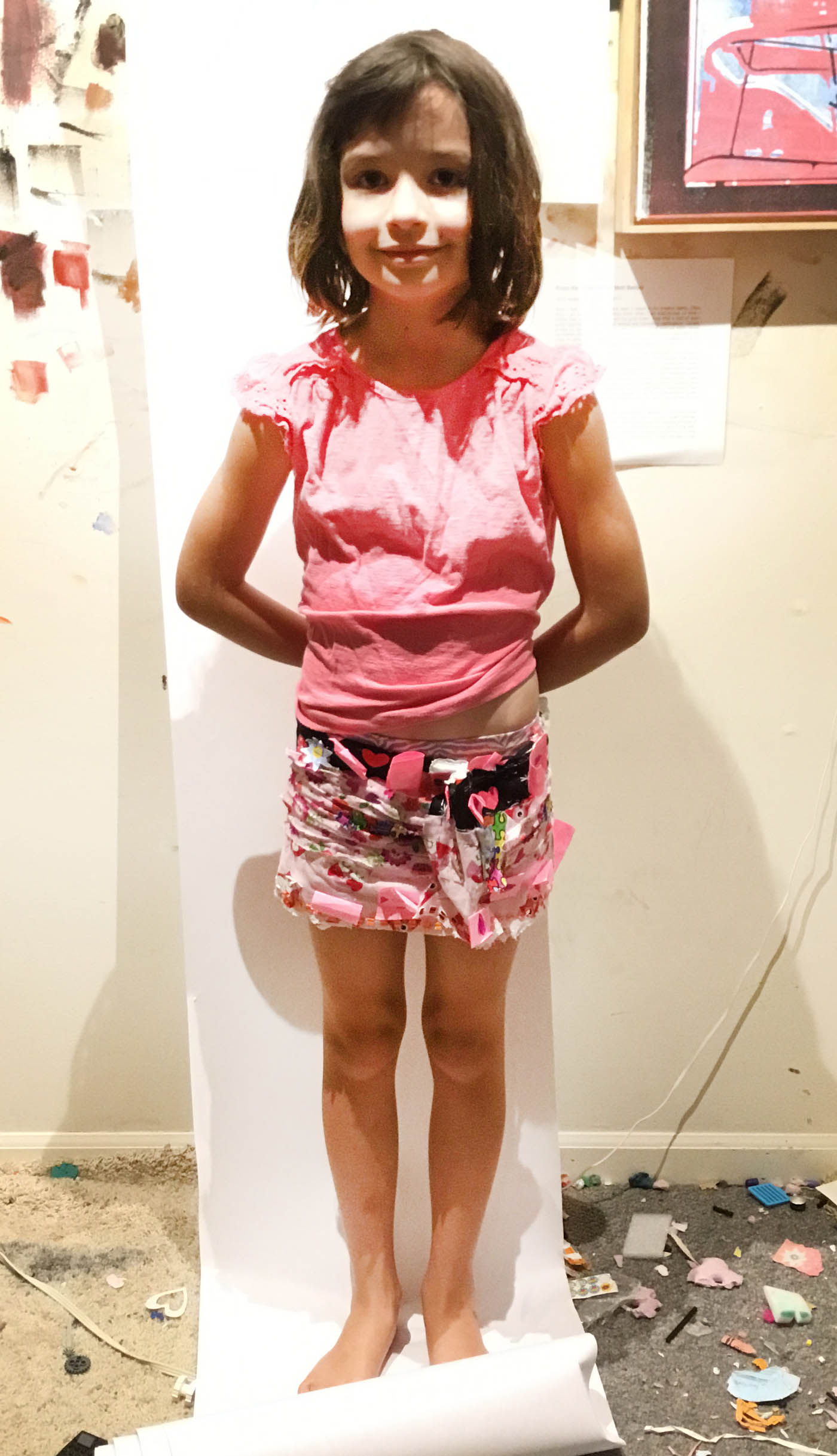
My daughter is also very much into working with fabrics and paper. She creates books – stories of every day events – and illustrates them. She makes games, and cuts out all of the pieces and creates the rules. She has made costumes, crowns, and jewels – all out of paper. Cardboard boxes have become space ships and forts. Recently she created – totally unprompted and with (as far as I can tell) no context – a sort of paper and fabric piece that functions as both a wall hanging and a skirt. Check it out.

The front side is pictured here on the left. The verso is on the right. When I was taking these photos she was annoyed that I wanted to take a picture of the back, but it’s amazing. She’s using staples to hold layers of various fabrics, paper, adhesive stickers and sheets, as well as post-it notes and tissue paper together. When hanging, she says it’s titled The Straightened Skirt. In this form it’s about 50 by 10 inches in size. Here’s Miranda modeling it in skirt mode:


Anyway, I think she’s pretty awesome. Each of my kiddos has been inspirational, and I expect they will all eventually have their own spot on my blog. I’m so thankful for these kids and their creativity and powerful presence in my life. They have made my work and teaching so much more rich and strange.

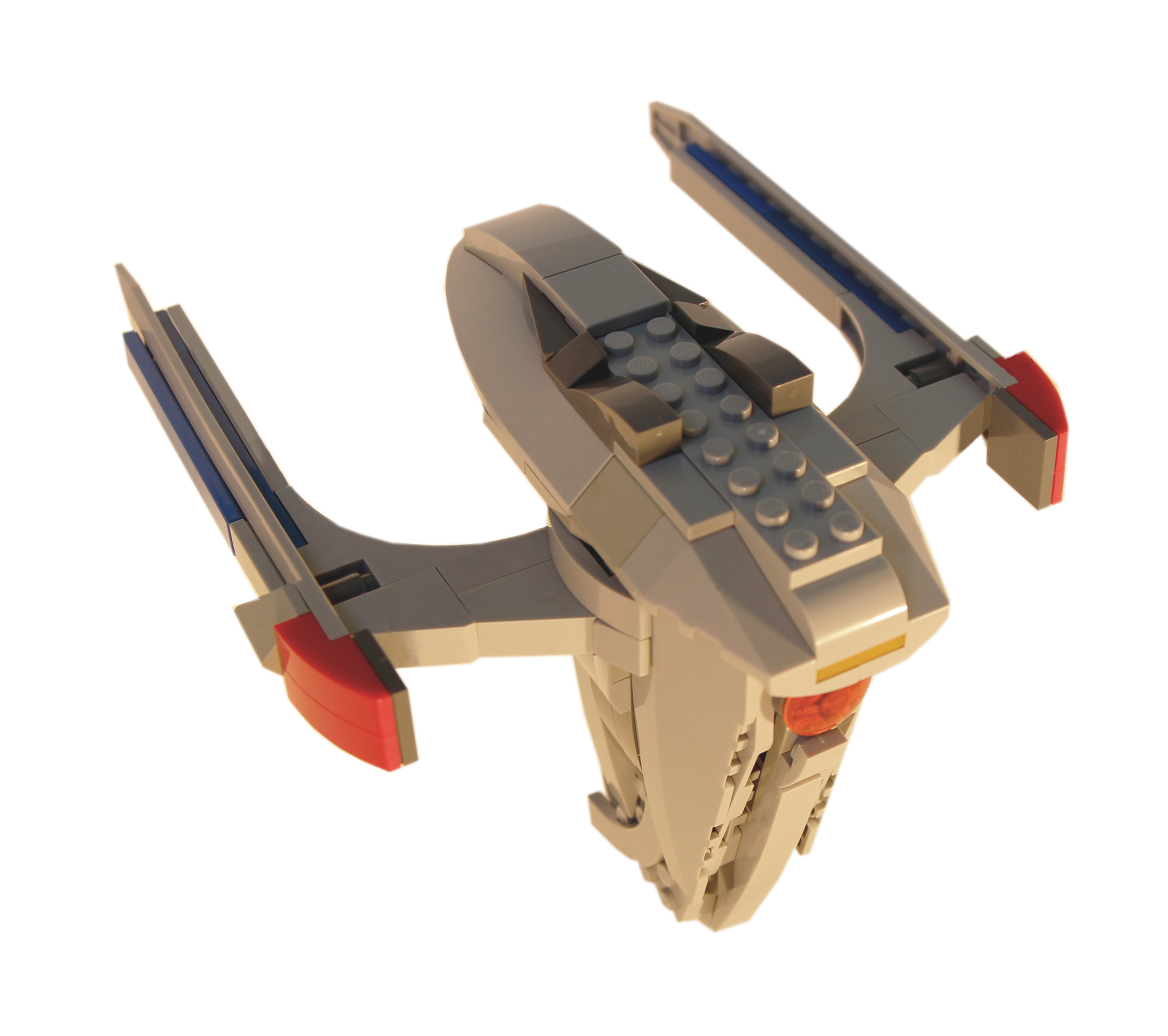
Updating the Glory (LEGO Star Trek Stuff)

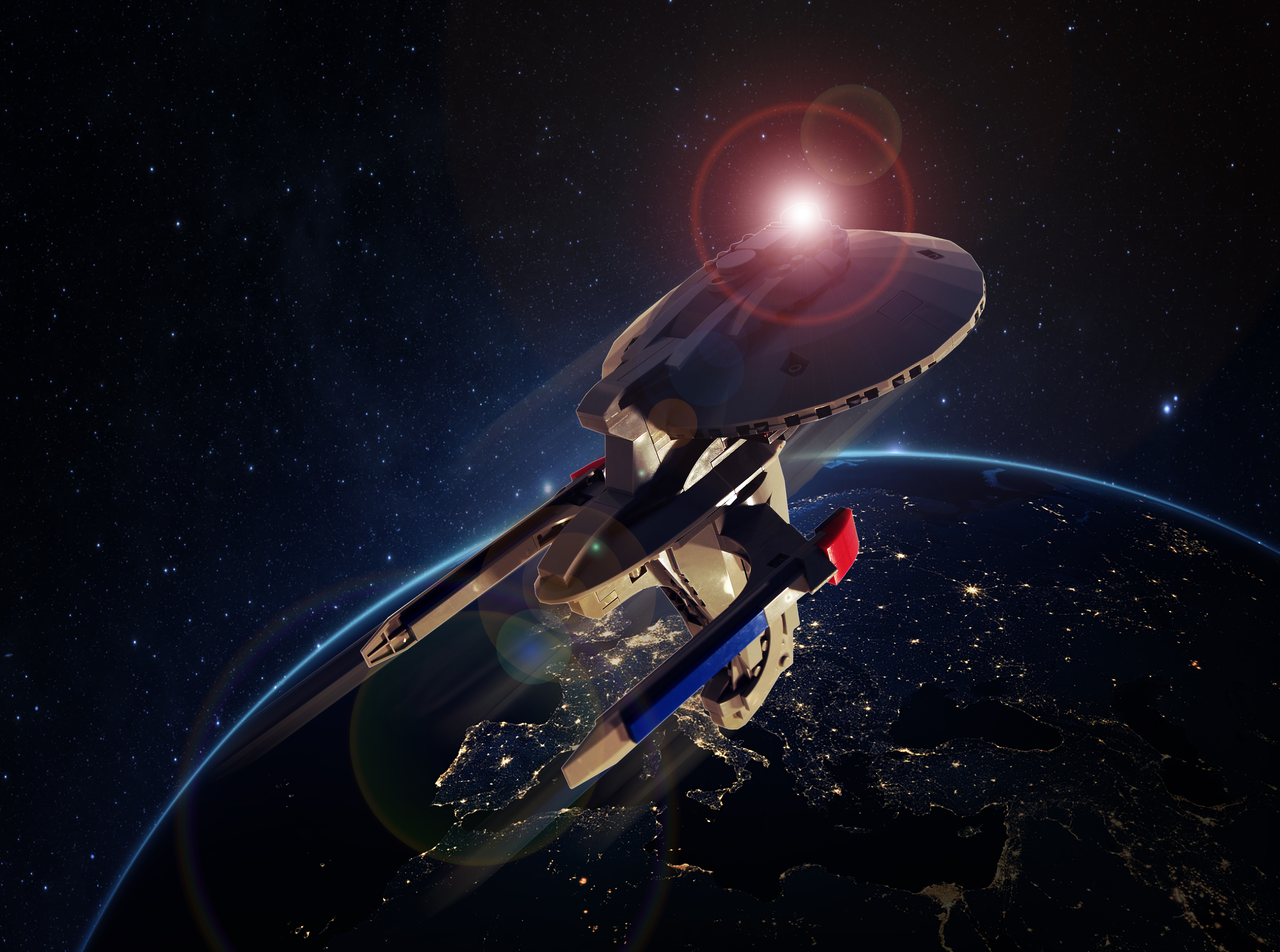
Planet Earth at night with my Chariot Class Starship

This summer I’ve been doing a lot of work – writing, project formulating, and making. But one needs to incorporate play into the process. Often hanging with my kiddos helps with that, but it’s been horrifically hot recently… so I’ve been in the basement. After taking a year or so off, I’ve gotten back into my LEGOs as a form for creative construction, both in terms of “serious” art and as a means to recharge with play.

Anyway, stick around here if you want to see the latest Star Trek themed ships I’ve made. To see some of the current direction in my artworks, see my Instagram.

Back in 2014, I had been trying to develop a LEGO version of a Chariot Class Starship. Check out the blueprints here, and my old post about the craft. Now, the Chariot Class is a non-canon ship, but it just looks so cool that I wanted to try it out. Finally, I got around to it. This was partly through the influence of my fellow FODS who view The Greatest Generation Podcast. Their encouragement of my embarrassing creations caused me to redouble my efforts. See below.

In the coming days I’ll add a few more of my newer ships to subsequent posts. If you’d like to look back at previous ships I’ve made, see these:

USS Claudius Galenus

USS Abblasen

The Ballou Collection – Chris Hall

Chris Hall – Thrustmasters. Oil on panel, 7×10 inches, 2012.

Chris Hall is a great guy. He’s a solid dude. He’s easy to get along with, to talk about Dune with, to consider the pros and cons of kayfabe with, and to think about art with. Back in 2011 Chris came into the MFA program at Mizzou and quickly stood out. Not only was he a good painter with interesting ideas, he was also willing to let his assumptions go to grow. His thesis work was among the strangest and most unique I’ve had the privilege to see. Check out his ongoing work at his website.

Chris has the unique ability to draw out both mirth and serious, intense thought in those around him. I’ve loved partying with him over the years, and I look forward to more fun in the future.

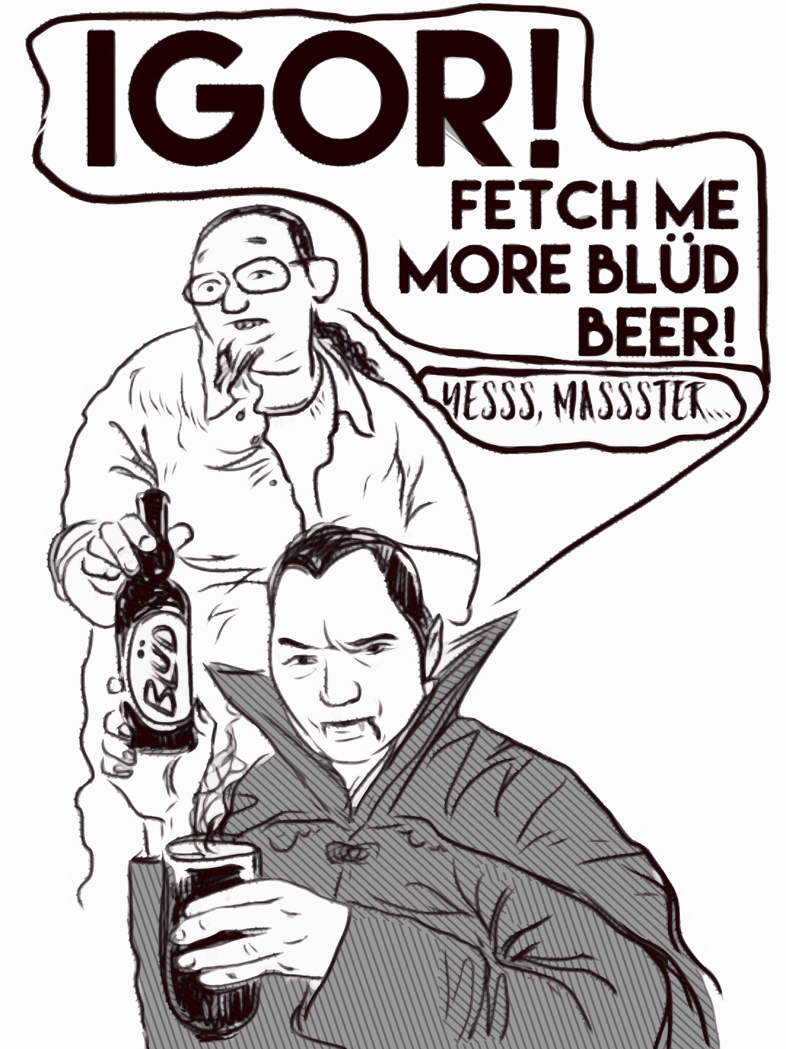
Above: Chris as Nosferatu and me as Igor in a drawing I made… this is how we party, people. Ballou digital drawing, 2017.

I have two artworks from Chris in my home. The first, Thrustmasters, is at the top of this post. And here is an untitled fridge interior from around the same time – 2012 or 2013, just as Chris was moving into his Thesis work.

Chris Hall- Untitled Fridge Interior (Vampiric Food). Oil on panel, 7×10.5 inches, 2013.

Chris is one of my favorite subjects for illustration (I’ve drawn caricatures of my friends, family, and students for many years). Not to be outdone, Chris had me pose for a number of his paintings early on, and those sessions are some of my favorite moments in academia!

Me posing for Chris… meme-ified.

Chris shaking his groove thang… Ballou digital drawing, 2016.

The Double Narrative of the Kehinde Wiley Portrait of Barack Obama

Portraits of President Obama and First Lady Michelle Obama at the unveiling, February 12, 2018.


Kehinde Wiley‘s portrait of Barack Obama is a nice addition to the history of presidential portraits. It contains a wonderful and strange double narrative. He emerges, calm and distinguished, from a wall of bushes: the Bush Era. The Bush, however, still ensconces him. It clings to his feet and begins to shroud the regal chair upon which he sits, just as the context set by George W is never too far away from the Hope and Change Obama partially realized. He is separate and beyond that Bush. But it still forms the space within which his history takes place.

Though he made strides in some human rights issues, in some economic issues, and in some issues of global policy, too much of the damage wrought by Bush and Cheney remained. And all too many Bush era policies lived on in the Obama White House. Cornel West has famously railed on the ways Obama failed to be the change he heralded. Particularly in terms of US war efforts, Obama maintained and expanded the failed, horrible strategies that have kept us stuck for nearly two decades. Sure, Obama got Bin Laden and drew down forces in Iraq and Afghanistan, but also massively increased drone usage and attacks around the world (both issues that have been mostly ignored by the American people). He continued attacks on whistle-blowers. He continued aid to various military forces around the world known for illegitimate attacks.

We can blame Bush and Cheney for starting it, but we have to admit that Obama made mistakes in dealing with shit they started. And we have to deal with the reality that there are unfortunate continuities from Clinton through Bush, Obama, and into the Trump administration. Yes, he helped end the recession and signed Dodd-Frank. But he also bailed out the banks and auto industry, moves which were not necessarily in the best interests of the 99% of us. Yes, he spearheaded the reform of health care and a nuclear deal with Iran, but both of those – like so many of his accomplishments – have been constantly undermined and/or reversed; the solutions weren’t robust enough.

President Barack Obama by Kehinde Wiley

The portraits are wonderful, but the President’s is a reminder that his legacy is double. I’m certainly not negative against President Obama. I think he did a decent job with the hand he was dealt. I think he was an inspiring leader and a person who used the government to help many people. Unfortunately, he also maintained a lot of the ways and means of previous administrations. He had to work within structures that often subvert human dignity and fail to lead to lasting change, which is partly why Trump has been able to counter so many of his best efforts.

I hope that we soon have leadership who will take the best desires of a man like Obama and reject the insidious systems operating within this country that keep us from truly liberating “the better angels of our nature.”


2017 Pride

I completed a number of projects in 2017 and started a few more. Setting goals and keeping an eye on the prize during the vicissitudes of daily life can be hard, but I’ve gotten better at it over the years (thanks mostly to my loving partner, Alison). I already mentioned stuff about my exercise routine, and posted about my exhibition of recent work (that opens today!).

Back in May I set some goals for the year while at the Wakonse Conference on College Teaching in Michigan. Here are my written goals:

I’m happy to say that I’ve worked to complete most of these items and even those I’ve not yet finished have been pushed forward. I’m glad, given how agitating 2017 was socially and politically, that at least in terms of family and my work I’ve been stable and focused. The results are things of which I am really proud.

Probably highest on my list is the publication of my essay On Scholarship: Empathic Attention, Holy Resistance. It appeared in SEEN Journal and explores the importance of attention in an environment of political vitriol and “fake news.” I hope you’ll pick up a copy and read it – it’s one of the best things I’ve written in years, and it shares space with artists and writers and thinkers I admire. I’m really thankful for the opportunity to have this piece out there.

A shot of the cover of the SEEN Journal and a copy of the first page of my essay. Above is a copy of The New Territory.

I am also super excited to be working on a piece for The New Territory. If you are a Midwesterner, you need to get this publication. I am working on a piece exploring the work of Joey Borovicka and adjacent ideas about interiority, Midwestern space, and solitude. I can’t wait to get it finalized and ready for the editors to sort through. Getting to write about key ideas and the work of others is very important to my identity as an artist and educator. I also just love being involved with publications like The New Territory and SEEN. They are labors of love and works of passion that really do the hard work of shoring up meaning, intellectual effort, and spiritual yearning.

I hope to continue this trend in 2018, as I’ve got the Promotion to finalize!


Statement for a new exhibition of WHENEVERwhen works, January 2018

Note: I’m getting the opportunity to show a new group of WHENEVERwhen pieces right off the bat in 2018. Here is my statement for the exhibition, with a few of the works interspersed within the text. I’ve enjoyed some wonderful experiences at Sager Braudis Gallery over the years, and this is the high point. I’m pleased with their installation and think the work looks great there. Of course, I’m biased. I’d love to hear what you think. You can see some gallery information here.

Splint – Oil on panel with custom oak frame. 2015-2017.

For more than twenty years, my painting, drawing, and printmaking have oscillated between symbolism-heavy representational imagery and formal explorations in the tradition of 20th century abstraction. This seemingly broad swing of subject and purpose in my work is directly related to my conviction that the core visual dynamics of either mode are, essentially, the same. I often tell my students that I’ve been making the same picture for my entire artistic life.

Sometimes I have felt led to apply those underlying compositional forces to the service of representational imagery, and other times I have felt the need to strip away everything but color, material, and surface. When I pursue abstraction, the resulting work is a foray into perceptual and physical experience. Thus, even though the works do not depict discernible objects, they are still – to me – realist in the sense that they focus on observational and haptic (sense of touch) phenomena. Conversely, my representational paintings are always abstract inquiries into the nature of meaning, purpose, and human engagement.

Periodically, when the communication of abstract, metaphorical ideals feels incongruous to me, I move intuitively into abstraction. The last time this shift occurred was about two years ago. I was coming out of a long period of working exclusively in the tondo format and had begun to readdress the rectilinear format standard to most painting and drawing. I had rejected it previously because it felt too much like a window or door space. I was looking to depict my ideas in some other form of oculus, something more subjective and mysterious. I started, in sketches and digital studies, to break the picture plane in a number of specific ways. These breaks were related to the work and ideas of artists such as Magalie Guerin, Vincent Fecteau, and Marcelo Bonevardi (among others). I was also greatly influenced by my research into Eastern and Western mandala forms as well as the newer generations of digital painting and drawing apps I was using.

Then, at age 39, I had a heart attack.

The near-death I experienced purged my interests. Though I have completed a few straight representational works since that cardiac arrest in February 2016, the vast majority of my work has focused on a series of abstract investigations I call WHENEVERwhen. In the WHENEVERwhen series I deploy an array of formal strategies that accumulate over time and leave a record within the work. These strategies are diverse; they might function in terms of simultaneity of form – for example, an area may appear to manifest as both light and solid structure – or display a counterintuitive sense of weight and balance. I have also incorporated a significant amount of collage, relief cutting, carving, and digital prototyping into my working methods.
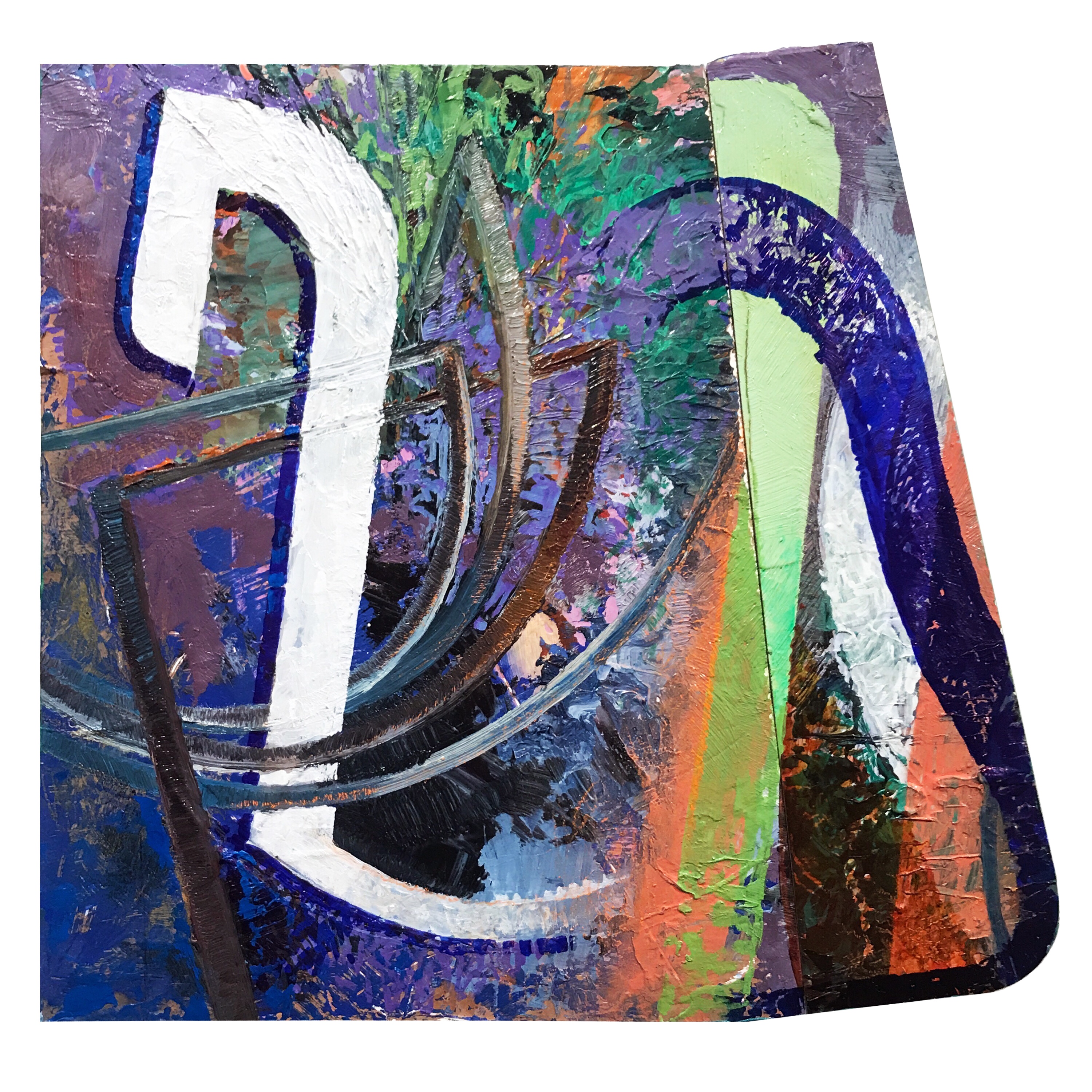
Icon Eikon – Oil, acrylic, marker, and spray-paint on shaped panel. 2016-2017.

Another significant development of the WHENEVERwhen series was my use of shaped surfaces and disrupted framing. I have been obsessed with making frames a part of the work for many years. At first I used clean, minimal float frames. More recently the frames both hold the work and are painted on or defied in specific ways – often through cutting and reassembly – in order to fit them into the pictorial language of the work. This integration of the frame is important to the sense of edge, continuity/discontinuity of the visual field, and aesthetic structure I seek. A number of my WHENEVERwhen works are framed in vintage oak reclaimed from old church pews and University of Missouri drawing desks. This 50 to 70 year old wood adds a density that corresponds to the surfaces and textures comprising my work.

The WHENEVERwhen series is serving as a kind of pivot within my life as an artist. I am bridging influences across history and media in ways I have not done in the past. I am pushing through old modes of working and thinking. My proclivities are both affirmed and challenged. My assumptions are acknowledged, and either used or left aside. Of course, this pivoting is also happening in the paintings, drawings, and prints themselves. Somewhat disheveled and awkward, yet bursting with chromatic beauty, these works are artifacts of aesthetic exploration, distillations of influence, and tributes to rigorous play.

Matthew Ballou – December 2017
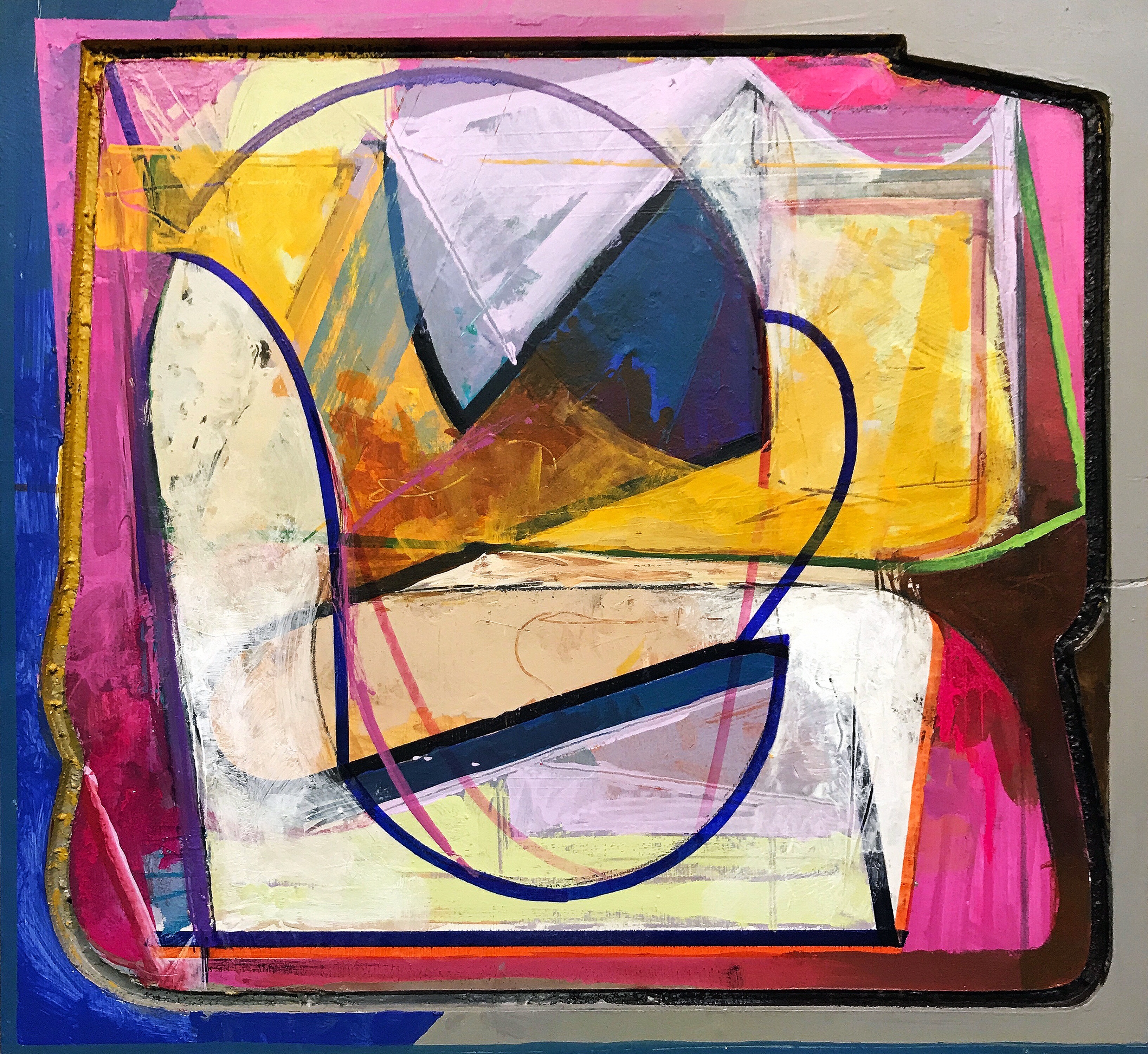
A la Lutes – Acrylic, gouache, Sharpie, and graphite on relief structure. 2015-2017.

Here are some installation shots of some of the work… I hope you can come and see the work before the show closes at the end of January.

img_0259img_0262img_0261img_0260