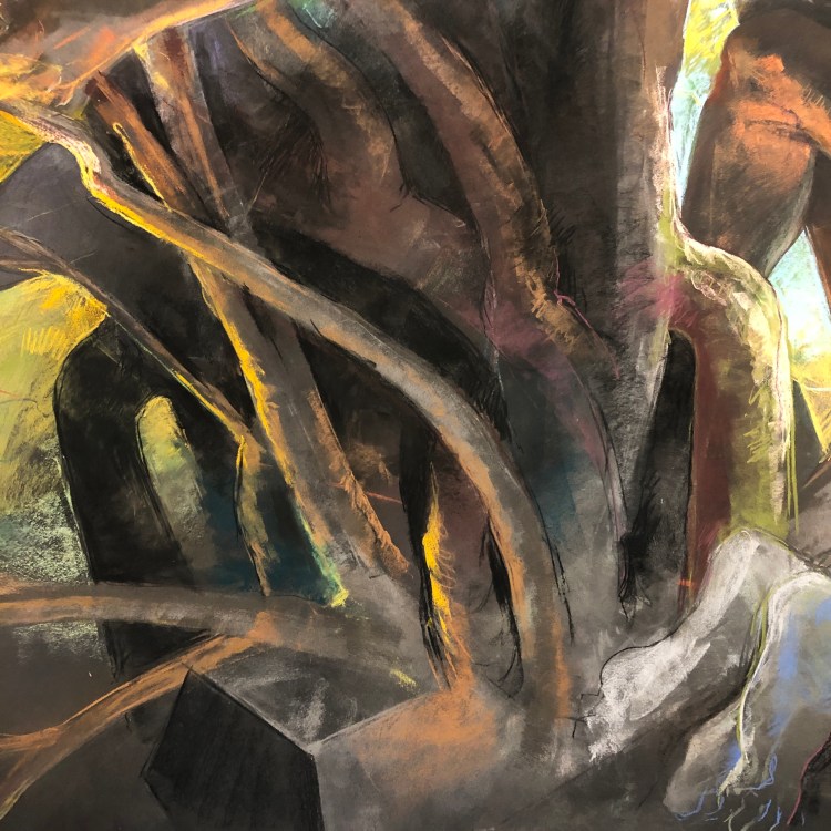
Subway Abstractions, Chicago

More than 20 years ago, when I first came to Chicago to study art at The School of The Art Institute of Chicago, the city shocked me. I was constantly in awe of the people, the exchange of pressure between the land and the lake, and the iconic architecture and spaces that mark this quintessentially American city.

I spent a good deal of time at subway stations and riding the L train rails. So much of what I remember about Chicago is from the vantage points the CTA afforded me. A lot changed in the years I spent there, and I witnessed a lot of those changes aboard the L or from the buildings where I took my classes at SAIC. I was always seeing through the modulating weather and variances of sunlight and season. It all kept my attention. Light, glass, rock, water, cloud, steel, snow, or asphalt; they all intrigued me.

My dad’s trusty Minolta was with me during those years, and I took many hundreds of photos. It was an attempt to understand what my eyes were being drawn to, and how my Eye – my aesthetic sense – wanted to see. It’s wonderful now, in looking back, to see how I was being developed (through education) and developing (through instinct and choice) the categories of judgement and intuition that would inform all of my work right up to today.

Among those photos is a series of pictures of empty signboards within subway stations. Often they would be left open for a while when advertisements were being changed out, but many times they stayed vacant for weeks on end. They had an austerity, and seemed to me to speak the language of modernist abstraction and abstract expressionism. What was interesting to me, beyond that formal similarity to intentionally crafted artworks, was that these were the result of the natural environment of the subway. The dust and grease and grime combined with blowing air – almost like a lung or the systolic/diastolic rhythms of the heart – to create strange inflow behind the placards of ads.

In other cases, workers who routinely painted around the frames designed to hold the placards, would inadvertently create dynamic fields of shapes via over-spray. This was a rhythm, too, a movement of maintenance and service reflecting the attempt to keep these arterial passageways operating. The spaces within the ad frames were a different kind of arena, moving at a different pace from the rest of the L train structures.

Thus that area behind the ads became a kind of palimpsest of the subway, but also of the city itself. The deposits of dirt accumulated in swaths of gray scale gradients. Intimately connected to the subway tunnel textures and layers of paint, the dust-fields were allowed to stick, protected behind ad boards for who knows how long.

Once revealed, these delicate, dirty paintings, which had been made by the trains and the people and the detritus of Chicago, held (it seemed to me) beauty. I loved them. I rode the L looking for them at every stop. I took dozens of photos. Perhaps one day I’ll try to publish them in a better form – I still have the original negatives, after all – but for now, I present a few of them here.

Restraint & Limitation Returns

Finally, after some serious delays because of COVID, the Chicagoland iteration of my curatorial effort Restraint & Limitation is taking place at the Riverside Arts Center.

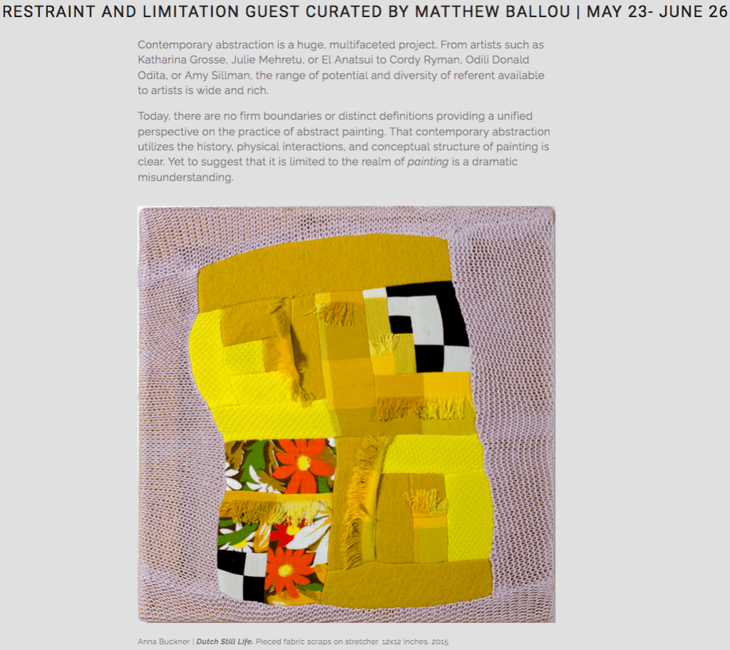
The exhibition features the work of Anna Buckner, Sharon Butler, and Magalie Guérin. Click above to read more about the show and its themes. To see other included artists, look below:

Sarah Arriagada

Dugallou Collaboration

Michael Hopkins

Erin King

Elizabeth Powell

Elise Rugolo

Sumire Skye Taniai

Simon Tatum

Jennifer Wiggs

I’m very proud of this show and thankful in particular to Anne Harris for helping me to bring it to fruition.

Featured image above: Detail of Wiggle Room by Elise Rugolo.

Mark Staff Brandl Is On To Something

I’ve been following Dr. Mark Staff Brandl for quite a while now. I particularly enjoy his Dr Great Art podcast, which has, of late, begun to feature some ideas from chapters of his forthcoming book (to be published by Bloomsbury).

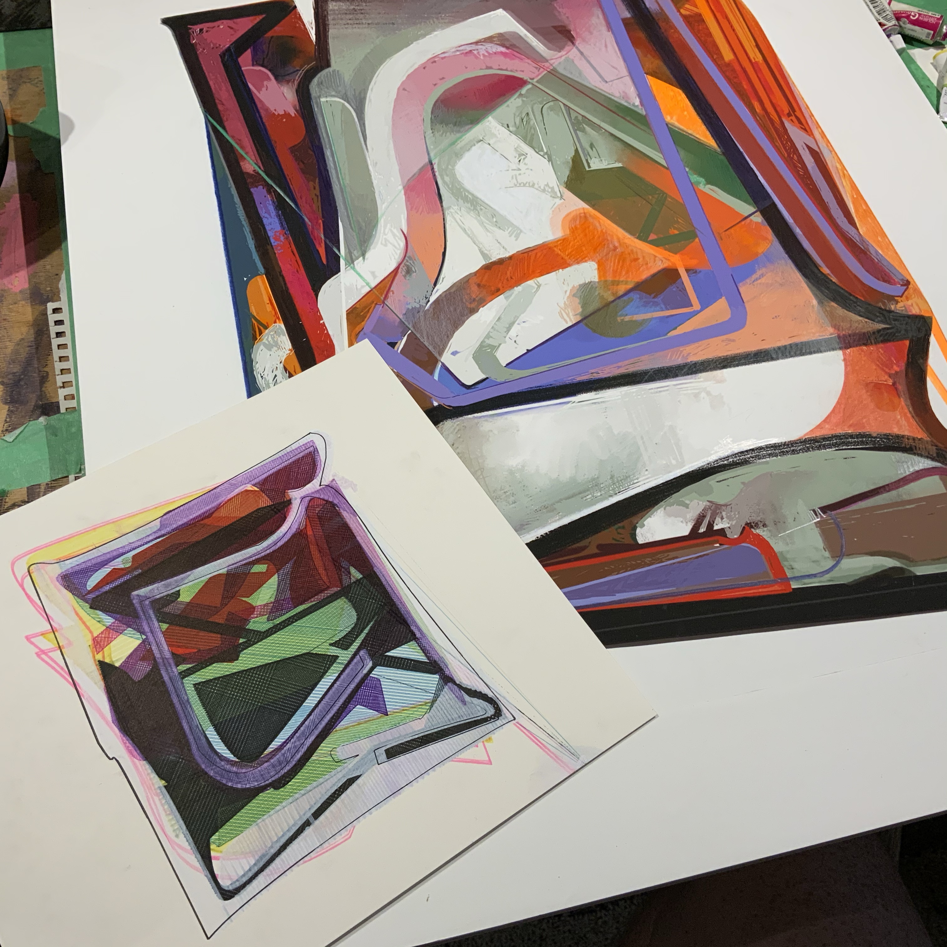
Two current works in progress.

His most recent podcast episode, linked below, definitely intrigues me and syncs up with a lot of the ways I’ve been thinking over the last couple of decades. Specifically, my wheneverWHEN and An Ensign For Miyoko Ito works are borrowing significantly from the kinds of ideas Professor Brandl is elucidating. My 2019-2020 collaboration with Joel T. Dugan, Phoneme, also deals with some of this.

An Ensign For Miyoko Ito (#16). Ink on paper, 12×10 inches, 2018. Private collection.

This is how I talk about some of the motivational ideas for these series of works:

“…I seek out the compacted and the overdrawn; the enclosed and the layered; the transformed and the solidified. I look for shapes, colors, and spaces that go far beyond a simple tension between figuration and abstraction, trying instead to suggest a layered arena of observational and haptic information.

Miyoko Ito (Japanese-American, 1918-1983) – whose work has been a key influence on me over the last 20 years – was able to activate subtle surfaces with the illusion of space and an evocative sense of palpability. This is what I’m investigating: the experience of perception apart from particular, representational depiction. In my exploration, questions arise: Does flat form appear to move away from my angle of view? Will color resolve into both static surface and suggested movement? Can space and color align to reinforce both static structure and an expression of time? Might the poetics of silent, unmoving images actually produce phenomena akin to those found in dreams, memories, ecstatic sensations, and atemporal musings?”

Take a listen to the Dr Great Art podcast and see if maybe some of the things I’m saying resonate with how Dr. Brandl is thinking:

While there are many points Brandl brings up that are worth exploring (I greatly anticipate getting to read his book once it comes out), I find myself particularly drawn to the explications he makes regarding ambiguity and conceptual blending. In these areas he distills and clarifies a number of philosophers and intellectual traditions into something artists can really wrap their minds – and artworks – around.

WHENEVERwhen (Michigan), inks on paper, 10×7 inches, 2018. Collection of the Artist.

Beyond the artists he references in his text, I think that there are a few more that very strongly connect with Mark Staff Brandl’s ideas, particularly Marcelo Bonevardi, Nicholas Byrne, Diebenkorn, Vincent Fecteau, Magalie Guérin, Miyoko Ito, and Kyle Staver, among others.

It’s exciting for my own passion for these artists to dovetail with the serious scholarship that Dr. Brandl is bringing forward. I know that I’ll be incorporating concepts from his book into my teaching for years to come. I hope you’ll join me in listening to the podcast and exploring what these ideas can mean for making and experiencing artworks.

Miranda Grace Makes Interiors

My eldest child, Miranda, is quite the artist (on top of being intense, defiant, powerful, passionate, and smart). Recently she’s been making these very interesting flattened interior spaces.

Miranda, the artist. Aged 10 and a half.

The drawings show an interest in categorization and organizational meaning, which are two interconnected ideas that Miranda has always been focused on. Placement and scale appear to be very important to her right now, too.

Grandma Valerie’s Tea Party
Colored pencil and ink on paper, 11 x 8.5 inches. 2020.

There is also a straightening and flattening of space in these new pieces. This is a little different for Miranda as she does understand perspective to a degree and has shown knowledge of recession of space in the past. However, these works seem to me to be more about the idea of the scene and less about naturalistic space or light.

Aunt Clarice’s Dinner Party
Colored pencil and ink on paper, 11 x 8.5 inches. 2020.

The way that forms extend unnaturally or terminate on two dimensional lines are unique aspects of these drawings. Above, see how the door extends into the floor or how the shelves stop right on the separation between the floor and the wall. These characteristics make the drawings function more as tableaux rather than structurally “correct” space depictions.

I’m interested to see how she combines the symbolic spaces of these drawings and the more expressionistic and observed spaces from her other drawings/paintings. I think that the organization and delineation of objects in her recent drawings are related to a desire for control. When she’s feeling more tense and uncertain, she wants to establish control. When she’s feeling more at ease and free her creates much more expressionistically and with fewer hard lines and forms.

I’ve taken Miranda on solo dates to museums a couple times (see most recently below) and she loves to do sketching from the master works and take in the quiet, calm spaces…

I am sure Miranda will keep growing as an artist and hone a unique way of making her experiences take shape in the world. ❤️

Halloween Portraits

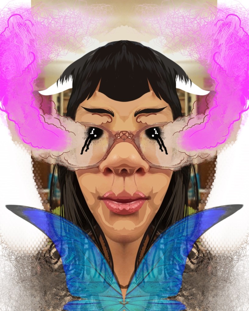
I decided to make a few strange and wonderful portraits for the spoooooky Halloween time, but it ended up turning into a whole family kind of thing. So here we are…

Miranda Grace
MeiMei
FangFang
Atticus
Alison
Matt

I had a fun time manipulating these in Procreate on my iPad Pro. Hope you enjoy them – or are freaked out by them. Don’t forget, fear and anxiety can (CAN, but not always DO) produce a redemptive tension. So go out there and watch The VVitch, or Hereditary, or Mandy, or Goodnight Mommy. Embrace it, then look towards a day of All Saints.

The Ballou Collection – Borovicka, Ebbe, McCarter, Rodier

We’re coming to the end of another year fraught with so many weird, world-altering experiences. In the midst of that it’s nice to step back and enjoy some things that are relatively stable. For me, that often means seeing what’s up on the walls of my home.

I’ve posted a few other things about what artworks are up in the old Ballou homestead and I didn’t want to let 2019 slip away without showing more. So here they are.

Joey BorovickaThe Alchemist’s Lair. Risograph Print. 2018.

I have loved Joey Borovicka’s strange, evocative interiors for many years. This sweet little risograph print – with that intense pink and blue – is a kind of distillation of what the artist does well: borrow, shape, and craft mood. I wrote about Borovicka’s work in the latest issue (#8) of The New Territory. Go there and subscribe!

Micah Ebbe – The Guardians (6/50). Screenprint. 2002.

I’ve known Ebbe since we worked together nearly 20 years ago in Evanston, IL. I’ve enjoyed watching his career develop over the years. I encourage you to look at his website – the quality is astounding. If you love masks, phantasmagorical tableaus, or CosPlay, Ebbe’s work is for you.

Stella McCarter – The Hornless Unicorn (4/5). Etching. 2008.

Stella gave me this print when she graduated. I like it quite a bit, but the way I remember it Stella’s real passion was for pigeons. She made a number of works about the birds, their colors, and their varieties during her undergraduate years. Hmmm… I might have to get me one of those, too.

Justin RodierUntitled (3 Views of Ballou’s Drawing Room). Photographic C-Print. 2011.

Though Justin graduated from Mizzou back in 2012, his presence is still felt. He – along with a small group of other Photo students – were a real force to be reckoned with. His work has continued to develop and break interesting, strange ground. I love following his work on Instagram and was pleased to include him in a show I curated last year. Stay wild, Justin.

There you have it. Four more entries into the Ballou Collection. I’ll have to add more in 2020…

YNGWIE in CHICAGO

The show flier, my ticket stub, and a guitar pick that Yngwie flung into the crowd. I’ve kept these things all this time…

On this day 20 years ago I was in the House of Blues in Chicago, having walked just a few blocks from my dorm on Michigan Avenue (It’s now classroom space, not dorms, but I kept my elevator floor sign before the demolition started).

I’d only been in the city a short time. This was my first trip out for a concert – OK, sure; lame choice. From my room across from the Art Institute it was just a short walk west, then north over the river, toward the “corn cob towers.” Just a few years later they’d be featured on the iconic Wilco record Yankee Hotel Foxtrot. If only I’d been to see them that night.

Yngwie was effervescent and shrill that night. Loping around the stage, posing before his stack of Marshall amps, and gratuitously clanging his numerous bracelets and bangles against the neck/fret board of his trusty Strat.

He was bursting from his leather? vinyl? spandex? pants. He was in full hair-band-era-cry. Hair teased so high, chest exposed by some combination of V-neck shirt or vest or Pirate jerkin… who knew?

In any case it was glorious. Furious. SO. LOUD. Riotous and ridiculous and raw. He gave his all, flinging guitar picks and sweat with abandon. My ears RANG for hours after, and were even stunned the next morning. It was epic. I can still recall the feel of the cool midnight air chilling me as I rushed back to my dorm room for a smoke and a reprise of Rising Force.

Yngwie. So many arpeggios, so little time.

Another Ten Years

Last month marked ten years of writing posts and posting pictures here. In most ways this site has become my de facto artist website rather than a space to post observations and non-art stuff. Kind of lame, I know. But I’ve had a personal website (and domain) for almost 22 years and I have administered it in a lot of different ways. But at some point – particularly after getting deep into full time teaching – I decided to lay aside HTML and CSS and private hosting.

I still have all of those older versions of my websites. Sometimes I browse them from their resting places inside my hard drives. I think about the effort and consideration that went into them. Thankfully I never committed the Geocities and Angelfire design atrocities… maybe WordPress is just the more contemporary version of those gaudy old things, I don’t know.

I have not written much in 2019. It has been a hard, strange year – emotionally, professionally, physically.

Physically, I have been sick and run down a lot this year. The medications I take to manage my heart disease are rough, and they constrain my metabolism and energy level; I have fallen asleep without wanting to a number of times this year. Though I work out every single day, my endurance seems to be sliding lower and lower. Normally I teach a course or two over the summer, but the reality is that I know I couldn’t keep up with that at this point. There’s more to say… but I won’t.

Professionally, while I’m not sure exactly where my artwork is going, I have a good body of work underway and am getting it out for people to see. I was recently promoted to Full Teaching Professor, which is the terminal rank in the Teaching Line. It took nine years to achieve. I feel secure and thankful for Mizzou, but there are a lot of pressures that rest on the shoulders of professors in a time when Universities are trying to do more with less. As someone who understands the importance of mental and physical health, well, those pressures can be life-threatening. I know that being an educator is not just time spent with students. If it were, I think I’d generally feel much better. God knows that I am still encouraged by being in the classroom – each and every time.

Emotionally, I don’t think I am the same after the heart attack. My general affect, emotional intelligence, and responses were dulled significantly. After two years it seemed that I had returned to normal. But have I? In 2012 I had a pretty major crisis of faith – one that corresponded with the onset of depression. There were other factors during the period of time between 2012 and 2015… then 2016 came with the death of my sister and my cardiac arrest mere days later. There have been a number of other things in the 3 and half years since then that have made impacts as well. Perhaps I am being changed by the medications and the inertia of routines… At least I am getting joy from working on LEGOs with my kids.

So I haven’t been writing. Maybe more will come.

Recent Artist’s Talk and Q&A

My current solo show, The Eternal Idol: Conflict, Impossible Scenes, and the Denial of Human Value, is on view right now (April 4-June 2, 2019) in the Montminy Gallery inside the Boone County Museum.

Detail of Head and Hole.

The exhibition features older work based in personal and spiritual conflict. One such piece is from 2001, created along the eastern shore of Lake Michigan amid the reverie of a pre-social-media world. A number of the large drawings were begun in 2006 and 2007 behind the apartment we rented on Elmwood Avenue in Evanston, Illinois. Little did I know then that those works would find their completion more than a decade later in Mid Missouri after many iterations.

The most recent paintings came from my fury over the US bombing of a Doctor’s Without Borders hospital in Kunduz, Afghanistan in October of 2015.

Detail of Current Events.

All of the works represent my ongoing attempt to picture the impossible spaces created by our collective unwillingness to constrain power, war, greed, consumerism, and ignorance – in ourselves and in society at large. Whether using documentary photos and videos or inventing from the history of the human form as a zone of violent incidence, I attempt to make plain the foolishness of conflict, oppression, and war.

At the reception event for this exhibition, I gave a talk and took questions from the audience. I present that talk here as a video, which features many images of the works on display and a number of photos taken during the reception event.

Detail of The Falling.

Here you can watch the video I’ve uploaded to YouTube. I’d love to hear any thoughts or questions you have – hell, I’ll even respond with more details if you ask me any!

The Glory of 2019 in Color Drawing

Listen. Look and Listen.

The recent work coming out of my color drawing students is phenomenal. They are thinking around my assignments, participating with the materials, and generally making leaps and bounds into understanding the physical properties of pastel and colored pencil (among other things).

Here are just a few of their amazing works this semester.


Sveta Wunnenberg. Study of Hose and Other Objects. Chalk Pastel. 18×24 inches. 2019.
Sveta Wunnenberg. Still Life in Colored Pencil. Colored Pencil. 18×21 inches. 2019.
Madison Read. Still Life with Strawberries and Glass Jars. Colored Pencil. 24x18x inches. 2019.
Devan Sweeney. Gummy Bears. Chalk Pastel. 18×24 inches. 2019.
Jessica Parker. Lunch. Oil Pastel. 16×16 inches. 2019.
Lydia Kappelmann. Apples and Brownies. Colored Pencil. 15×15 inches. 2019.
Elizabeth Finck. Bottle Caps and Pills. Colored Pencil. 17×17 inches. 2019.
Ashley Bigos. Spoon Reflection. 22×10 inches. Oil Pastel. 2019.
Jessica Parker. Reflection in the Angel. 14×16 inches. Colored Pencil. 2019.
Madeline Amack. Lunch. Chalk Pastel. 24×18 inches. 2019.
Sveta Wunnenberg. Me and Carter Reflected in a Spoon. Colored Pencil. 18×18 inches. 2019.